Ash Grey
Meet Ash Grey (#B2BEB5), a sophisticated neutral that strikes a perfect balance between warmth and coolness. Its subtle green undertone gives it a unique character, setting it apart from typical grays and offering a quiet, earthy foundation for any design palette.
What color is Ash Grey?
Ash Grey is a pale, cool-toned grey that sits between light and medium shades. Its appearance is often likened to the fine powder left after wood has burned, carrying a subtle, muted quality.
This color typically presents with cool undertones, often leaning slightly towards blue or green. This gives Ash Grey a crisp and composed character, distinguishing it from warmer, more earthy greys.
What is the meaning of the color Ash Grey (#B2BEB5)?
Psychologically, Ash Grey is a color of balance and composure, often evoking a feeling of quiet stability.
It carries a symbolic weight of sophistication and intellect, a timeless shade that suggests maturity and reflection.
How can I use Ash Grey in UI design?
Ash Grey’s versatility shines when used to create visual hierarchy. Pair #B2BEB5 with a strong, saturated accent color to make calls-to-action pop, or use it within a monochromatic scheme for a sophisticated, minimalist aesthetic. It serves beautifully as a background, container, or secondary text color, providing a stable foundation that allows primary content to stand out.
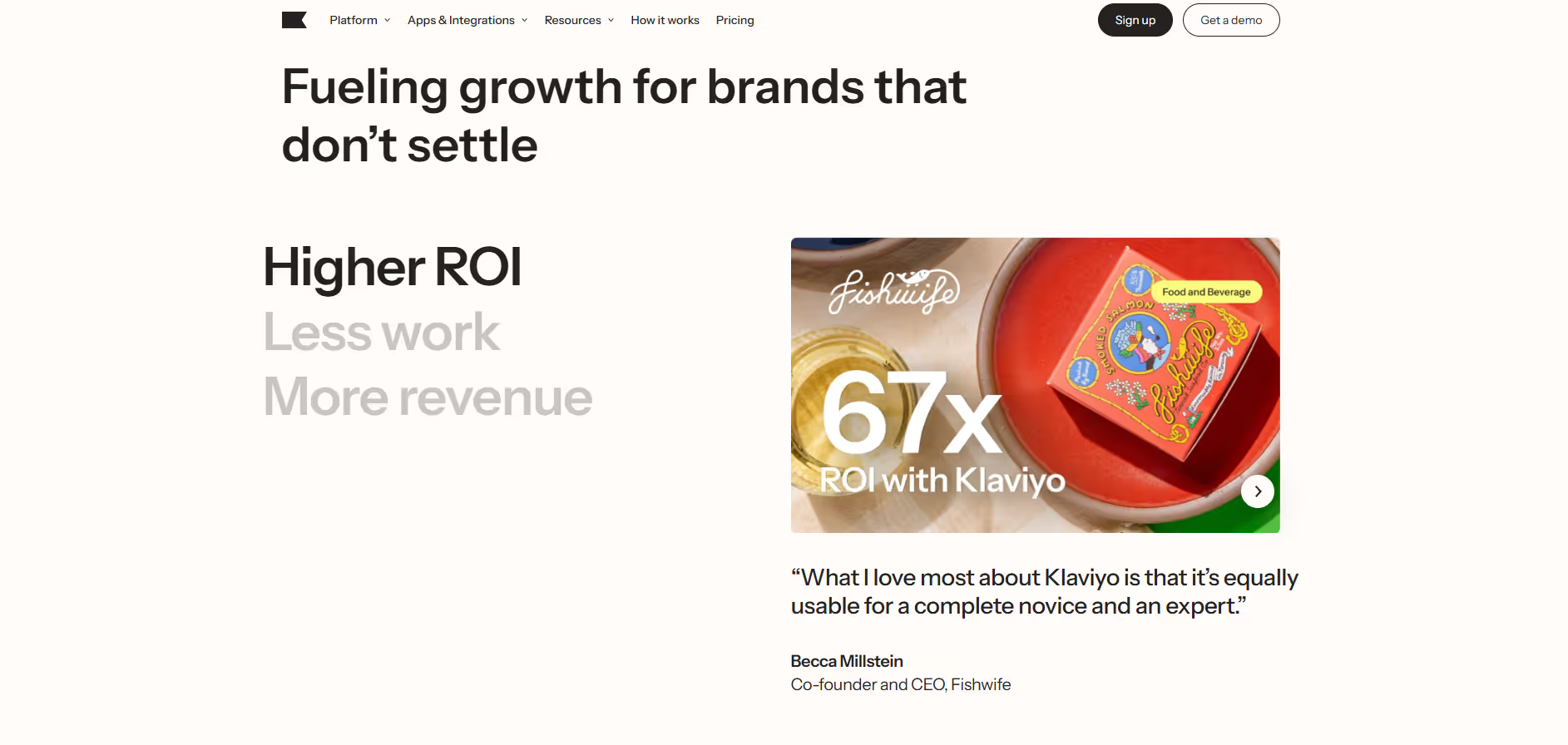
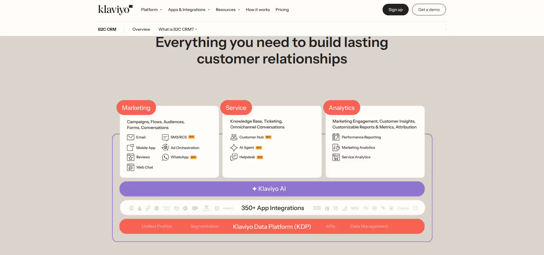
While not a common primary brand color, you can find shades similar to Ash Grey in the interfaces of companies like Klaviyo. Its rarity can be an advantage, offering a unique and refined look that helps a design feel clean and focused, allowing key UI elements to take center stage.
Use the tools below to explore curated palettes, test color contrast for accessibility, and preview Ash Grey in real UI components from top brands.
Using Ash Grey color codes
Using Ash Grey in your design work is straightforward. The most common starting point is its hexadecimal code, #B2BEB5, which is the standard for web development and many digital design tools.
Depending on your project's needs, you may need to convert #B2BEB5. For digital displays, you'll use its RGB values. For print materials, you'll need the CMYK equivalent. Other models like HSL offer a more intuitive way to make adjustments by separating hue, saturation, and lightness.
To get you started, we've converted Ash Grey's #B2BEB5 hex code into a variety of popular formats. You can find and copy these values right below.
Analogous
Colors adjacent to Ash Grey on the color wheel form an analogous scheme, which produces a cohesive and tranquil visual experience.
Complementary
Complementary colors are opposites on the color wheel. When used with Ash Grey, these pairings produce a striking and energetic visual contrast.
Split Complementary
A split complementary scheme for Ash Grey uses the two colors adjacent to its direct complement, offering a vibrant yet balanced palette.
Triadic
A triadic scheme pairs Ash Grey with two other colors, all equally spaced on the color wheel, creating a vibrant and balanced palette.
Tetradic
A tetradic color scheme for Ash Grey uses two pairs of complementary colors, forming a rectangle on the color wheel for a vibrant, balanced palette.
Square
A square color scheme uses four colors evenly spaced on the color wheel. With Ash Grey as a base, this creates a vibrant, high-contrast palette.
Text Color
Background Color
Your Catchy Large Text Goes Here
Shades
Shades of Ash Grey are darker tones made by adding black, which adds depth and gravity.
Tints
Tints are lighter versions of Ash Grey, created by adding white for a softer effect.
Tones
Tones of Ash Grey are created by adding gray, resulting in softer, less saturated variations.
Hues
Hues of Ash Grey are variations in temperature or intensity that can shift a design’s feel.

Never run out of inspiration again.
Use Mobbin for free as long as you like or get full access with any of our paid plans.