#1db954
Copy
Copied

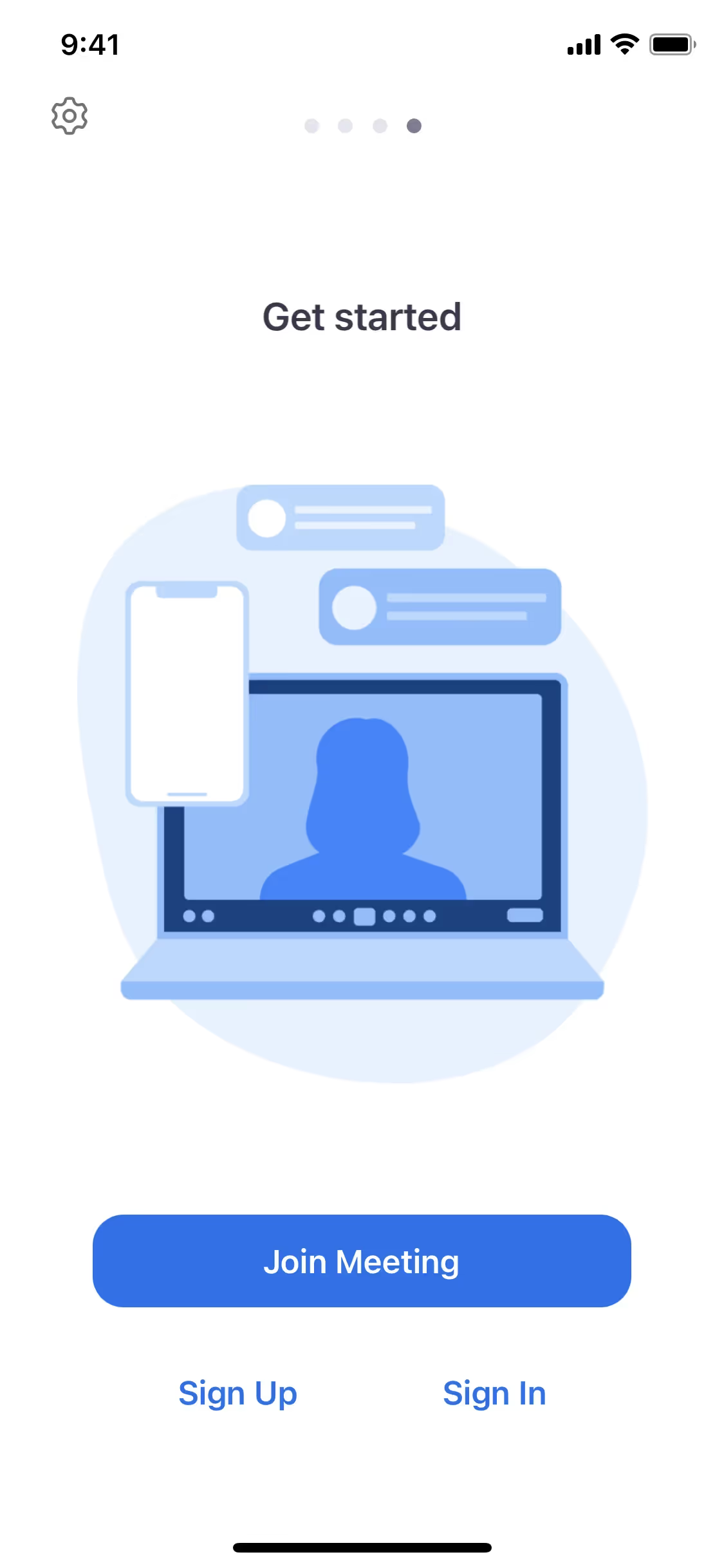
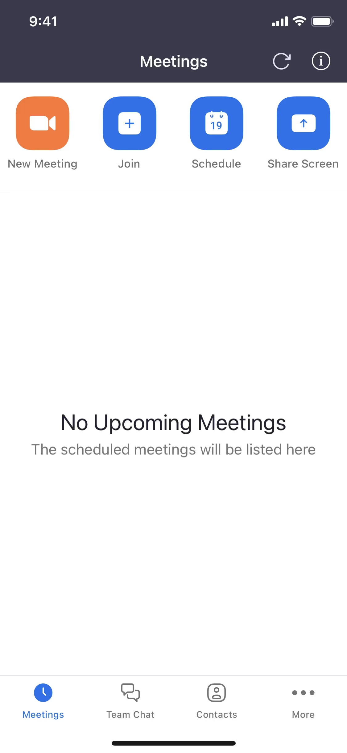
Zoom Video Communications, Inc. is a leading video conferencing platform for virtual meetings. Its branding and interface designs feature Black Russian, White, Bright Turquoise, and the iconic Blue Ribbon. We've made it easy for you to copy these official colors in Hex, CMYK, and RGB formats.
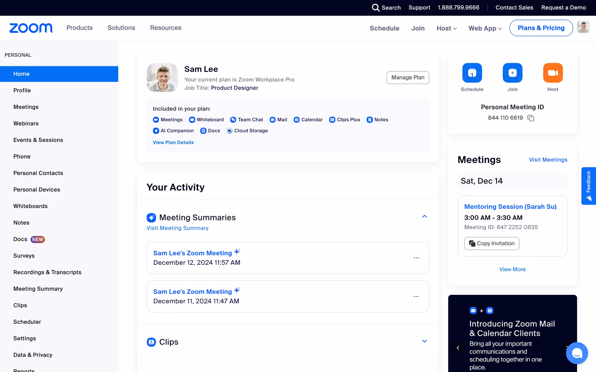
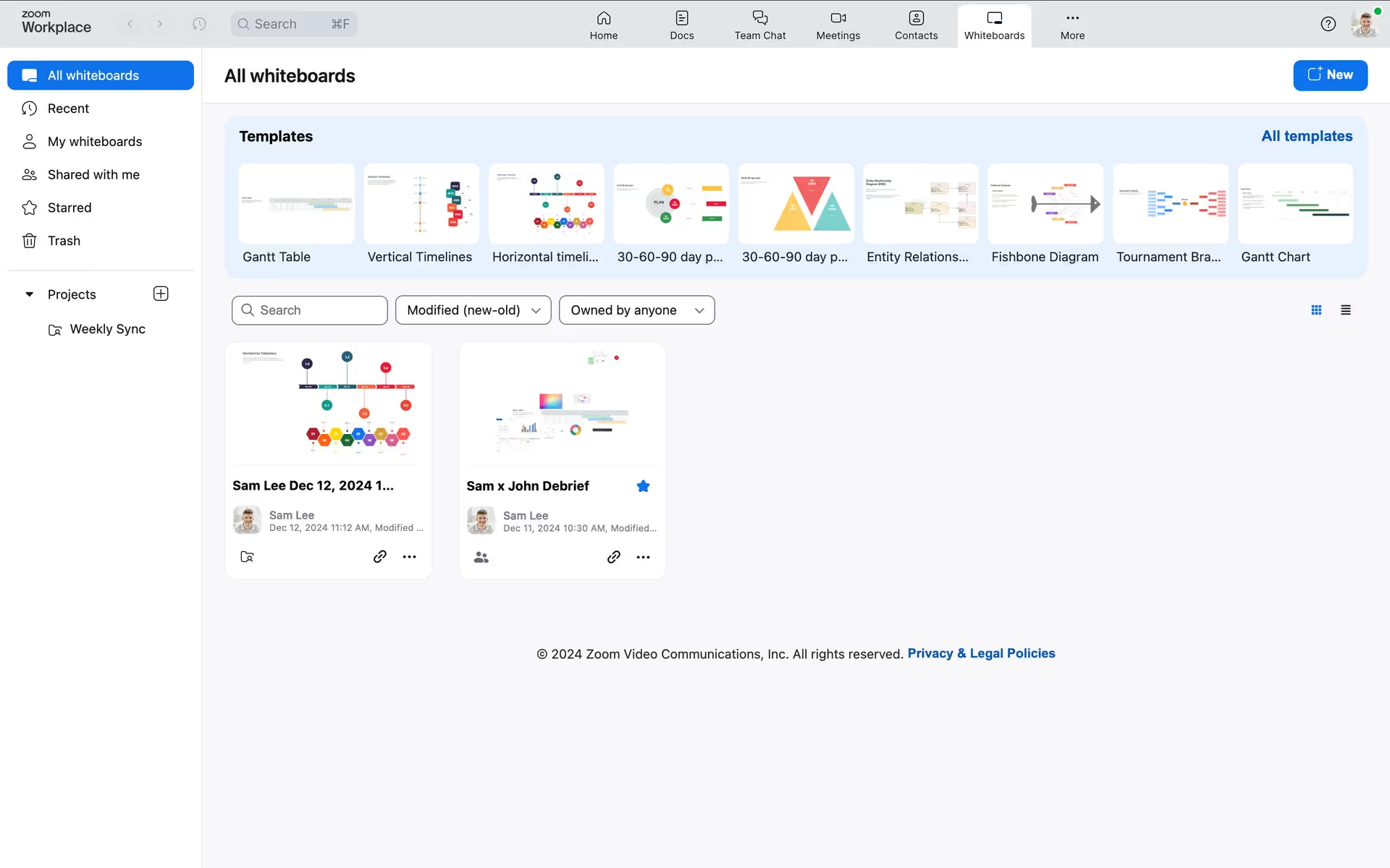
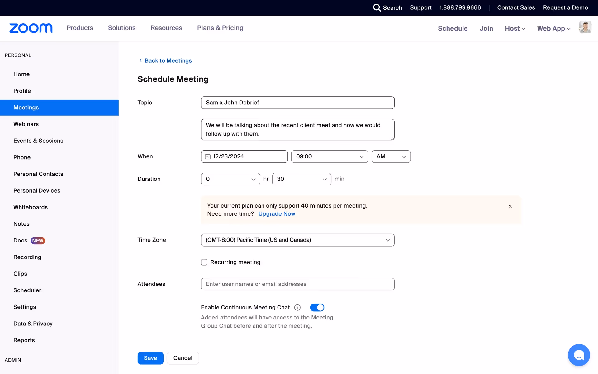
We've found that Zoom's main color palette is a powerful combination of professional and energetic hues. It primarily features a deep Black Russian (#00031F), a crisp White (#FFFFFF), a vibrant Bright Turquoise (#00EDE7), and their signature Blue Ribbon (#0B5CFF).
Zoom's foundational dark blue (#00031F) grounds the brand in professionalism and trust, creating a stable backdrop for your meetings. The pops of vibrant blue then inject a sense of energy and clear communication, reflecting the seamless connection the platform provides.
Zoom's signature blue is a strategic choice that taps into the psychology of color, conveying the trust and reliability you need from a communication platform.
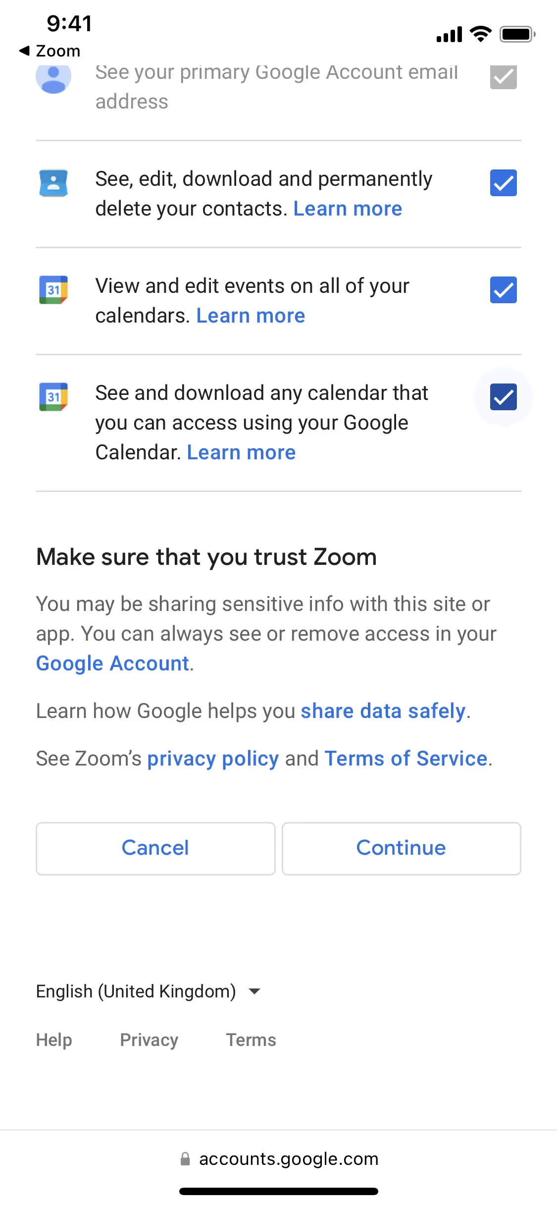
In our analysis, Zoom masterfully uses its signature blue to build trust and guide you toward primary actions. The high-contrast palette ensures a focused experience, while the vibrant turquoise accent makes navigating secondary options feel effortless and intuitive.
To build on Zoom's core navy, we recommend introducing a warm accent like a muted terracotta for sophisticated contrast, or a vibrant coral to add an energetic pop to your designs.
On our brand colors page, you can explore curated palettes from top companies. We also offer access to thousands of other UI designs and interfaces from various brands, making it a great resource for finding new color combinations and getting inspiration from real-world examples.
Mobbin offers an extensive, constantly updated collection of mobile and web design patterns, showcasing the very latest in UI/UX—from color usage to entire user flows. By exploring our library, you can easily see current design practices in action and stay ahead of industry trends.
You can try Mobbin today for free for as long as you like, or get full access with any of our paid plans.

Use Mobbin for free as long as you like or get full access with any of our paid plans.


