#1db954
Copy
Copied

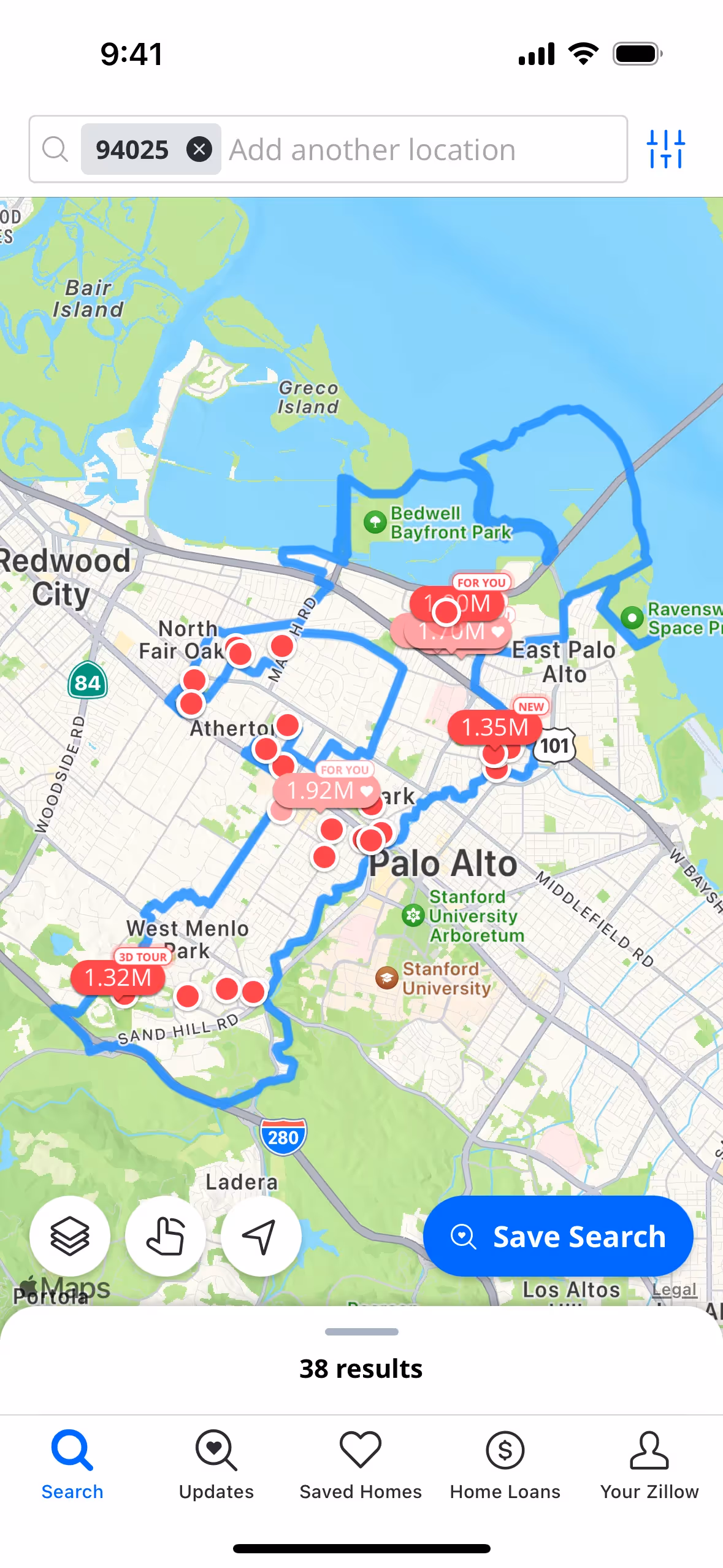
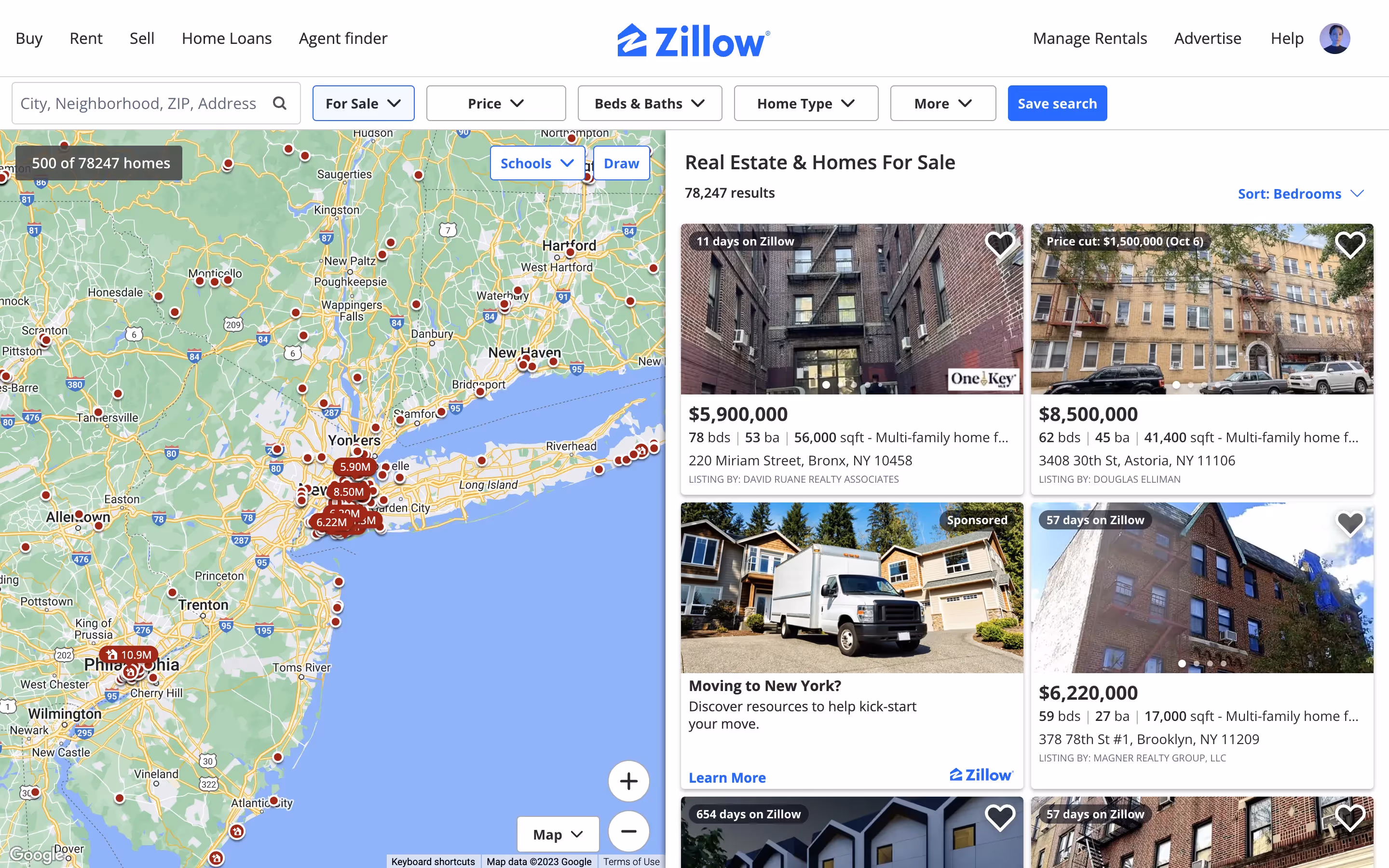
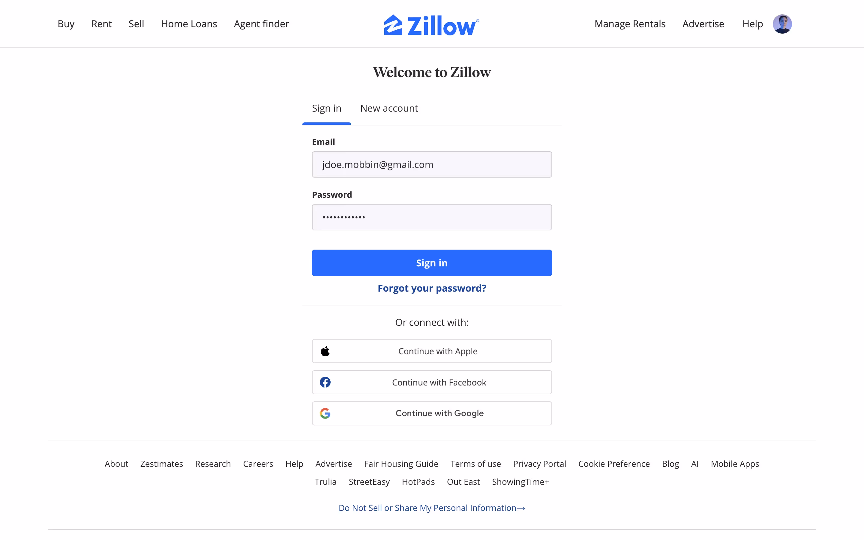
Zillow is a comprehensive real estate platform offering listings for homes, rentals, and mortgage rates. The platform's branding and interface designs prominently feature a distinctive blue (#0041D9) and a deep black (#111116). You can easily copy Zillow's colors in Hex, CMYK, RGB, and other popular formats for your projects.
The main colors in Zillow's color palette are a vibrant blue (#0041D9) and a deep black (#111116). These colors are designed to create a strong visual identity and enhance user experience.
Zillow's primary color, #0041D9, is a deep blue that conveys trust, stability, and professionalism, aligning perfectly with the brand's identity as a reliable real estate platform. This shade of blue instills confidence and a sense of security, essential for users making significant financial decisions. Complementing this, the use of black (#111116) adds a touch of sophistication and modernity, enhancing the overall message of trustworthiness and expertise.
Zillow's color scheme, featuring a calming blue and white palette, was chosen to evoke trust and reliability, key elements in the real estate industry. The brand's colors were influenced by the need to create a sense of professionalism and approachability, ensuring that you feel confident and secure while navigating their platform.
Zillow uses color psychology to create a trustworthy and user-friendly interface. The strategic use of blue for primary actions and highlights instills a sense of security and guides you through the platform, while black provides clarity and authority, ensuring that important information stands out and is easy to read.
To complement Zillow's primary color (#0041D9), consider using shades like a soft coral (#FF6F61) for a warm contrast, a light gray (#D3D3D3) for a neutral balance, or a vibrant lime green (#32CD32) to add a fresh, energetic touch. These colors can enhance your design by creating a harmonious yet dynamic visual experience.
On Mobbin’s brand colors page, you can explore a curated list of brand color palettes from top companies. We also offer access to thousands of other UI designs and interfaces from various brands, making it a great resource for finding new color combinations and getting inspiration from real-world examples.
Mobbin helps you stay up-to-date with the latest UI/UX trends by offering an extensive, constantly updated collection of mobile and web design patterns. From color usage to user flows, you can easily explore current design practices and stay ahead of industry trends.
Don't miss out—try Mobbin today for free as long as you like, or get full access with any of our paid plans.
Use Mobbin for free as long as you like or get full access with any of our paid plans.


