#1db954
Copy
Copied

Workable is a leading hiring and recruiting software for scaling businesses. Its branding and interface designs feature a sophisticated palette of Cyprus, Foam, and Pine Green. You can easily copy these colors in Hex, CMYK, RGB, and other popular formats on this page.
To help you nail your next design, we've broken down Workable's main color palette for you. Their key colors are the deep green Cyprus (#004038), the vibrant Pine Green (#00756A), and the clean off-white Foam (#F6FEFB).
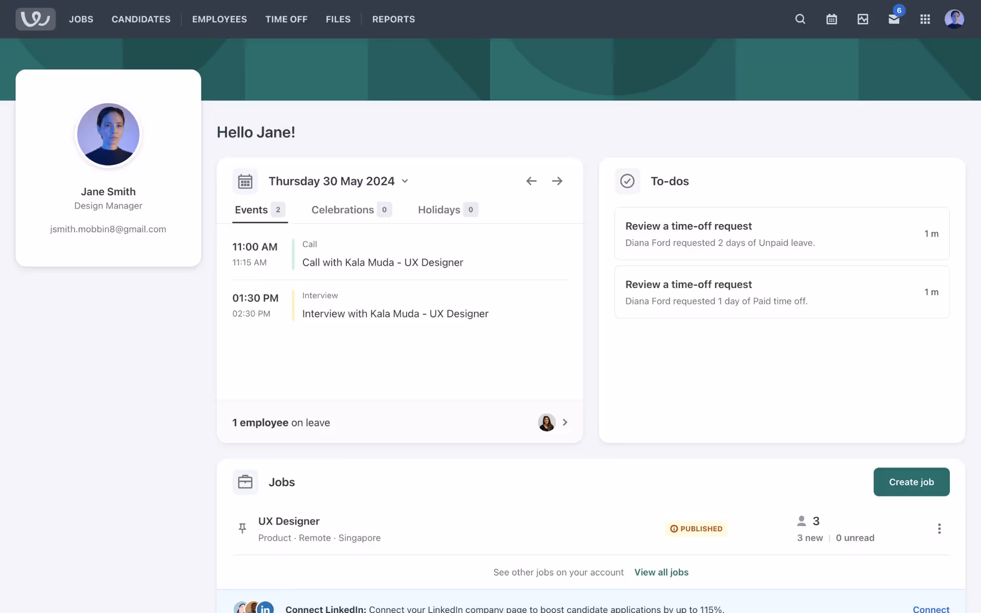
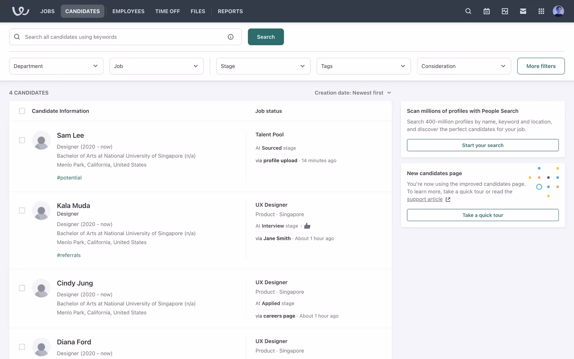
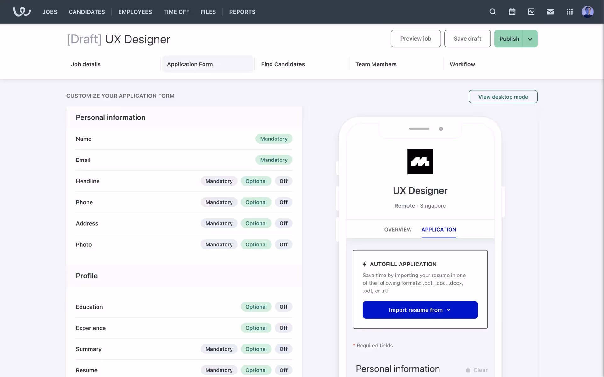
Workable's deep Cyprus green (#004038) grounds the experience in professionalism and growth, reflecting their mission to help you build great teams. We find the complementary Pine Green and clean Foam white create a focused, uncluttered interface, guiding you through the hiring process with clarity and confidence.
Workable's color choices expertly balance corporate reliability with a fresh, user-friendly feel. We believe their palette was intentionally crafted to inspire confidence and clarity throughout the hiring journey.
Workable strategically uses its green-toned palette to build trust and signal growth, with the vibrant Pine Green guiding you toward key actions while the calming Foam background ensures a focused, uncluttered experience.
To create a striking contrast with Workable's deep Cyprus green, we suggest exploring a warm terracotta for an earthy balance or a sophisticated gold for a touch of vibrant energy. These additions can help you build a more dynamic and visually compelling palette.
On our brand colors page, you can explore curated color palettes from top companies. We also offer access to thousands of UI designs from various brands, providing endless inspiration for your next color combination from real-world examples.
Our platform offers an extensive, constantly updated library of mobile and web design patterns, allowing you to see the latest trends in everything from color palettes to intricate user flows. By exploring our collection, you can easily observe current design practices from leading apps and stay ahead of the curve in the fast-paced design industry.
Why not try Mobbin today? You can use it for free for as long as you like, or get full access with one of our paid plans.
Use Mobbin for free as long as you like or get full access with any of our paid plans.


