#1db954
Copy
Copied


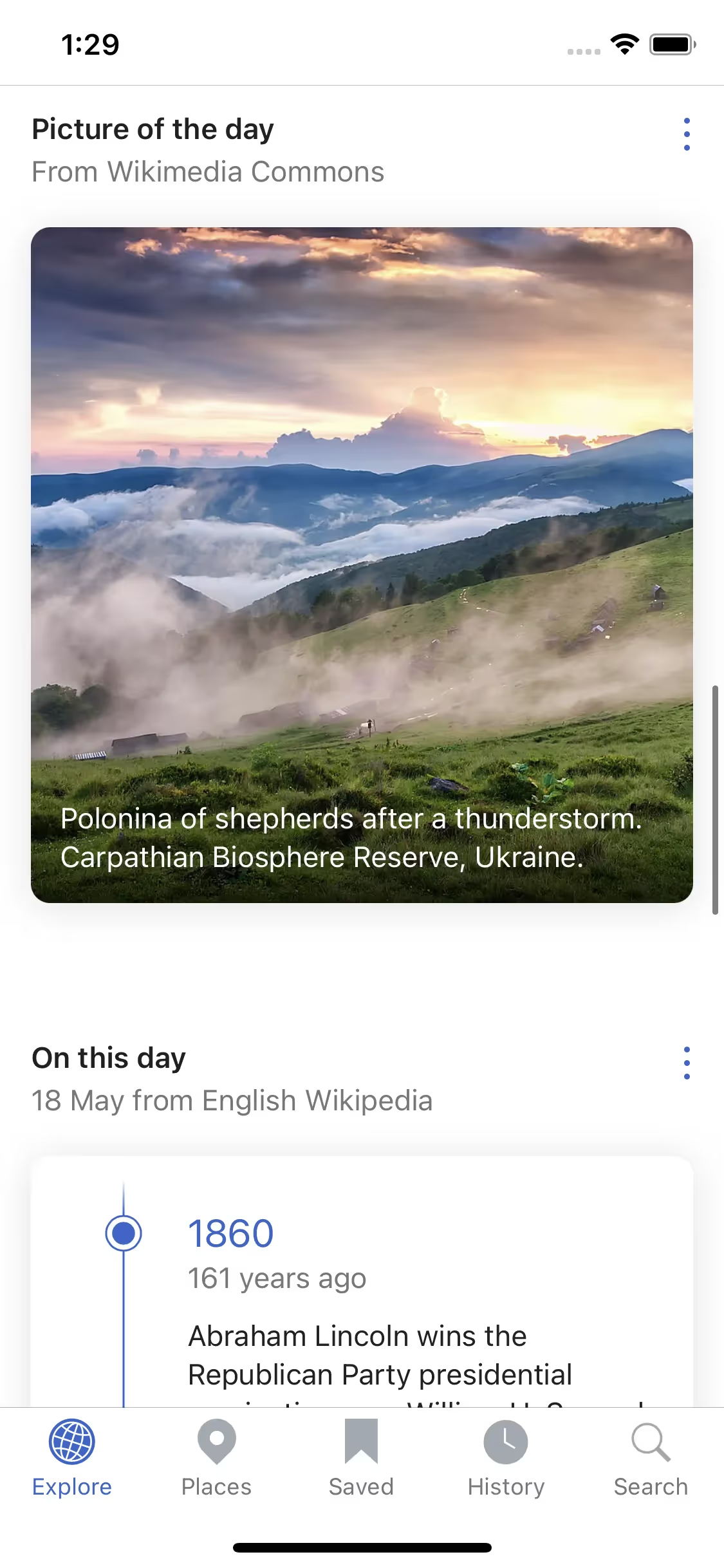
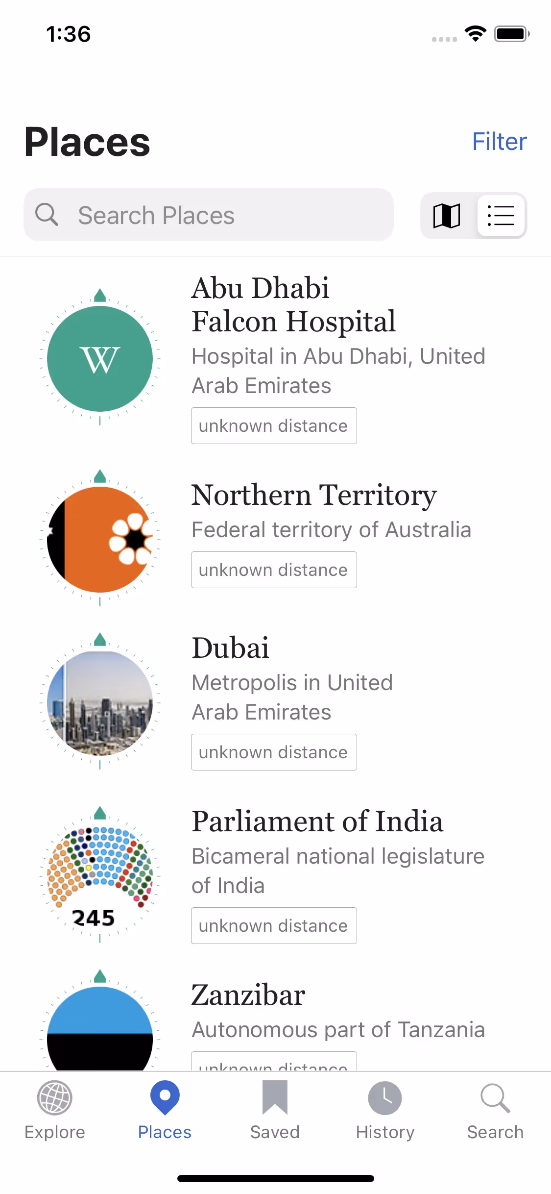
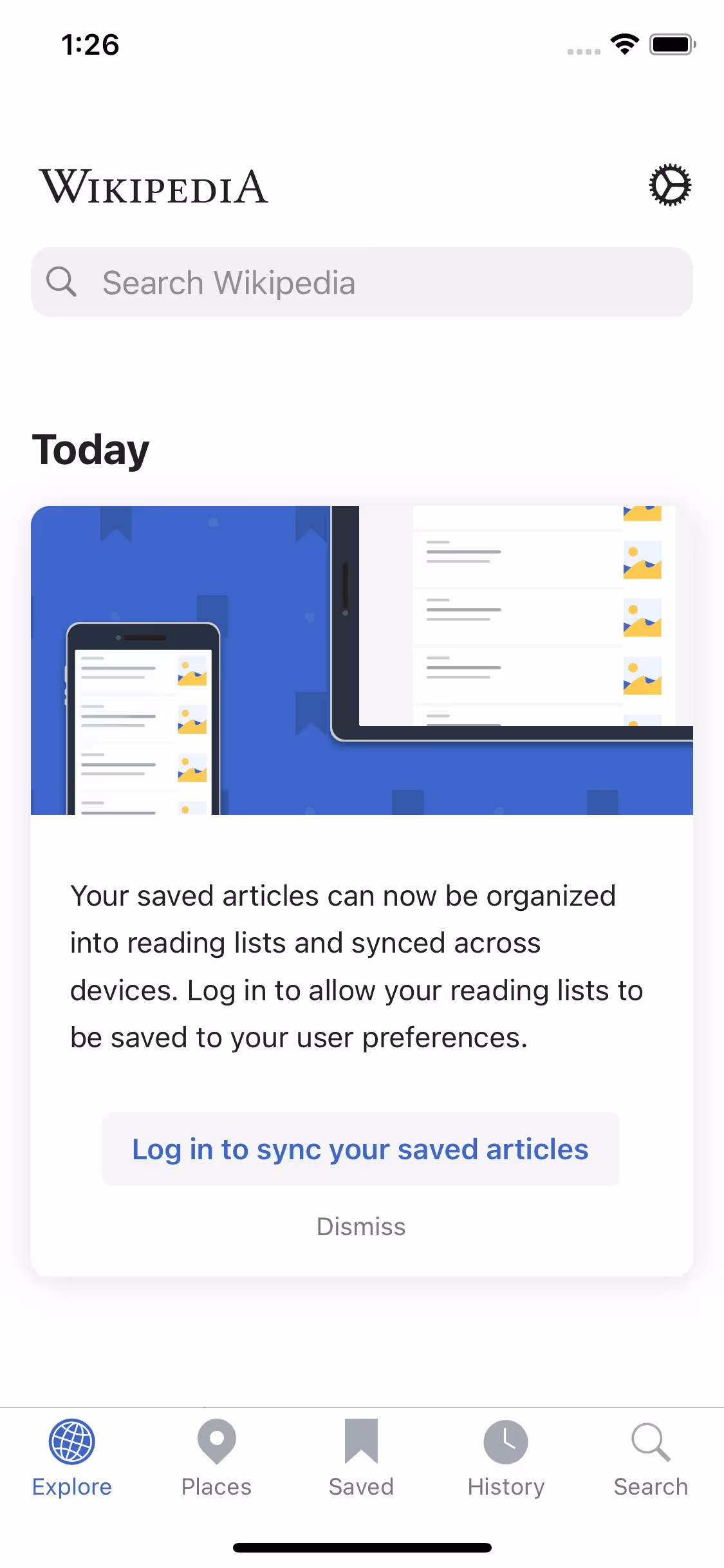
Wikimedia Foundation is a nonprofit providing the infrastructure for free knowledge. The general colors used in Wikimedia Foundation's branding and interface designs include Abbey (#54595D), White (#FFFFFF), and Mariner (#3366CC). You can easily copy Wikimedia Foundation's colors in Hex, CMYK, RGB, and other popular formats in this page.
The main colors in Wikimedia Foundation's color palette are Abbey (#54595D), White (#FFFFFF), and Mariner (#3366CC). These colors provide a balanced and versatile foundation for your design projects.
The primary color, Abbey (#54595D), in Wikimedia Foundation's app or website, conveys a sense of reliability and professionalism, aligning with the organization's commitment to providing trustworthy and neutral information. This muted, sophisticated shade of gray underscores the brand's focus on knowledge and clarity. Complementing this, the use of White (#FFFFFF) enhances readability and simplicity, while Mariner (#3366CC) adds a touch of vibrancy and trust, reinforcing the brand's dedication to openness and accessibility.
The Wikimedia Foundation's color scheme, featuring blue, green, and red, was chosen to symbolize knowledge, growth, and passion. These colors were selected to reflect the Foundation's commitment to free knowledge and community-driven projects, aiming to inspire and engage you in the collaborative mission of sharing and preserving human knowledge.
Wikimedia Foundation strategically uses color psychology in its interface designs to guide user actions and create specific user experiences. The dark gray "Abbey" (#54595D) provides a strong contrast for readability, while "White" (#FFFFFF) ensures clarity and focus on content. The blue "Mariner" (#3366CC) is used for interactive elements like links and buttons, drawing attention and encouraging engagement. This thoughtful use of colors not only enhances usability but also fosters trust and transparency.
To complement Wikimedia Foundation's primary color (#54595D), consider using shades like "Sunset Orange" (#FF4500) for a vibrant contrast, "Sea Green" (#2E8B57) for a balanced, natural feel, or "Slate Blue" (#6A5ACD) for a harmonious yet distinct look. These colors can enhance your design by creating visual interest and depth.
On Mobbin’s brand colors page, you can explore a curated list of brand color palettes from top companies. We also offer access to thousands of other UI designs and interfaces from various brands, making it a great resource for finding new color combinations and getting inspiration from real-world examples.
Mobbin offers an extensive, constantly updated collection of mobile and web design patterns, showcasing the latest trends in UI/UX design, from color usage to user flows. By using Mobbin, you can easily explore current design practices and stay ahead of trends in the industry.
Ready to elevate your design game? Try Mobbin today for free as long as you like, or get full access with any of our paid plans.

Use Mobbin for free as long as you like or get full access with any of our paid plans.


