#1db954
Copy
Copied


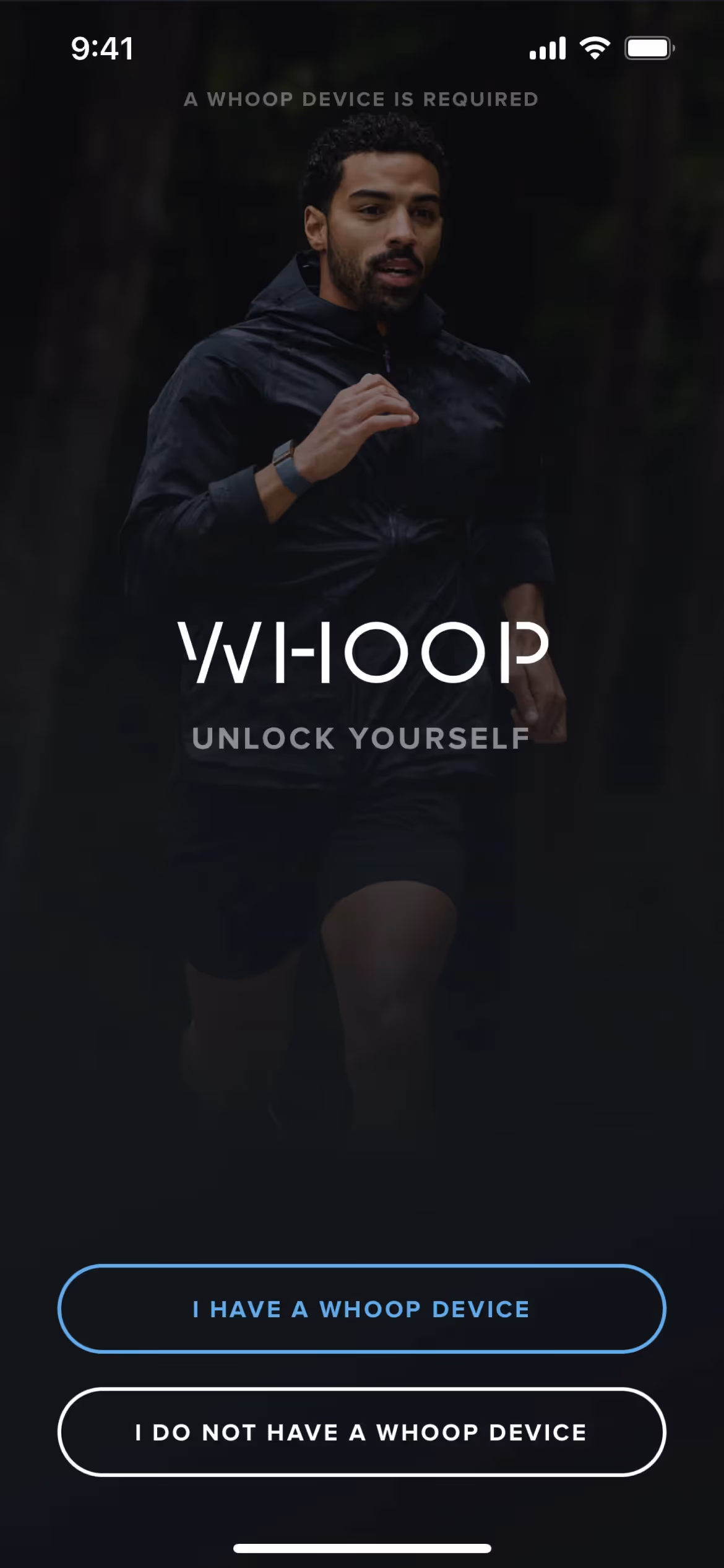
WHOOP, Inc. provides a device and app to track users' health and fitness metrics. Its branding and interface designs primarily use Cod Gray, White, and a signature Red. You can easily copy WHOOP's colors in Hex, CMYK, RGB, and other popular formats here.
You'll find WHOOP's core color palette is a striking combination of Cod Gray (#0B0B0B), White (#FFFFFF), and a high-impact Red (#FF0100). We believe this minimalist yet bold trio is a fantastic reference for creating interfaces that feel both premium and energetic.
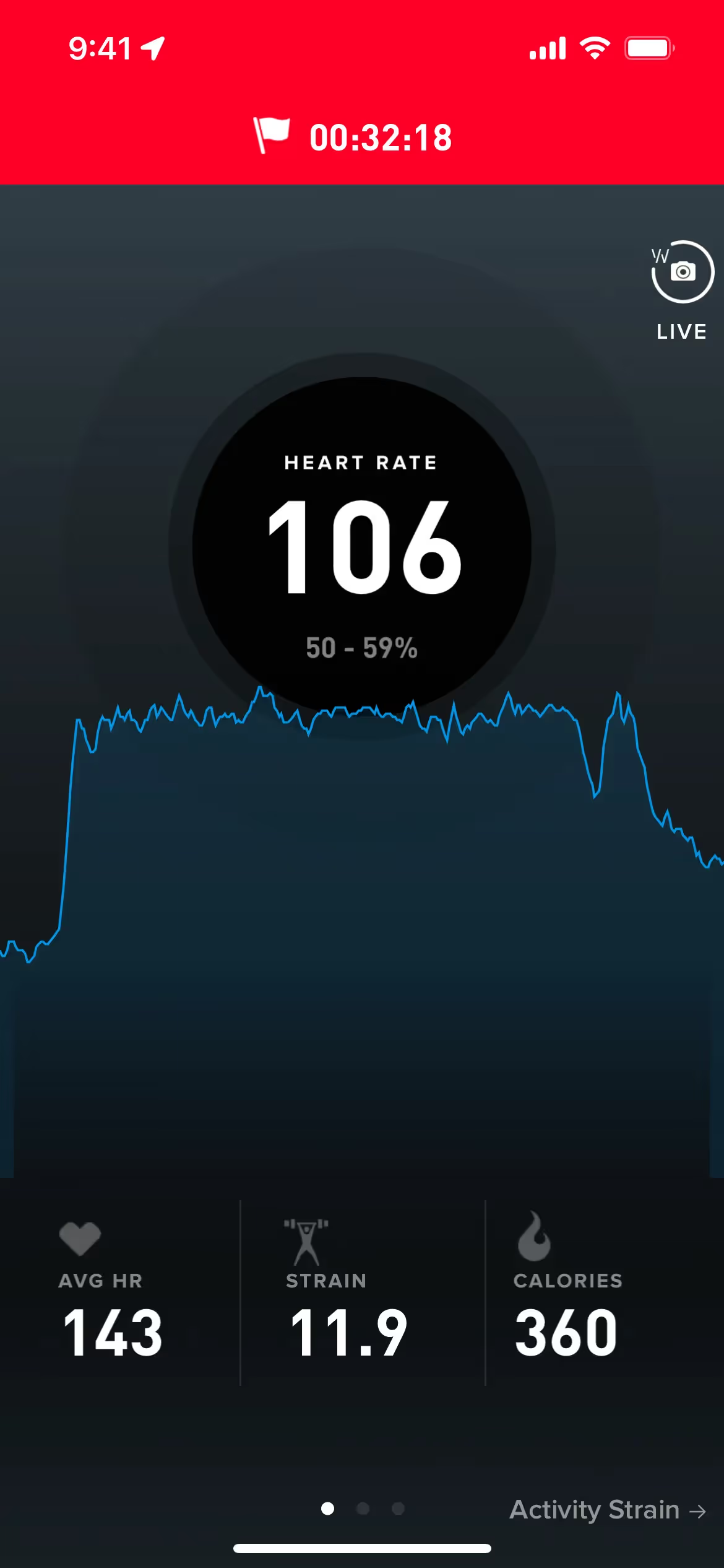
You'll notice WHOOP's primary black (#0B0B0B) grounds the experience in data-driven seriousness and elite performance, creating a premium feel. The supporting red and white then cut through the noise, drawing your eye to critical data points and actionable insights that matter most.
Diving into WHOOP's interface, you'll see their color choices are deeply tied to function, creating an intuitive visual language for performance data that offers powerful lessons for your own designs.
WHOOP masterfully employs a minimalist gray and white canvas to keep you focused on your data. The intentional use of red acts as a powerful visual cue, instantly highlighting key metrics to help you make smarter decisions about your health and performance.
To build on WHOOP's core palette, we suggest exploring deep blues for a sophisticated, tech-focused vibe, or energetic yellows and oranges as accent colors to create sharp, eye-catching contrast against the primary black.
On our brand colors page, you can explore curated color palettes from top companies. We also offer access to thousands of UI designs from various brands, providing endless inspiration for your next color combination.
Mobbin keeps you at the forefront of design with our extensive, constantly updated collection of mobile and web design patterns. By exploring the latest trends in everything from color usage to user flows, you can easily see what leading apps are doing and stay ahead of the curve in the industry.
You can try Mobbin today for free for as long as you like, or get full access with any of our paid plans.
Use Mobbin for free as long as you like or get full access with any of our paid plans.


