#1db954
Copy
Copied

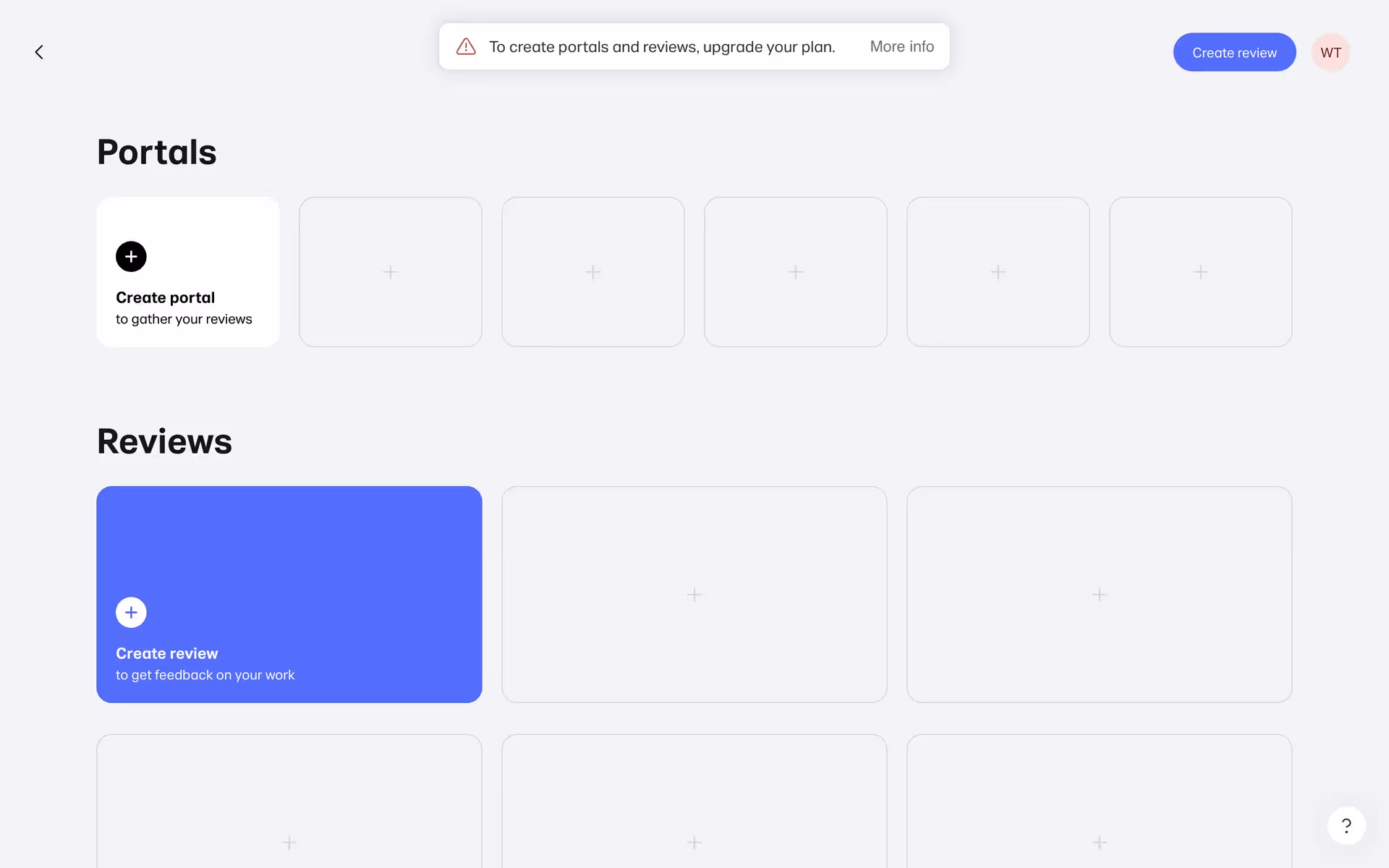
WeTransfer is a Dutch file-sharing service for sending large digital files. Its branding and interface designs primarily use Woodsmoke, White, and a distinctive Dodger Blue. On this page, you can easily copy these colors in Hex, CMYK, RGB, and more.
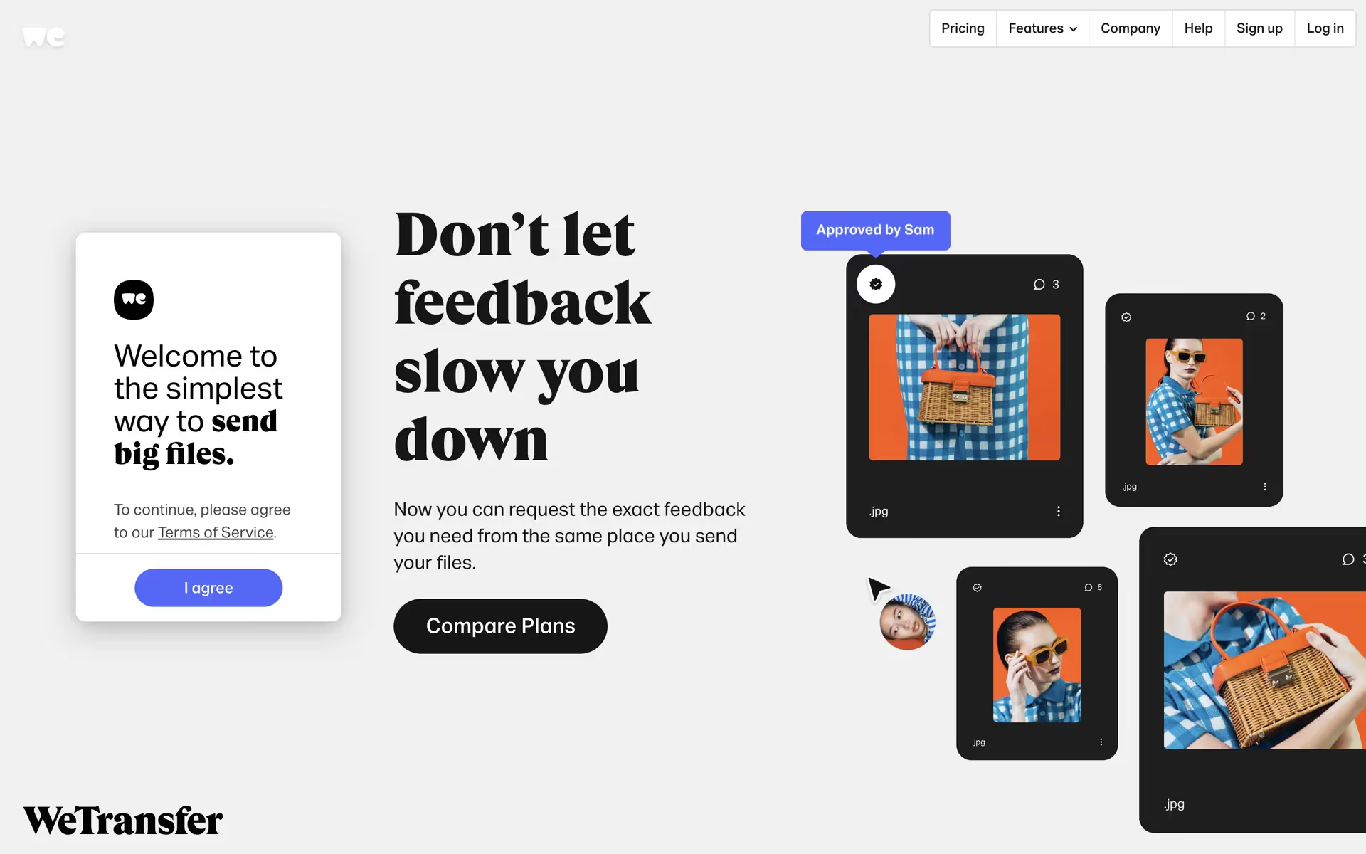
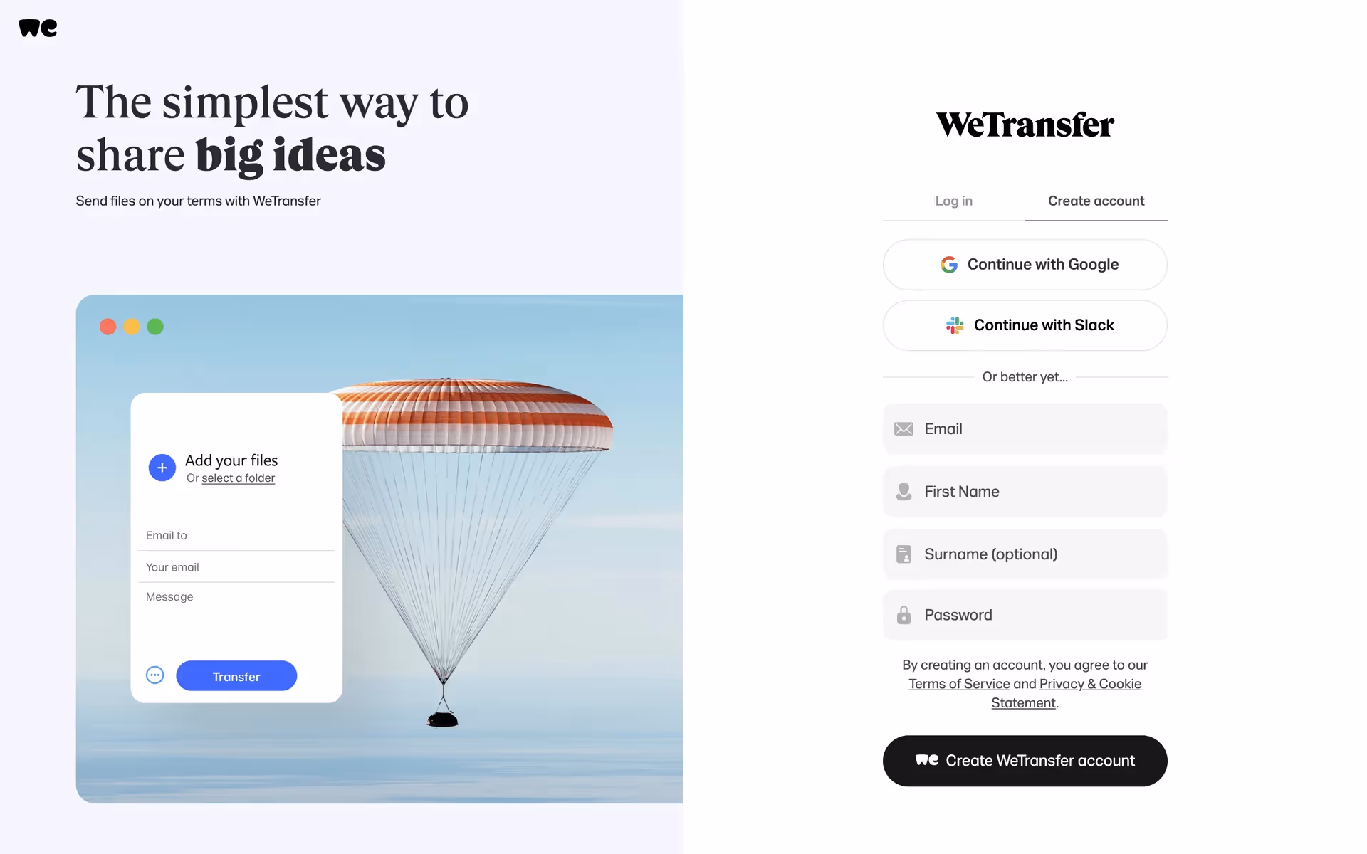
WeTransfer primarily uses a simple and striking palette of Woodsmoke (#17181A), White (#FFFFFF), and Dodger Blue (#409FFF). This combination provides a clean canvas with a vibrant accent, offering a great reference for your own projects.
WeTransfer uses its deep Woodsmoke (#17181A) to create a professional, reliable canvas that puts your creative work front and center. The supporting White and Dodger Blue then provide functional clarity, guiding your actions without distracting from the main event.
WeTransfer's color philosophy is rooted in simplicity, using a minimal palette to serve as a quiet backdrop for the vibrant, rotating artwork they feature. This intentional choice ensures the focus is always on creative expression, a value we share.
WeTransfer masterfully uses its neutral Woodsmoke and White palette to create a clean, focused canvas that minimizes distractions for you. Their signature Dodger Blue is then strategically used for key interactive elements, acting as a clear and trustworthy guide to encourage confident action.
To build on WeTransfer's core palette, we suggest exploring a warm, earthy terracotta for a more grounded feel, or a vibrant marigold to introduce an energetic, creative pop against the existing blue and black.
On our brand colors page, you can explore curated color palettes from top companies. We also offer access to thousands of UI designs from various brands, providing endless inspiration for your next color combination.
Mobbin keeps you at the forefront of design with our extensive, constantly updated library of mobile and web UI/UX patterns. By exploring the latest trends, from innovative color palettes to seamless user flows, you can easily see what's current and stay ahead of the curve in the ever-evolving design industry.
Why not try Mobbin today? You can use it for free for as long as you like, or get full access with one of our paid plans.
Use Mobbin for free as long as you like or get full access with any of our paid plans.


