#1db954
Copy
Copied


Walmart is a leading retail giant known for its extensive range of products and services. The brand's primary colors are Blue (#0071ce) and Spark Yellow (#ffc220), which are prominently featured in its branding and interface designs. You can easily copy Walmart's colors in Hex, CMYK, RGB, and other popular formats on this page.
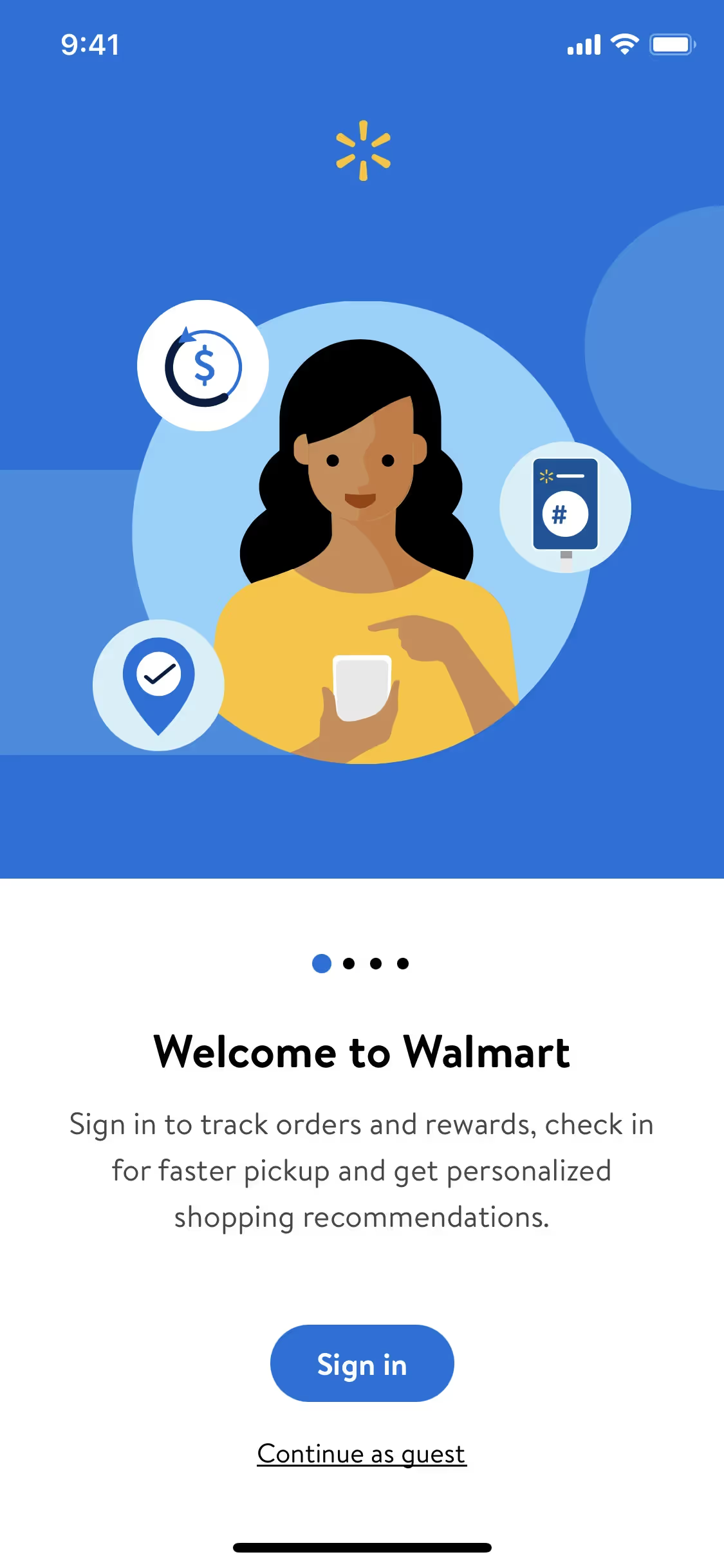
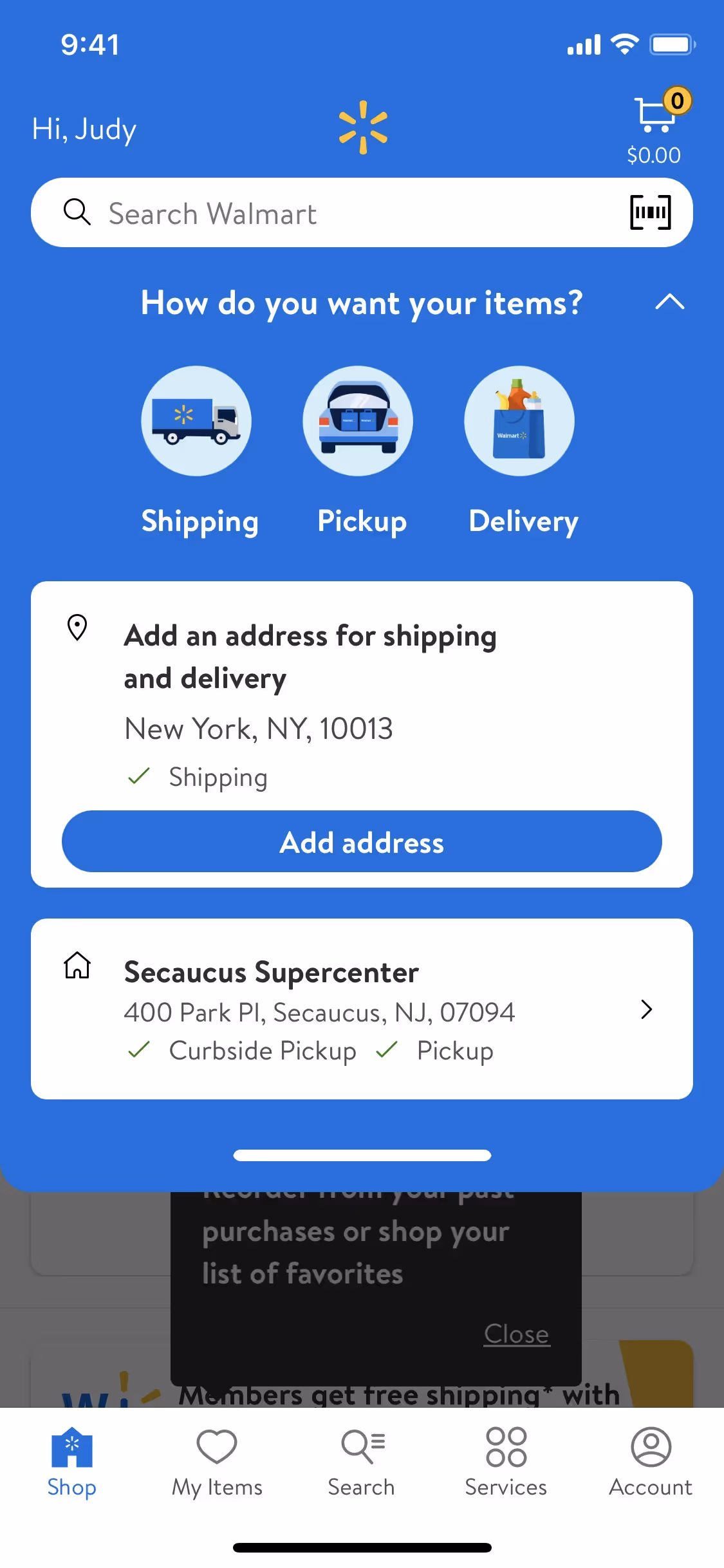
The main colors in Walmart's color palette are a vibrant blue (#0071ce) and a bright spark yellow (#ffc220). These colors are designed to be eye-catching and memorable, helping to create a strong brand identity.
Walmart's primary color, #0071ce, conveys a sense of trust, reliability, and professionalism, aligning perfectly with the brand's identity as a dependable retail giant. This blue hue is designed to evoke feelings of calm and assurance, making you feel confident in your shopping experience. Complementing this, the vibrant Spark Yellow (#ffc220) adds a touch of warmth and energy, highlighting Walmart's commitment to affordability and customer satisfaction. Together, these colors create a balanced and inviting visual experience that reinforces Walmart's brand message.
Walmart's color scheme, featuring blue, yellow, and white, has evolved to reflect its commitment to affordability and trust. The choice of these colors is influenced by their association with reliability, optimism, and clarity, aligning with Walmart's brand identity of providing value and a positive shopping experience.
Walmart strategically uses its signature blue and spark yellow colors to guide your actions and influence your decisions. The blue evokes trust and reliability, while the spark yellow creates a sense of urgency and highlights key actions, making your shopping experience intuitive and engaging.
To complement Walmart's primary blue (#0071ce), consider using colors like a vibrant coral (#FF6F61) for a striking contrast, a soft mint green (#98FF98) for a refreshing balance, or a deep navy (#003366) for a sophisticated look. These choices can enhance your design by creating visual interest and harmony.
On Mobbin’s brand colors page, you can explore a curated list of brand color palettes from top companies. We also offer access to thousands of other UI designs and interfaces from various brands, making it a great resource for finding new color combinations and getting inspiration from real-world examples.
Mobbin helps you stay up-to-date with the latest UI/UX trends by offering an extensive, constantly updated collection of mobile and web design patterns. From color usage to user flows, our platform showcases the latest trends in UI/UX design, allowing you to easily explore current design practices and stay ahead in the industry.
Don't miss out—try Mobbin today for free as long as you like, or get full access with any of our paid plans.

Use Mobbin for free as long as you like or get full access with any of our paid plans.


