#1db954
Copy
Copied

Vrbo is a platform for booking and managing holiday rentals. Vrbo's branding and interface designs feature colors like Blue Zodiac (#0E214B), White (#FFFFFF), and Mariner (#2474DE). You can easily copy Vrbo's colors in Hex, CMYK, RGB, and other popular formats in this page.
The main colors in Vrbo's color palette are Blue Zodiac (#0E214B), White (#FFFFFF), and Mariner (#2474DE). These colors create a cohesive and inviting visual experience for users.
The primary color in Vrbo's app and website, Blue Zodiac (#0E214B), conveys a sense of trust, reliability, and sophistication, aligning perfectly with Vrbo's brand identity of providing dependable and high-quality vacation rental experiences. Complementing this, the use of White (#FFFFFF) adds a clean, modern touch, while Mariner (#2474DE) injects a vibrant, inviting energy, enhancing the overall message of a welcoming and trustworthy platform.
While the specific history and influences behind Vrbo's color scheme aren't detailed, it's clear that their choice of colors aims to evoke a sense of trust and reliability, essential for a platform dedicated to travel and property rentals. The colors are designed to be both inviting and professional, enhancing user experience and brand recognition.
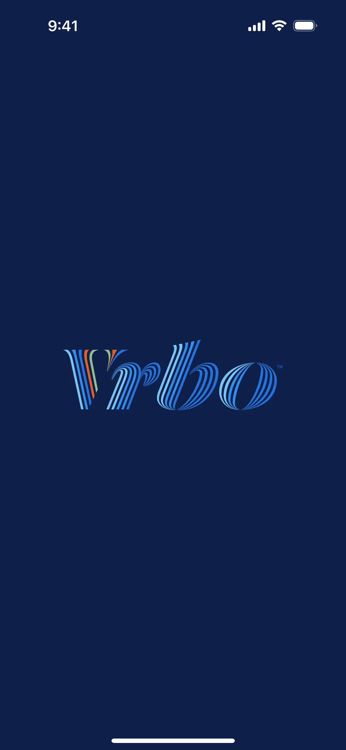
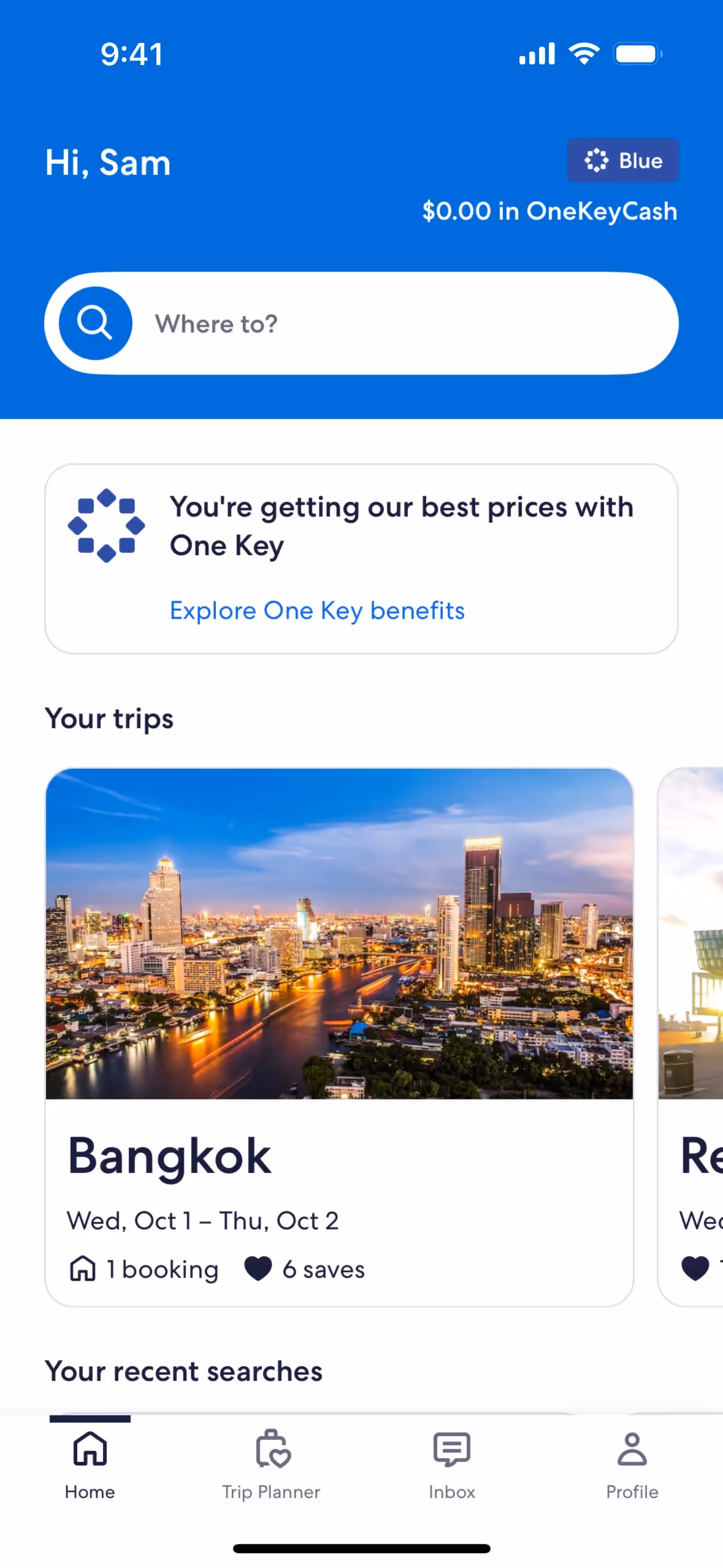
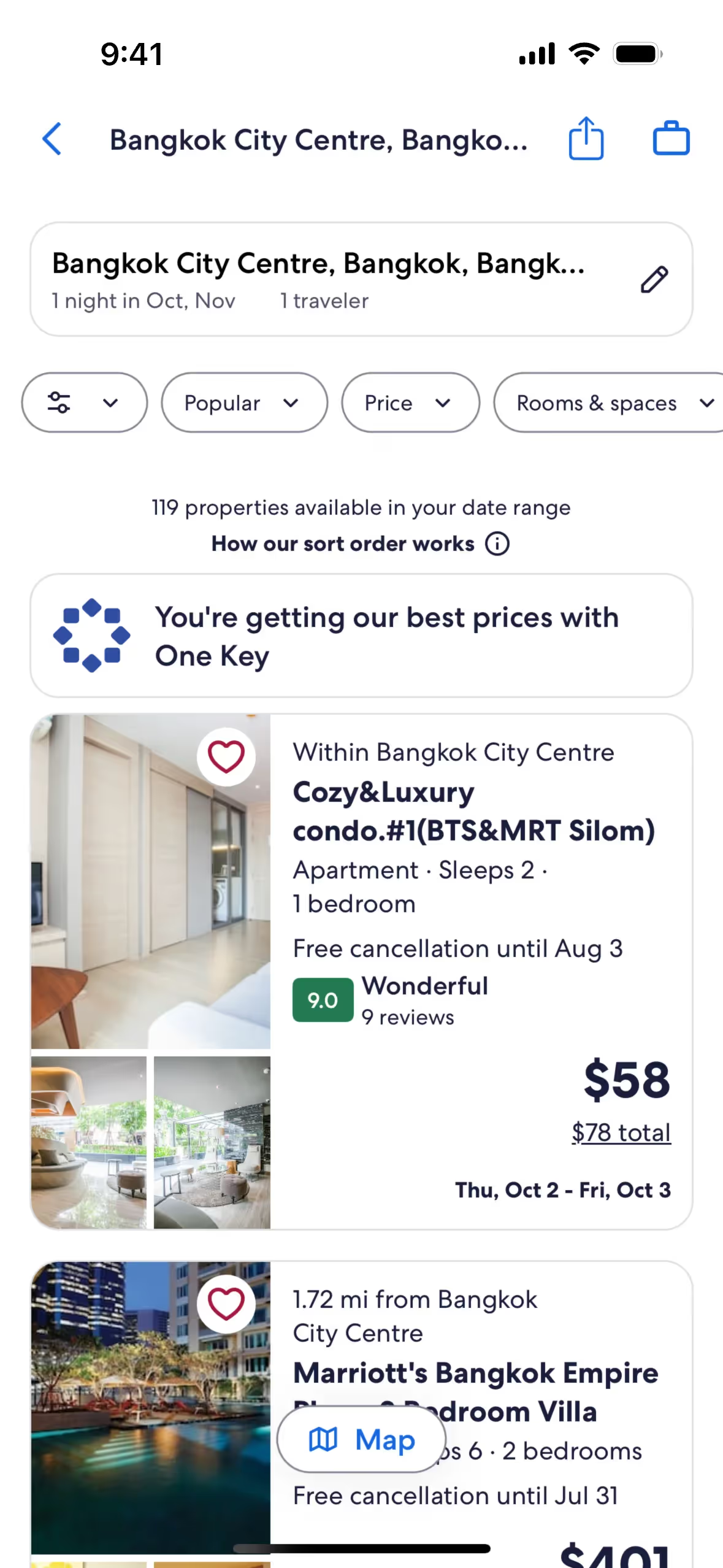
Vrbo strategically uses Blue Zodiac, White, and Mariner in its interface designs to create a calming and trustworthy environment. Blue Zodiac and Mariner guide your actions by highlighting key features and calls to action, while White provides a clean, uncluttered backdrop that enhances readability and focus.
To complement Vrbo's primary color (#0E214B), consider using shades like coral (#FF6F61) for a vibrant contrast, or soft gray (#B0B0B0) to create a balanced, sophisticated look. These colors can enhance your design by adding depth and visual interest.
On Mobbin’s brand colors page, you can explore a curated list of brand color palettes from top companies. We also offer access to thousands of other UI designs and interfaces from various brands, making it a great resource for finding new color combinations and getting inspiration from real-world examples.
Mobbin offers an extensive, constantly updated collection of mobile and web design patterns, showcasing the latest trends in UI/UX design, from color usage to user flows. By using Mobbin, you can easily explore current design practices and stay ahead of trends in the industry.
Ready to elevate your design game? Try Mobbin today for free as long as you like, or get full access with any of our paid plans.
Use Mobbin for free as long as you like or get full access with any of our paid plans.


