#1db954
Copy
Copied


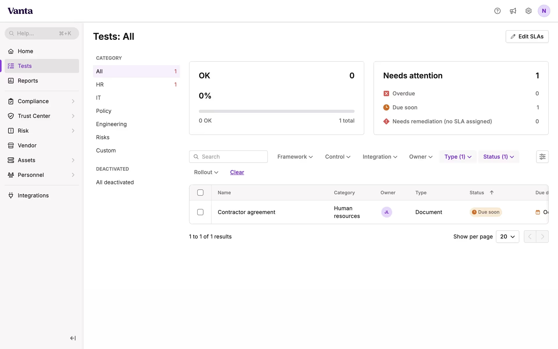
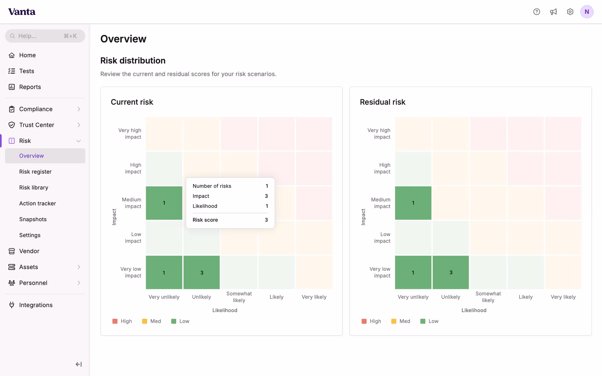
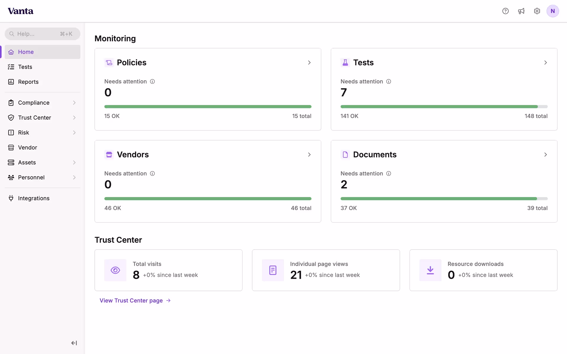
Vanta is a Trust Management Platform that automates security and compliance processes for organizations. Vanta's branding and interface designs prominently feature Vanta Purple (#AC55FF), Vanta Dark Purple (#240642), and Vanta White (#F8F4F3). You can easily copy Vanta's colors in Hex, CMYK, RGB, and other popular formats on this page.
The main colors in Vanta's color palette are Vanta Purple (#AC55FF), Vanta Dark Purple (#240642), and Vanta White (#F8F4F3). These colors can help you create a visually striking and cohesive design.
Vanta's primary color, Vanta Purple (#AC55FF), exudes a sense of creativity and innovation, aligning perfectly with the brand's identity as a forward-thinking and dynamic platform. This vibrant hue is complemented by Vanta Dark Purple (#240642), which adds depth and sophistication, and Vanta White (#F8F4F3), which brings clarity and balance, enhancing the overall user experience.
Vanta's color scheme was developed to reflect its commitment to trust and security, though specific historical details and influences behind the choice of colors are not explicitly documented. The palette is designed to convey reliability and professionalism, aligning with Vanta's mission to automate compliance and risk management.
Vanta strategically uses Vanta Purple, Vanta Dark Purple, and Vanta White to guide your actions, influence decisions, and create specific user experiences. These colors are chosen to enhance visual hierarchy, draw attention to key elements, and foster a sense of trust and professionalism in their interface designs.
To complement Vanta's primary color (#AC55FF), consider using teal (#008080) for a striking contrast, or soft peach (#FFDAB9) to create a balanced and harmonious look. These colors can enhance your design by adding depth and vibrancy while maintaining a cohesive aesthetic.
On Mobbin’s brand colors page, you can explore a curated list of brand color palettes from top companies. We also offer access to thousands of other UI designs and interfaces from various brands, making it a great resource for finding new color combinations and getting inspiration from real-world examples.
Mobbin offers an extensive, constantly updated collection of mobile and web design patterns, showcasing the latest trends in UI/UX design, from color usage to user flows. By using Mobbin, you can easily explore current design practices and stay ahead of trends in the industry.
Don't miss out—try Mobbin today for free as long as you like, or get full access with any of our paid plans.

Use Mobbin for free as long as you like or get full access with any of our paid plans.


