#1db954
Copy
Copied

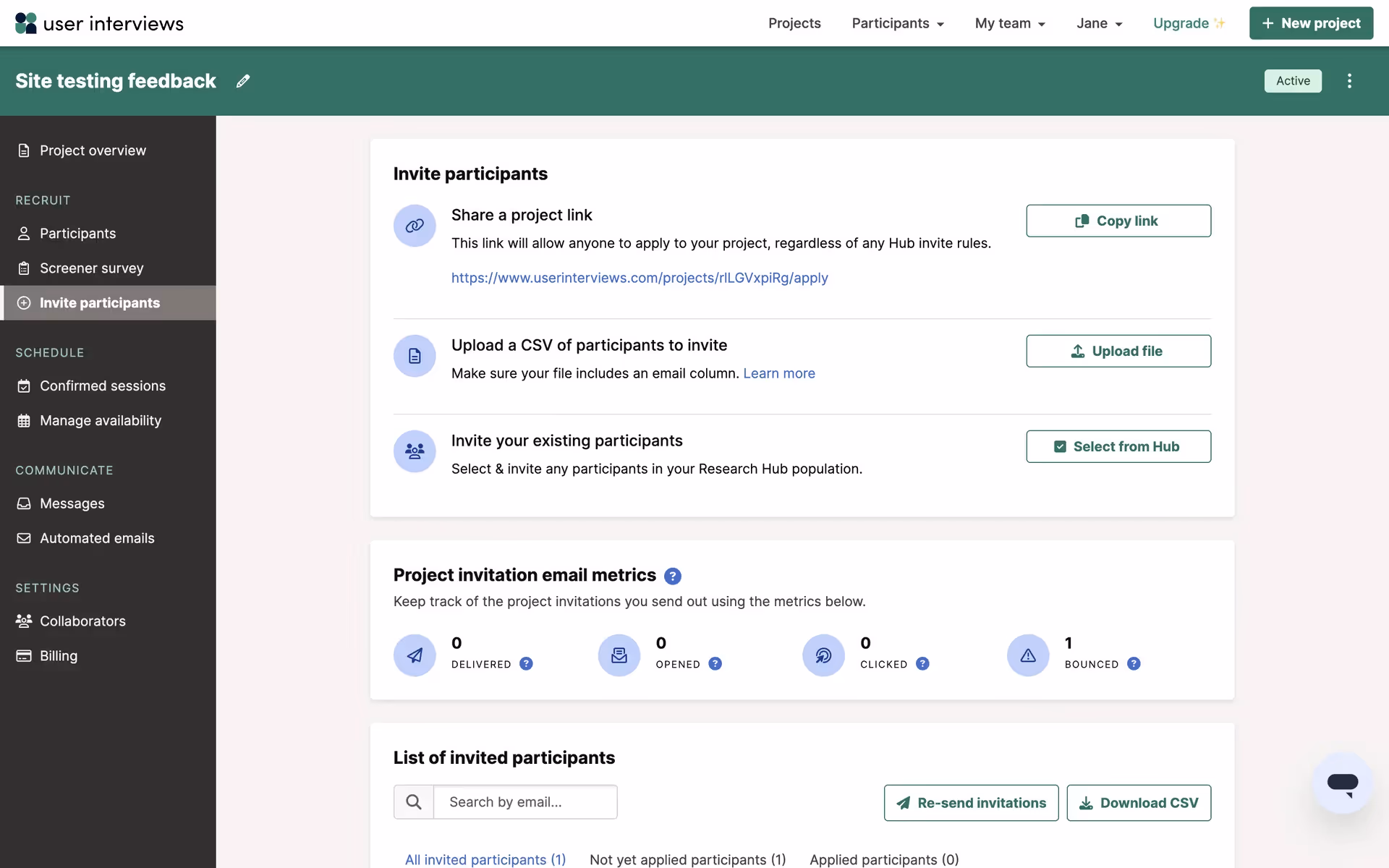
User Interviews Inc. is a platform for recruiting research participants. Their branding and interface designs feature a core palette of Midnight, White, and Eden. Here, you can easily copy these colors in Hex, CMYK, RGB, and other popular formats.
You'll find that User Interviews's main color palette is built around three core colors: a deep Midnight (#011936), a clean White (#FFFFFF), and a vibrant Eden (#156152).
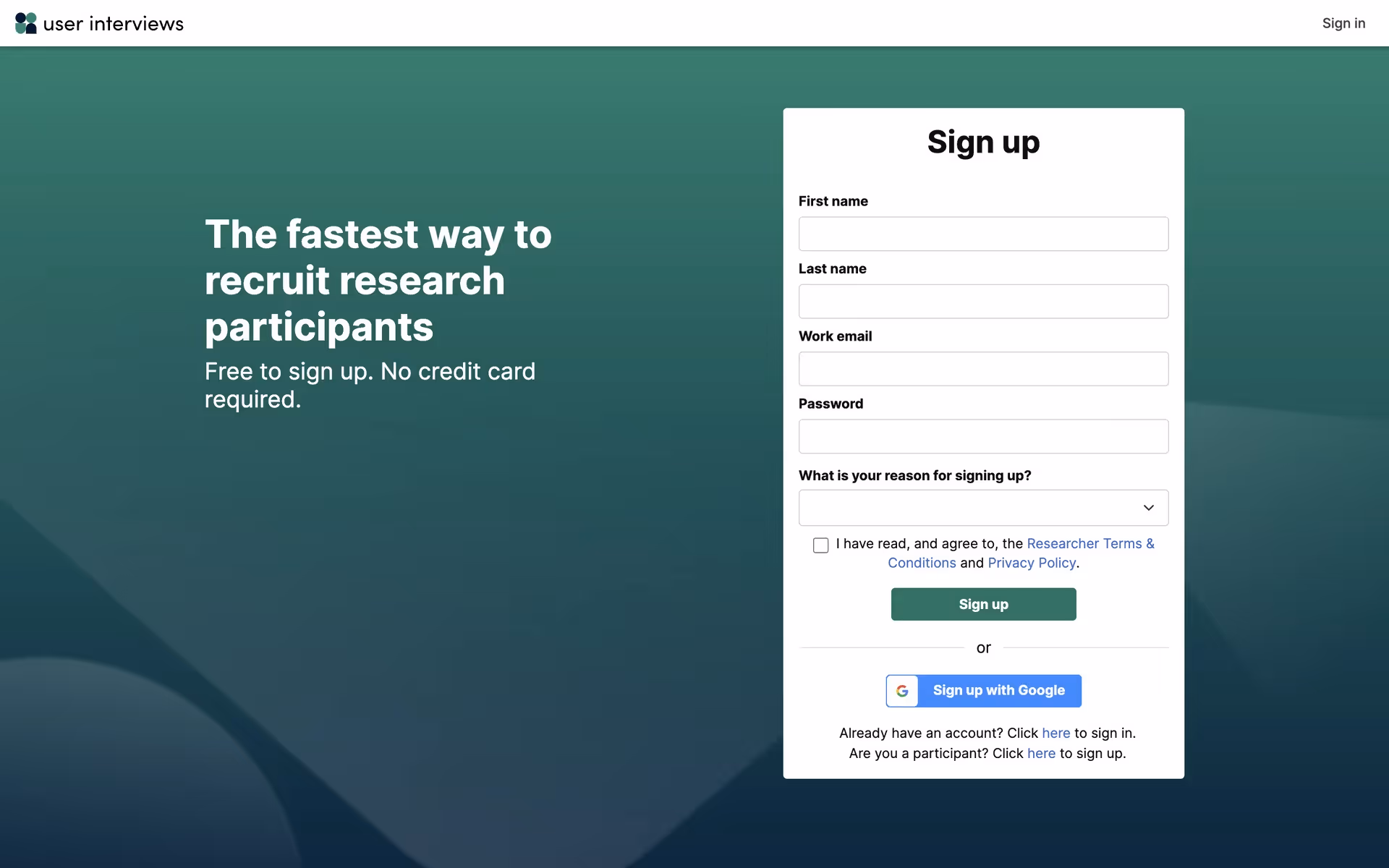
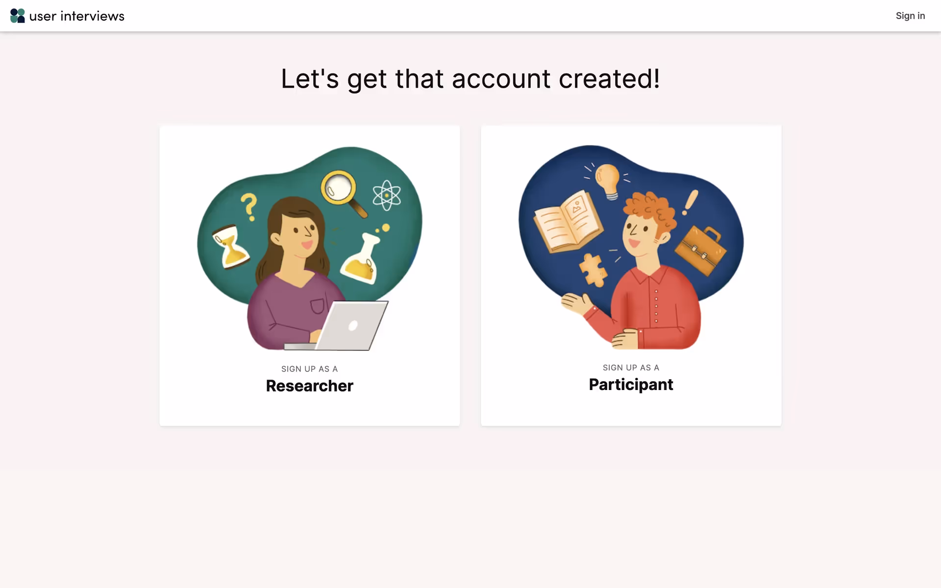
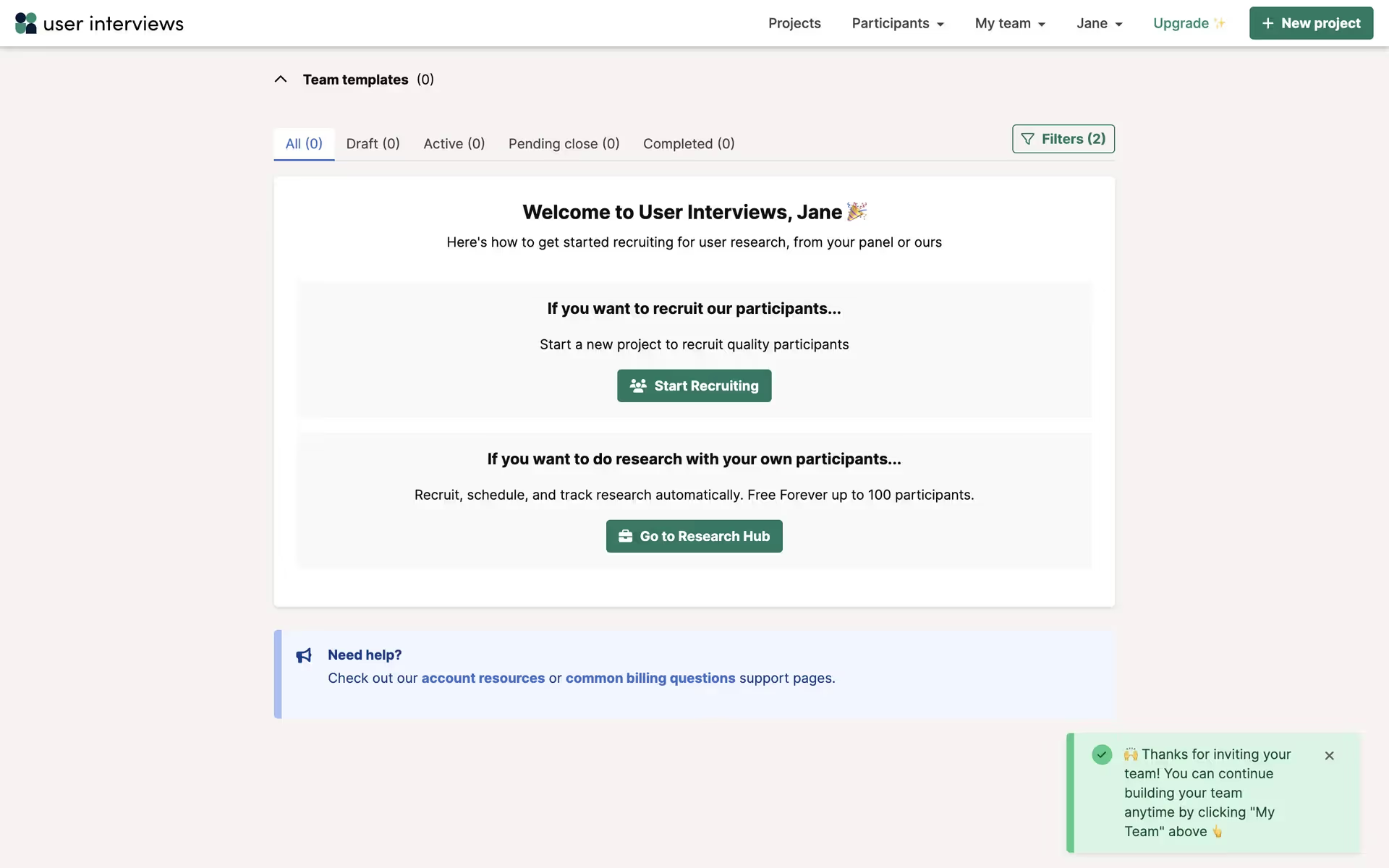
The deep Midnight blue (#011936) in User Interviews's palette instills a sense of trust and professionalism, crucial for research. This is complemented by the insightful Eden green (#156152), creating a color scheme that feels both reliable and empowering as you seek valuable feedback.
While the specific history behind their color choices isn't publicly detailed, we can see how the palette effectively builds a sense of trust and approachability for both researchers and participants on the platform.
By pairing the stable, professional Midnight with the clean, open feel of White, User Interviews creates a focused environment, using the energetic Eden green to draw your eye and prompt key decisions.
To introduce warmth and create a striking focal point against the deep Midnight blue, we suggest exploring a warm ochre or a vibrant coral. These colors can add a burst of energy to your UI, helping guide the user's eye without overpowering the core palette.
On our brand colors page, you can explore a curated list of color palettes from top companies. We also offer access to thousands of other UI designs and interfaces from various brands, providing endless inspiration for new color combinations from real-world examples.
Mobbin keeps you at the forefront of design with our extensive, constantly updated collection of mobile and web design patterns, showcasing the latest trends from color usage to user flows. By exploring our library, you can easily see current design practices in action and stay ahead of the curve in the industry.
Why not try Mobbin today? You can use it for free for as long as you like, or get full access with any of our paid plans.
Use Mobbin for free as long as you like or get full access with any of our paid plans.


