#1db954
Copy
Copied

Uptime App Ltd is the company behind the knowledge-hacking app, Uptime. Their branding and interface designs feature a vibrant Deep Pink, a deep Space Cadet, and clean White. On this page, you can easily copy these colors in Hex, CMYK, RGB, and other popular formats.
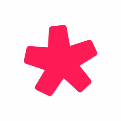
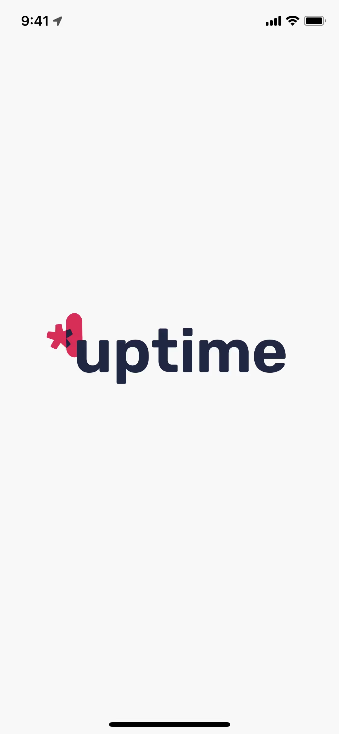
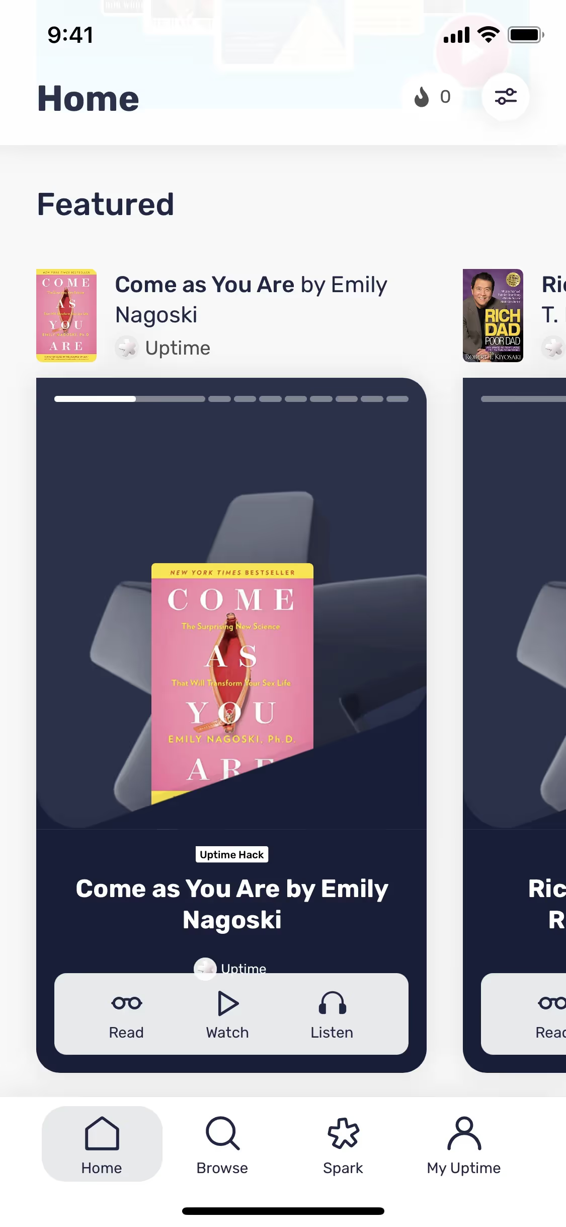
Uptime's core color palette features a bold Deep Pink (#EA0053) and a rich Space Cadet blue (#1E2644), complemented by a classic White (#FFFFFF).
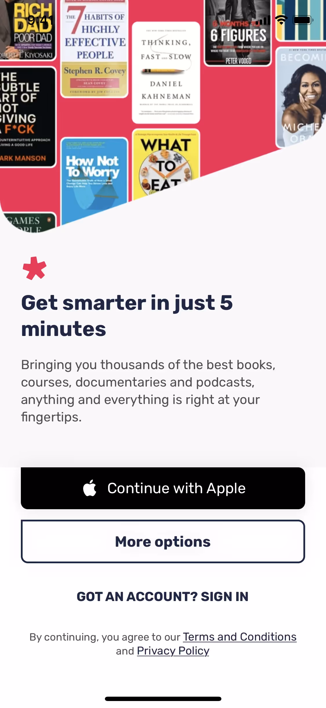
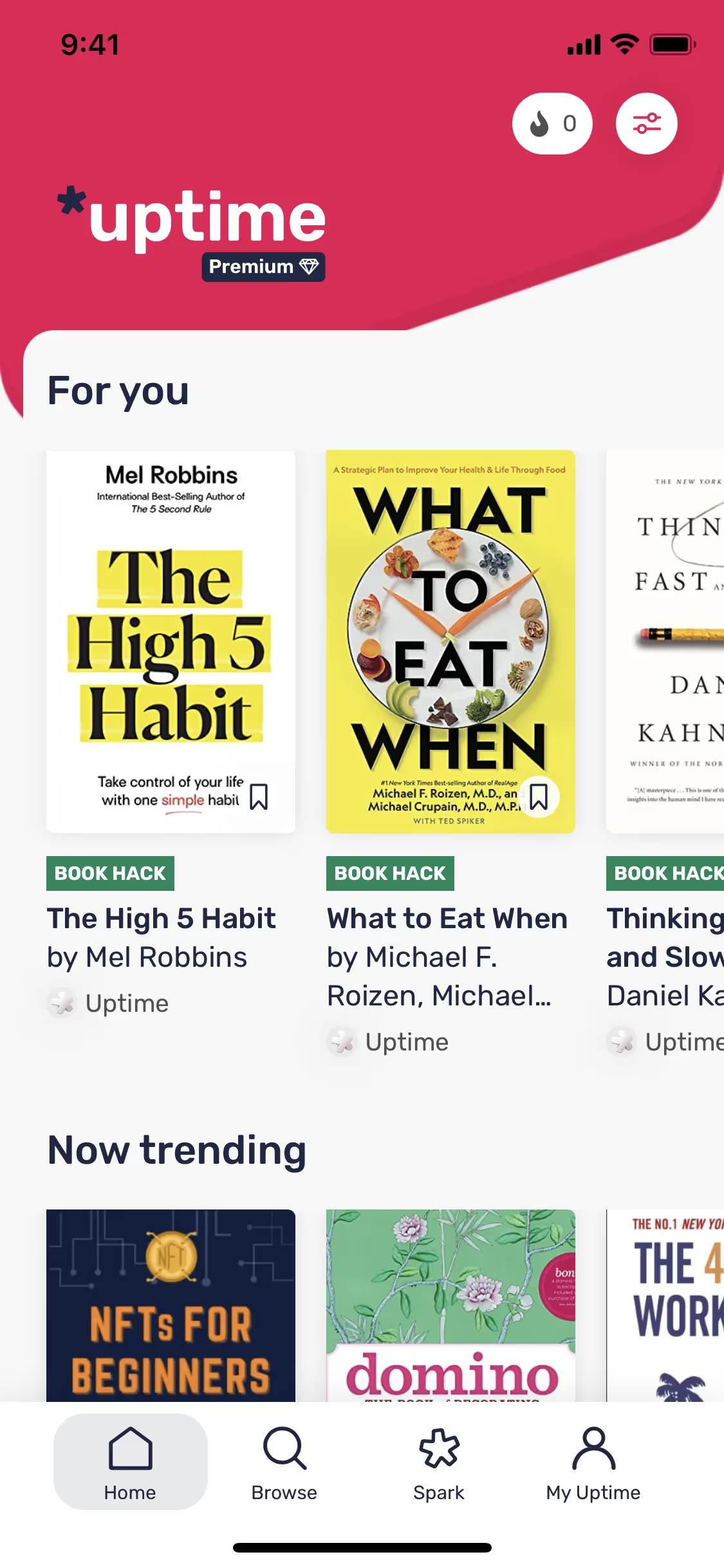
Uptime's signature deep pink is a burst of energy and passion, designed to make knowledge feel exciting and accessible. This vibrancy is grounded by a deep, focused blue and clean white, creating a high-contrast environment where ideas and insights can take center stage.
Uptime's color palette seems to be a strategic choice that reflects the accessible and innovative nature of their learning platform, a common practice we see in modern ed-tech branding.
In our analysis, Uptime uses its color palette to create a clear visual hierarchy. The high-contrast Deep Pink is strategically applied to calls-to-action to guide your focus, while the combination of Space Cadet and White establishes a clean, professional backdrop that enhances readability and reduces cognitive load.
To build on Uptime's palette, you could introduce a warm golden yellow for an energetic pop or a cool, muted teal to create a calming contrast. A soft gray would also work well to expand the neutral options for more subtle UI elements.
On our brand colors page, you can explore a curated list of color palettes from top companies. We also offer access to thousands of other UI designs and interfaces from various brands, making it a great resource for finding new color combinations and getting inspiration from real-world examples.
Our platform offers an extensive, constantly updated library of mobile and web design patterns, giving you a real-time look at the latest trends in UI/UX. By exploring everything from color usage to intricate user flows from top apps, you can easily keep your design skills sharp and stay ahead of the curve.
You can try Mobbin today for free for as long as you like, or get full access with any of our paid plans.
Use Mobbin for free as long as you like or get full access with any of our paid plans.


