#1db954
Copy
Copied


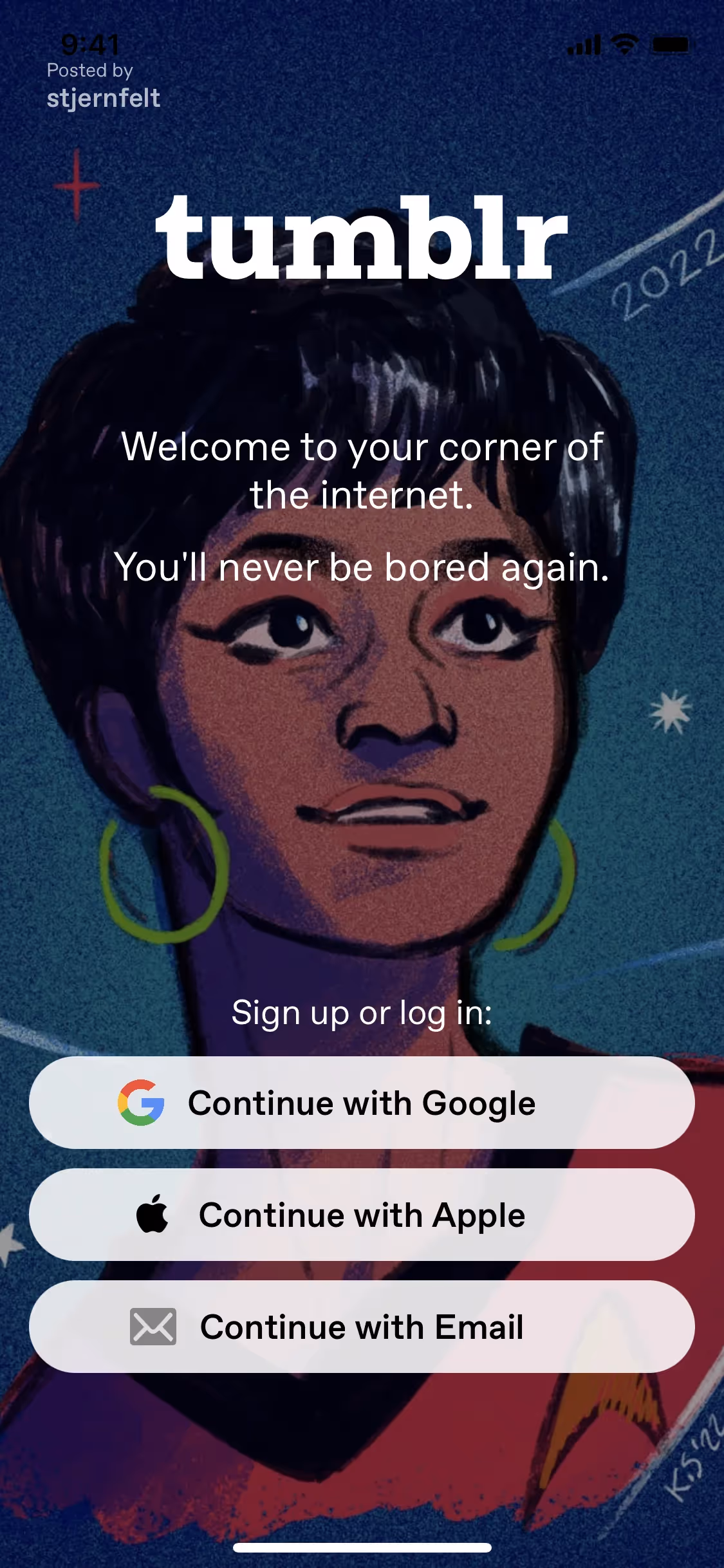
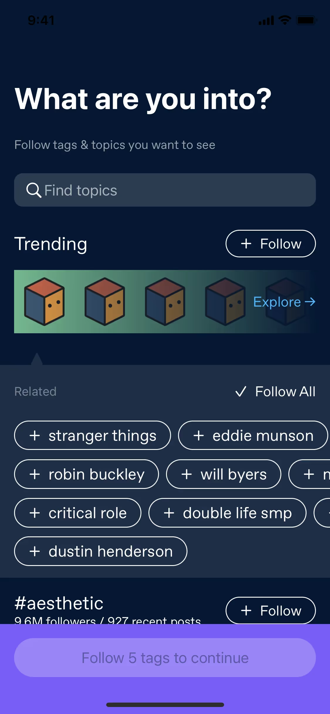
Tumblr is a microblogging and social networking platform where users share multimedia content. The platform's branding and interface designs prominently feature colors like Dodger Blue (#00B8FF), Midnight (#001935), Cornflower Blue (#7C5CFF), and White (#FFFFFF). You can easily copy Tumblr's colors in Hex, CMYK, RGB, and other popular formats on this page.
The main colors in Tumblr's color palette are Dodger Blue (#00B8FF), Midnight (#001935), Cornflower Blue (#7C5CFF), and White (#FFFFFF). These colors create a vibrant and cohesive visual identity that you can draw inspiration from for your own design projects.
The primary color in Tumblr's palette, Dodger Blue (#00B8FF), evokes a sense of creativity, freedom, and modernity, aligning perfectly with Tumblr's brand identity as a platform for self-expression and community. This vibrant blue is complemented by Midnight (#001935), which adds depth and sophistication, and Cornflower Blue (#7C5CFF), which introduces a playful yet calming element. Together, these colors create a cohesive and inviting atmosphere that encourages you to explore and share your unique voice.
Tumblr's color scheme has evolved over the years, influenced by the need to create a visually appealing and user-friendly interface. While the exact history and key influences behind the choice of colors aren't explicitly documented, it's clear that the platform's palette has been designed to enhance readability and user engagement, reflecting a modern and dynamic aesthetic.
Tumblr strategically uses colors like Dodger Blue, Midnight, Cornflower Blue, and White to guide your actions, influence decisions, and create specific user experiences. These colors are chosen to balance vibrancy and calmness, making the interface engaging and easy on the eyes, while features like the "Change palette" button allow you to personalize your experience, enhancing comfort and inclusivity.
To complement Tumblr's primary color (#00B8FF), consider using shades like coral (#FF6F61) for a vibrant contrast, or mint green (#98FF98) for a refreshing balance. These colors can enhance your design by adding depth and visual interest.
On Mobbin’s brand colors page, you can explore a curated list of brand color palettes from top companies. We also offer access to thousands of other UI designs and interfaces from various brands, making it a great resource for finding new color combinations and getting inspiration from real-world examples.
Mobbin helps you stay up-to-date with the latest UI/UX trends by offering an extensive, constantly updated collection of mobile and web design patterns. From color usage to user flows, our platform showcases the latest trends in UI/UX design, allowing you to easily explore current design practices and stay ahead in the industry.
Don't miss out—try Mobbin today for free as long as you like, or get full access with any of our paid plans.
Use Mobbin for free as long as you like or get full access with any of our paid plans.


