#1db954
Copy
Copied

Transit App, Inc. created the Transit app to simplify navigating public transportation. Its branding and interface designs feature Parsley, Whisper, and a signature Jungle Green. On this page, you can easily copy these colors in Hex, CMYK, RGB, and more.
Transit's color palette is built around three core colors: a deep Parsley (#12452B), a vibrant Jungle Green (#33B668), and a clean Whisper (#F6F7FA). We've found this combination offers a great starting point for creating a balanced and engaging interface.
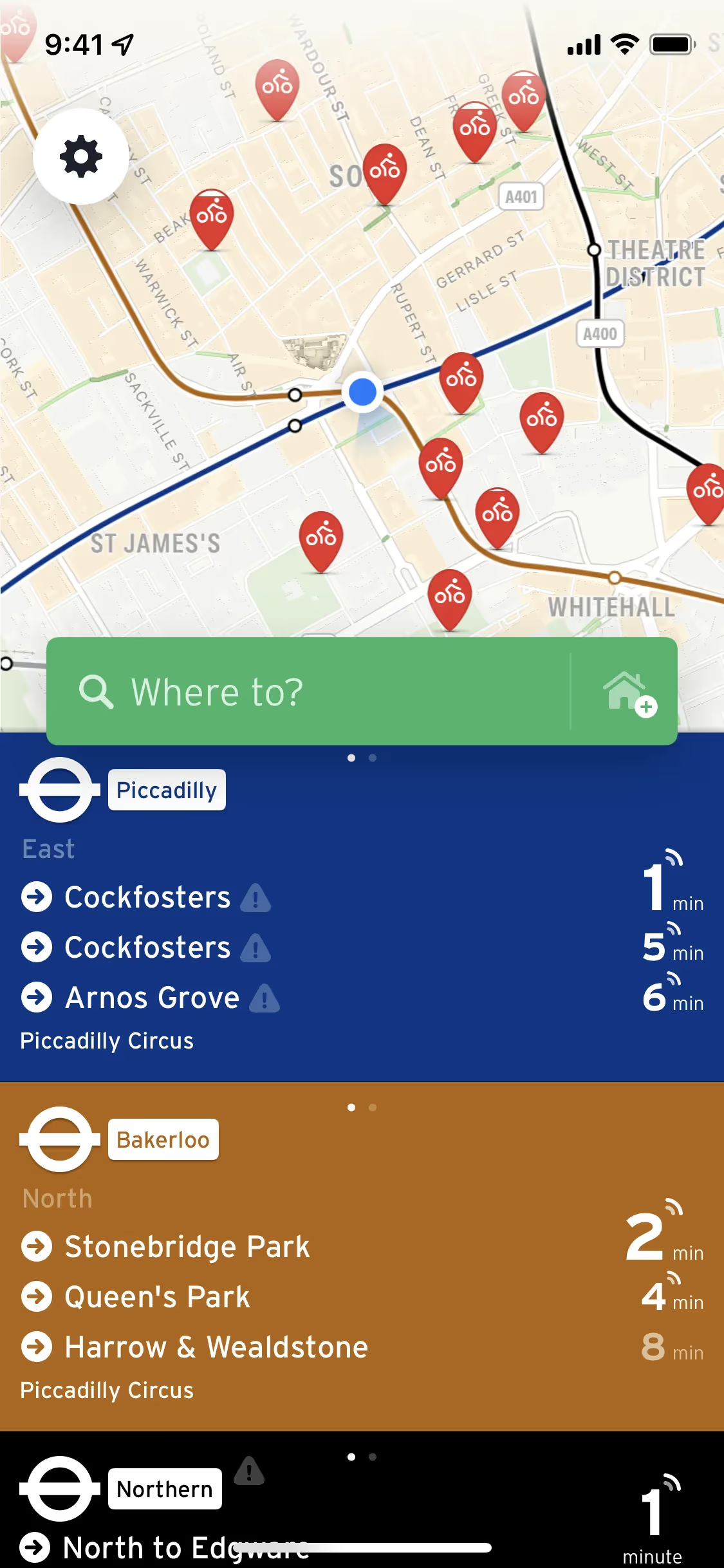
We find that Transit's deep Parsley green establishes a foundation of reliability and trust, while the vibrant Jungle Green acts as an energetic 'go' signal, ensuring you can navigate your journey with clarity and confidence.
While Transit hasn't publicly detailed the history behind their color choices, we can see how the vibrant palette effectively guides you through complex city navigation, making every journey feel intuitive.
We see Transit masterfully use color to guide your actions. The vibrant Jungle Green acts as a clear 'go' signal for key functions, while the high-contrast pairing of Parsley on Whisper creates a calming, effortlessly legible interface for your journey.
To complement Transit's deep Parsley green, we'd suggest exploring a warm cream for a softer neutral base. You could also introduce a muted terracotta or a soft gold to create an earthy, sophisticated contrast that enhances the brand's grounded feel.
On our brand colors page, you can explore curated color palettes from top companies. We also offer access to thousands of UI designs from various brands, providing endless inspiration for your next color combination.
Mobbin keeps you at the forefront of design with our extensive, constantly updated library of mobile and web design patterns. By exploring the latest trends in everything from color usage to intricate user flows, you can easily see current design practices in action and stay ahead in the industry.
You can try Mobbin today for free for as long as you like, or get full access with any of our paid plans.

Use Mobbin for free as long as you like or get full access with any of our paid plans.


