#1db954
Copy
Copied


TradingView is a popular charting platform and social network for traders and investors. Its branding and interface prominently feature Dodger Blue, Mirage, and White as its primary colors. On this page, you can easily copy these colors in Hex, RGB, CMYK, and more.
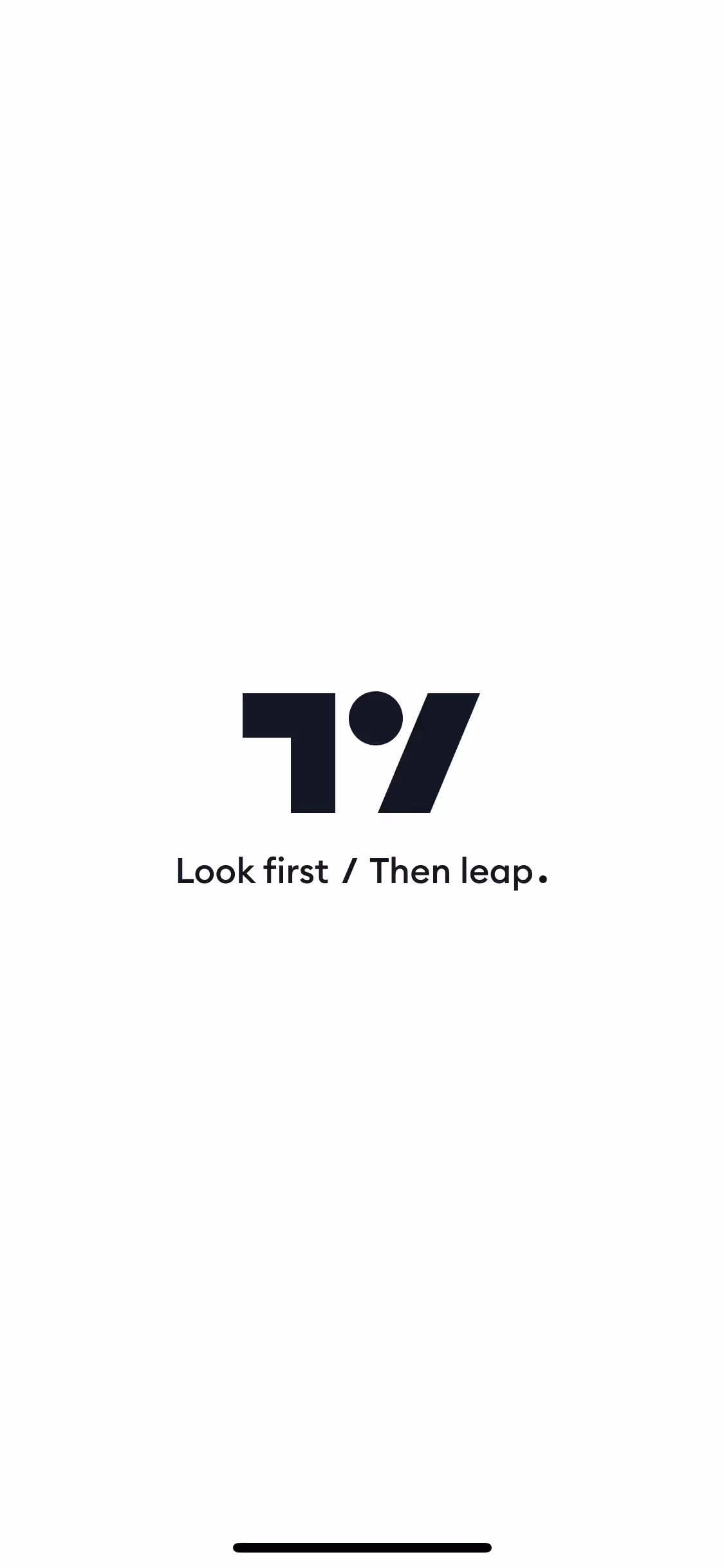
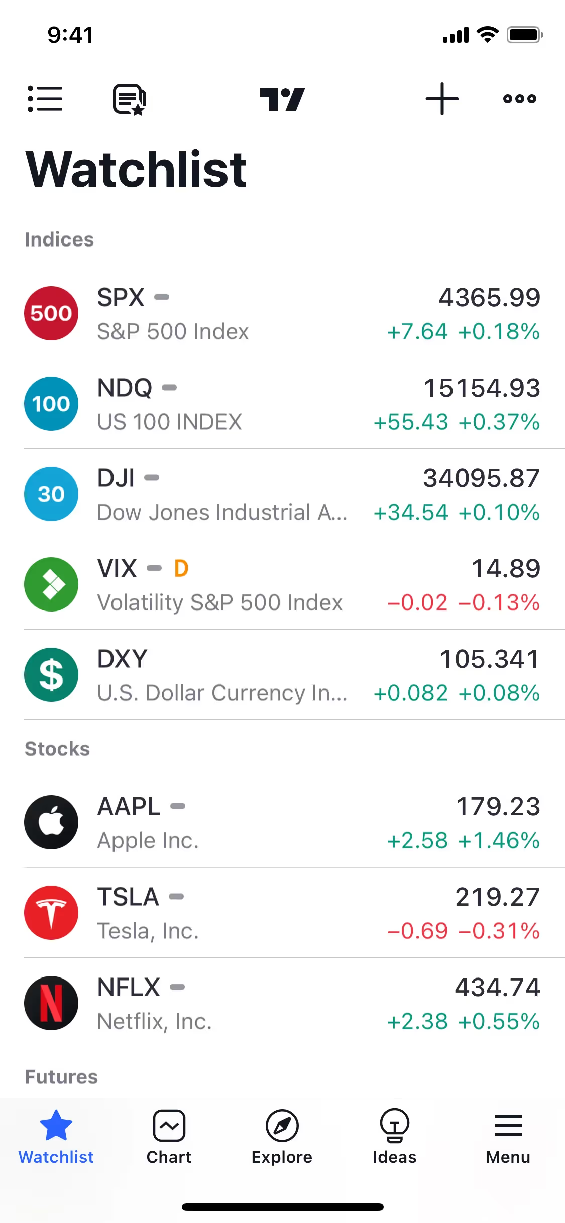
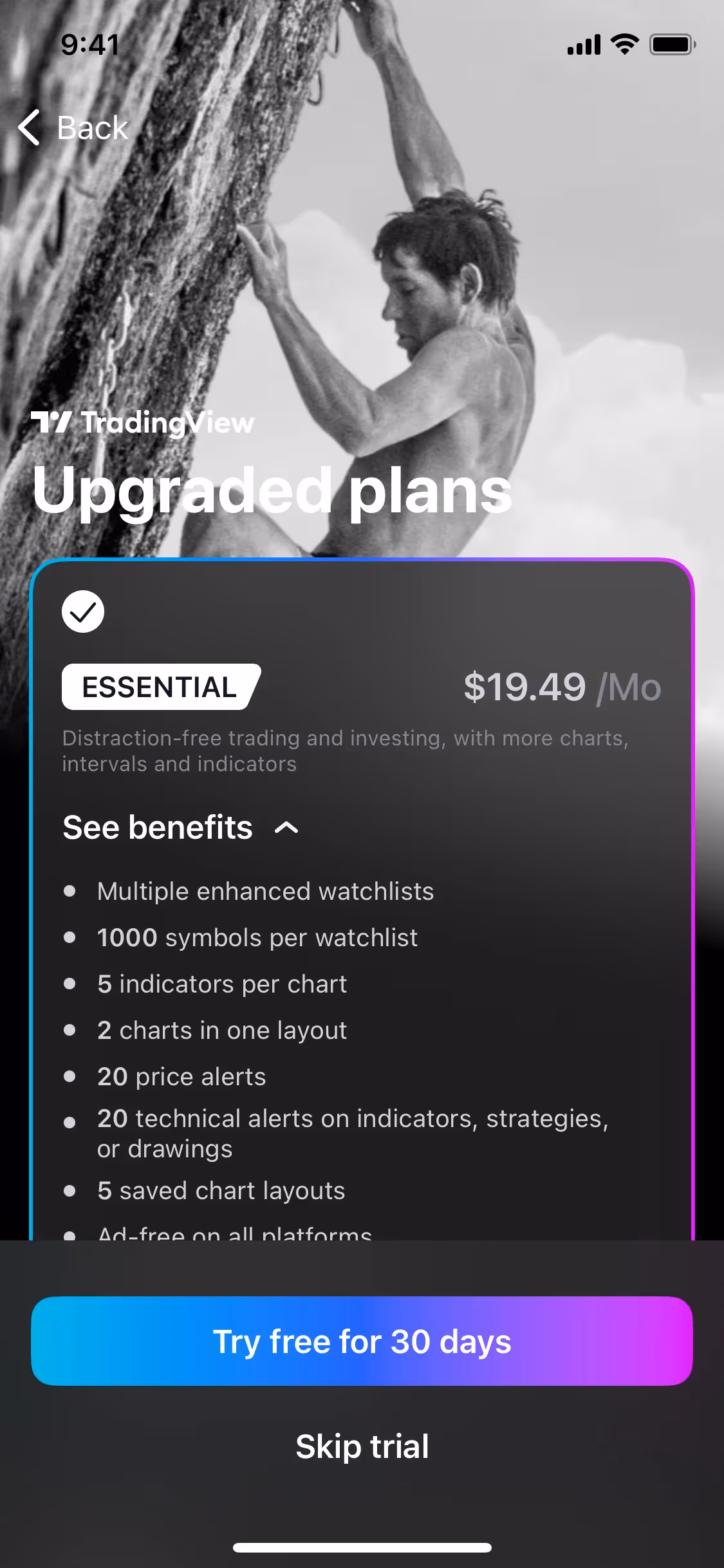
TradingView's core color palette is a dynamic trio of Dodger Blue (#2962FF), a deep Mirage (#131722), and a crisp White (#FFFFFF). We've found this combination offers a versatile foundation for creating clear and impactful financial data visualizations.
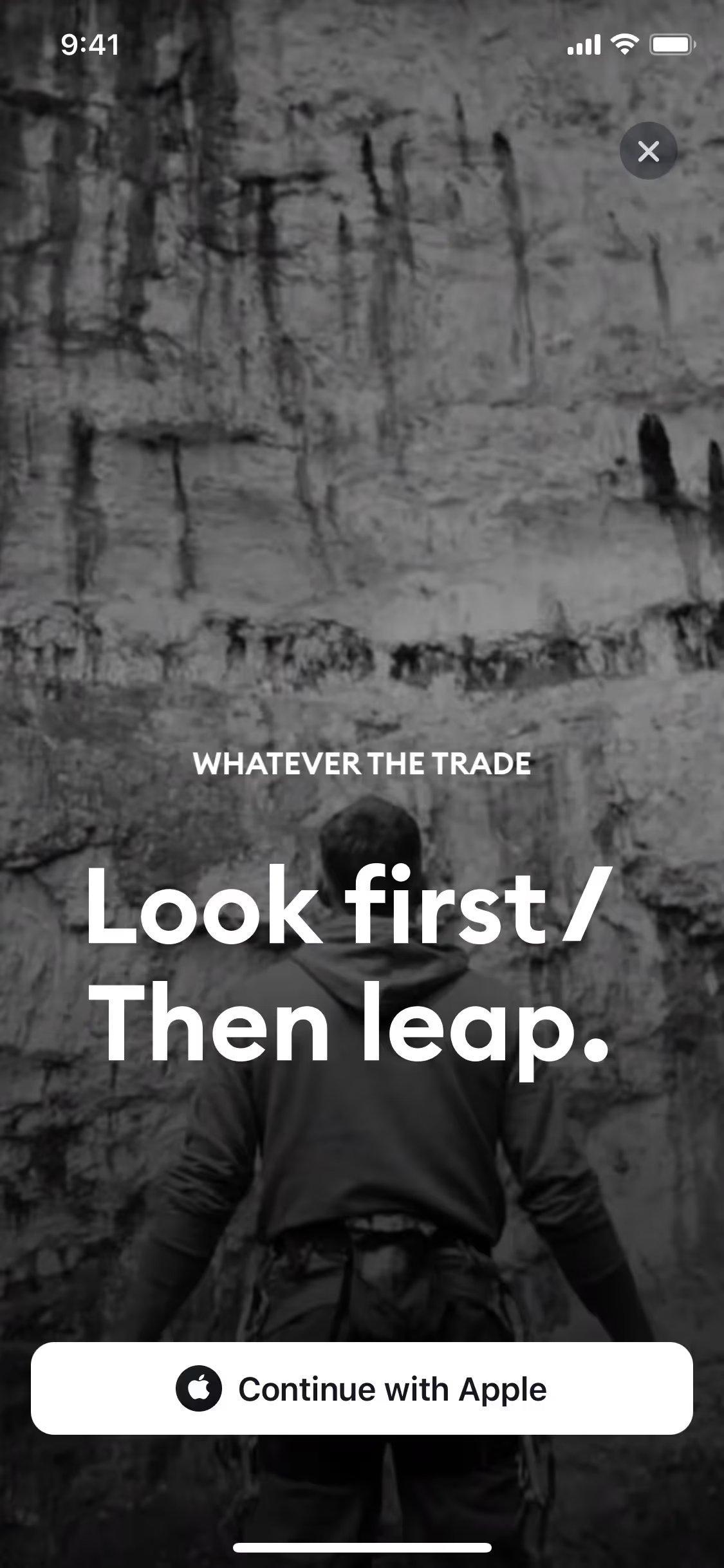
TradingView's signature blue evokes trust and technological prowess, a core part of their brand identity that we admire. This vibrant hue is grounded by a high-contrast black and white palette, ensuring you can focus on the data without distraction.
TradingView's color scheme was intentionally chosen to enhance data clarity and reduce visual noise, allowing you to focus squarely on analyzing charts and making informed decisions without distraction.
TradingView’s color palette masterfully builds trust and guides your focus. The high-contrast Mirage and White backgrounds make data pop, while Dodger Blue is strategically used on interactive elements to confidently direct your actions.
To complement TradingView's signature blue, we suggest exploring warm accents like a vibrant orange for high-contrast calls-to-action, or introducing softer grays and muted greens to create a more harmonious and modern balance in your designs.
On our brand colors page, you can explore curated color palettes from top companies. We also offer thousands of UI designs from various brands, providing endless inspiration for your next color combination from real-world examples.
Our extensive, constantly updated collection of mobile and web design patterns gives you a real-time look at the latest UI/UX trends, from color usage to intricate user flows. By exploring our library, you can easily see current design practices in action and stay ahead of the curve in the fast-paced design industry.
Why not try Mobbin today? You can use it for free for as long as you like, or get full access with any of our paid plans.
Use Mobbin for free as long as you like or get full access with any of our paid plans.


