#1db954
Copy
Copied

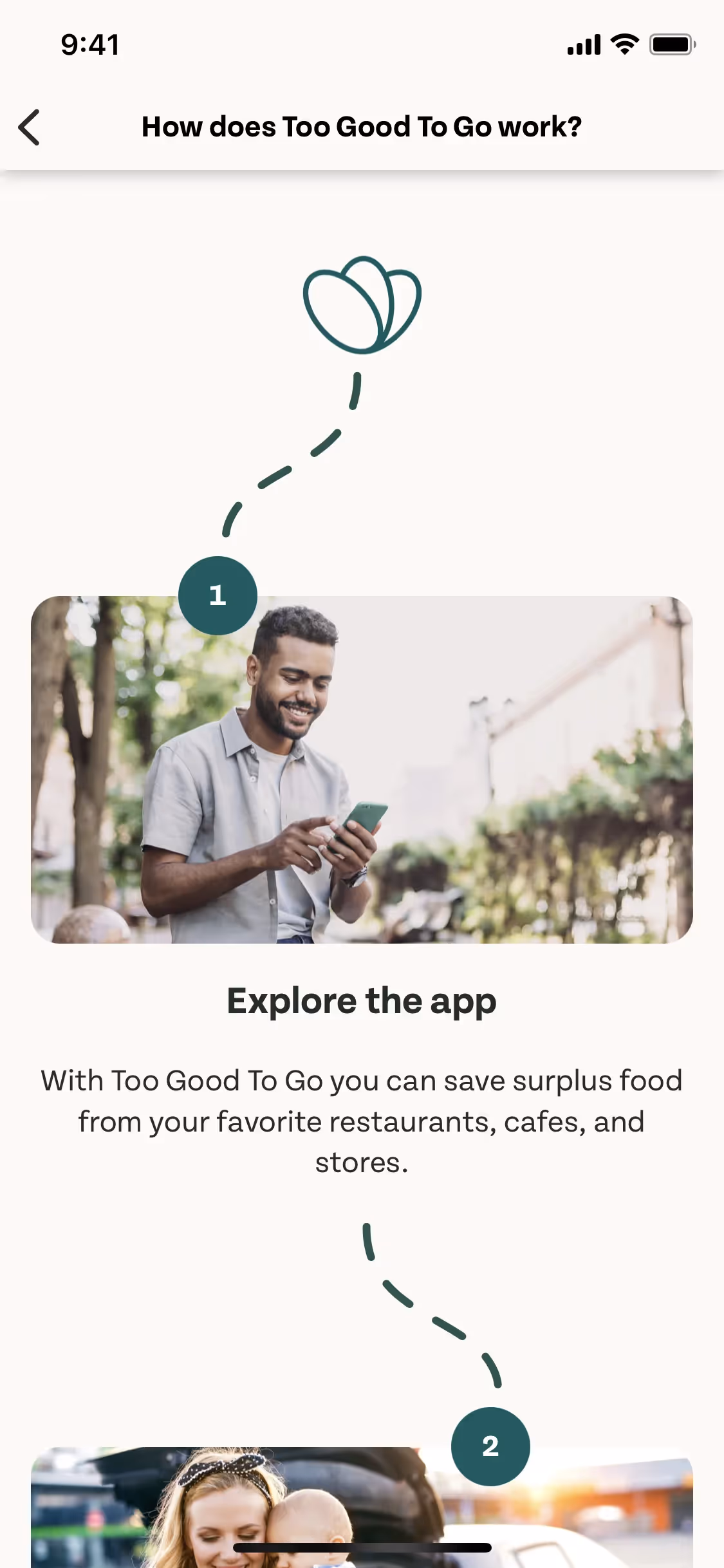
Too Good To Go, ApS operates the Too Good To Go app, fighting food waste. Its branding and interface designs use Blue Stone (#00615F) and Vista White (#F9F3F0). You can easily copy Too Good To Go's colors in Hex, CMYK, RGB, and other popular formats on this page.
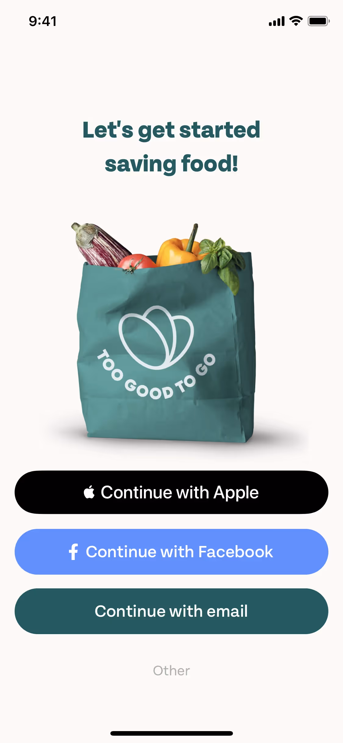
Too Good To Go's color palette is primarily built on two key colors you can use for inspiration: a deep teal named Blue Stone (#00615F) and a warm off-white called Vista White (#F9F3F0).
We see how Too Good To Go's primary deep teal (#00615F) grounds the experience in eco-consciousness and trust, while the warm off-white (#F9F3F0) provides a layer of optimism and clarity, making their mission feel both urgent and approachable to you.
While the exact history behind Too Good To Go's color choices isn't publicly detailed, their palette strongly reflects a vibrant, earth-friendly mission that designers can draw inspiration from.
We've observed that their deep Blue Stone is strategically used to guide your focus toward key actions, building trust, while the warm Vista White creates a clean, calming backdrop that encourages thoughtful decisions.
To build on Too Good To Go's palette, we suggest exploring warm, earthy tones like terracotta to create a natural contrast with their signature teal. You could also use a vibrant coral as an energetic accent for key actions, adding a pop of visual interest to your designs.
On our brand colors page, you can explore a curated list of color palettes from top companies. We also offer access to thousands of other UI designs and interfaces, making it a great resource for discovering new color combinations and getting inspiration from real-world examples.
Mobbin helps you stay on the cutting edge with our extensive, constantly updated collection of mobile and web design patterns. By exploring the latest trends in everything from color usage to user flows, you can easily see current design practices and stay ahead in the industry.
You can try Mobbin today for free for as long as you like, or get full access with any of our paid plans.
Use Mobbin for free as long as you like or get full access with any of our paid plans.


