#1db954
Copy
Copied


Tines Security Services Limited develops Tines, a workflow automation and orchestration platform. Its branding primarily features Butterfly Bush, White Linen, and Sandy brown in its interface designs. In this page, you can easily copy these colors in Hex, CMYK, RGB and other popular formats.
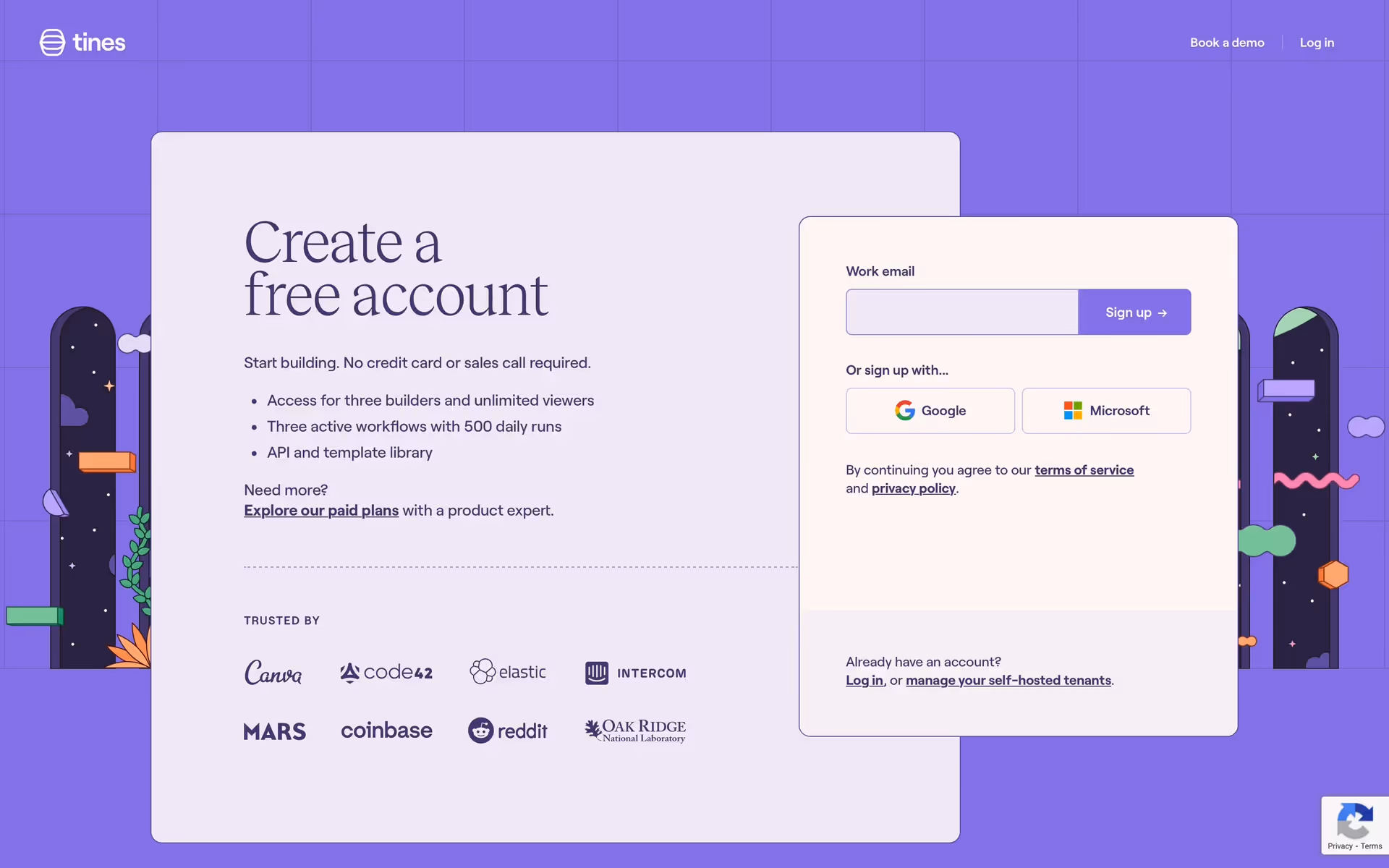
Tines's core color palette features a sophisticated deep purple, a warm off-white, and a vibrant sandy brown. We find this combination creates a professional yet approachable feel, perfect for inspiring your next project.
Tines's signature purple, #5E4D9A, embodies the sophistication and ambition of its powerful automation tools, assuring you of its robust capabilities. This is balanced by the warm sandy brown and clean off-white, which make the platform feel approachable and clear, inspiring you to build with confidence.
We see Tines's color scheme as a powerful reflection of its focus on security and innovation, creating a modern and trustworthy feel that's perfect for its automation platform.
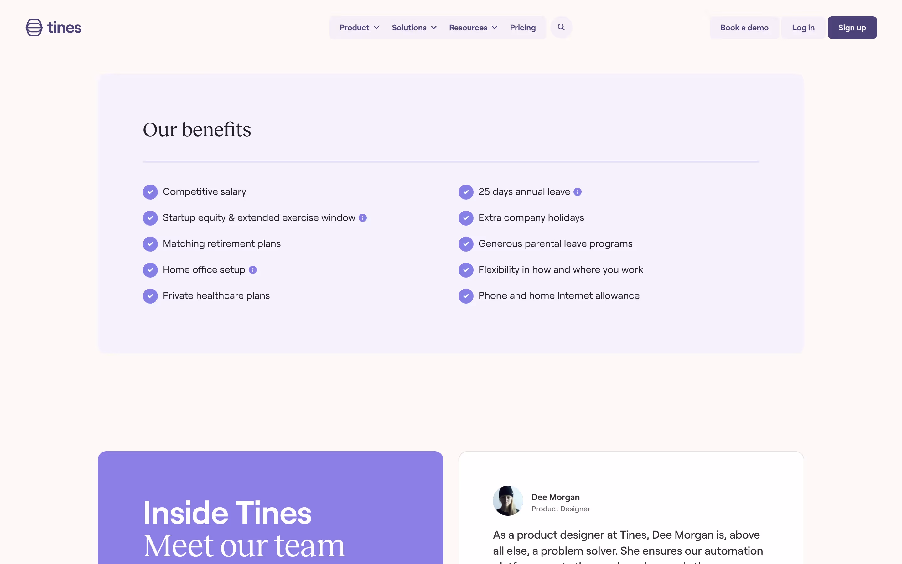
Tines masterfully uses its palette to create a focused user journey. The calming Butterfly Bush and spacious White Linen establish a sense of trust and clarity, while the energetic Sandy Brown is strategically deployed for calls-to-action, guiding you toward key decisions without feeling intrusive.
To build on Tines's palette, we suggest exploring a muted sage green to give your designs a calm, organic feel, or a deep navy for a touch of professional sophistication. For high-contrast accents that pop, a vibrant mustard yellow can help you create a truly dynamic user experience.
On our brand colors page, you can explore curated palettes from top companies. We also offer access to thousands of other UI designs and interfaces, making it a fantastic resource for discovering new color combinations and drawing inspiration from real-world examples.
Our platform offers an extensive, constantly updated library of mobile and web design patterns, showcasing the very latest in UI/UX—from evolving color palettes to innovative user flows. By exploring our collection, you can easily see what's current, understand emerging design practices, and stay ahead of industry trends.
Why not try Mobbin today? You can use it for free for as long as you like, or get full access with one of our paid plans.

Use Mobbin for free as long as you like or get full access with any of our paid plans.