#1db954
Copy
Copied

TIDAL Music LLC is a high-fidelity music streaming service. Its branding and interface designs feature a striking palette of black, white, and cyan. We've made it easy for you to copy these colors in Hex, RGB, CMYK, and other popular formats.
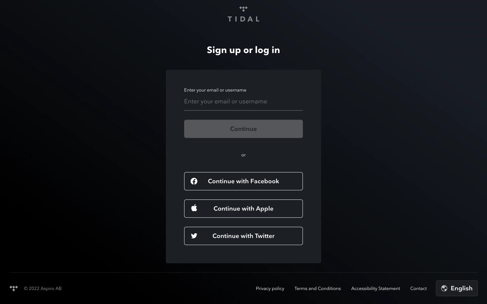
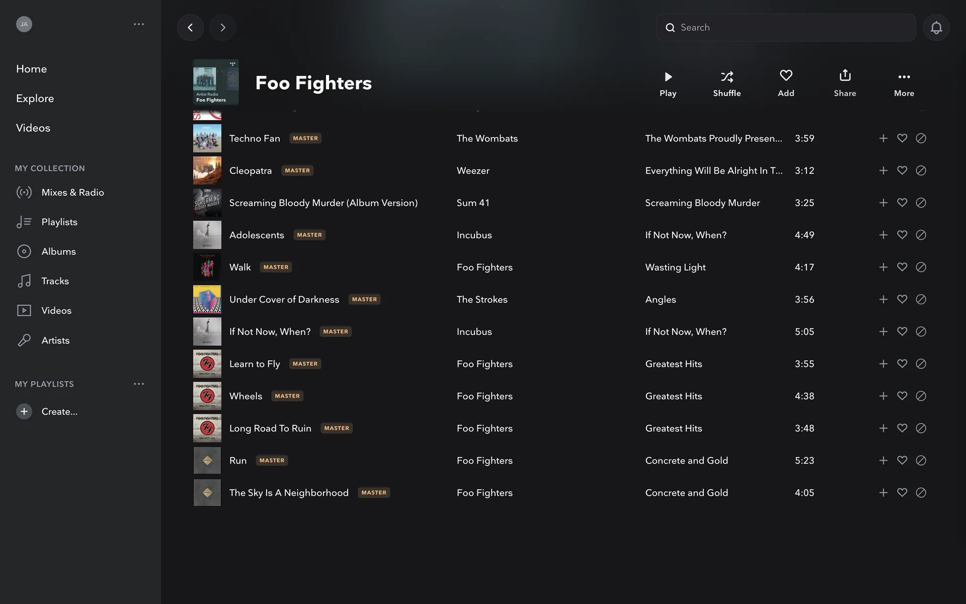
TIDAL's main color palette is a minimalist yet bold trio: Black (#000000), White (#FFFFFF), and a striking Cyan/Aqua (#00FFFF). This high-contrast scheme offers a clean, modern foundation for your design explorations.
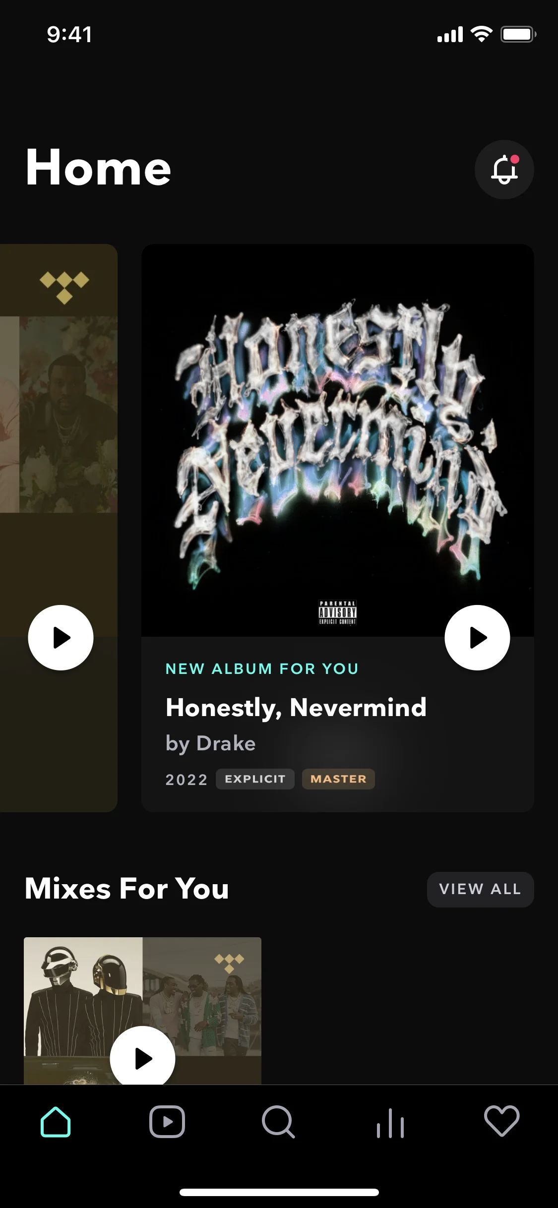
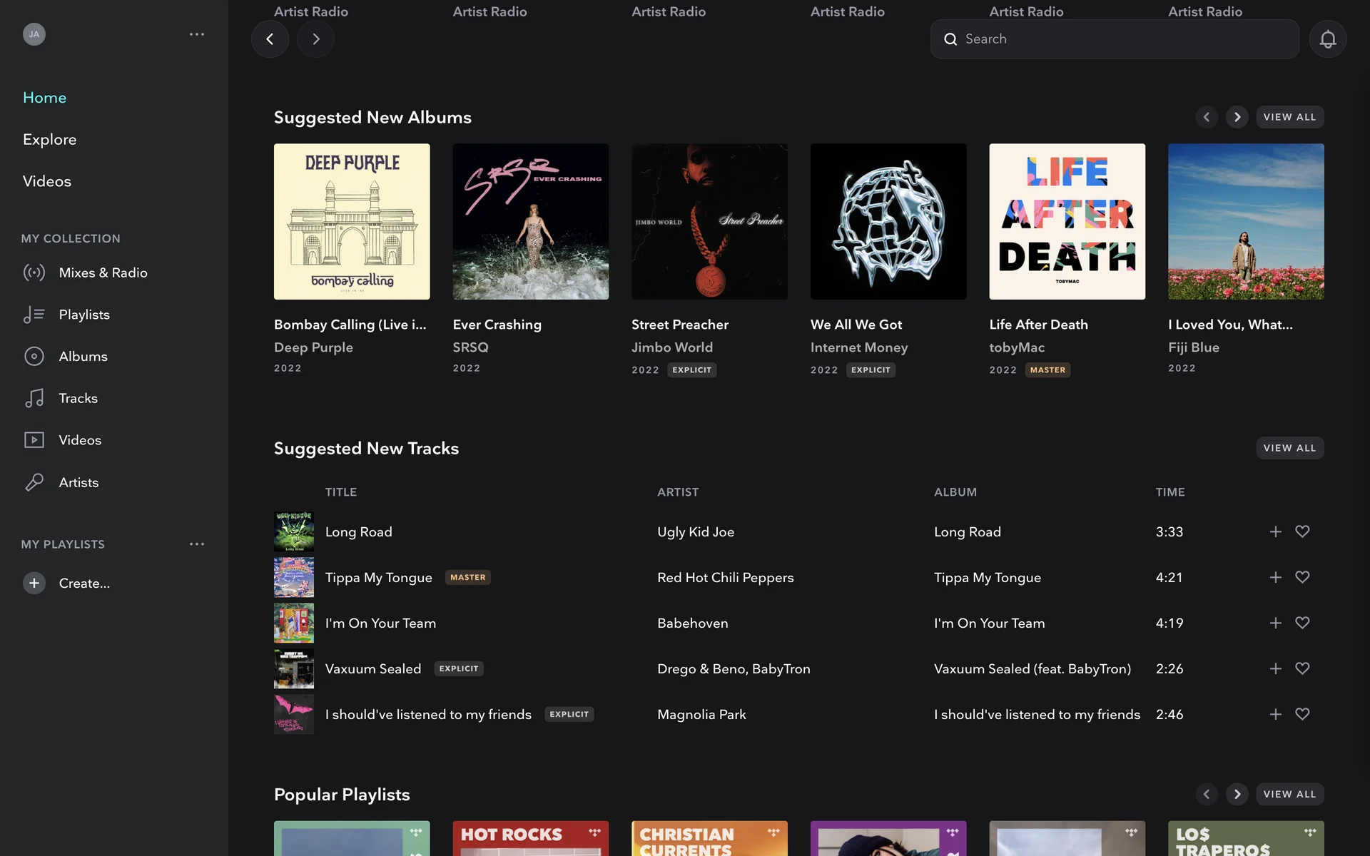
TIDAL's dominant black creates a sophisticated, premium stage for its high-fidelity content, while the vibrant cyan and clean white accents guide your focus and reinforce a modern, artist-first identity.
While there's no public record of the exact "aha!" moment, TIDAL's color scheme was a strategic choice to signal its premium, artist-first identity, using a classic black and white for high-fidelity quality and a vibrant cyan accent to stand out in a crowded market.
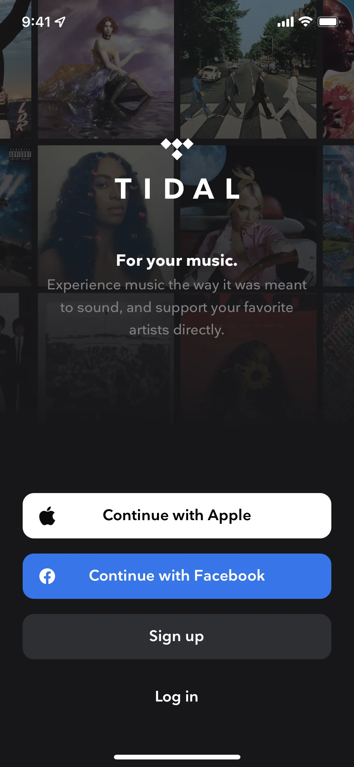
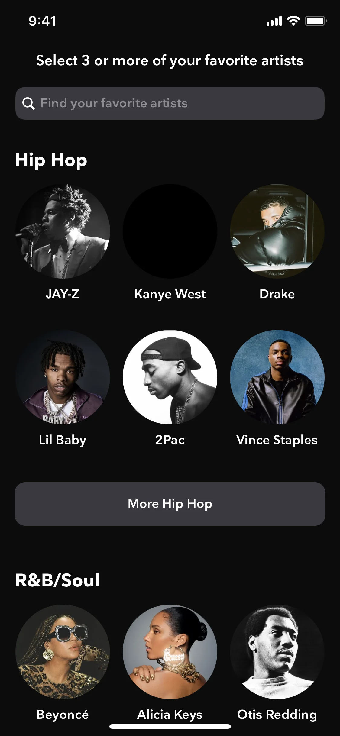
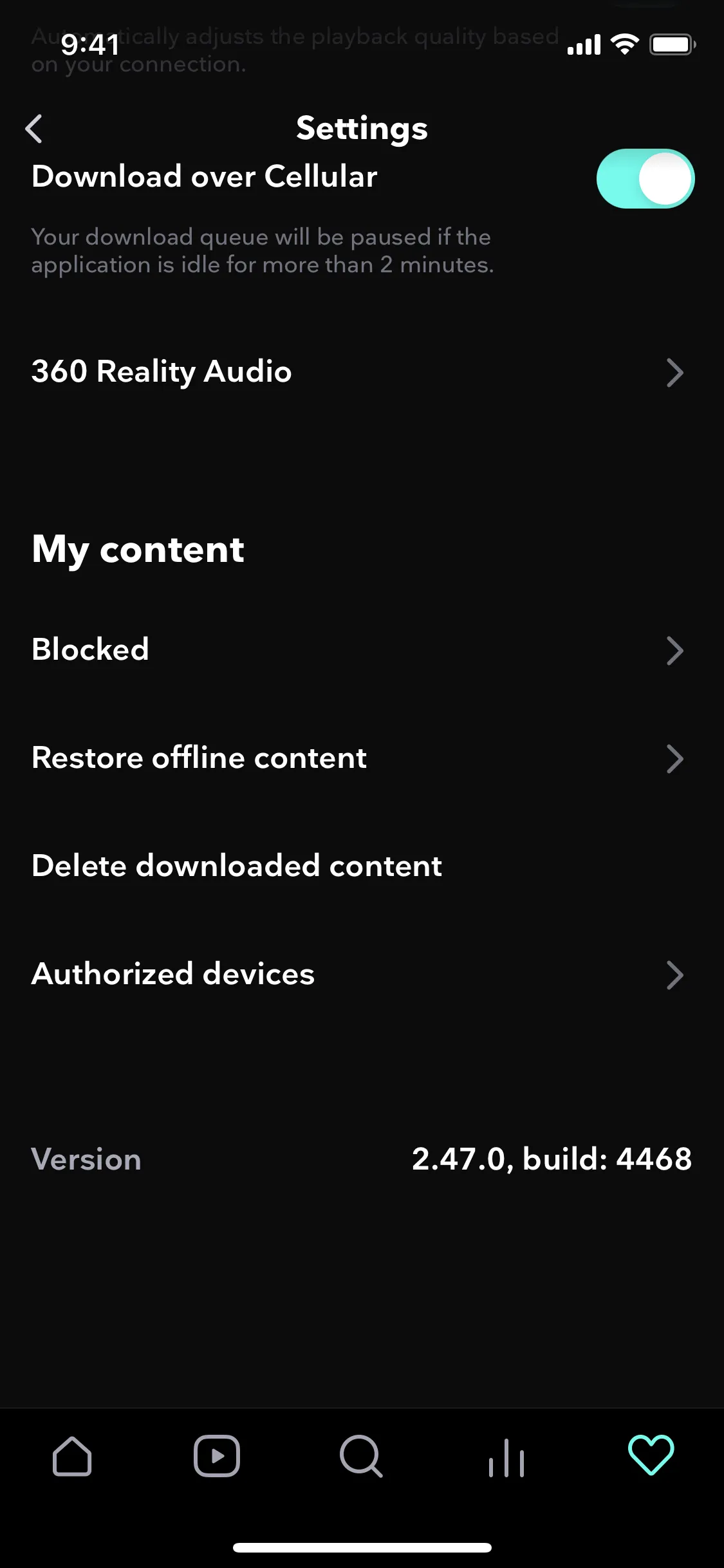
TIDAL’s deep black interface creates a premium, cinematic stage that lets the music and artist visuals take center stage. We see how their vibrant cyan accent is then used to guide your eye, highlighting interactive elements and key calls-to-action.
To build on TIDAL's high-contrast aesthetic, we suggest using a vibrant color like electric yellow to make key actions pop against the black. For a more subtle approach, introducing shades of deep charcoal or slate gray can create a sophisticated visual hierarchy and add depth to your designs.
On our brand colors page, you can explore curated color palettes from top companies. We also offer access to thousands of UI designs from various brands, providing endless inspiration for your next color combination.
Our extensive, constantly updated collection of mobile and web design patterns gives you a direct look into the latest UI/UX trends, from color usage to complete user flows. By using Mobbin, you can easily explore current design practices to stay ahead of the curve and inspire your next project.
You can try Mobbin today for free for as long as you like, or get full access with any of our paid plans.
Use Mobbin for free as long as you like or get full access with any of our paid plans.


