#1db954
Copy
Copied


Superhuman is an AI-powered email app from Superhuman Labs, Inc. for maximum productivity. Its branding and interface primarily use Cod Gray, White, and a distinctive Picton Blue. On this page, we've made it easy for you to copy its brand colors in Hex, CMYK, RGB, and other popular formats.
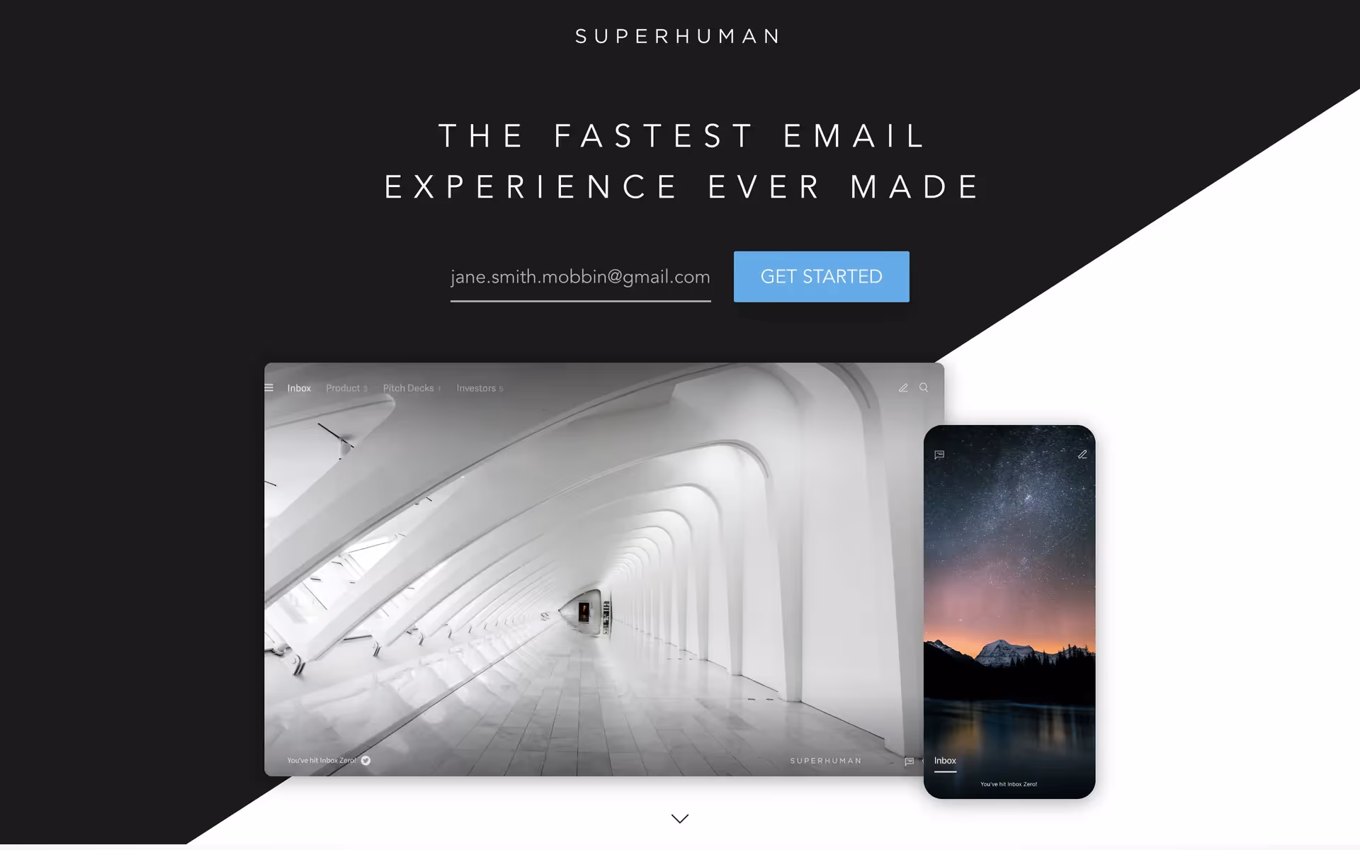
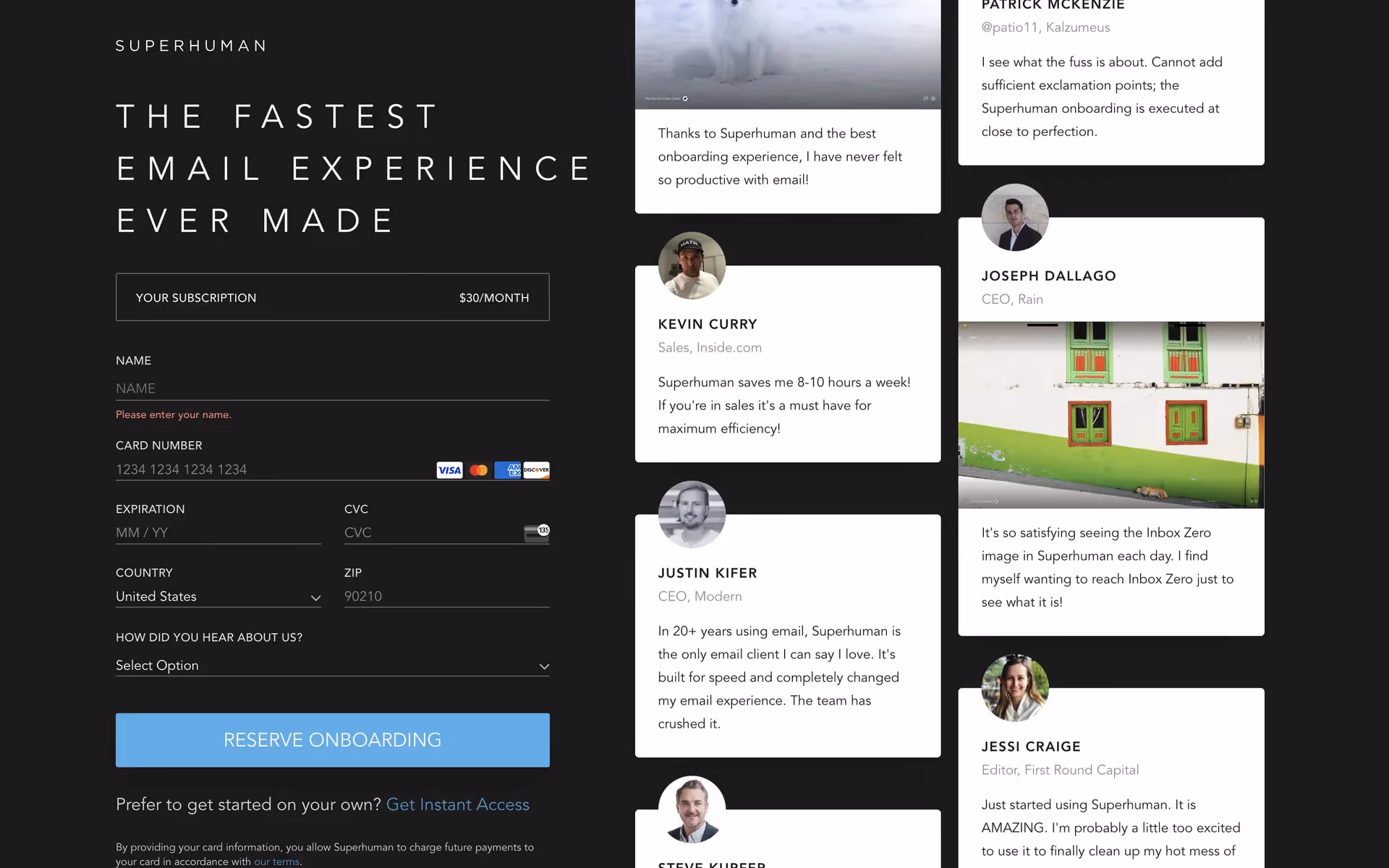
Superhuman primarily uses a sophisticated yet simple palette of Cod Gray and White, punctuated by a striking Picton Blue. We've found this trio creates a sharp, professional look that helps users focus on what matters.
In our view, Superhuman's near-black primary color evokes a sense of deep focus and premium efficiency, creating a distraction-free environment for you. The sharp contrast with white enhances clarity, while pops of Picton Blue confidently guide your actions, reinforcing the brand's promise of a smarter, faster email experience.
Superhuman's color scheme was intentionally chosen to support its core promise of speed and focus. The high-contrast, dark-mode aesthetic minimizes distraction, while vibrant accents guide you to your next action, creating a faster workflow.
Superhuman's high-contrast palette of Cod Gray and White creates a focused, distraction-free environment, which we find is key to their productive experience. Their strategic use of Picton Blue then guides you to key actions, making the interface feel both intuitive and incredibly fast.
To complement Superhuman's dark primary, consider a vibrant marigold yellow for a high-energy accent or a deep forest green to evoke focused productivity. We find these colors create a striking contrast that helps guide user attention effectively.
On our brand colors page, you can explore a curated list of color palettes from top companies. We also offer access to thousands of UI designs from various brands, providing endless inspiration for your next color combination.
Our platform offers an extensive, constantly updated collection of mobile and web design patterns, so you can see the latest UI/UX trends in action—from color usage to entire user flows—and stay ahead of the industry curve.
You can try Mobbin today for free for as long as you like, or get full access with any of our paid plans.
Use Mobbin for free as long as you like or get full access with any of our paid plans.


