#1db954
Copy
Copied


Sprig is a modern research platform for UX teams. Its branding and interface designs feature colors like Supernova (#F9C600), Spring Wood (#F2EDE7), and Firefly (#0B2330). You can easily copy Sprig's colors in Hex, CMYK, RGB, and other popular formats on this page.
The main colors in Sprig's color palette are Supernova (#F9C600), Spring Wood (#F2EDE7), and Firefly (#0B2330). These colors provide a vibrant yet balanced aesthetic, perfect for inspiring your next design project.
Sprig's primary color, #F9C600, known as Supernova, exudes a sense of warmth and optimism, perfectly aligning with the brand's identity of fostering growth and positivity. This vibrant yellow not only grabs attention but also conveys energy and enthusiasm, making it a cornerstone of Sprig's visual language.
Complementing Supernova, the soft, neutral tone of Spring Wood (#F2EDE7) provides a calming backdrop, ensuring that the primary color stands out without overwhelming the viewer. Meanwhile, the deep, sophisticated hue of Firefly (#0B2330) adds depth and contrast, enhancing the overall aesthetic and reinforcing a sense of reliability and trustworthiness. Together, these colors create a balanced and inviting palette that supports Sprig's mission to inspire and empower its users.
Sprig's color scheme is designed to reflect its modern, fast, and data-driven approach to UX research. While specific historical details and influences behind the choice of colors aren't explicitly documented, the brand's emphasis on clean, trustworthy, and empowering visuals likely plays a significant role in their color decisions.
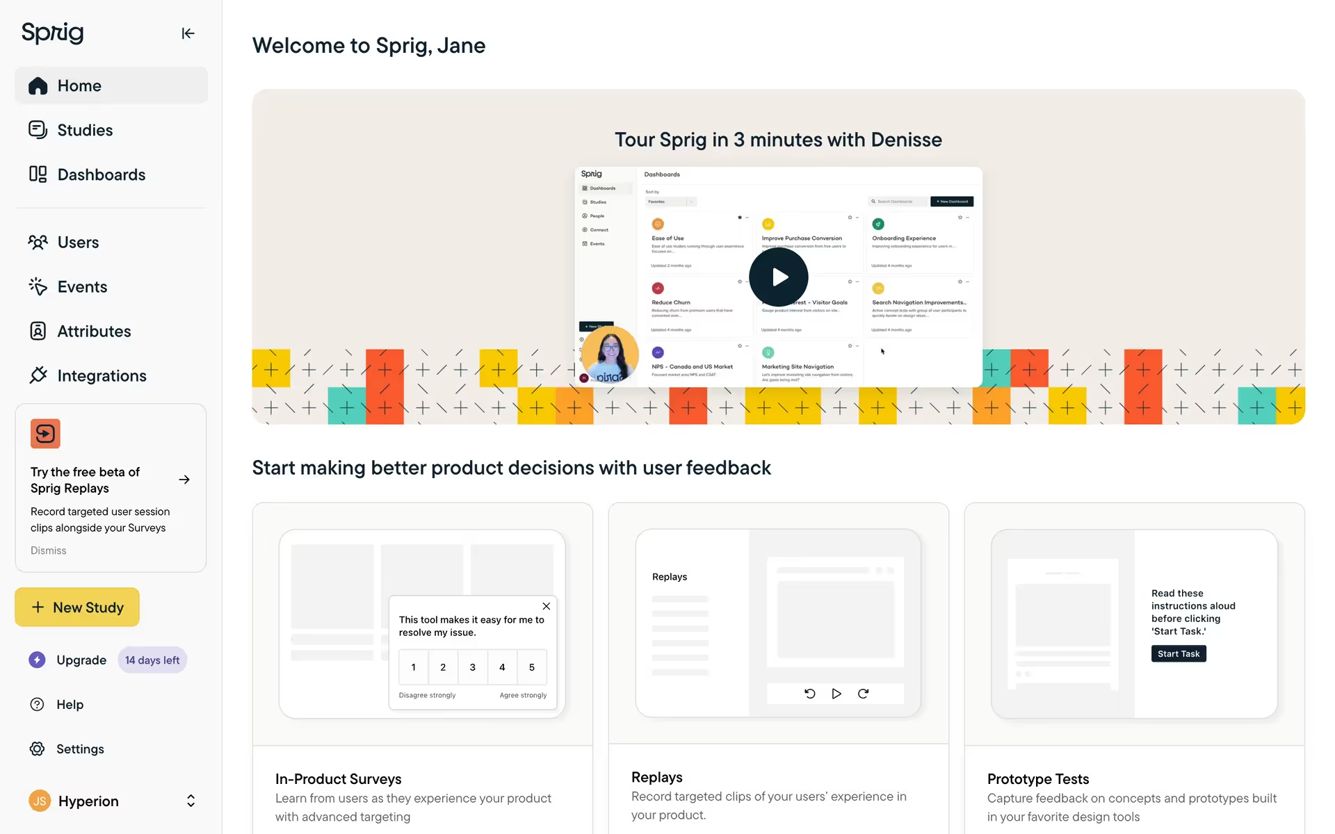
Sprig uses color psychology to create a user-friendly and engaging interface. The bright yellow of Supernova (#F9C600) highlights key actions like "Book a Demo," drawing your attention immediately. The soft, off-white Spring Wood (#F2EDE7) provides a clean, calming background, making content easy to scan. Meanwhile, the deep green-blue Firefly (#0B2330) is used for navigation and headers, conveying trust and professionalism. These strategic color choices guide your actions, influence decisions, and create a specific user experience that is both inviting and action-oriented.
To complement Sprig's primary color (#F9C600), consider using deep navy blue (#001F3F) for a striking contrast, or a soft lavender (#E6E6FA) to create a balanced and harmonious look. These colors can enhance your design by adding depth and sophistication.
On Mobbin’s brand colors page, you can explore a curated list of brand color palettes from top companies. We also offer access to thousands of other UI designs and interfaces from various brands, making it a great resource for finding new color combinations and getting inspiration from real-world examples.
Mobbin offers an extensive, constantly updated collection of mobile and web design patterns, showcasing the latest trends in UI/UX design, from color usage to user flows. By using Mobbin, you can easily explore current design practices and stay ahead of trends in the industry.
Don't miss out—try Mobbin today for free as long as you like, or get full access with any of our paid plans.


Use Mobbin for free as long as you like or get full access with any of our paid plans.


