#1db954
Copy
Copied


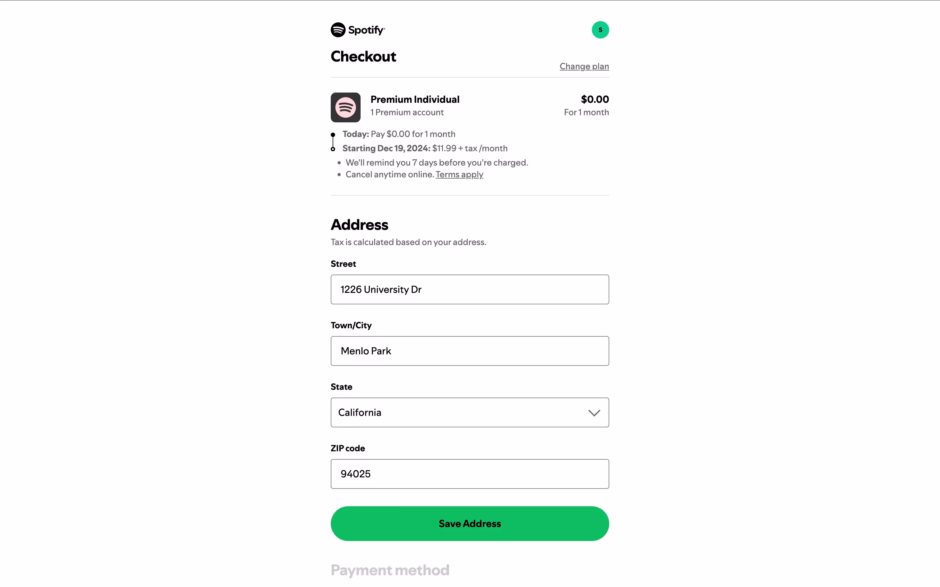
Spotify's web player is a vibrant hub for music lovers. The platform's branding prominently features green (#1DB954), white (#FFFFFF), and black (#191414) colors. You can easily copy Spotify's colors in Hex, CMYK, RGB, and other popular formats on this page.
Spotify's main colors are Green (#1DB954), White (#FFFFFF), and Black (#191414). These colors form the core of its vibrant and recognizable brand identity.
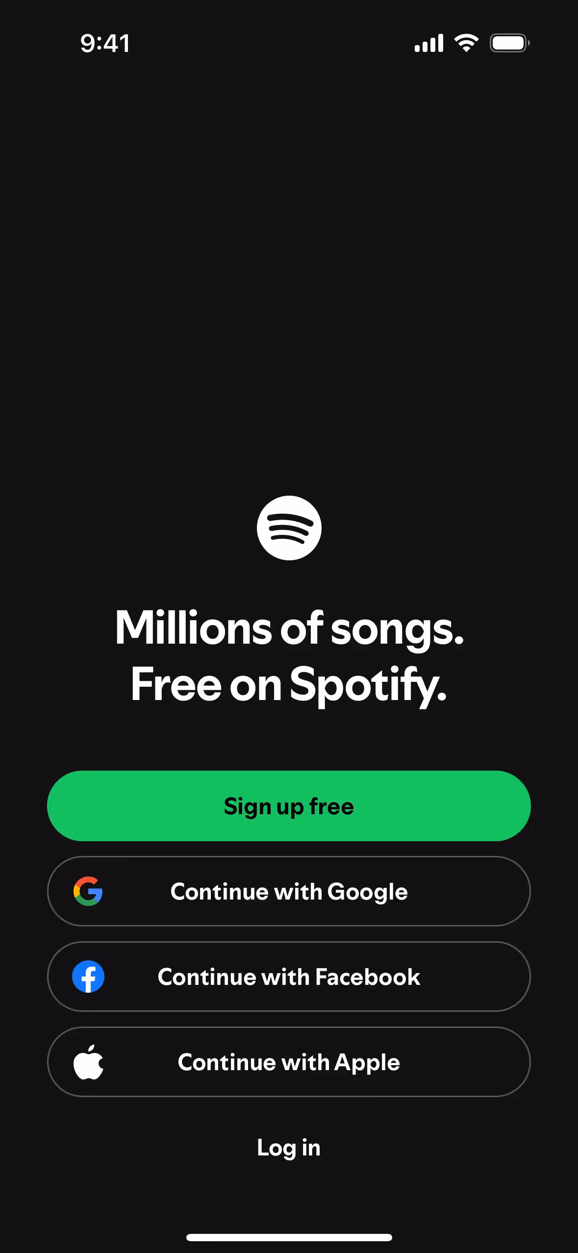
Spotify's primary color, the vibrant green (#1DB954), symbolizes growth, energy, and renewal, aligning perfectly with the brand's dynamic and innovative spirit. This green hue is complemented by the use of white (#FFFFFF) and black (#191414), which provide a clean, modern contrast, enhancing readability and ensuring a sleek, user-friendly interface.
Spotify's color scheme, particularly the use of Spotify Green, is designed to ensure brand recognition and accessibility. While the exact historical influences behind the choice of colors aren't detailed, the guidelines emphasize creative color combinations and high contrast to maintain a consistent and recognizable user experience.
Spotify uses color psychology by employing its signature green to evoke energy, growth, and creativity, guiding you to interact with key elements like "Sign up free" buttons. The strategic use of black and white provides a modern, sophisticated backdrop, making content and interactive elements stand out, thus enhancing your overall user experience.
To complement Spotify's primary green (#1DB954), consider using shades like deep navy blue (#003366) for a sophisticated contrast, or a vibrant coral (#FF6F61) to add a pop of warmth and energy. These colors can create a balanced and visually appealing palette that enhances the overall user experience.
On Mobbin’s brand colors page, you can explore a curated list of brand color palettes from top companies. We also offer access to thousands of other UI designs and interfaces from various brands, making it a great resource for finding new color combinations and getting inspiration from real-world examples.
Mobbin offers an extensive, constantly updated collection of mobile and web design patterns, showcasing the latest trends in UI/UX design, from color usage to user flows. By using Mobbin, you can easily explore current design practices and stay ahead of trends in the industry.
Don't miss out—try Mobbin today for free as long as you like, or get full access with any of our paid plans.


Use Mobbin for free as long as you like or get full access with any of our paid plans.


