#1db954
Copy
Copied


Snapchat is a multimedia messaging app developed by Snap Inc. The app's branding and interface designs prominently feature the colors yellow (#FFFC00), white (#FFFFFF), and black (#000000). You can easily copy Snapchat's colors in Hex, CMYK, RGB, and other popular formats on this page.
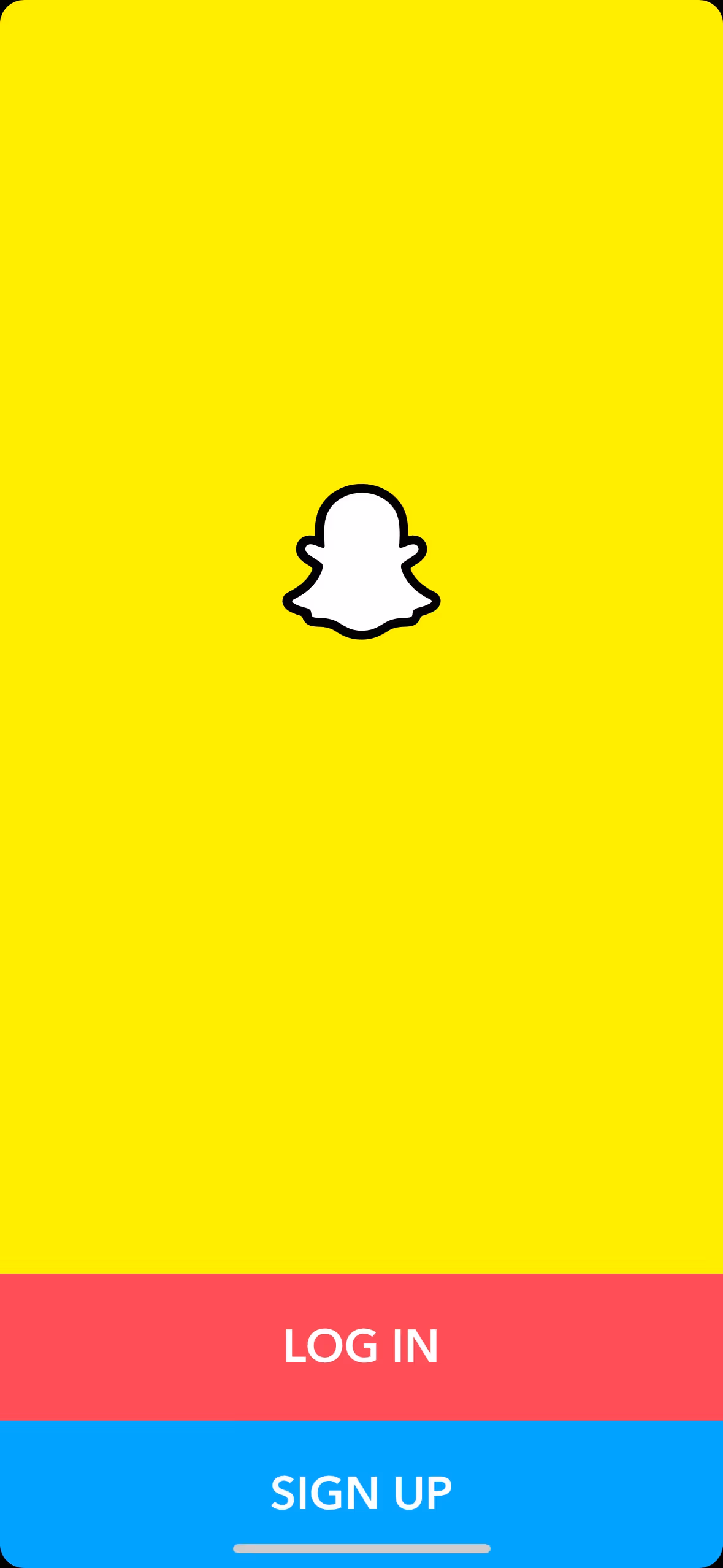
Snapchat's color palette primarily features three main colors: a vibrant yellow (#FFFC00), crisp white (#FFFFFF), and deep black (#000000). These colors create a distinctive and recognizable visual identity that you can leverage for your design inspiration.
Snapchat's primary color, #FFFC00, is a vibrant yellow that conveys energy, optimism, and creativity, perfectly aligning with the app's playful and dynamic brand identity. Complemented by white and black, these colors create a clean, modern look that enhances the app's overall message of fun and spontaneity.
Snapchat's color scheme, particularly its iconic yellow, was chosen to create a distinctive and recognizable brand identity. While the exact historical details and influences behind the choice of colors aren't explicitly documented, it's clear that yellow plays a crucial role in making Snapchat stand out in the digital landscape.
Snapchat's use of color psychology is evident in its strategic choice of Snap Yellow, Black, and White. Snap Yellow, with its vibrant and energetic hue, is used to draw attention and evoke feelings of positivity and friendliness. This color, combined with the clarity and contrast provided by Black and White, creates a recognizable and engaging user experience, guiding your actions and influencing your decisions seamlessly.
To complement Snapchat's primary yellow (#FFFC00), consider using shades of blue like #007BFF or #00BFFF for a striking contrast. Additionally, soft grays such as #B0B0B0 or vibrant purples like #800080 can create a balanced and visually appealing palette.
On Mobbin’s brand colors page, you can explore a curated list of brand color palettes from top companies. We also offer access to thousands of other UI designs and interfaces from various brands, making it a great resource for finding new color combinations and getting inspiration from real-world examples.
Mobbin helps you stay up-to-date with the latest UI/UX trends by offering an extensive, constantly updated collection of mobile and web design patterns. From color usage to user flows, you can easily explore current design practices and stay ahead of trends in the industry.
Ready to elevate your design game? Try Mobbin today for free as long as you like, or get full access with any of our paid plans.
Use Mobbin for free as long as you like or get full access with any of our paid plans.


