#1db954
Copy
Copied

Slack is a leading business communication and collaboration platform. Its branding and interface designs prominently feature blue, green, yellow, and red colors. You can easily copy Slack's colors in Hex, CMYK, RGB, and other popular formats on this page.
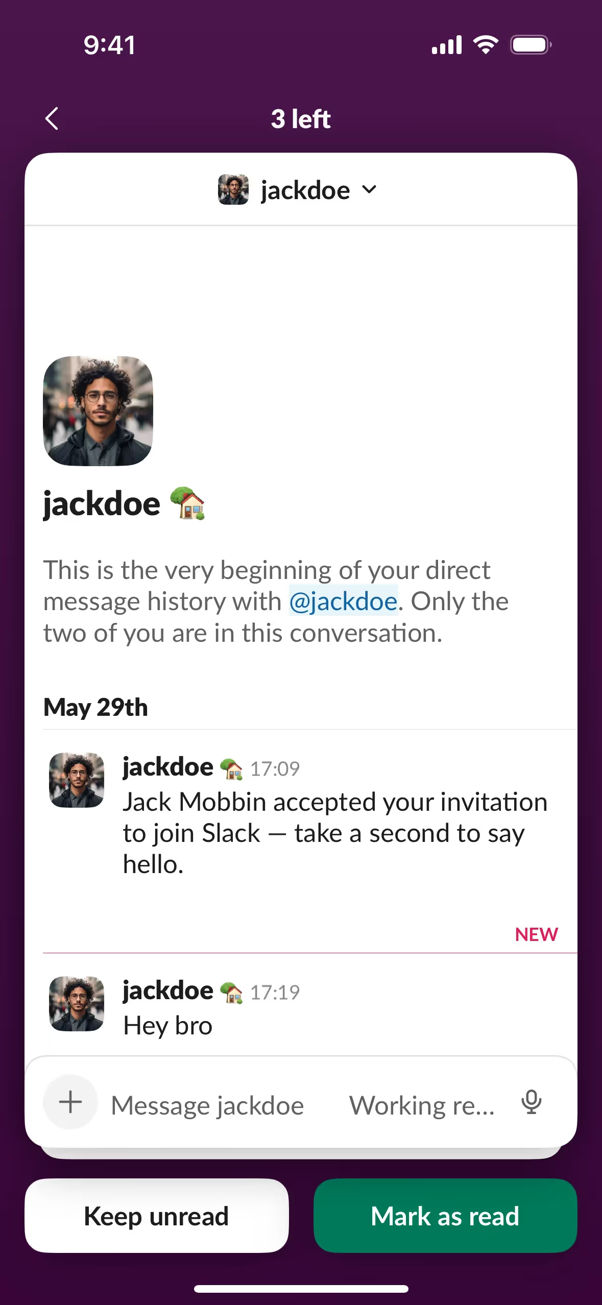
The main colors in Slack's color palette are Blue (#36C5F0), Green (#2EB67D), Yellow (#ECB22E), and Red (#E01E5A). These vibrant hues are designed to create a lively and engaging user experience.
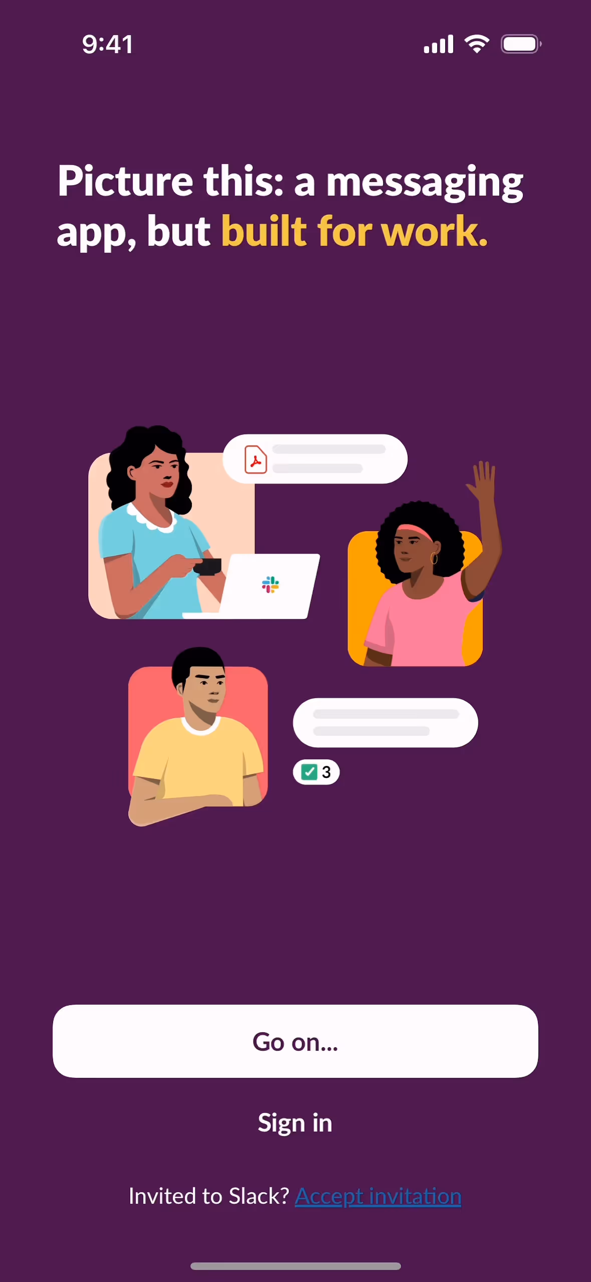
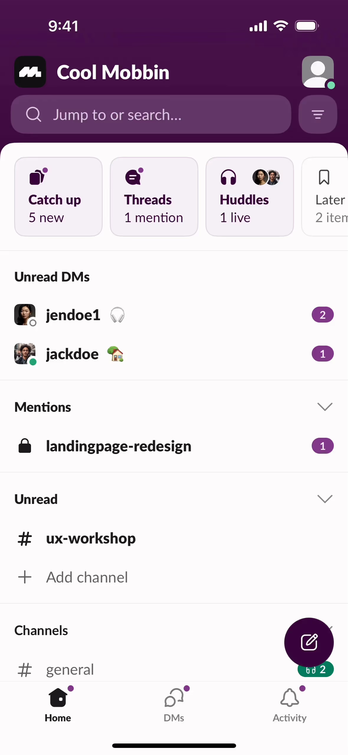
Slack's primary color, #36C5F0, embodies a sense of calm and trust, aligning with the brand's identity as a reliable and user-friendly communication tool. This blue hue fosters a professional yet approachable atmosphere, encouraging collaboration and productivity. Complementing this, the green (#2EB67D) signifies growth and harmony, the yellow (#ECB22E) adds a touch of optimism and energy, and the red (#E01E5A) injects a sense of urgency and passion, all working together to create a vibrant and dynamic user experience.
Slack's color scheme is meticulously designed to ensure clarity, accessibility, and brand consistency. While the specific historical narrative and key influences behind the choice of colors aren't detailed, the current palette is crafted to maintain visual harmony and legibility across all media.
Slack uses color psychology in its interface designs to create an intuitive and engaging user experience. By strategically employing blue, green, yellow, and red, Slack guides your actions, highlights important elements, and fosters a productive and inviting workspace. These colors are carefully chosen to evoke specific emotional responses and ensure accessibility, making your interactions with the platform both efficient and enjoyable.
To complement Slack's primary color (#36C5F0), consider using coral (#FF6F61) for a vibrant contrast, or lavender (#E6E6FA) for a softer, more balanced look. These colors can enhance your design by adding depth and visual interest.
On Mobbin’s brand colors page, you can explore a curated list of brand color palettes from top companies. We also offer access to thousands of other UI designs and interfaces from various brands, making it a great resource for finding new color combinations and getting inspiration from real-world examples.
Mobbin offers an extensive, constantly updated collection of mobile and web design patterns, showcasing the latest trends in UI/UX design, from color usage to user flows. By using Mobbin, you can easily explore current design practices and stay ahead of trends in the industry.
Ready to elevate your design game? Try Mobbin today for free as long as you like, or get full access with any of our paid plans.


Use Mobbin for free as long as you like or get full access with any of our paid plans.


