#1db954
Copy
Copied

The Skyscanner app, by Skyscanner Ltd, helps you find cheap flights and hotels. Their branding and interface designs feature a palette of Haiti, White, and Cabaret. You can easily copy the Hex, CMYK, and RGB codes for these colors on this page.
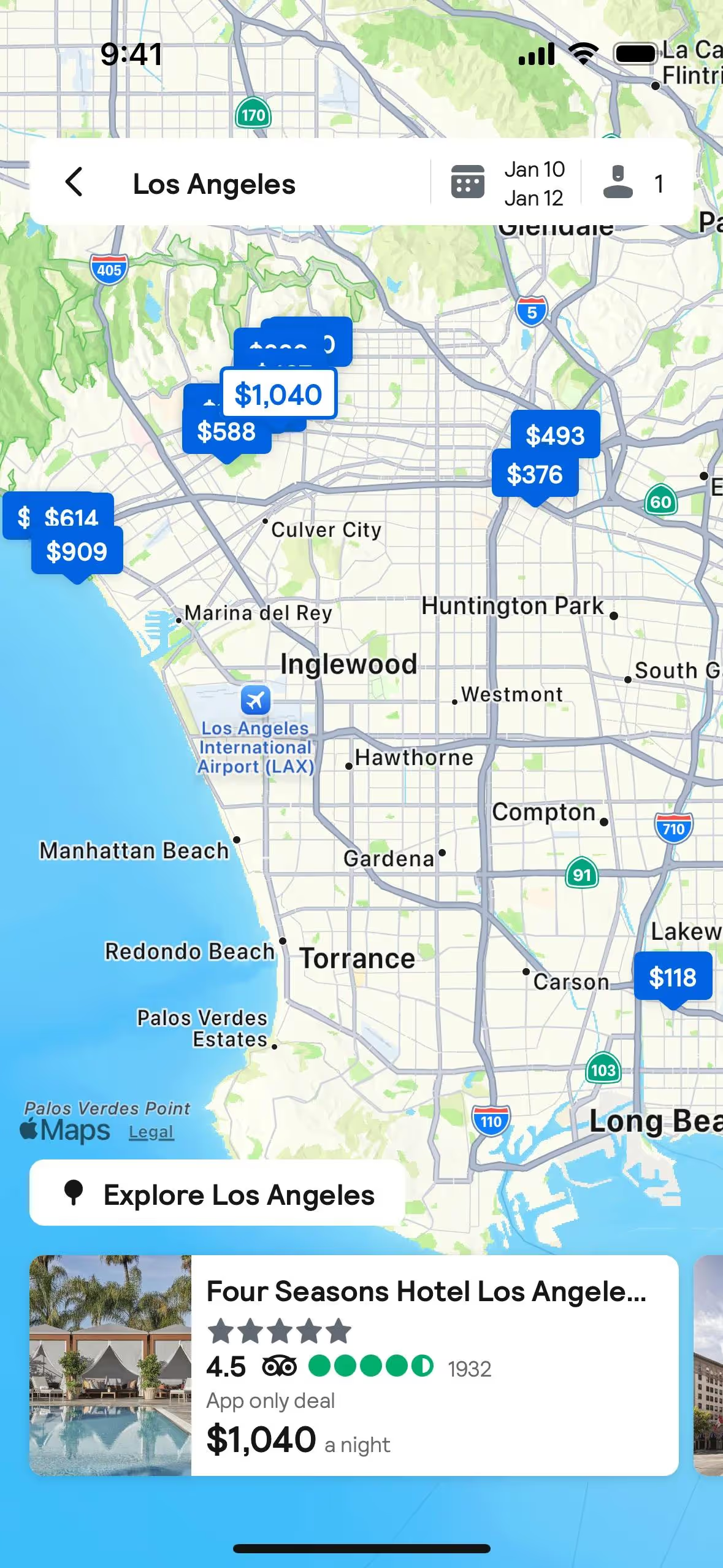
When you explore Skyscanner in our library, you'll see their palette centers on three main colors: a deep navy called Haiti (#121234), a crisp White (#FFFFFF), and a vibrant pink-red, Cabaret (#D1435B).
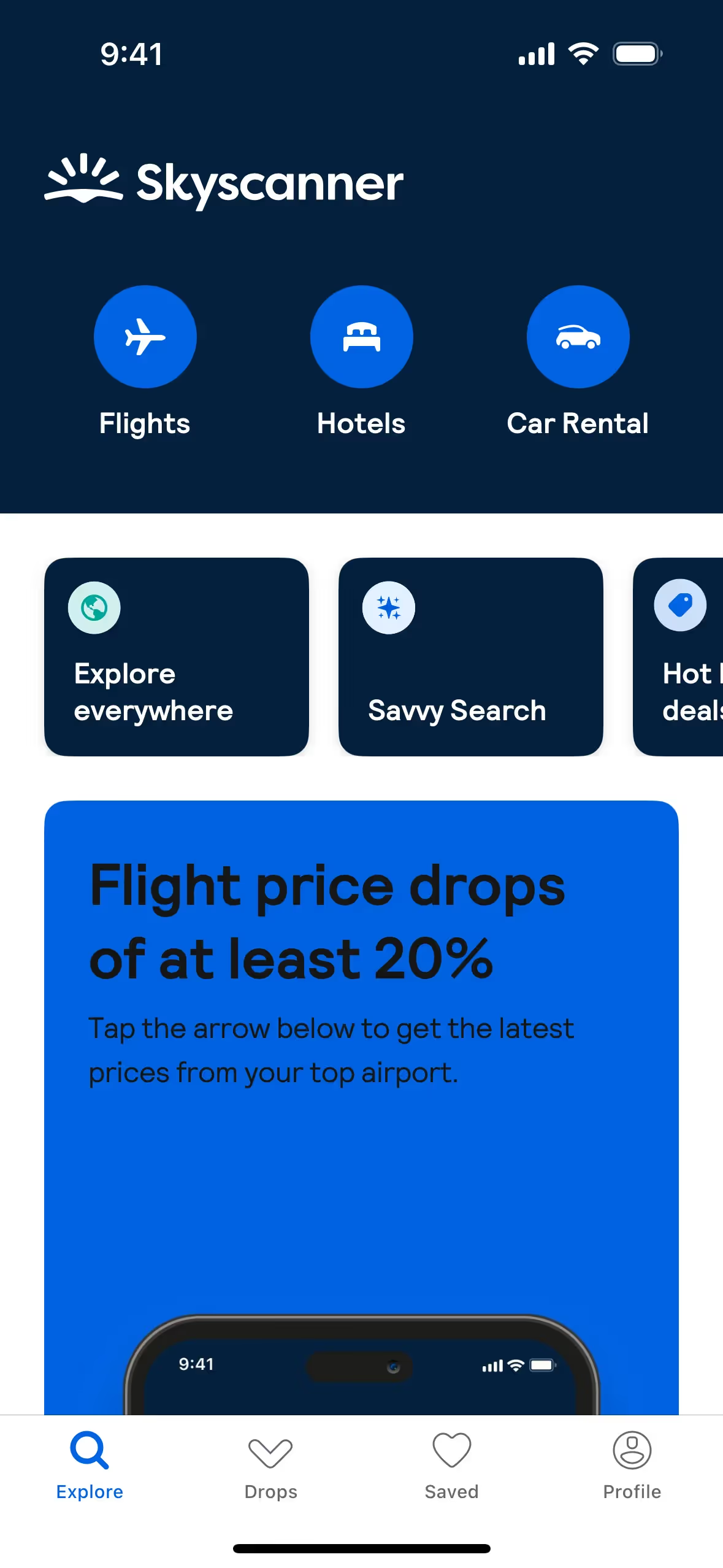
Skyscanner's deep blue, Haiti, establishes a foundation of trust and reliability for your travel planning. The vibrant Cabaret red then injects a splash of excitement and passion, guiding you toward your next adventure.
Their current color scheme is the result of a significant 2019 rebrand, designed to embody the clarity and optimism of the sky and simplify the travel planning experience for you.
We see how Skyscanner uses its core colors to create a focused experience for you. The deep Haiti blue and clean White establish a calm, trustworthy backdrop, allowing the vibrant Cabaret to strategically guide your attention towards key booking decisions.
To build on Skyscanner's foundational dark blue, we suggest exploring a vibrant gold for an optimistic pop or a calming sage green to create a more grounded, trustworthy feel for your users.
On our brand colors page, you can explore curated color palettes from top companies. We also offer access to thousands of UI designs from various brands, providing endless inspiration for your next color combination.
Our platform offers an extensive, constantly updated library of mobile and web design patterns, giving you a real-time look at the latest UI/UX trends—from color palettes to intricate user flows. By exploring our collection, you can easily see what leading apps are doing and stay ahead of the curve in the fast-paced design industry.
You can try Mobbin today for free for as long as you like, or get full access with any of our paid plans.
Use Mobbin for free as long as you like or get full access with any of our paid plans.


