#1db954
Copy
Copied

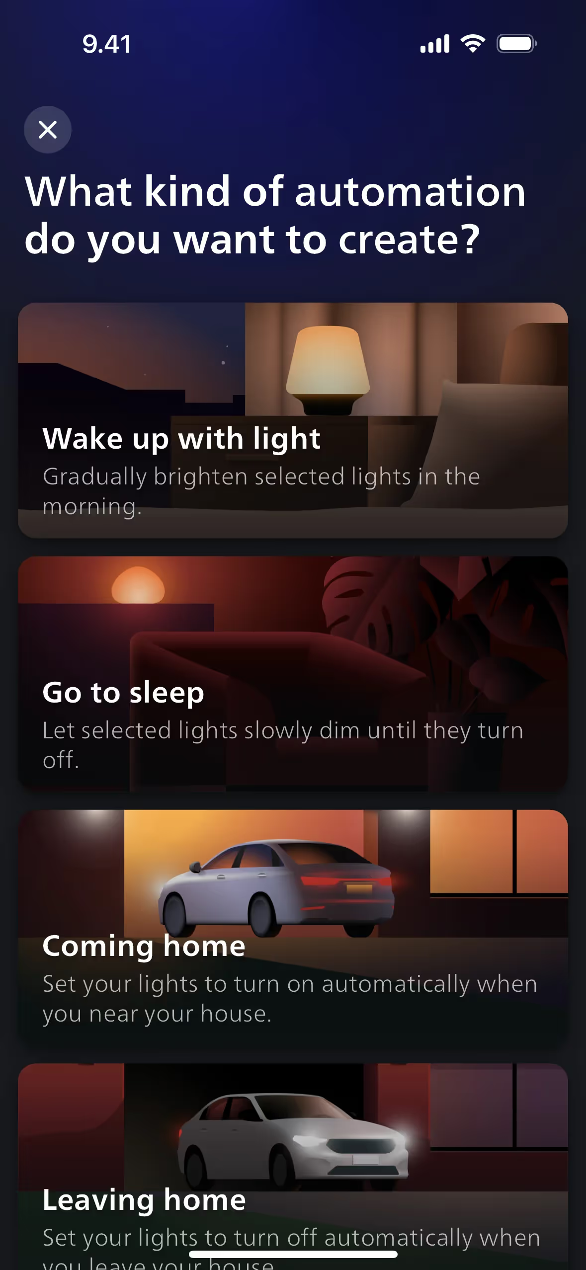
Signify Holding owns Philips Hue, whose app controls its smart lighting system. Its branding uses Denim, Blue Charcoal, Midnight, and White for its interface and marketing materials. On this page, you can easily copy these colors in Hex, CMYK, and RGB formats.
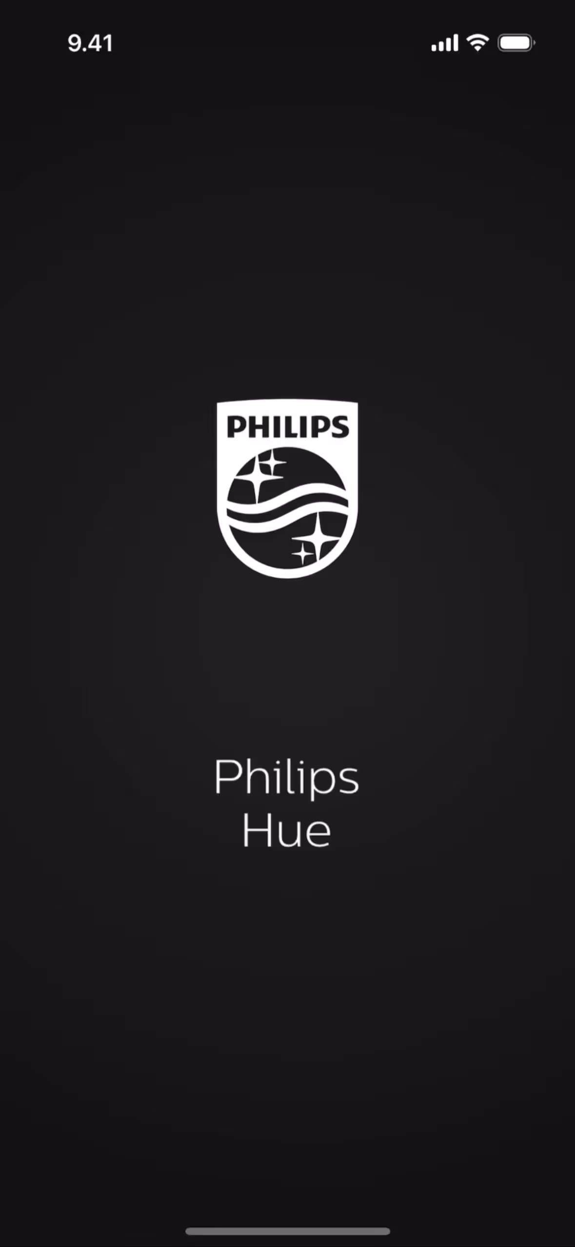
To help you design with the Philips Hue aesthetic, we've identified their core color palette: a foundation of deep blues and blacks like Denim (#0F70B8), Blue Charcoal (#010417), and Midnight (#000826), all set against a crisp White (#FFFFFF).
We see Philips Hue's primary blue, Denim, as a reflection of its core promise: smart, reliable technology that brings a sense of calm and control to your space. This is beautifully supported by deep, atmospheric shades like Midnight and Blue Charcoal, which create a sophisticated backdrop, allowing the brilliance of their lighting—and your creativity—to truly shine.
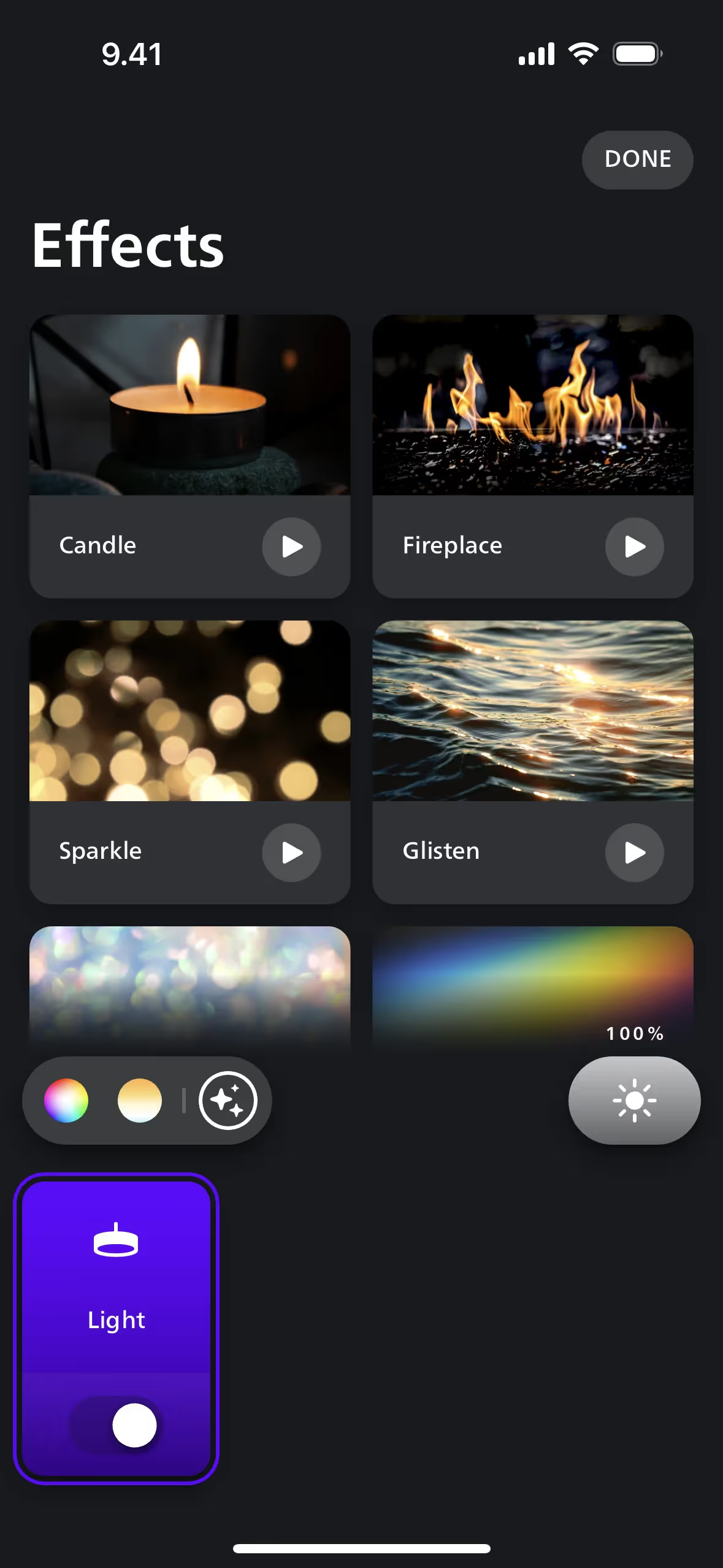
We see Philips Hue's color scheme as a direct reflection of its product philosophy—it masterfully blends the vibrant spectrum of light with a clean, tech-focused foundation to inspire your creativity.
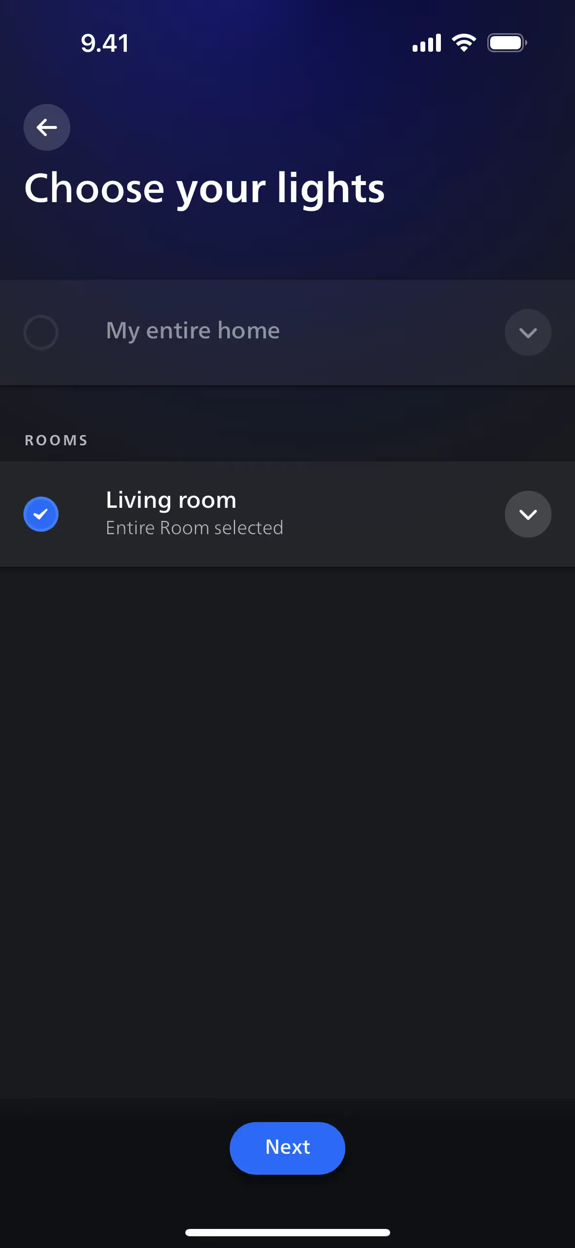
Philips Hue masterfully uses its deep blues like Midnight and Blue Charcoal to create an immersive, focused experience, while the contrasting Denim blue serves as a clear, actionable guide for your interactions, and the crisp White ensures everything remains readable and clean.
To create a striking contrast with Philips Hue's primary blue, we'd explore a warm terracotta or a vibrant coral. For a more subtle, balanced palette, a soft sage green can introduce an element of natural calm to the interface.
On our brand colors page, you can explore curated color palettes from top companies. We also offer access to thousands of UI designs from various brands, providing endless inspiration for your next color combination.
Mobbin keeps you at the forefront of design with our extensive, constantly updated library of mobile and web UI/UX patterns. By exploring the latest trends—from innovative color usage to seamless user flows—you can easily see what's current and stay ahead of the curve in the design industry.
You can try Mobbin today for free for as long as you like, or get full access with any of our paid plans.
Use Mobbin for free as long as you like or get full access with any of our paid plans.


