#1db954
Copy
Copied

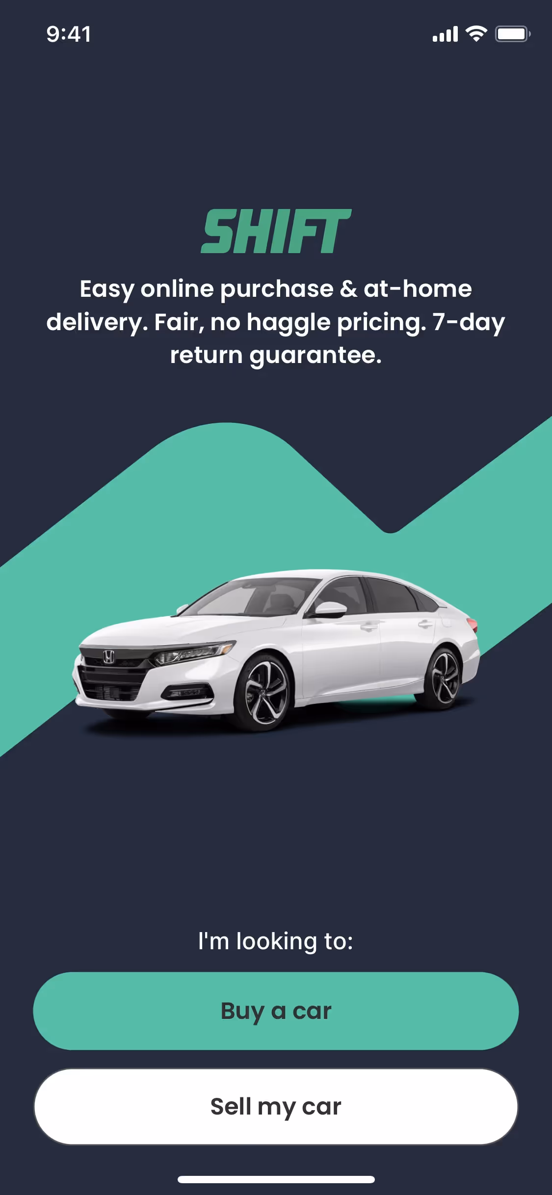
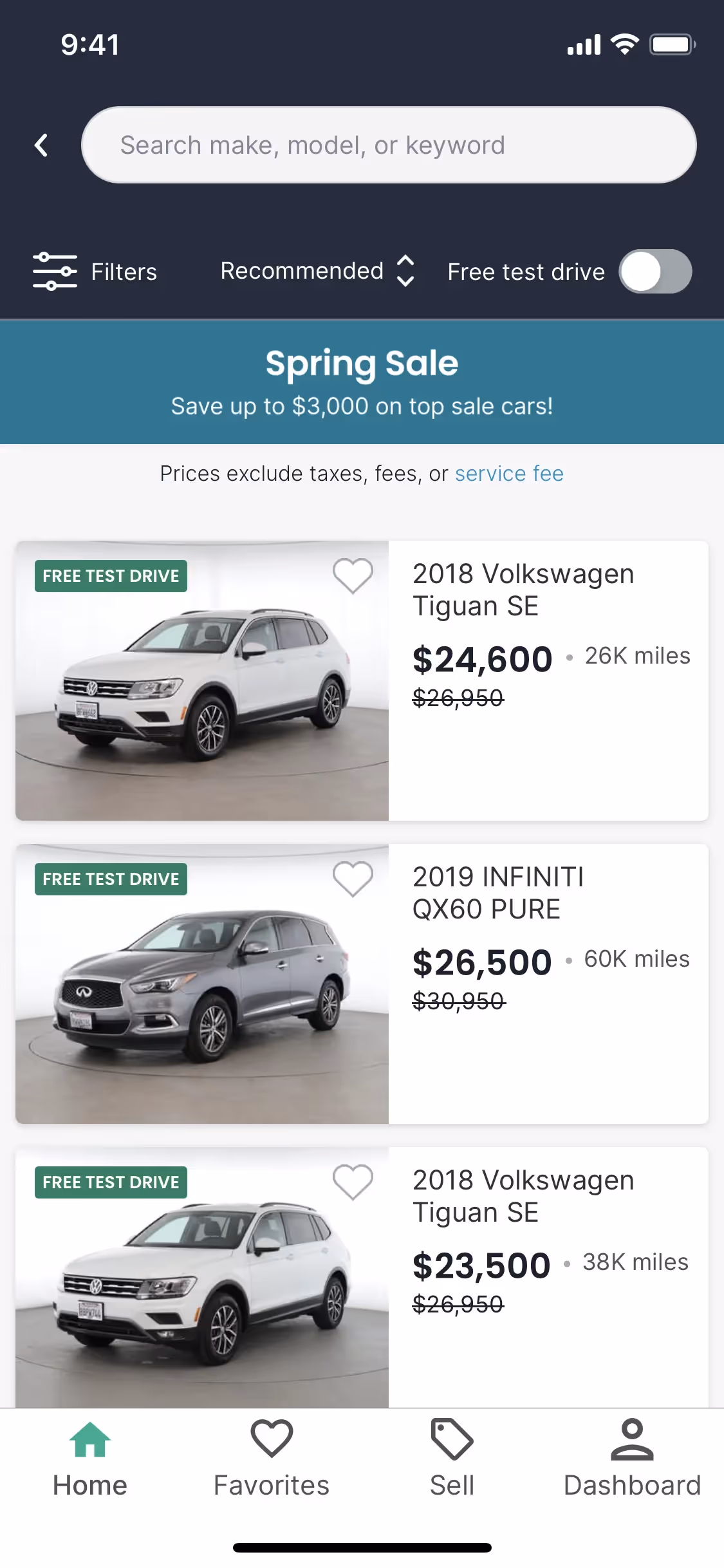
Shift is a browser designed to integrate web apps, email accounts, and workflows into a single, seamless experience. The general colors used in Shift's branding and interface designs include Blue (#403CA8), Light Blue (#1DD2FD), and Black (#24272F). You can easily copy Shift's colors in Hex, CMYK, RGB, and other popular formats on this page.
The main colors in Shift's color palette are Blue (#403CA8), Light Blue (#1DD2FD), and Black (#24272F). These colors provide a versatile and visually appealing foundation for your design projects.
Shift's primary color, a deep blue (#403CA8), conveys a sense of trust, reliability, and professionalism, aligning perfectly with the brand's identity. Complementary colors like light blue (#1DD2FD) and black (#24272F) enhance this message by adding a touch of modernity and sophistication, creating a cohesive and inspiring visual experience for you.
Shift's color scheme was developed to create a cohesive and streamlined user experience, though specific historical details and key influences behind the choice of colors are not explicitly documented. The design philosophy focuses on reducing cognitive load and simplifying digital life, which likely influenced the color choices to ensure a visually calming and efficient interface.
Shift does not explicitly discuss the use of color psychology in its interface designs. However, the strategic use of colors like Blue, Light Blue, and Black can be inferred to enhance user experience by providing a visually cohesive and organized interface, which helps guide your actions and reduce cognitive load.
To complement Shift's primary color (#403CA8), consider using shades like coral (#FF6F61) for a vibrant contrast, or mint green (#98FF98) for a refreshing balance. These colors can enhance your design by adding depth and visual interest.
On Mobbin’s brand colors page, you can explore a curated list of brand color palettes from top companies. We also offer access to thousands of other UI designs and interfaces from various brands, making it a great resource for finding new color combinations and getting inspiration from real-world examples.
Mobbin offers an extensive, constantly updated collection of mobile and web design patterns, showcasing the latest trends in UI/UX design, from color usage to user flows. By using Mobbin, you can easily explore current design practices and stay ahead of trends in the industry.
Ready to elevate your design game? Try Mobbin today for free as long as you like, or get full access with any of our paid plans.
Use Mobbin for free as long as you like or get full access with any of our paid plans.


