#1db954
Copy
Copied


Sephora is a leading beauty retailer known for its extensive range of makeup, skincare, and fragrance products. The brand's interface designs prominently feature black (#000000), white (#FFFFFF), and denim (#136BEA) colors. You can easily copy Sephora's colors in Hex, CMYK, RGB, and other popular formats on this page.
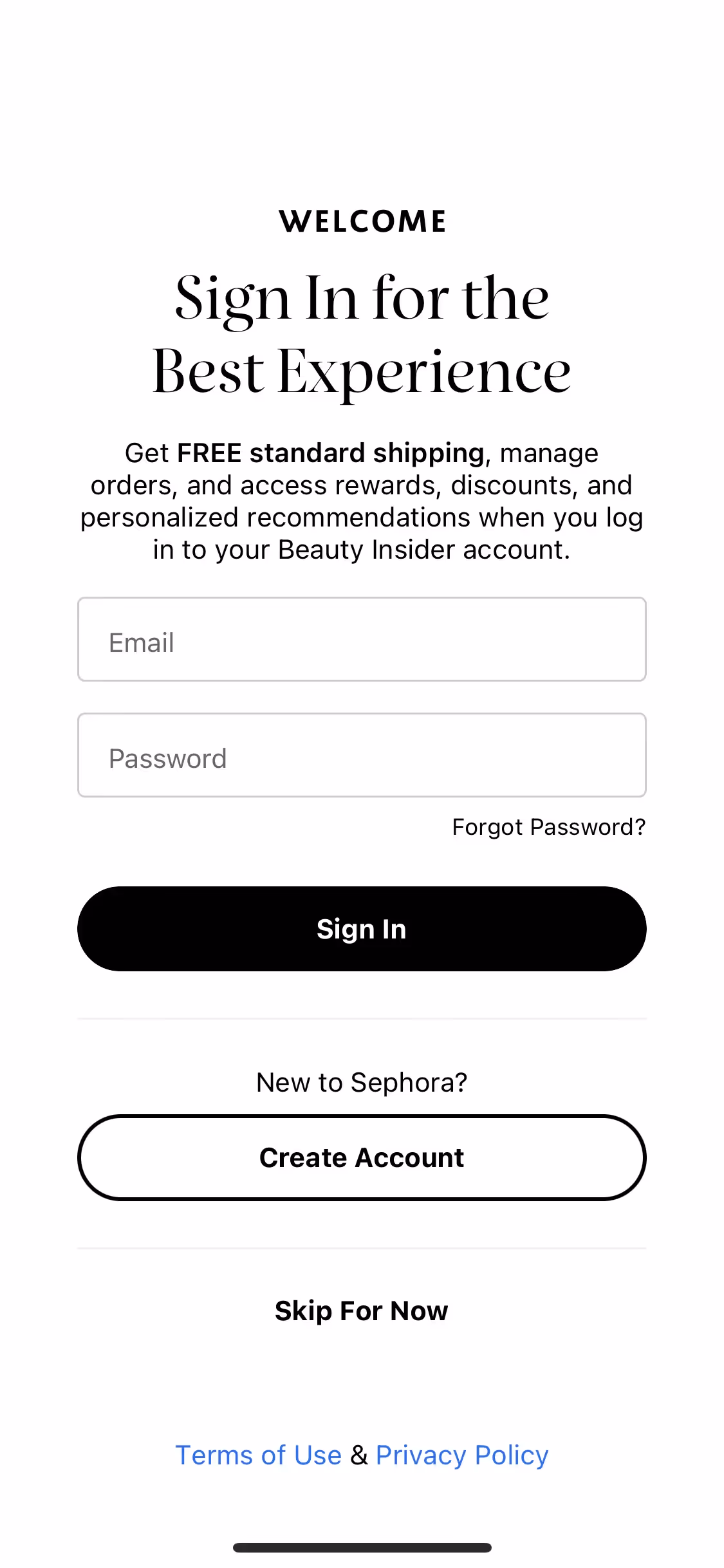
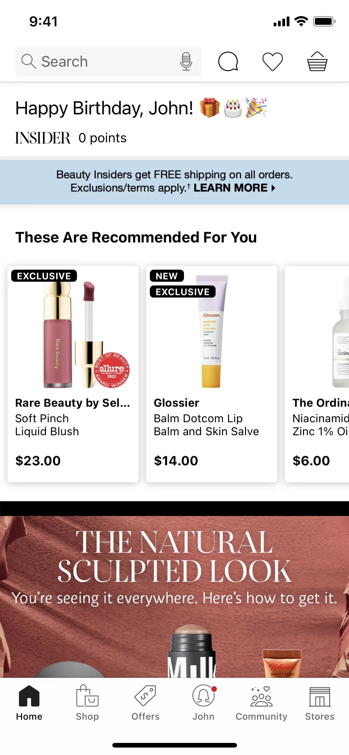
The main colors in Sephora's color palette are Black (#000000), White (#FFFFFF), and Denim (#136BEA). These colors create a sleek and modern aesthetic that you can draw inspiration from for your own design projects.
Sephora's primary color, black (#000000), conveys sophistication, elegance, and timelessness, aligning perfectly with the brand's identity as a leader in the beauty industry. Complementing this, white (#FFFFFF) adds a sense of purity and simplicity, while denim (#136BEA) introduces a modern, vibrant touch, enhancing the overall message of innovation and inclusivity.
Sephora's iconic black and white color scheme is designed to evoke a sense of elegance and sophistication, aligning with the brand's luxurious image. While the specific history and influences behind the choice of these colors aren't detailed, the consistent use of this palette helps create a strong, recognizable brand identity that resonates with you as a consumer and designer.
Sephora strategically uses black, white, and denim colors in its interface designs to guide your actions, influence decisions, and create specific user experiences. Black and white provide a sophisticated, high-contrast backdrop that highlights key elements, while denim accents likely draw attention to interactive features and promotions, enhancing usability and engagement.
To complement Sephora's primary color (#000000), consider incorporating shades like gold (#FFD700) for a touch of luxury, or blush pink (#FFC0CB) to add a soft, feminine contrast. Additionally, deep emerald green (#50C878) can create a sophisticated and balanced look.
On Mobbin’s brand colors page, you can explore a curated list of brand color palettes from top companies. We also offer access to thousands of other UI designs and interfaces from various brands, making it a great resource for finding new color combinations and getting inspiration from real-world examples.
Mobbin helps you stay up-to-date with the latest UI/UX trends by offering an extensive, constantly updated collection of mobile and web design patterns. From color usage to user flows, you can easily explore current design practices and stay ahead of trends in the industry.
Don't miss out—try Mobbin today for free as long as you like, or get full access with any of our paid plans.

Use Mobbin for free as long as you like or get full access with any of our paid plans.


