#1db954
Copy
Copied

Roofoods Limited, trading as Deliveroo, operates a popular food and goods delivery app. Their branding features Outer Space, White, and a distinctive Robin's Egg Blue in its interface designs. On this page, you can easily copy these colors in Hex, CMYK, RGB, and more.
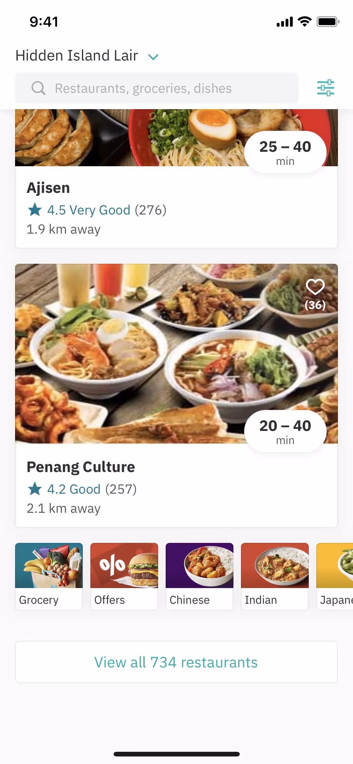
Deliveroo's core palette consists of a distinctive Robin's Egg Blue (#00CCBC), a deep Outer Space (#2E3333), and a clean White (#FFFFFF). These colors are key to achieving their recognizable and energetic brand aesthetic.
Deliveroo's primary 'Outer Space' charcoal conveys a sense of premium reliability and sophistication. This dark, stable foundation allows the energetic 'Robin's Egg Blue' to pop, communicating the speed and efficiency at the core of their brand promise to you.
Deliveroo's vibrant color scheme was born from its major 2016 rebrand, aiming for a bold identity that would stand out in a crowded market. The high-visibility palette was also a strategic choice for function, enhancing the safety and recognition of their riders on the streets.
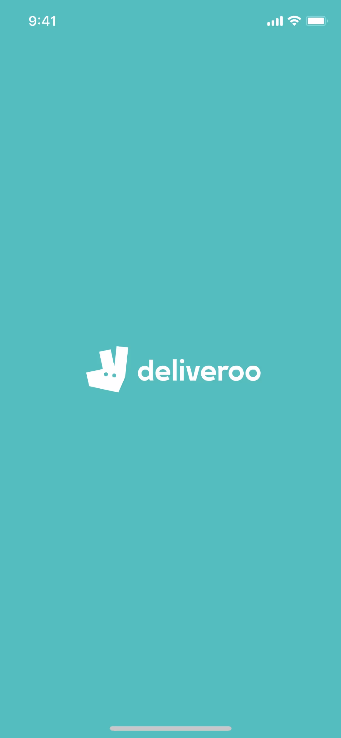
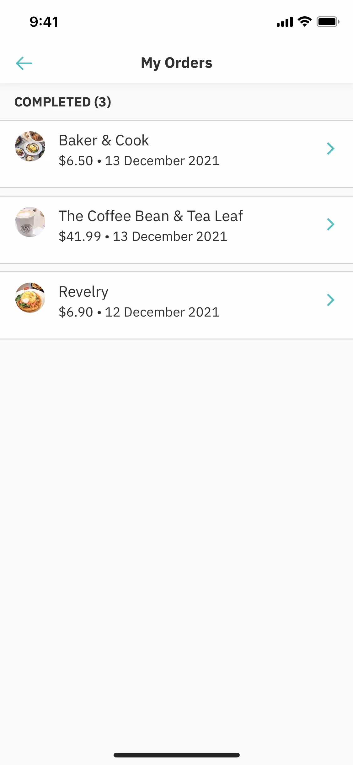
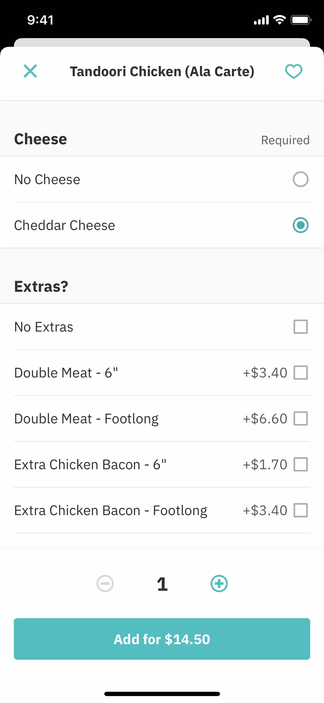
In our analysis, we see Deliveroo masterfully use its palette to guide your journey. The energetic Robin's Egg Blue propels you toward key actions, while the clean foundation of White and Outer Space keeps the experience uncluttered, letting the food itself be the star.
To create a striking contrast, we suggest you try a warm, energetic color like a vibrant coral or a rich ochre against the deep charcoal. For a more subtle and sophisticated feel, a soft cream or a muted sage green can also beautifully complement the palette in your designs.
On our brand colors page, you can explore curated palettes from top companies. We also offer thousands of UI designs from various brands, providing endless inspiration for your next color combination from real-world examples.
Mobbin keeps you on the cutting edge with our extensive, constantly updated collection of mobile and web design patterns, letting you explore the latest trends in everything from color usage to user flows to stay ahead in the industry. Try Mobbin today for free for as long as you like, or get full access with any of our paid plans.
Use Mobbin for free as long as you like or get full access with any of our paid plans.


