#1db954
Copy
Copied


Readng BV. is the company behind Oku, a companion app for your bookshelf. Its branding and interface designs primarily feature a minimalist palette of black and white. You can easily copy Oku's colors in Hex, CMYK, RGB, and other popular formats on this page.
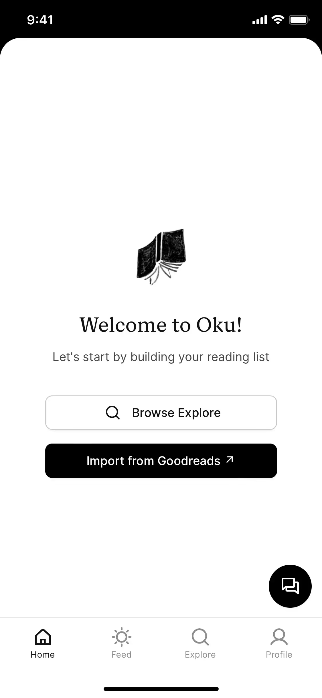
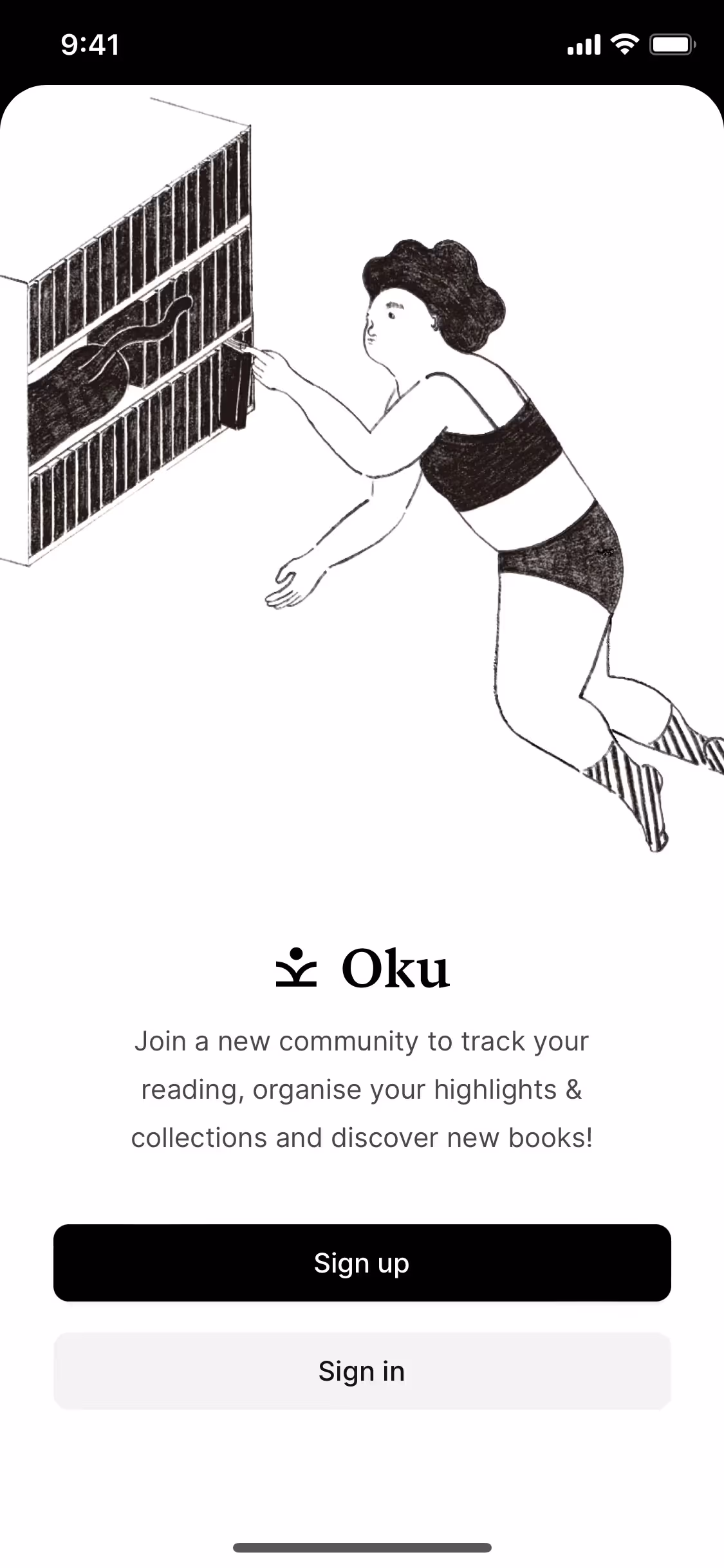
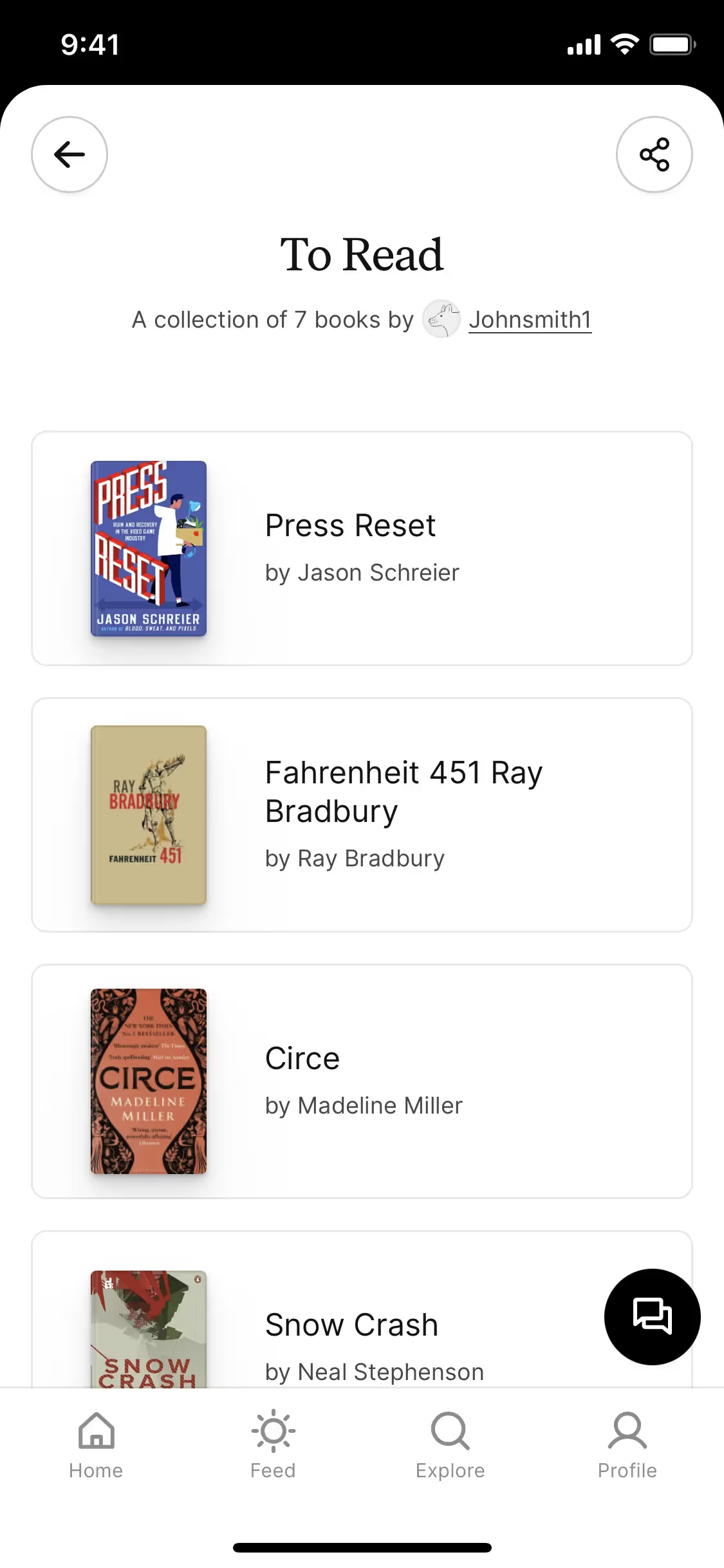
Oku's core color palette is a study in simplicity, featuring just black (#000000) and white (#FFFFFF). This deliberate choice puts the focus squarely on the content, giving you a clear and uncluttered user experience.
In our analysis, Oku's dominant black conveys a sense of deep focus and sophistication, creating the perfect environment for your reading. The contrasting white enhances this by providing a clean, high-contrast canvas that makes the content you're tracking truly stand out.
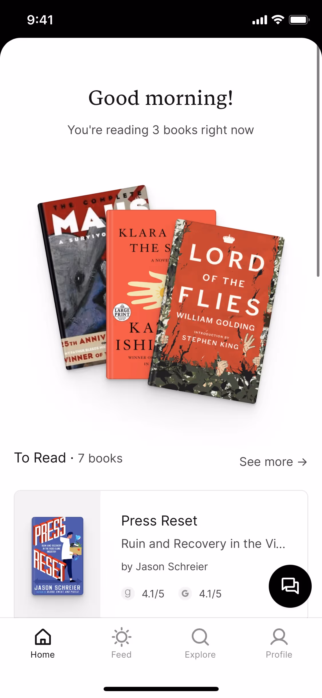
Oku's minimalist black-and-white palette creates a focused, book-like canvas, while its signature yellow accent acts like a classic highlighter, drawing your eye to what matters most.
Oku's high-contrast black and white palette creates a sophisticated, content-first experience that lets book covers shine. This minimalist approach reduces visual noise, naturally guiding your focus to content and key interactive elements for a seamless journey.
To build on Oku's strong foundation, we suggest exploring deep jewel tones for a touch of luxury, or vibrant neons to create a striking, high-energy contrast that commands attention.
On our brand colors page, you can explore curated color palettes from top companies. We also offer access to thousands of UI designs from various brands, providing endless inspiration for your next color combination.
Our platform offers an extensive, constantly updated library of mobile and web design patterns, allowing you to see the latest trends in everything from color palettes to intricate user flows. By exploring our collection, you can easily keep a pulse on current design practices and stay ahead of the curve in the fast-paced world of UI/UX.
Why not try Mobbin today? You can start for free for as long as you like, or unlock full access with one of our paid plans.
Use Mobbin for free as long as you like or get full access with any of our paid plans.


