#1db954
Copy
Copied

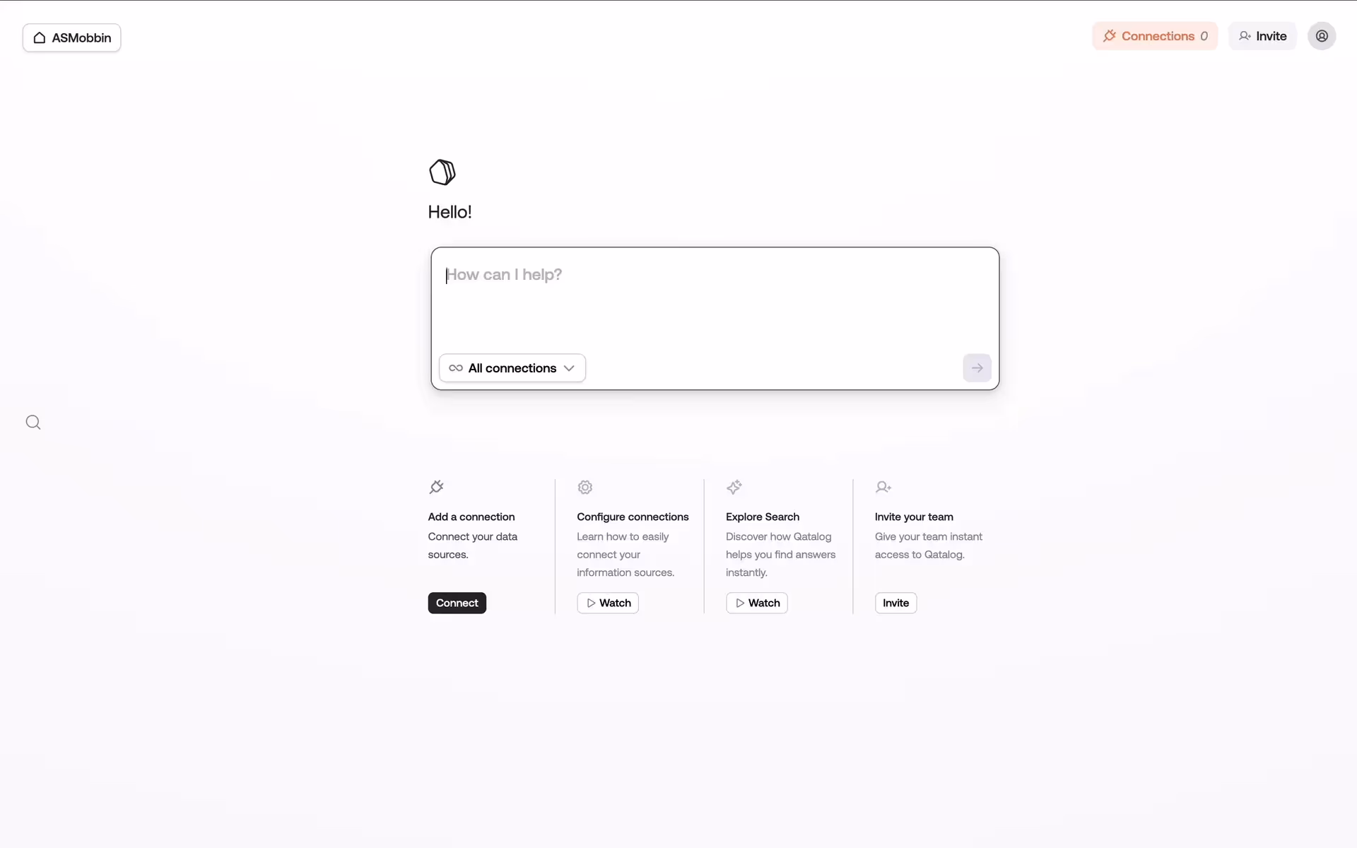
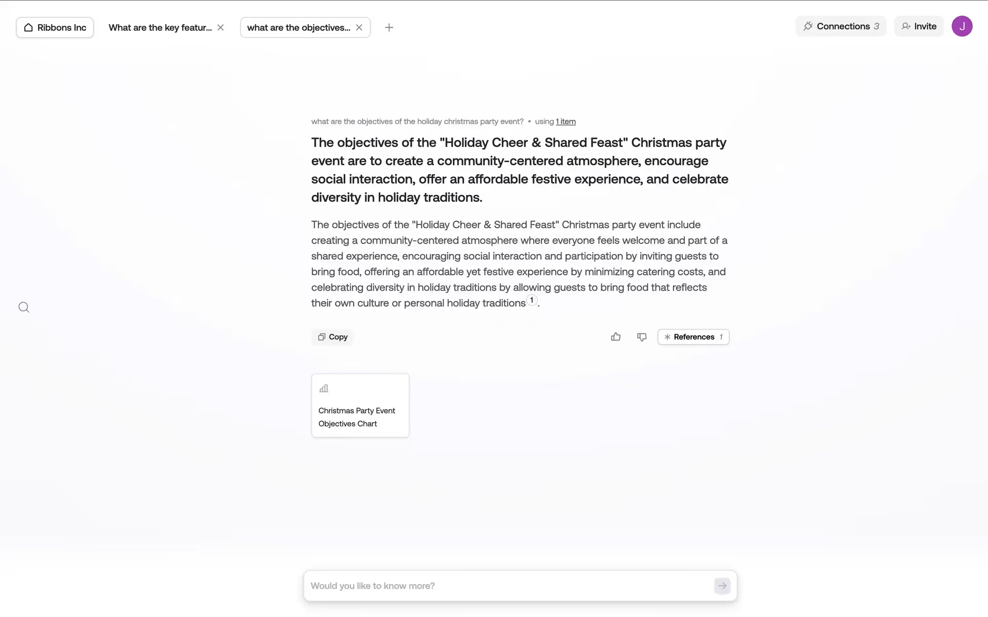
Qatalog is a modern work hub designed to connect teams and their various tools. Its branding and interface designs feature a sophisticated palette of dark gray, off-white, and pale pink. On this page, you can easily copy these colors in Hex, CMYK, RGB, and other popular formats.
Qatalog's main color palette offers a sophisticated trio for your design inspiration: the deep charcoal of Mine Shaft (#292929), the warm off-white of Black White (#FFFEF8), and a soft, dusty pink called Prim (#EFDEE7).
Qatalog's deep gray primary color (#292929) conveys a sense of focus and professionalism, creating a dependable foundation for your work. In our view, the supporting off-white and soft pink accents then introduce clarity and a human touch, balancing the platform's power with approachability.
Qatalog's color scheme appears deliberately chosen to convey technological sophistication while building user trust. The palette creates a focused environment, helping you navigate complex data with confidence and clarity.
In our analysis, Qatalog leverages a high-contrast foundation of Mine Shaft and Black White for utmost clarity, while the soft Prim accent is used to gently guide your eye towards key interactive elements and calls-to-action.
To build on Qatalog's existing palette, we'd recommend introducing a deep teal for a sophisticated, modern feel, or a warm terracotta to create an approachable contrast against the dark neutral base.
On our brand colors page, you can explore curated color palettes from top companies. We also offer thousands of UI designs from various brands, providing endless inspiration for your next color combination from real-world examples.
Our platform offers an extensive, constantly updated collection of mobile and web design patterns, showcasing the latest trends in everything from color usage to user flows. By exploring our library, you can easily discover current design practices and stay ahead of the industry curve.
You can try Mobbin today for free for as long as you like, or get full access with any of our paid plans.
Use Mobbin for free as long as you like or get full access with any of our paid plans.