#1db954
Copy
Copied

The Premier League is the top professional football league in England, featuring 20 clubs competing for the championship. The league's branding and interface designs prominently feature colors like Valentino (#360D3A), Razzmatazz (#E90052), Electric Violet (#963CFF), and White (#FFFFFF). You can easily copy these colors in Hex, CMYK, RGB, and other popular formats on this page.
The main colors in the Premier League's color palette are Valentino (#360D3A), Razzmatazz (#E90052), Electric Violet (#963CFF), and White (#FFFFFF). These vibrant hues can inspire your next design project, adding a dynamic and energetic feel to your work.
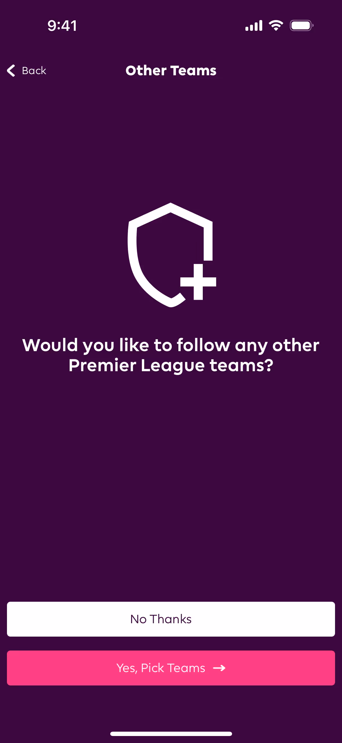
The primary color of the Premier League's app and website, #360D3A, conveys a sense of sophistication and authority, aligning with the league's prestigious and competitive nature. This deep, rich hue is complemented by other prominent colors like #E90052 (Razzmatazz), which adds a vibrant, energetic touch, and #963CFF (Electric Violet), which introduces a modern, dynamic feel. Together, these colors create a cohesive and compelling brand identity that resonates with the excitement and passion of Premier League football.
The Premier League's color scheme has evolved over the years, influenced by its need to stand out in the global sports market and reflect its dynamic, modern identity. The choice of colors is designed to be bold and instantly recognizable, ensuring that the brand remains memorable and impactful.
The Premier League strategically uses colors like Valentino, Razzmatazz, Electric Violet, and White to guide your actions and influence decisions. Valentino provides a bold backdrop, Razzmatazz highlights key features, Electric Violet adds vibrancy, and White ensures readability, creating an engaging and intuitive user experience.
To complement Premier League's primary color (#360D3A), consider using shades like gold (#FFD700) for a luxurious touch, teal (#008080) for a balanced contrast, or light gray (#D3D3D3) to create a neutral backdrop. These colors can enhance the brand's visual appeal while maintaining harmony and contrast.
On Mobbin’s brand colors page, you can explore a curated list of brand color palettes from top companies. We also offer access to thousands of other UI designs and interfaces from various brands, making it a great resource for finding new color combinations and getting inspiration from real-world examples.
Mobbin helps you stay up-to-date with the latest UI/UX trends by offering an extensive, constantly updated collection of mobile and web design patterns. From color usage to user flows, you can easily explore current design practices and stay ahead of industry trends.
Don't miss out—try Mobbin today for free as long as you like, or get full access with any of our paid plans.
Use Mobbin for free as long as you like or get full access with any of our paid plans.


