#1db954
Copy
Copied


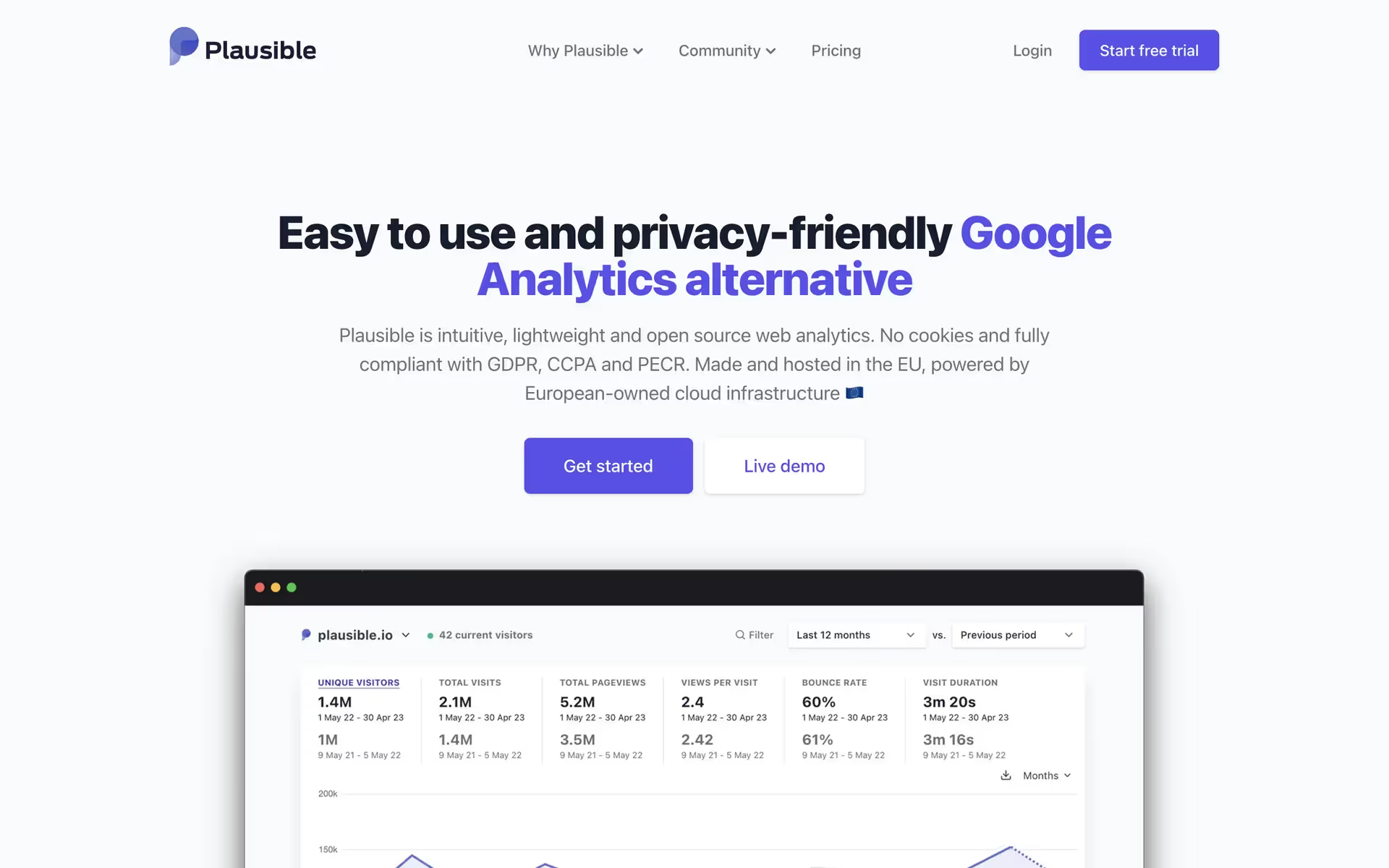
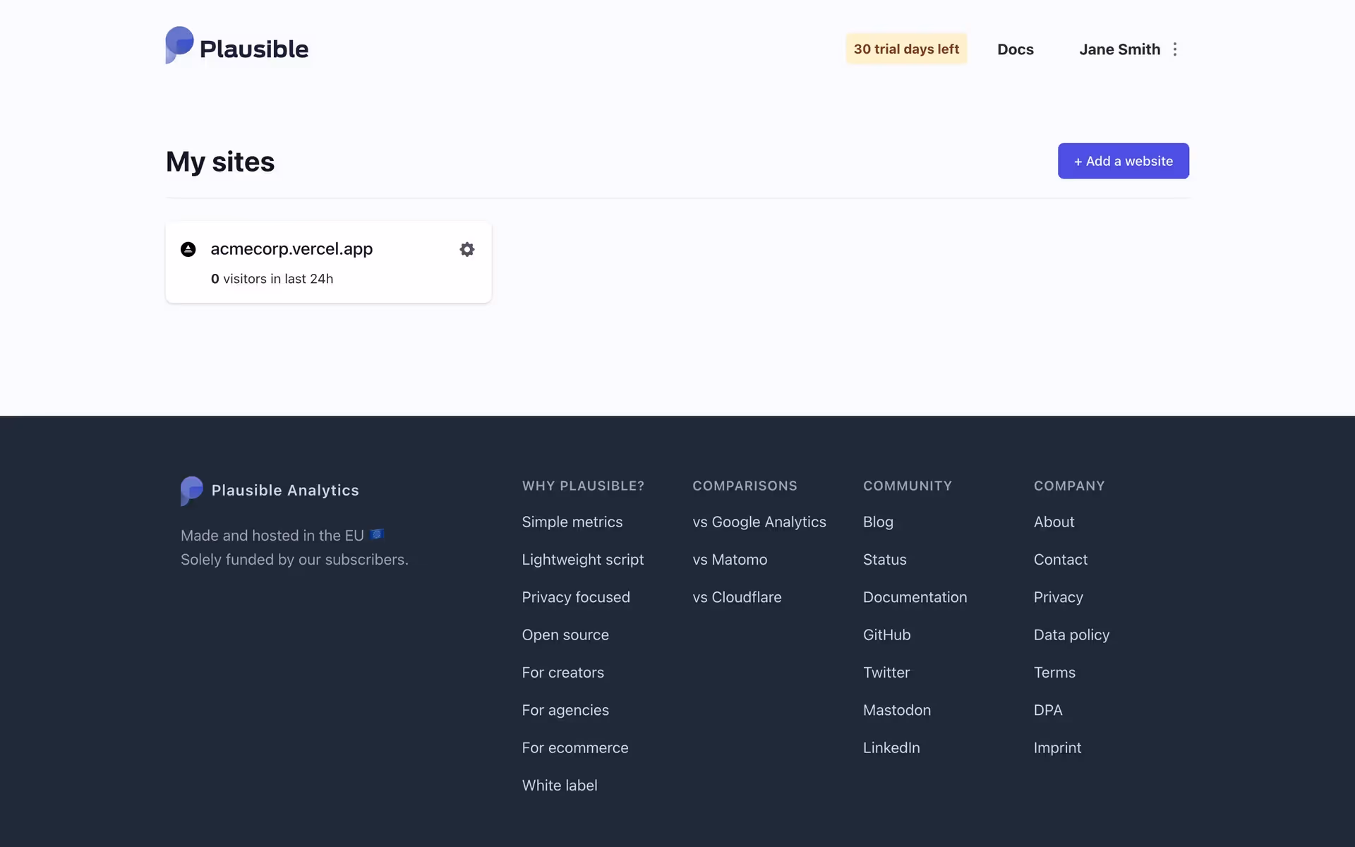
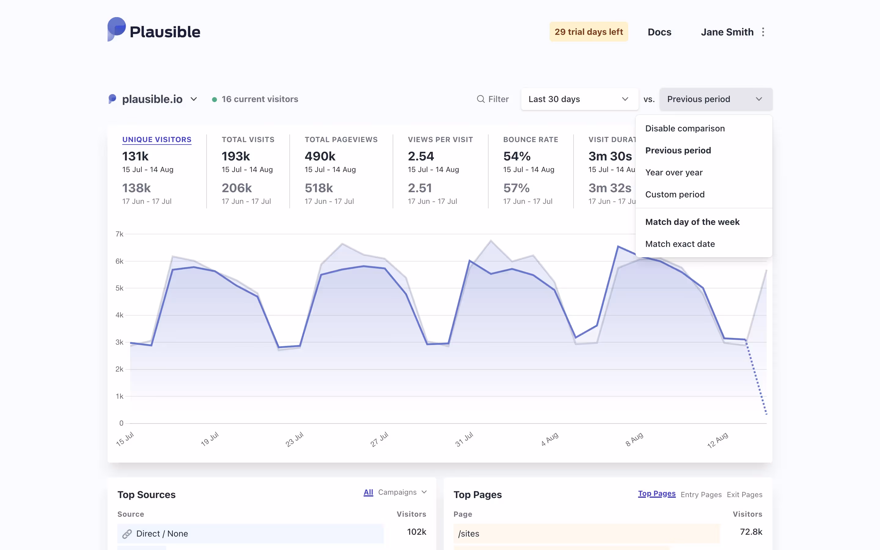
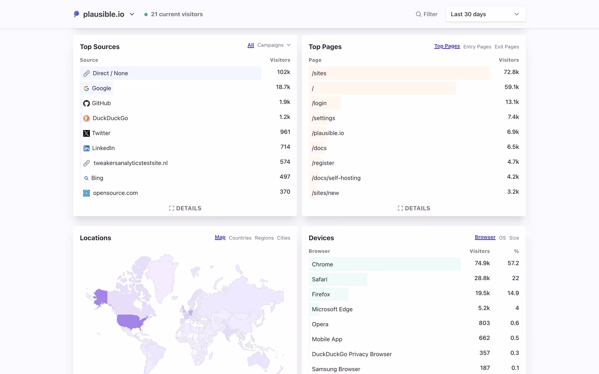
Plausible Analytics is a simple, privacy-friendly, and open-source web analytics platform. The general colors used in Plausible Analytics's branding and interface designs include Baltic Sea (#1C1B21), Catskill White (#F9FAFC), and Purple Heart (#4B38D8). You can easily copy Plausible Analytics's colors in Hex, CMYK, RGB, and other popular formats on this page.
The main colors in Plausible Analytics's color palette are Baltic Sea (#1C1B21), Catskill White (#F9FAFC), and Purple Heart (#4B38D8). These colors create a balanced and visually appealing interface, perfect for inspiring your next design project.
The primary color in Plausible Analytics's app, Baltic Sea (#1C1B21), conveys a sense of sophistication and reliability, aligning with the brand's identity as a trustworthy and professional analytics tool. Complementing this, Catskill White (#F9FAFC) and Purple Heart (#4B38D8) enhance the overall message by adding clarity and a touch of creativity, respectively, making the interface both user-friendly and visually appealing.
The history and key influences behind Plausible Analytics's color scheme are not explicitly documented. However, the brand's emphasis on simplicity, privacy, and transparency likely guided their choice of a clean, minimalistic palette that aligns with their user-friendly and privacy-focused ethos.
Plausible Analytics uses color psychology to create a calm and focused user experience. The dark gray of Baltic Sea ensures readability and professionalism, Catskill White provides a clean and spacious background, and Purple Heart highlights interactive elements, guiding your actions and enhancing trust.
To complement Plausible Analytics's primary color (#1C1B21), consider using shades like #FF6F61 (Coral), #00A8E8 (Vivid Sky Blue), and #FFD700 (Gold). These colors can create a balanced and visually appealing contrast, enhancing the overall user experience.
On Mobbin’s brand colors page, you can explore a curated list of brand color palettes from top companies. We also offer access to thousands of other UI designs and interfaces from various brands, making it a great resource for finding new color combinations and getting inspiration from real-world examples.
Mobbin helps you stay up-to-date with the latest UI/UX trends by offering an extensive, constantly updated collection of mobile and web design patterns. From color usage to user flows, our platform showcases the latest trends in UI/UX design, allowing you to easily explore current design practices and stay ahead in the industry.
Ready to elevate your design game? Try Mobbin today for free as long as you like, or get full access with any of our paid plans.
Use Mobbin for free as long as you like or get full access with any of our paid plans.


