#1db954
Copy
Copied


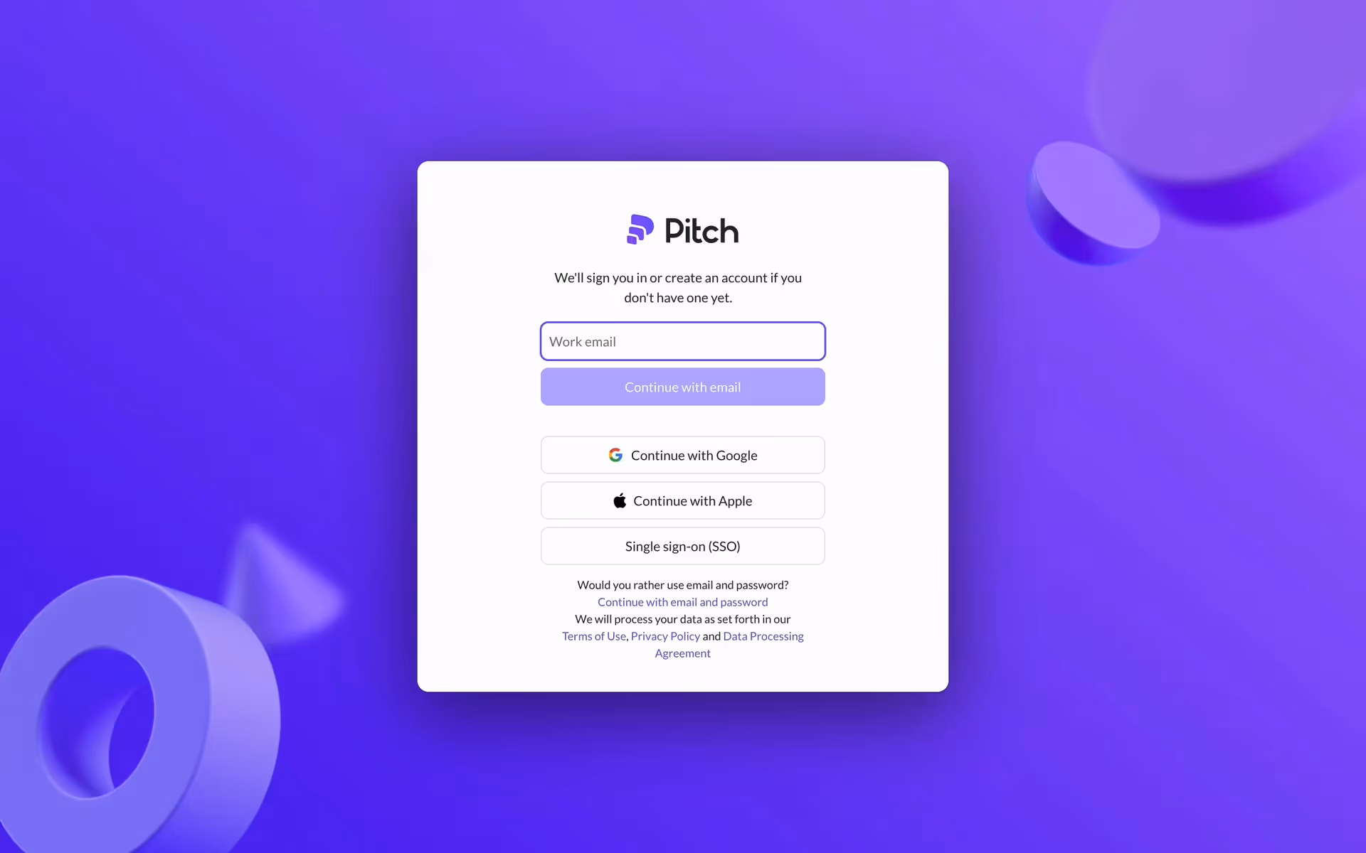
Pitch Software GmbH develops Pitch, a modern presentation platform for fast-moving teams. Its branding and interface primarily use Charade, White, and a distinctive Cornflower Blue. On our platform, you can easily copy its brand colors in Hex, CMYK, and RGB formats.
Pitch's color palette is built around a core trio of colors: Charade (#2B2A35), White (#FFFFFF), and a vibrant Cornflower Blue (#6B53FF). We've found this combination offers a great balance of professionalism and creative energy for your design projects.
Pitch's deep charcoal base (#2B2A35) establishes a sense of professionalism and stability, giving your ideas a sophisticated foundation. The pops of cornflower blue and crisp white then inject a layer of modern creativity and clarity, ensuring your message is both innovative and clear.
Pitch's color scheme was chosen to embody their brand as a modern, collaborative, and design-forward platform, helping you create presentations that feel both professional and fresh.
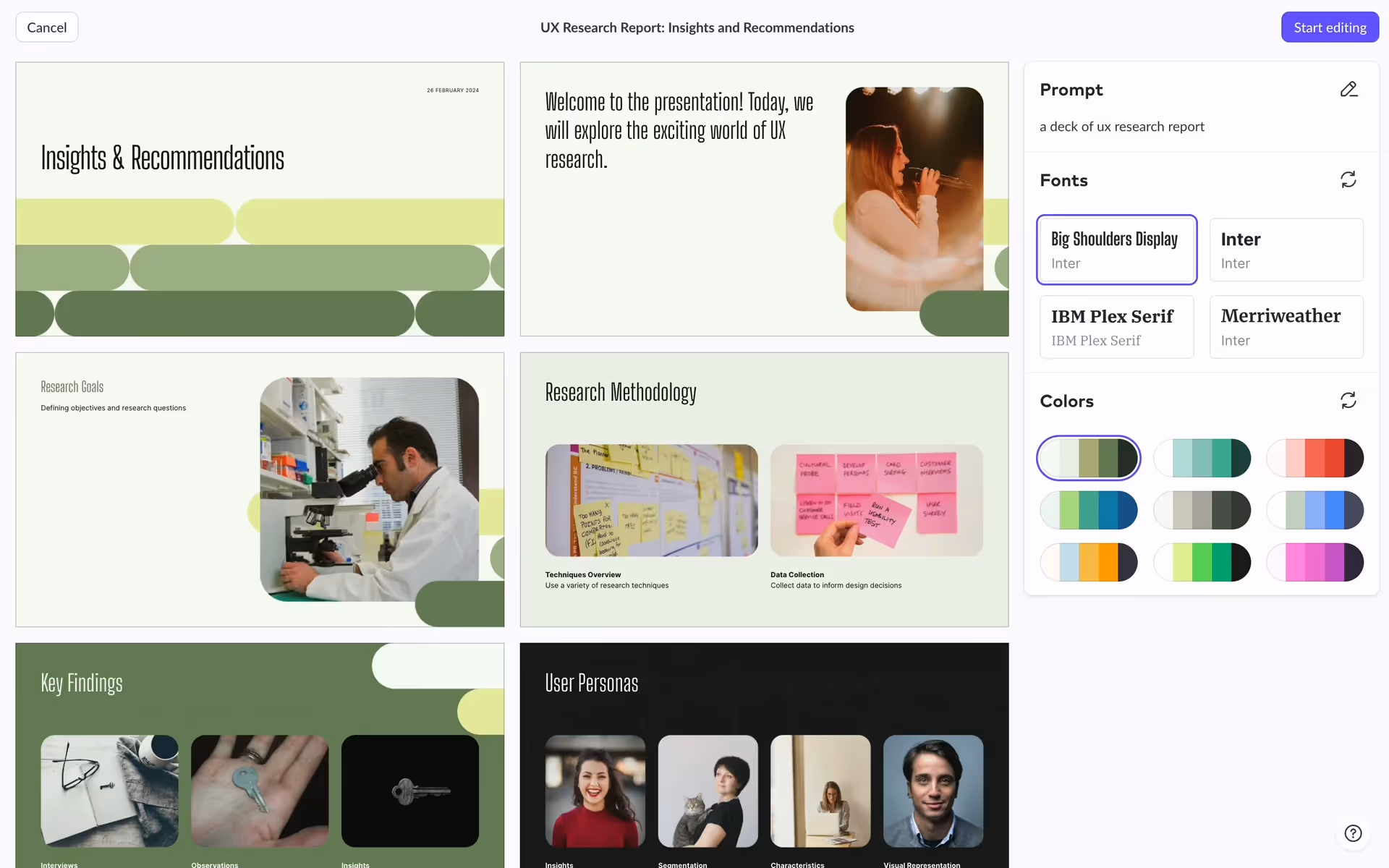
Pitch masterfully uses its high-contrast base to create a clean canvas, allowing the vibrant Cornflower Blue to guide your focus. This accent is strategically placed on calls-to-action and interactive elements, influencing your decisions and streamlining the entire presentation workflow.
To create a striking contrast with Pitch's deep primary color, we suggest exploring warm, earthy tones like a burnt sienna or a rich ochre. For a more vibrant, energetic feel that guides attention, you could also introduce a pop of marigold yellow to your palette.
On our brand colors page, you can explore curated color palettes from top companies. We also offer access to thousands of UI designs from various brands, providing endless inspiration for your next color combination.
Our extensive, constantly updated collection of mobile and web design patterns shows you the latest trends in UI/UX, from color usage to entire user flows. By exploring these real-world examples, you can easily discover current design practices and stay ahead in the industry.
You can try Mobbin today for free for as long as you like, or get full access with any of our paid plans.

Use Mobbin for free as long as you like or get full access with any of our paid plans.


