#1db954
Copy
Copied

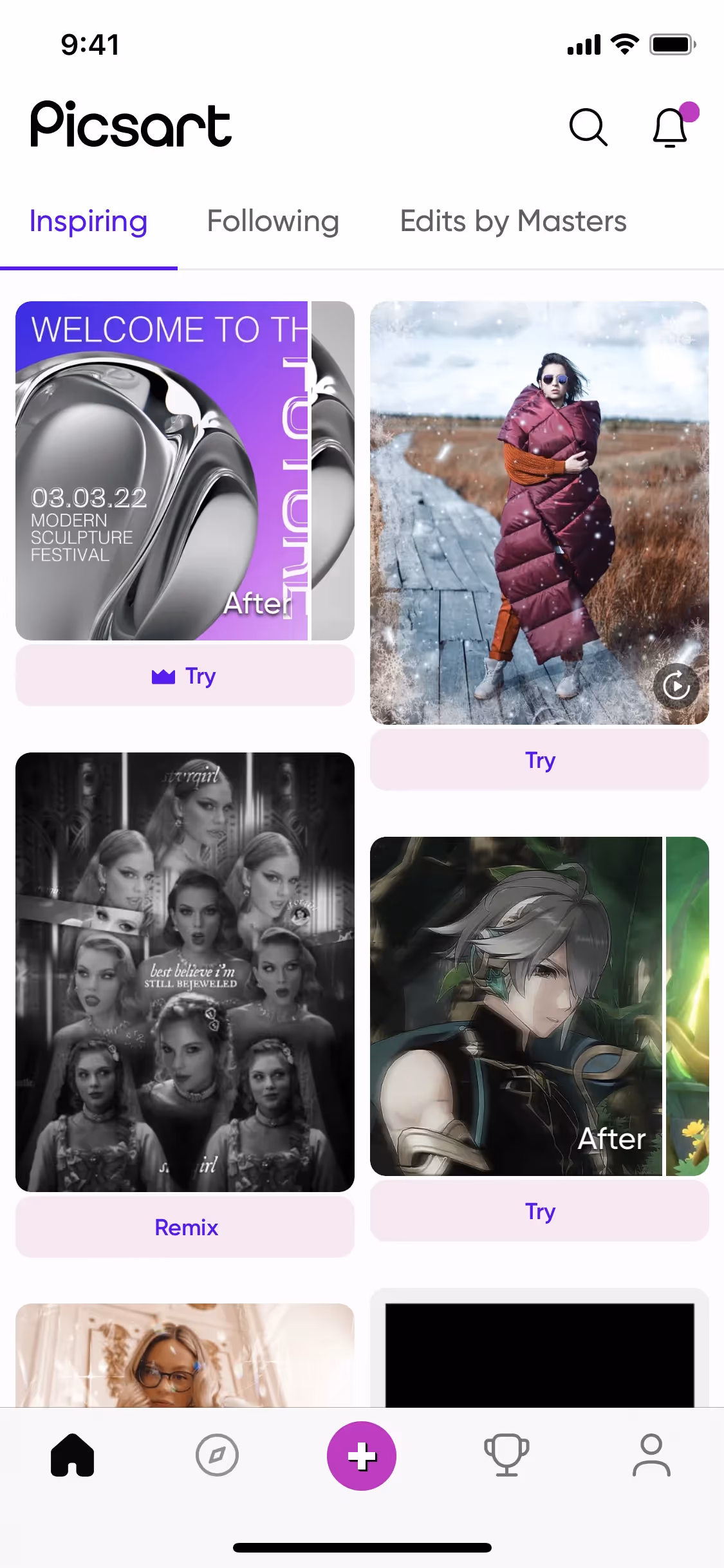
Picsart is a dynamic platform known for its robust photo and video editing tools. The brand's interface prominently features colors like Violet Eggplant, White, Charade, and Electric Violet. You can easily copy Picsart's colors in Hex, CMYK, RGB, and other popular formats on this page.
The main colors in Picsart's color palette are Violet Eggplant (#C209C1), White (#FFFFFF), Charade (#282B36), and Electric Violet (#5A00EE). These vibrant and contrasting hues can inspire your next design project, offering a dynamic range of options to enhance your creativity.
Picsart's primary color, Violet Eggplant (#C209C1), exudes creativity and innovation, aligning perfectly with the brand's identity as a hub for artistic expression. This vibrant hue is complemented by other prominent colors like White (#FFFFFF), which adds a clean, modern touch, and Charade (#282B36), providing a sophisticated contrast. Electric Violet (#5A00EE) further enhances the dynamic and energetic feel, making the overall palette both inspiring and visually engaging.
Unfortunately, there is no available information on the history, key influences, or evolution of Picsart's color scheme. The provided HTML content does not offer any insights into the design philosophy behind their brand colors. We encourage you to explore other resources or directly engage with Picsart's design team for more detailed information.
Picsart's color choices, such as Violet Eggplant, White, Charade, and Electric Violet, are strategically used to guide your actions and influence your decisions. These colors create specific user experiences by drawing attention to key features and enhancing the overall aesthetic appeal, making your interaction with the app both intuitive and visually engaging.
To complement Picsart's primary color (#C209C1), consider using shades like teal (#008080) for a striking contrast, or soft pastels like mint green (#98FF98) and peach (#FFDAB9) to create a balanced and harmonious palette. These choices can enhance your design's visual appeal and provide a fresh, dynamic look.
On Mobbin’s brand colors page, you can explore a curated list of brand color palettes from top companies. We also offer access to thousands of other UI designs and interfaces from various brands, making it a great resource for finding new color combinations and getting inspiration from real-world examples.
Mobbin offers an extensive, constantly updated collection of mobile and web design patterns, showcasing the latest trends in UI/UX design, from color usage to user flows. By using Mobbin, you can easily explore current design practices and stay ahead of trends in the industry.
Ready to elevate your design game? Try Mobbin today for free as long as you like, or get full access with any of our paid plans.
Use Mobbin for free as long as you like or get full access with any of our paid plans.


