#1db954
Copy
Copied

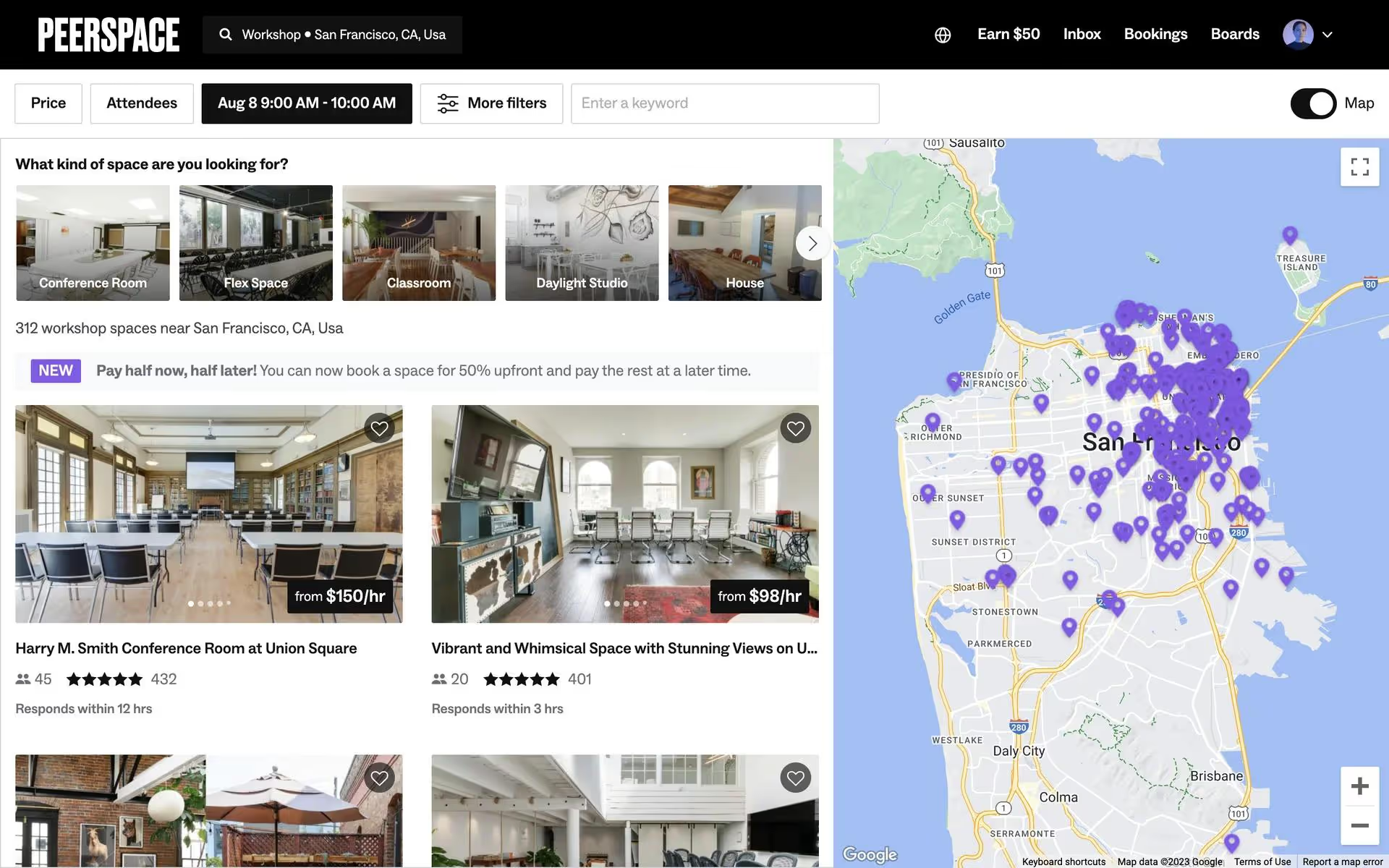
Peerspace, Inc. is an online marketplace for hourly venue and production space rentals. Its branding and interface designs feature a simple palette of brown, black, and white. On this page, you can easily copy these colors in Hex, CMYK, RGB, and more.
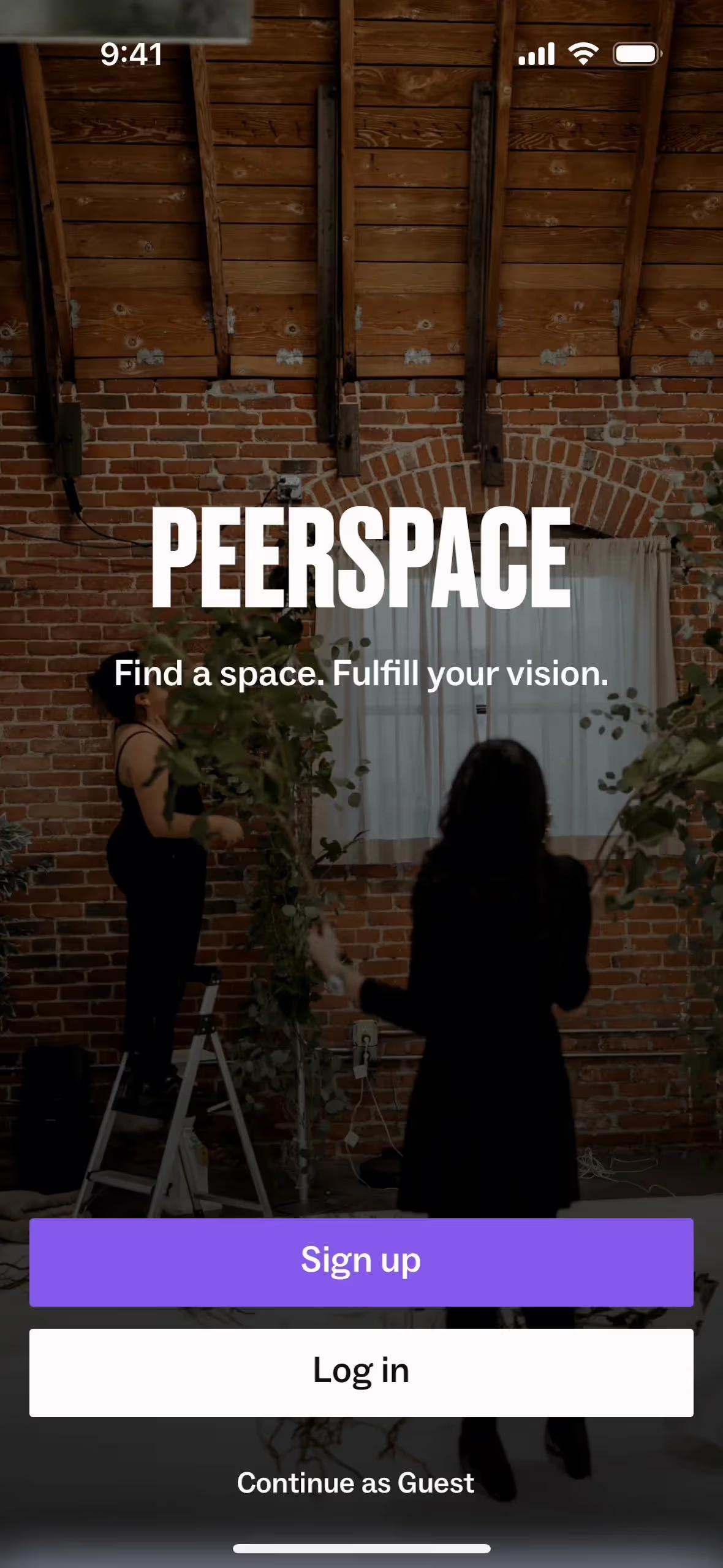
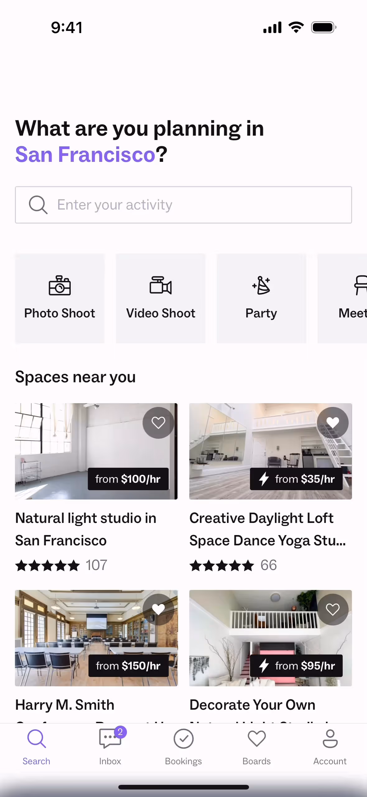
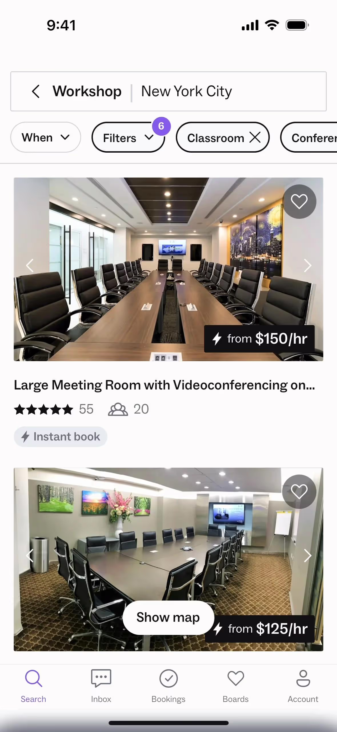
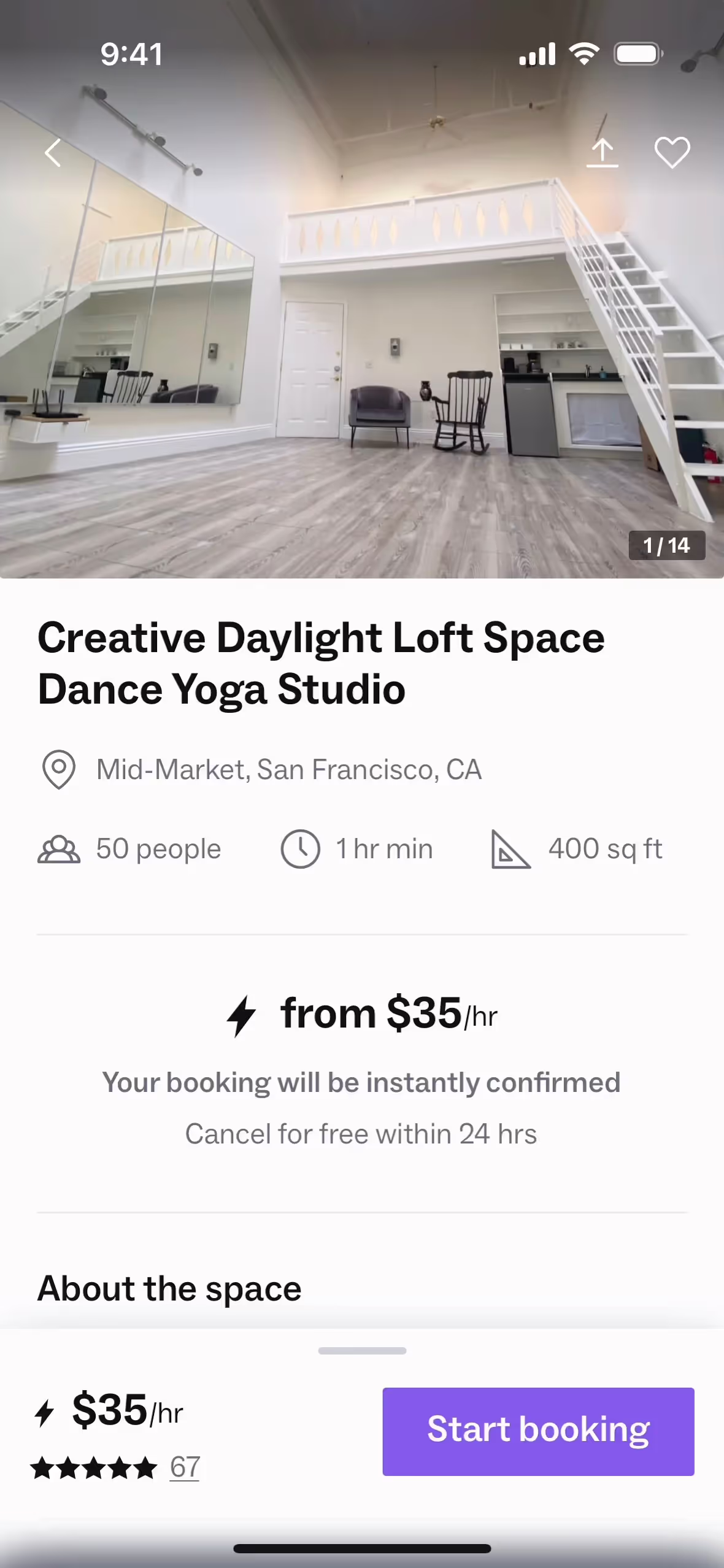
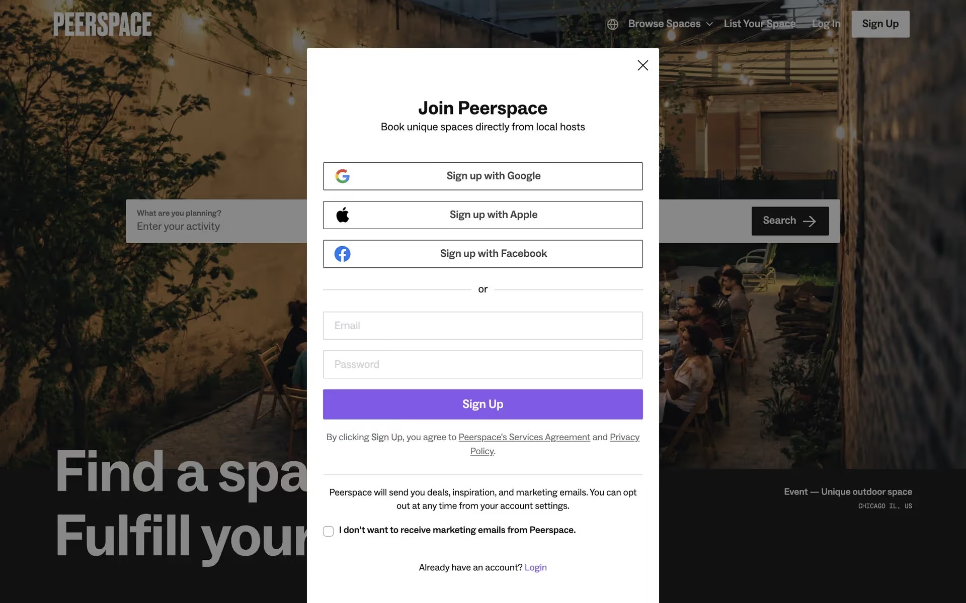
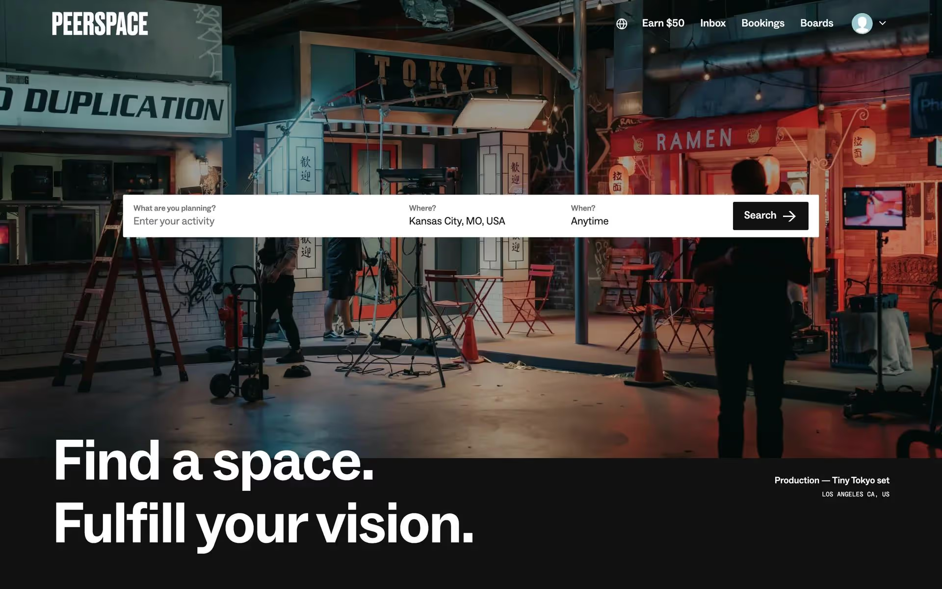
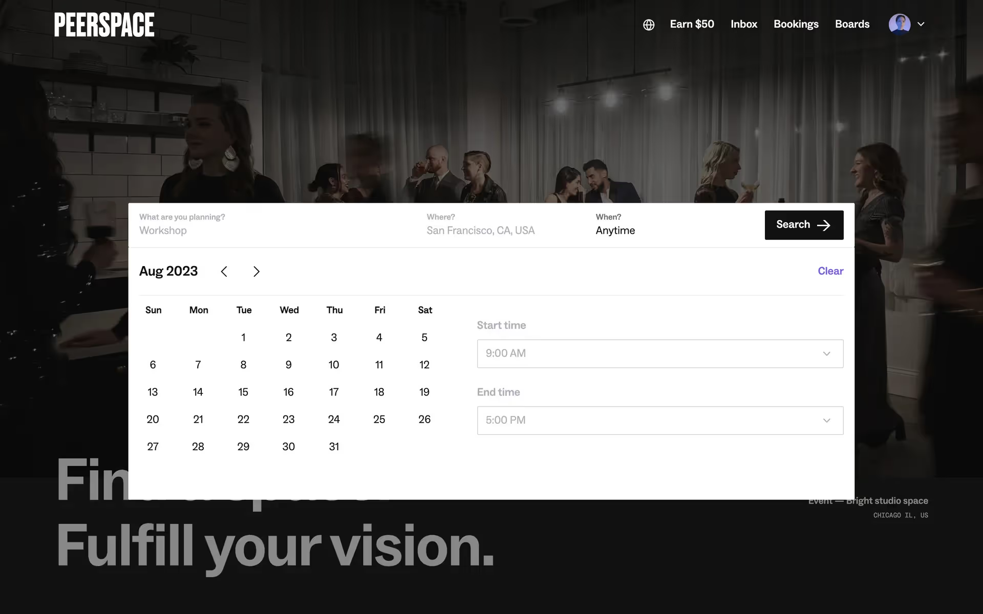
You'll find that Peerspace's core color palette consists of a warm brown (Dallas, #72502B), a dark gray (Mine Shaft, #313131), and a classic white (#FFFFFF), creating a clean and inviting user experience.
Peerspace's signature earthy brown evokes warmth and reliability, perfectly reflecting the unique and dependable spaces you can find. This is complemented by a sophisticated dark gray and clean white, creating a professional yet approachable canvas for your creative projects.
While Peerspace hasn't publicly detailed the history of its color choices, the palette is clearly a strategic decision to support the brand's mission of fostering creativity and providing a trustworthy platform for your unique projects.
Peerspace leverages a clean white and dark gray foundation to make its stunning venue photography the hero of the experience. The earthy Dallas brown then acts as a warm, trustworthy guide, subtly encouraging you to take key actions like booking a space.
To make their signature brown pop, we suggest introducing a cool, muted blue for contrast. For a more subtle, earthy feel, you could also incorporate shades of sage green or a warm, sandy beige to create a balanced and inviting palette.
On our brand colors page, you can explore a curated list of color palettes from top companies. We also offer access to thousands of other UI designs from various brands, providing endless inspiration for new color combinations from real-world examples.
Our platform offers an extensive, constantly updated library of mobile and web design patterns, allowing you to see the latest trends in everything from color usage to user flows. By exploring our collection, you can easily discover current design practices and stay ahead of the curve in the fast-paced world of UI/UX.
You can try Mobbin today for free for as long as you like, or get full access with any of our paid plans.
Use Mobbin for free as long as you like or get full access with any of our paid plans.


