#1db954
Copy
Copied

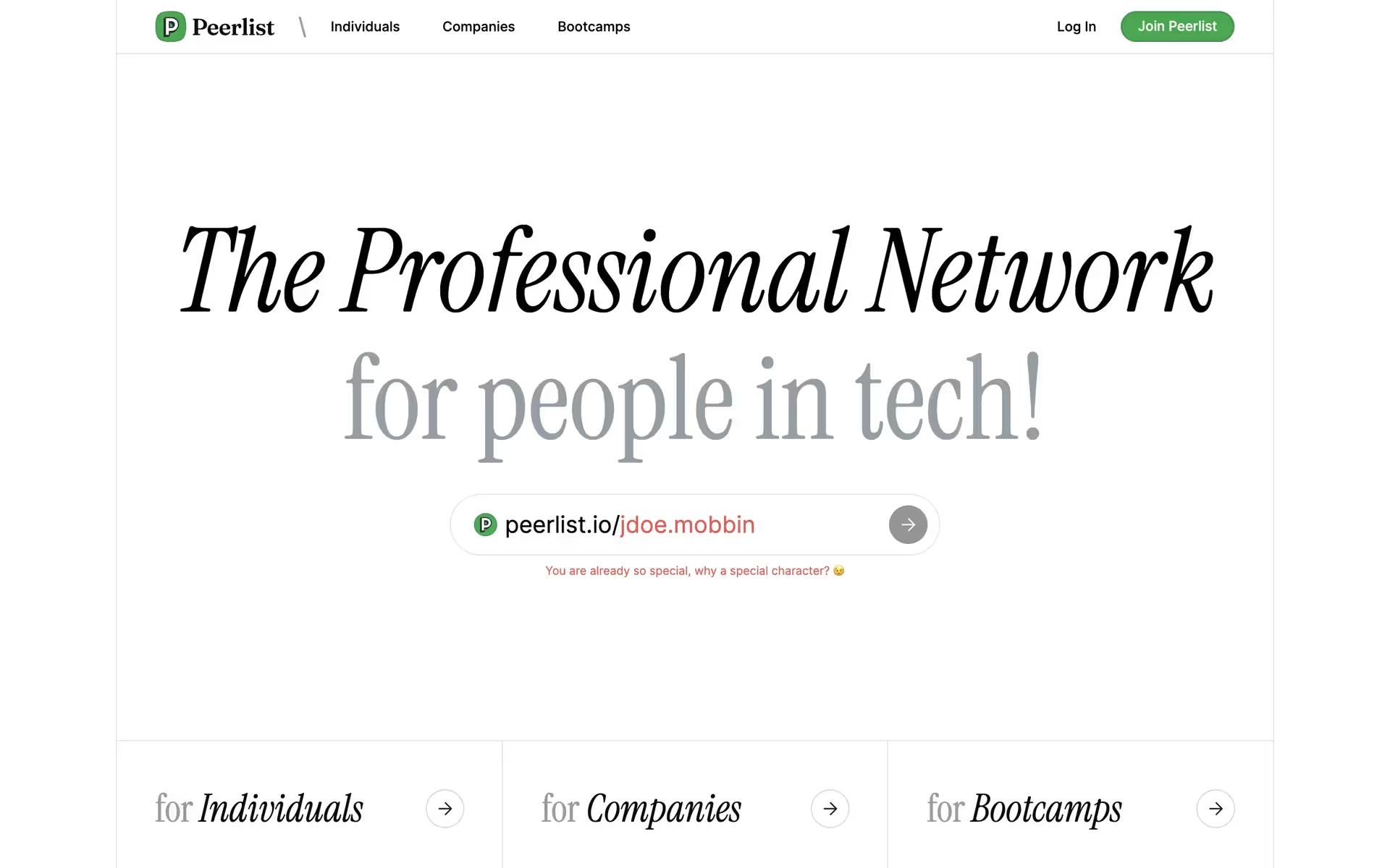
Peerlist Inc. is a professional network for people in tech. Their branding and interface designs feature a clean palette of Green Haze, Mine Shaft, and White. You can easily copy these colors in Hex, CMYK, RGB, and other popular formats right here on our page.
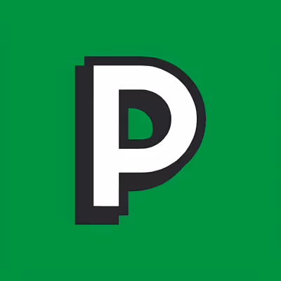
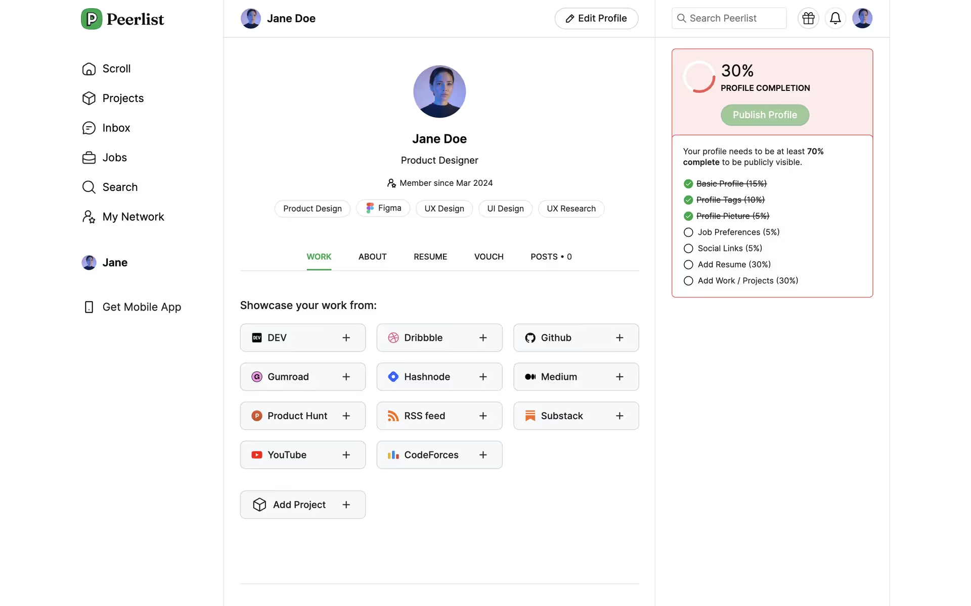
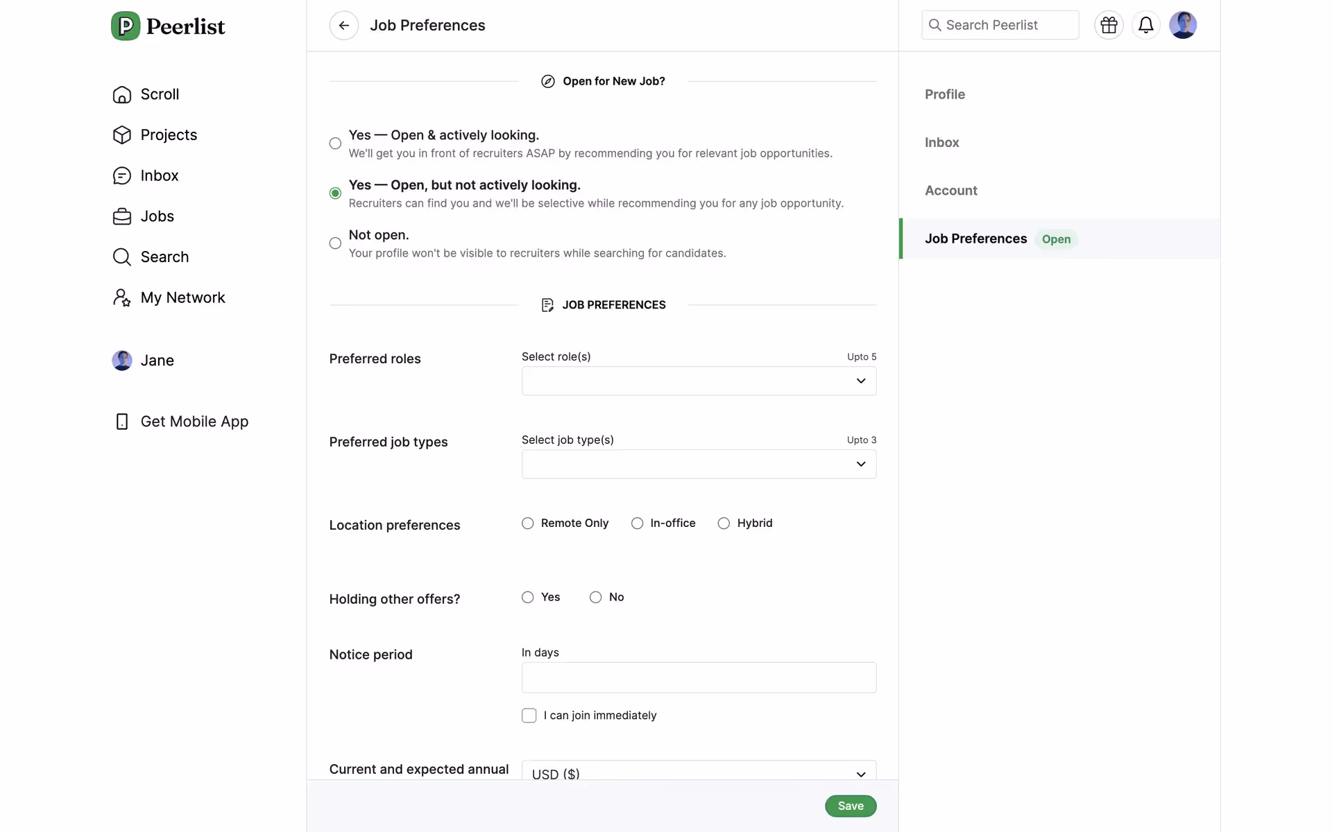
Peerlist's main colors are a striking Green Haze (#00AA45), a solid Mine Shaft (#313131), and a clean White (#FFFFFF). We find this combination offers a great starting point for creating a visually balanced and modern interface.
Peerlist's signature green embodies growth and opportunity, signaling the professional progress you can achieve on the platform. This vibrant hue is balanced by a crisp white and a deep gray, creating a clean, focused space for you to showcase your work and connect with peers.
Peerlist's color scheme appears intentionally crafted to mirror its community of builders. The choice of a vibrant green accent against a clean, professional backdrop evokes a sense of innovation and focused work, creating an environment where your ideas can flourish.
The vibrant Green Haze acts as a powerful psychological cue for "go," guiding you toward key actions like launching projects, while the high-contrast Mine Shaft and clean White create a focused, professional environment that builds trust and encourages engagement.
For a striking contrast, consider a warm coral or deep navy for accents, which can make your calls-to-action pop. Alternatively, to create a more harmonious and earthy palette, we suggest exploring shades of soft beige or a muted gold to balance the primary green.
On our brand colors page, you can explore a curated list of color palettes from top companies. We also offer access to thousands of other UI designs and interfaces from various brands, making it a great resource for finding new color combinations and getting inspiration from real-world examples.
Our platform offers an extensive, constantly updated library of mobile and web design patterns, allowing you to see the latest UI/UX trends in action—from innovative color palettes to seamless user flows. By exploring our curated collection, you can easily discover current design practices and stay ahead of the curve in the ever-evolving design industry.
Why not try Mobbin today? You can use it for free for as long as you like, or get full access with one of our paid plans.
Use Mobbin for free as long as you like or get full access with any of our paid plans.


