#1db954
Copy
Copied

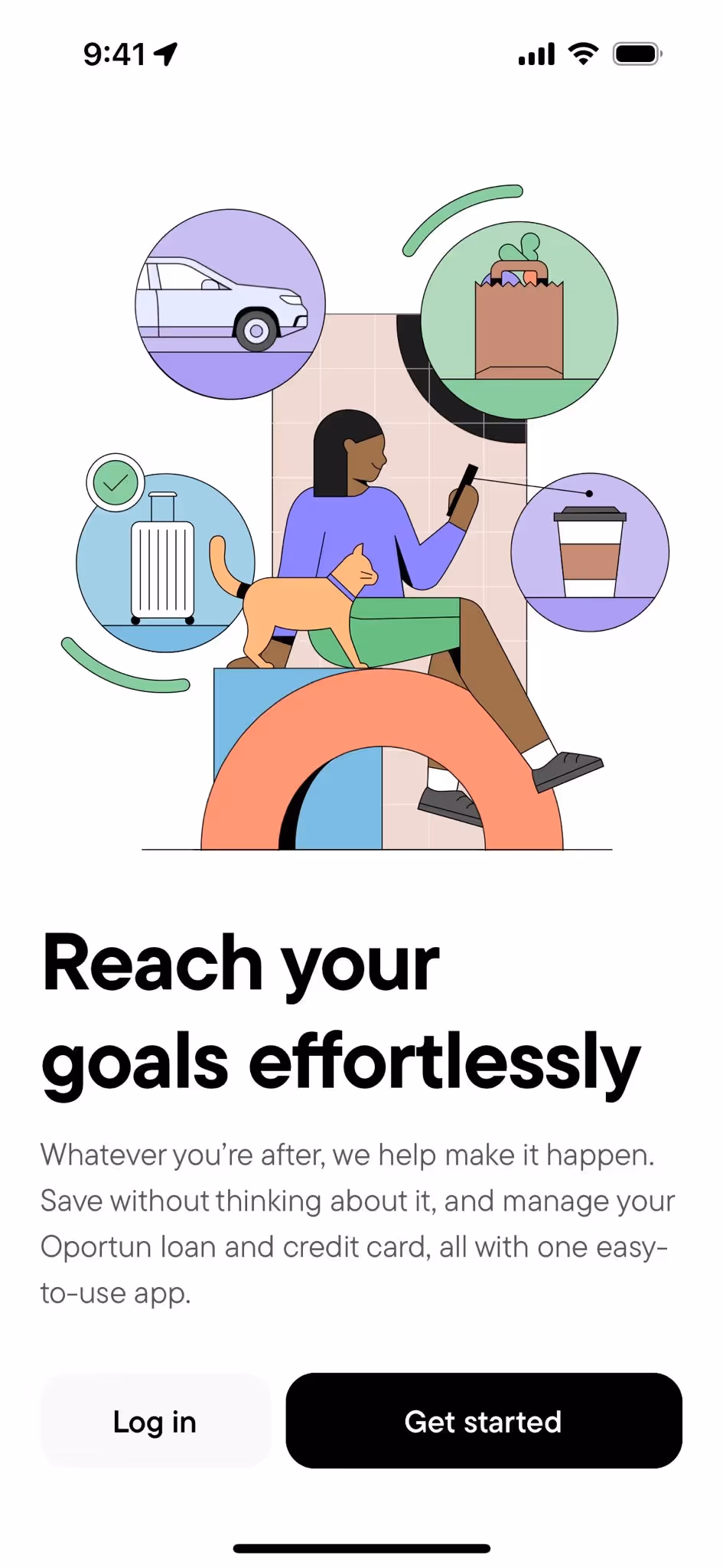
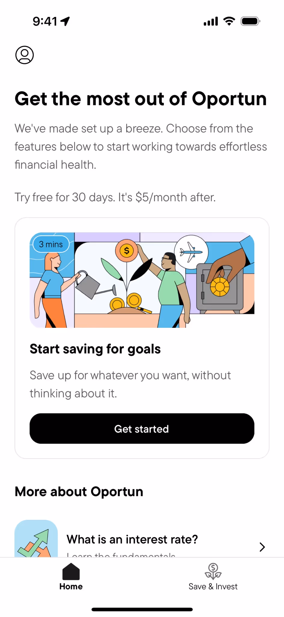
Hello Digit, LLC, now Oportun, is a popular personal finance management app. Its branding and interface designs feature Honeydew Green, Black, a distinctive Lavender Mist and more. You can easily copy Oportun's colors in Hex, CMYK, RGB, and other popular formats on this page.
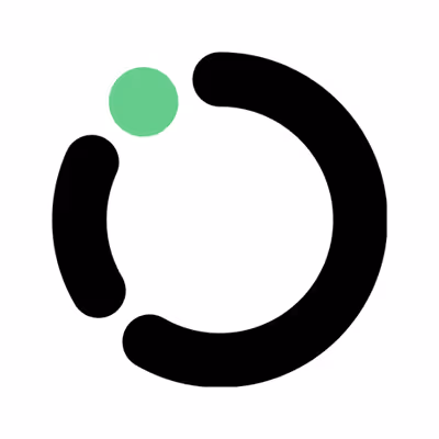
To help you nail the look, we've identified Oportun's primary colors as a refreshing Honeydew Green (#BFEBC9), a foundational Black (#000000), and a calming Lavender Mist (#B19DF5).
Oportun's primary Honeydew Green evokes a sense of calm and financial growth, assuring you of a fresh start. We find the supporting black and lavender add a perfect balance of stability and modern approachability, creating a palette that feels both trustworthy and innovative.
From our analysis, Oportun's color palette seems intentionally chosen to reflect its mission of providing accessible financial solutions, inspiring trust and optimism for its users.
While Oportun hasn't publicly detailed the specific strategic thinking behind its color palette, you can explore our library to see how these colors are applied in practice to create a clear and trustworthy user experience.
To build on Oportun's refreshing green, we suggest exploring a soft peach for a warm, inviting contrast, or a deep charcoal to ground the design with modern sophistication. These additions can help you create a more dynamic and balanced visual experience.
On our brand colors page, you can explore a curated list of color palettes from top companies. We also offer access to thousands of other UI designs and interfaces from various brands, making it a great resource for finding new color combinations and getting inspiration from real-world examples.
Our platform offers an extensive, constantly updated library of mobile and web design patterns, allowing you to see the latest trends in everything from color usage to intricate user flows. By exploring our collection, you can easily keep a pulse on current design practices and stay ahead of the curve in the fast-evolving UI/UX industry.
You can try Mobbin today for free for as long as you like, or get full access with any of our paid plans.

Use Mobbin for free as long as you like or get full access with any of our paid plans.


