#1db954
Copy
Copied

OpenAI is a leading artificial intelligence research and deployment company. Their branding and interface designs primarily feature a minimalist palette of Cod Gray and White. We've made it easy for you to copy their official colors in Hex, CMYK, RGB, and other popular formats on this page.
OpenAI's core color palette is a study in minimalism, primarily featuring Cod Gray (#080808) and White (#FFFFFF). We find this high-contrast duo creates a clean, focused aesthetic, providing a great source of inspiration for your own designs.
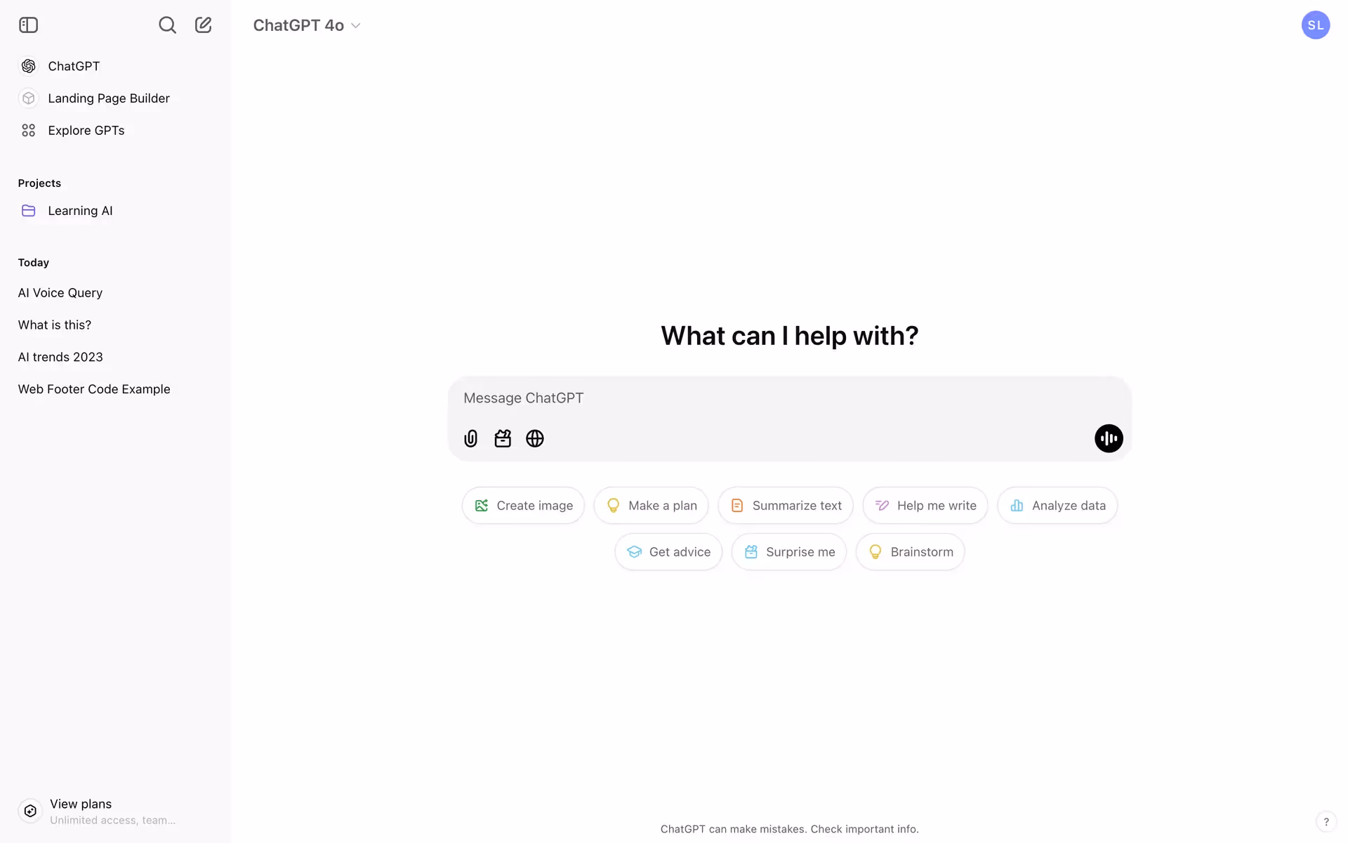
In OpenAI's palette, we see the deep, near-black gray conveying sophistication and the profound potential of AI. The contrasting crisp white brings a sense of clarity, making their powerful technology feel more accessible and open for you to explore.
From our perspective, OpenAI's color scheme is rooted in a minimalist, tech-forward ethos, using its black-and-white base to communicate clarity. This allows you to focus on the product-specific gradients, which signal a blend of human creativity and powerful innovation.
We see OpenAI masterfully use its high-contrast palette of Cod Gray and White to create a focused, uncluttered digital space. This deliberate minimalism guides your eye to essential interactions, reinforcing the platform's sophisticated, tool-like identity and empowering you to create without distraction.
To build on their stark, monochrome foundation, we suggest introducing a vibrant, tech-forward cyan for a splash of energy, or a deep, earthy green to ground the brand with a more human, organic feel.
On our brand colors page, you can explore curated color palettes from top companies. We also offer thousands of UI designs from various brands, providing endless inspiration for your next color combination.
Mobbin keeps you at the forefront of design with our extensive, constantly updated library of mobile and web UI/UX patterns. By exploring the latest trends in everything from color palettes to intricate user flows from top apps, you can easily absorb current best practices and stay ahead of the curve in the fast-paced design industry.
You can try Mobbin today for free for as long as you like, or unlock full access with one of our paid plans.
Use Mobbin for free as long as you like or get full access with any of our paid plans.


