#1db954
Copy
Copied

Notion is a productivity and collaboration platform known for its unified workspace. The general colors used in Notion's branding and interface designs are black and white. You can easily copy Notion's colors in Hex, CMYK, RGB, and other popular formats on this page.
The main colors in Notion's color palette are Black (#000000) and White (#FFFFFF), providing a clean and minimalist aesthetic that enhances readability and focus.
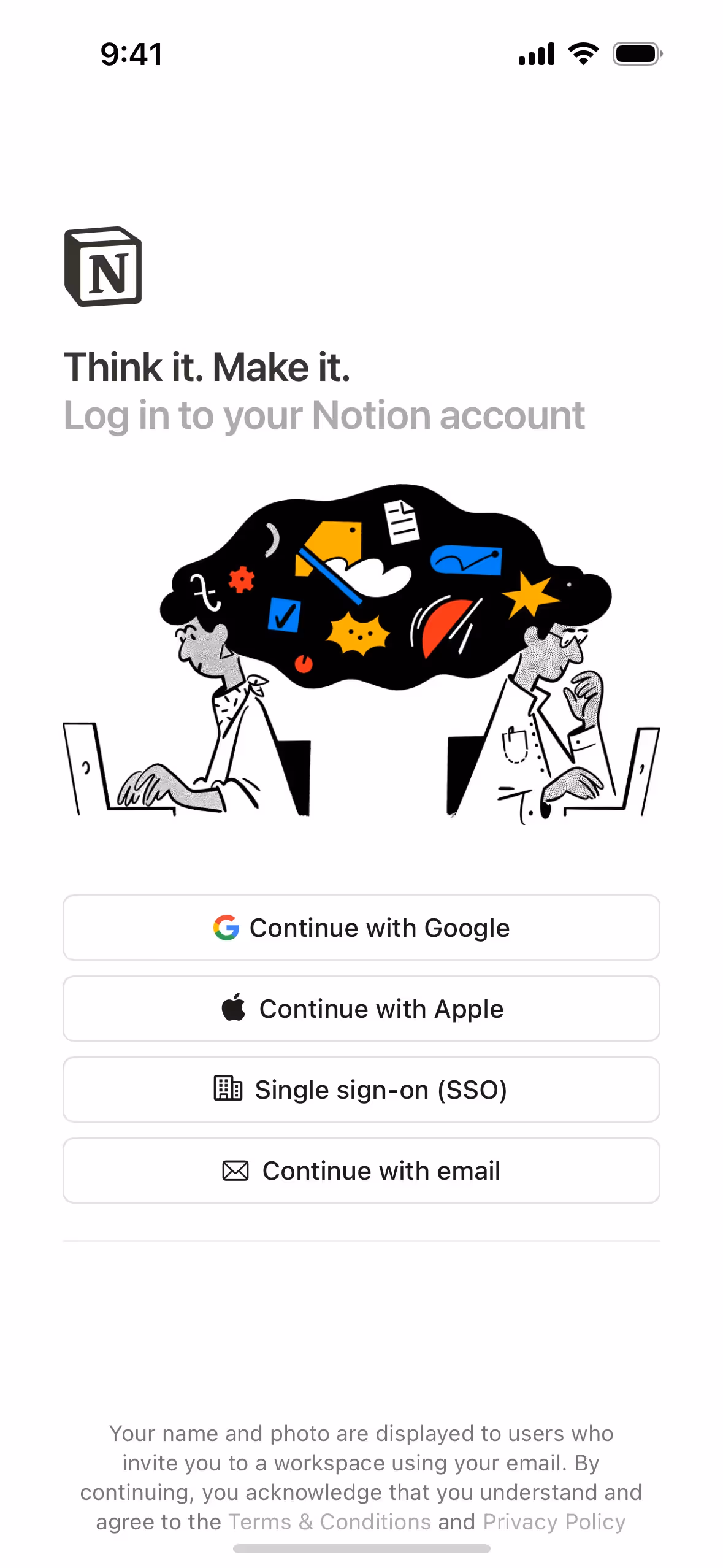
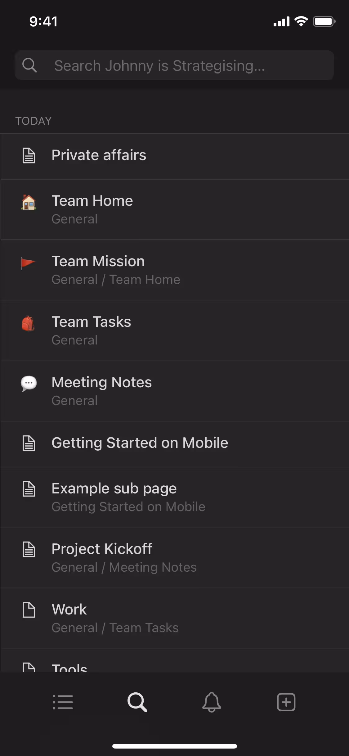
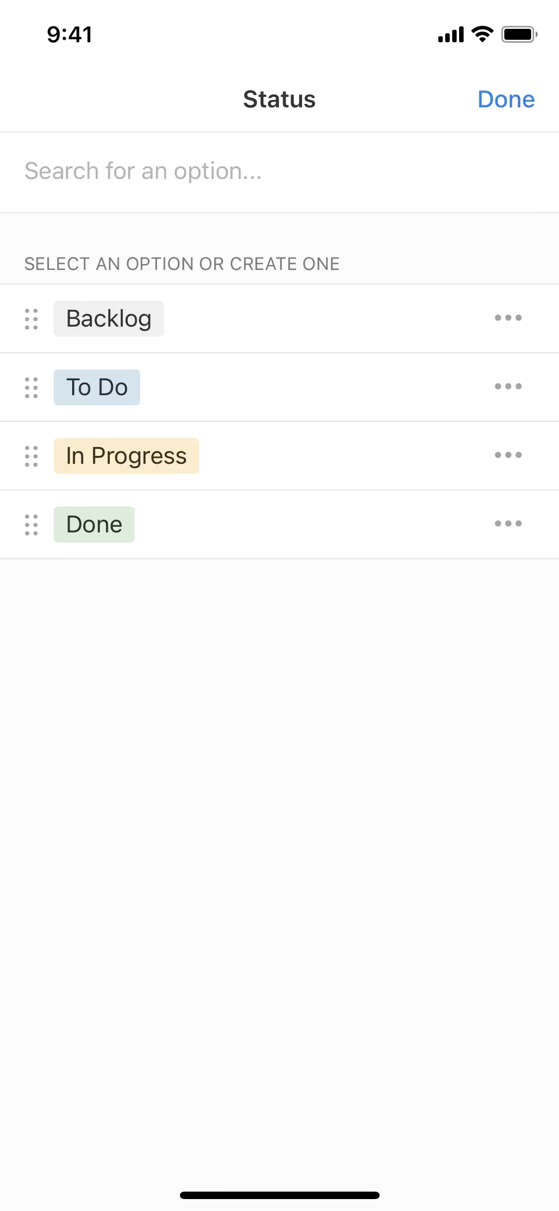
In Notion's app and website, the primary color black (#000000) conveys a sense of sophistication, clarity, and focus, aligning perfectly with the brand's identity as a versatile and professional tool. This choice of color underscores Notion's commitment to providing a clean and distraction-free workspace. Complementing this, the use of white (#FFFFFF) enhances readability and creates a balanced, minimalist aesthetic, further reinforcing the brand's emphasis on simplicity and efficiency.
Notion's color scheme is designed to be clean and minimalistic, reflecting its focus on simplicity and functionality. The choice of colors is influenced by the need to create a calm and distraction-free workspace, enhancing user productivity and clarity.
Notion's strategic use of black and white colors in its interface designs creates a clean, minimalist aesthetic that guides your actions and enhances focus. The contrast between black and white helps to highlight key elements, making navigation intuitive and user decisions more straightforward.
To complement Notion's primary color (#000000), consider using shades like #FF5733 (a vibrant orange) for a striking contrast, or #2ECC71 (a fresh green) to create a balanced and harmonious look. These colors can enhance your design by adding depth and visual interest while maintaining a cohesive aesthetic.
On Mobbin’s brand colors page, you can explore a curated list of brand color palettes from top companies. We also offer access to thousands of other UI designs and interfaces from various brands, making it a great resource for finding new color combinations and getting inspiration from real-world examples.
Mobbin offers an extensive, constantly updated collection of mobile and web design patterns, showcasing the latest trends in UI/UX design, from color usage to user flows. By using Mobbin, you can easily explore current design practices and stay ahead of trends in the industry.
Ready to elevate your design game? Try Mobbin today for free as long as you like, or get full access with any of our paid plans.


Use Mobbin for free as long as you like or get full access with any of our paid plans.


