#1db954
Copy
Copied

Must App Corp is a global community and social network for movie fans. Must App Corp's general colors include Black (#000000), White (#FFFFFF), and Azure Radiance (#01A1FF), which are used in its branding and interface designs. You can easily copy Must App Corp's colors in Hex, CMYK, RGB, and other popular formats on this page.
The main colors in Must App Corp's color palette are Black (#000000), White (#FFFFFF), and Azure Radiance (#01A1FF). These colors provide a versatile and vibrant foundation for your design projects.
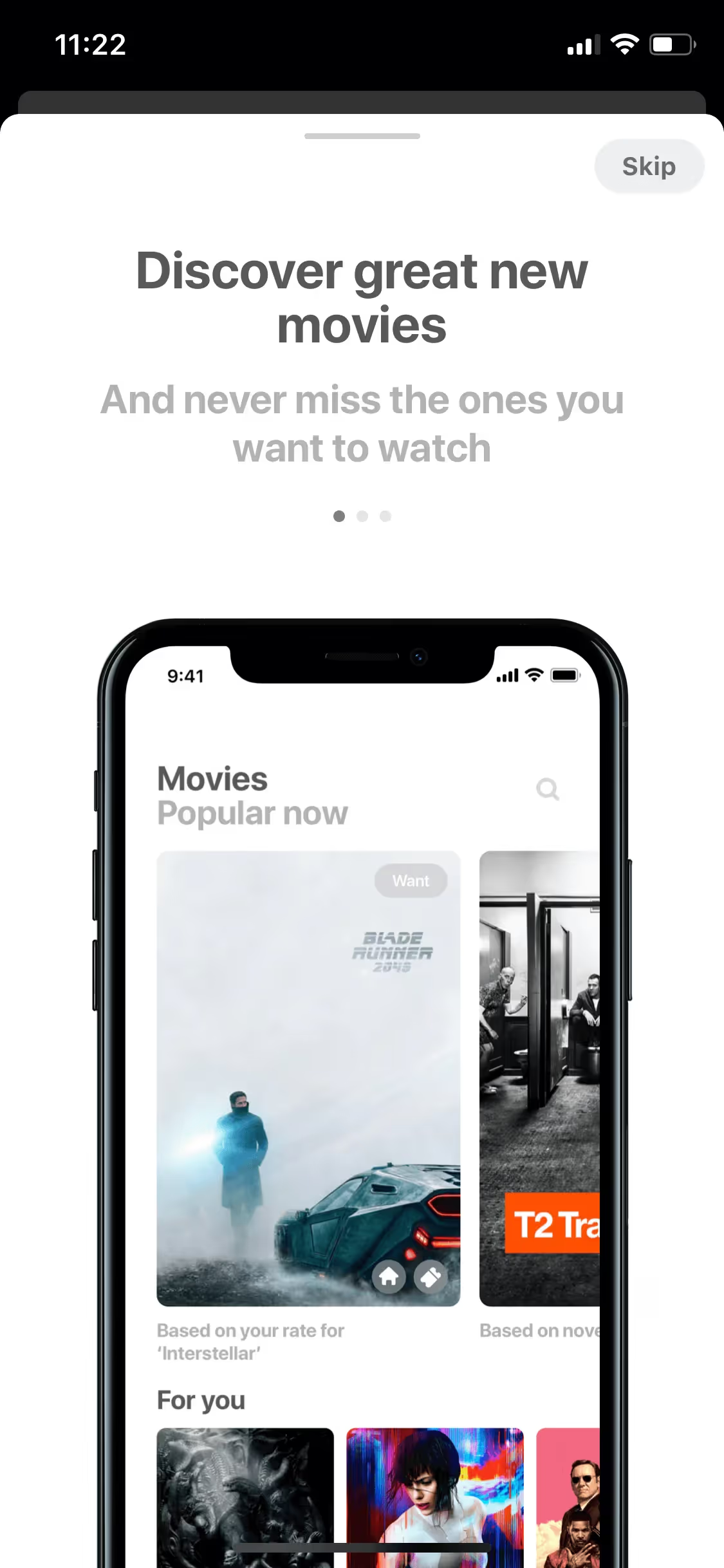
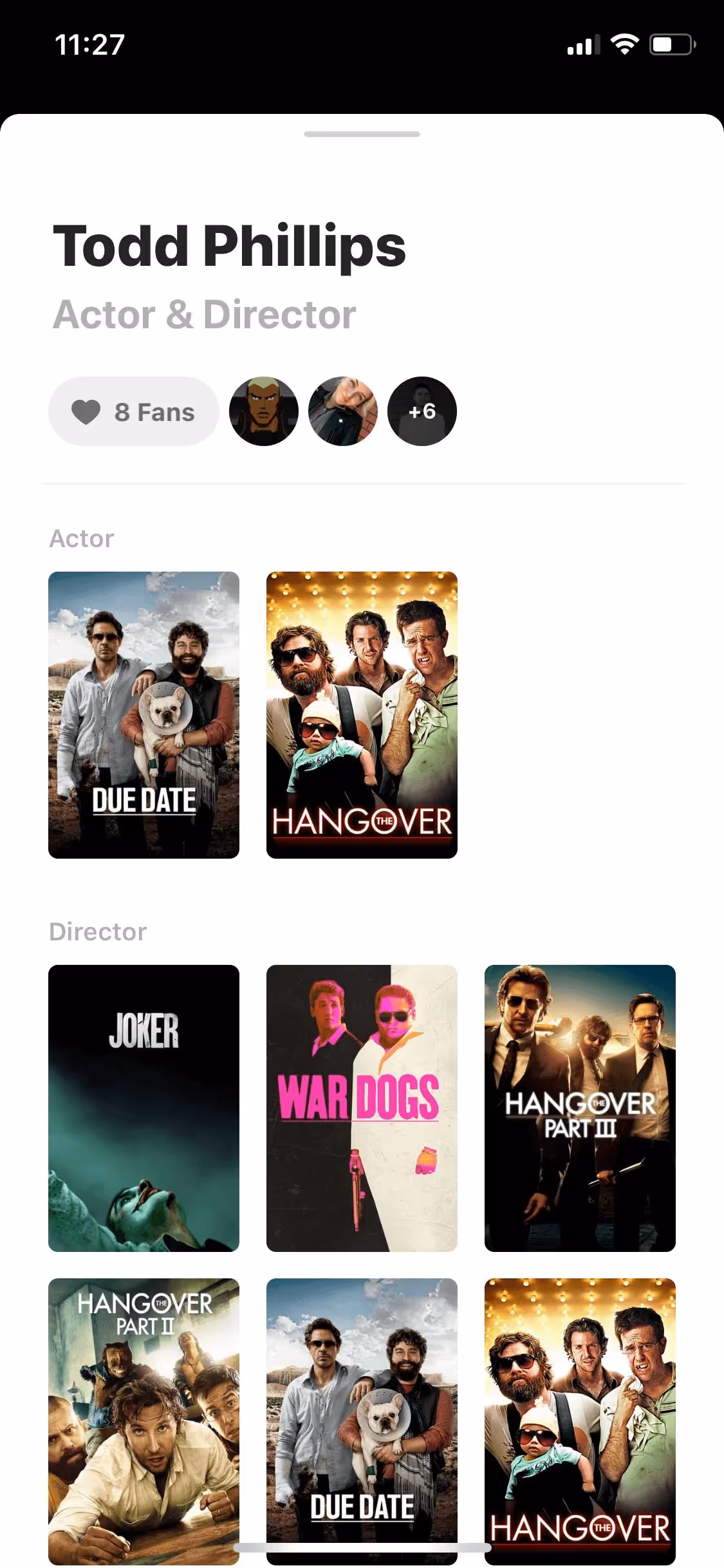
The primary color in Must App Corp's app, black (#000000), conveys a sense of sophistication, authority, and elegance, aligning with the brand's identity of being a reliable and premium service. Complementing this, white (#FFFFFF) provides a clean, minimalist backdrop that enhances readability and user focus, while Azure Radiance (#01A1FF) adds a touch of vibrancy and modernity, making the interface feel fresh and engaging.
The history and key influences behind Must App Corp's color scheme are not explicitly detailed. However, the choice of colors likely reflects the brand's aim to create a vibrant, engaging, and community-driven platform for movie enthusiasts. The colors are designed to resonate with users, enhancing the overall user experience and making the app visually appealing.
Must App Corp strategically uses Black (#000000) to create a sophisticated and focused backdrop, White (#FFFFFF) to enhance readability and clarity, and Azure Radiance (#01A1FF) to draw attention to key actions and instill a sense of trust and energy. These color choices guide your actions, influence your decisions, and create an engaging user experience.
To complement Must App Corp's primary color (#000000), consider using shades like deep red (#8B0000) for a bold contrast, or a soft gray (#A9A9A9) to create a balanced, sophisticated look. Additionally, a vibrant yellow (#FFD700) can add a touch of energy and warmth to your design.
On Mobbin’s brand colors page, you can explore a curated list of brand color palettes from top companies. We also offer access to thousands of other UI designs and interfaces from various brands, making it a great resource for finding new color combinations and getting inspiration from real-world examples.
Mobbin offers an extensive, constantly updated collection of mobile and web design patterns, showcasing the latest trends in UI/UX design, from color usage to user flows. By using Mobbin, you can easily explore current design practices and stay ahead of trends in the industry.
Don't miss out—try Mobbin today for free as long as you like, or get full access with any of our paid plans.
Use Mobbin for free as long as you like or get full access with any of our paid plans.


