#1db954
Copy
Copied


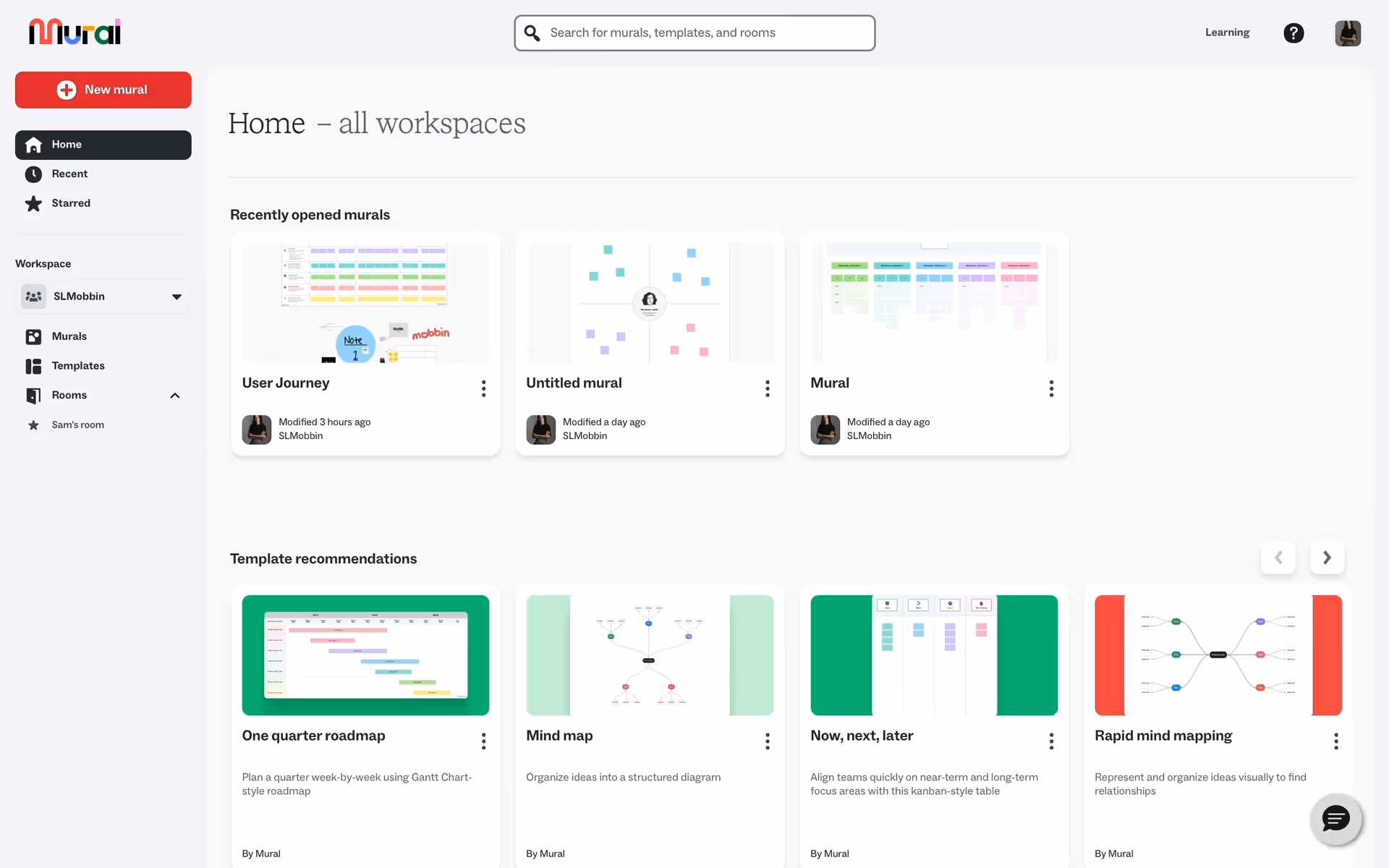
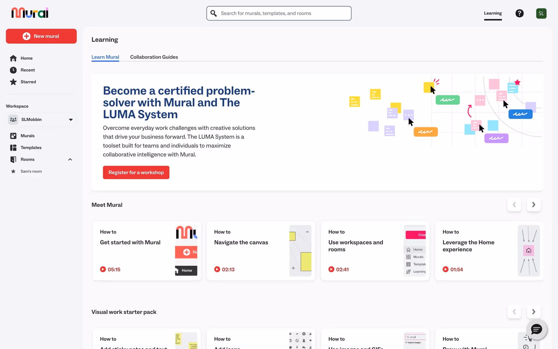
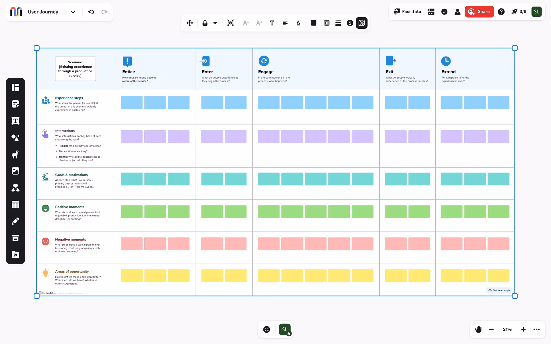
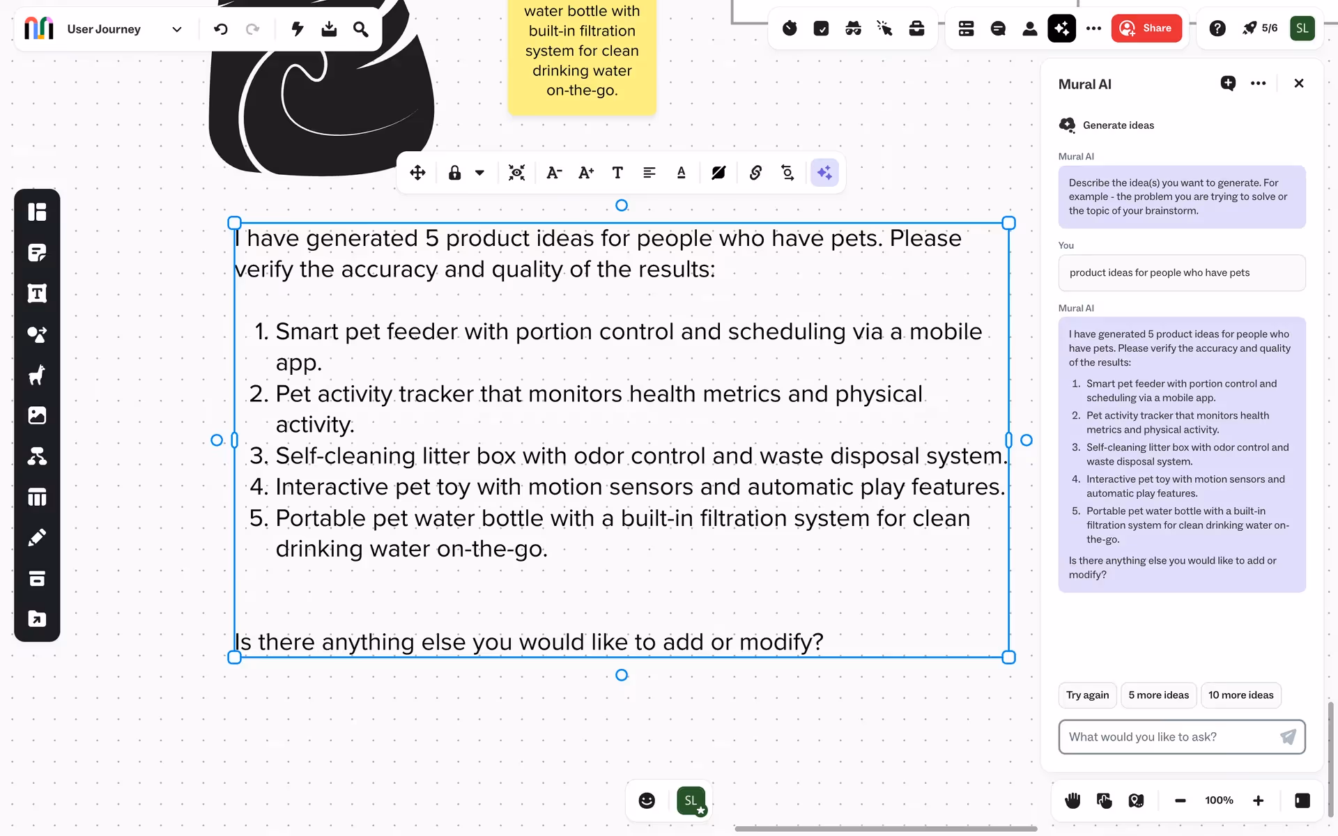
Mural is a secure, AI-powered, visual work platform designed for collaboration. Mural's branding and interface designs feature colors like Web Orange (#FFAA00), White (#FFFFFF), Mine Shaft (#1F1F1F), Heliotrope (#BE53FF), Malibu (#79C1FF), Caribbean Green (#00C27A), and Heliotrope (#FC83FF). You can easily copy Mural's colors in Hex, CMYK, RGB, and other popular formats on this page.
Mural's color palette features vibrant and dynamic hues, including Web Orange (#FFAA00), White (#FFFFFF), Mine Shaft (#1F1F1F), Heliotrope (#BE53FF and #FC83FF), Malibu (#79C1FF), and Caribbean Green (#00C27A).
Mural's primary color, #FFAA00, exudes warmth and creativity, embodying the brand's vibrant and collaborative spirit. This energetic hue, often referred to as "Web Orange," is designed to inspire innovation and engagement. Complementing this, colors like #BE53FF (Heliotrope) and #00C27A (Caribbean Green) add a dynamic and playful touch, enhancing the overall message of creativity and collaboration.
While the specific history and key influences behind Mural's color scheme are not detailed, our understanding is that the brand's colors were chosen to reflect its emphasis on collaboration, innovation, and inclusivity. The vibrant palette aims to inspire creativity and engagement among users, making the platform visually appealing and conducive to productive teamwork.
Mural strategically uses colors like Web Orange, White, Mine Shaft, Heliotrope, Malibu, and Caribbean Green to guide your actions and influence decisions. These colors are chosen to create a visually engaging and intuitive user experience, enhancing productivity and collaboration by making key features and actions stand out.
To complement Mural's primary color (#FFAA00), consider using shades like navy blue (#000080) for a striking contrast, or soft lavender (#E6E6FA) for a balanced, harmonious effect. These colors can enhance your design by adding depth and variety while maintaining visual appeal.
On Mobbin’s brand colors page, you can explore a curated list of brand color palettes from top companies. We also offer access to thousands of other UI designs and interfaces from various brands, making it a great resource for finding new color combinations and getting inspiration from real-world examples.
Mobbin helps you stay up-to-date with the latest UI/UX trends by offering an extensive, constantly updated collection of mobile and web design patterns. From color usage to user flows, our platform showcases the latest trends in UI/UX design, allowing you to easily explore current design practices and stay ahead in the industry.
Ready to elevate your design game? Try Mobbin today for free as long as you like, or get full access with any of our paid plans.
Use Mobbin for free as long as you like or get full access with any of our paid plans.


