#1db954
Copy
Copied


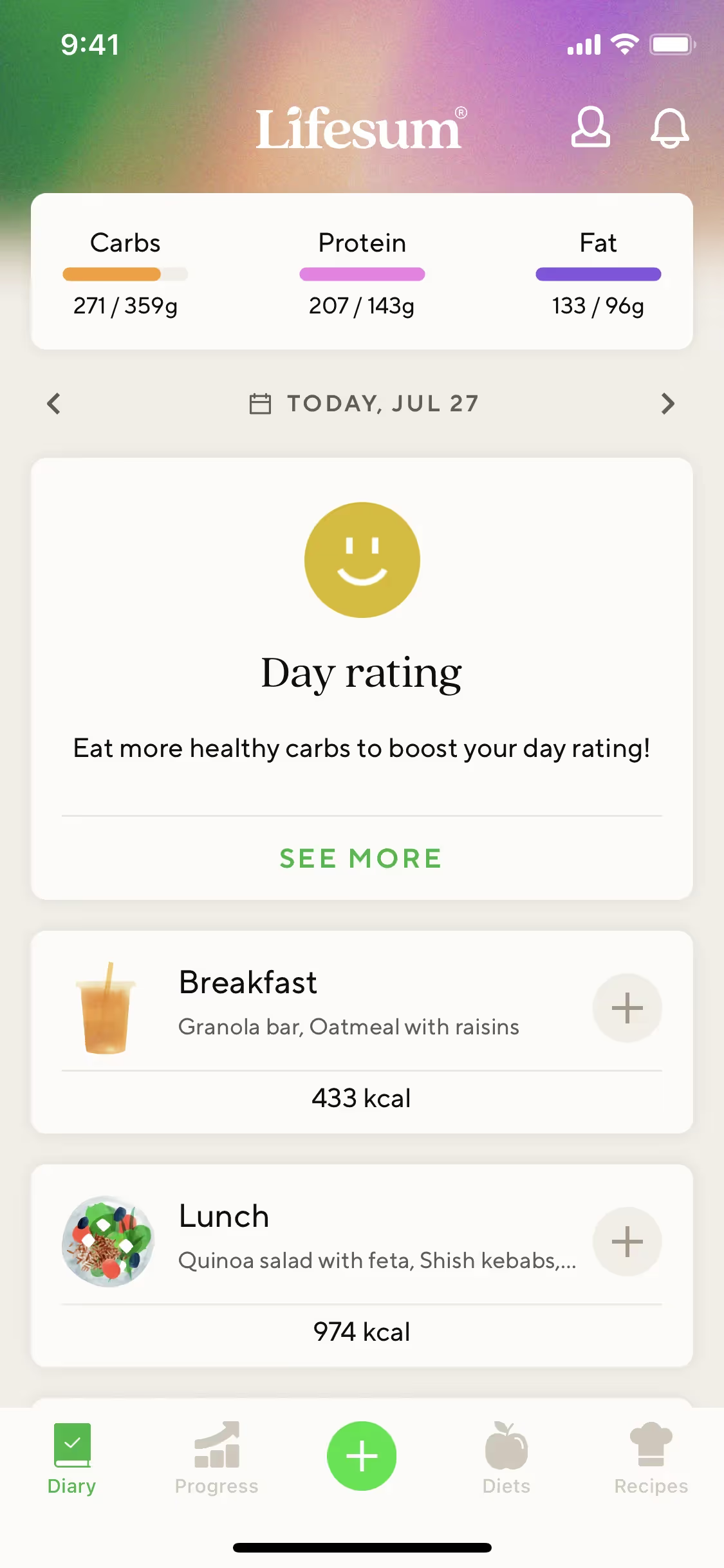
Lifesum is a health and nutrition tracking app developed by Lifesum AB and LykonDX GmbH. The app's branding and interface designs prominently feature colors like Mine Shaft (#242424), Spring Wood (#FAFAF5), and Ocean Green (#37B97D). You can easily copy Lifesum's colors in Hex, CMYK, RGB, and other popular formats in this page.
The main colors in Lifesum's color palette are Mine Shaft (#242424), Spring Wood (#FAFAF5), and Ocean Green (#37B97D). These colors create a balanced and visually appealing interface that can inspire your design projects.
The primary color in Lifesum's app, Mine Shaft (#242424), conveys a sense of sophistication and reliability, aligning with the brand's commitment to providing a trustworthy and premium user experience. Complementing this, Spring Wood (#FAFAF5) adds a touch of cleanliness and simplicity, while Ocean Green (#37B97D) injects a refreshing and energetic vibe, enhancing the overall message of health and vitality.
Unfortunately, there is no available information on the history or key influences behind Lifesum's color scheme. However, we encourage you to explore Lifesum's app and website to see how their vibrant and health-focused palette enhances user experience and brand identity. This can serve as a great source of inspiration for your own design projects.
Lifesum strategically uses colors like Mine Shaft, Spring Wood, and Ocean Green to create a cohesive and engaging user experience. Mine Shaft provides a sleek, modern backdrop, while Spring Wood offers a clean, inviting contrast. Ocean Green is used to highlight key actions and guide you through the app, making it easier to navigate and stay motivated on your health journey.
To complement Lifesum's primary color (#242424), consider using shades like "Coral" (#FF6F61) for a vibrant contrast, "Slate Gray" (#708090) for a balanced, sophisticated look, or "Goldenrod" (#DAA520) to add a touch of warmth and energy. These colors can enhance your design by creating visual interest and harmony.
On Mobbin’s brand colors page, you can explore a curated list of brand color palettes from top companies. We also offer access to thousands of other UI designs and interfaces from various brands, making it a great resource for finding new color combinations and getting inspiration from real-world examples.
Mobbin helps you stay up-to-date with the latest UI/UX trends by offering an extensive, constantly updated collection of mobile and web design patterns. From color usage to user flows, our platform showcases the latest trends in UI/UX design, allowing you to easily explore current design practices and stay ahead in the industry.
Don't miss out—try Mobbin today for free as long as you like, or get full access with any of our paid plans.

Use Mobbin for free as long as you like or get full access with any of our paid plans.


