#1db954
Copy
Copied

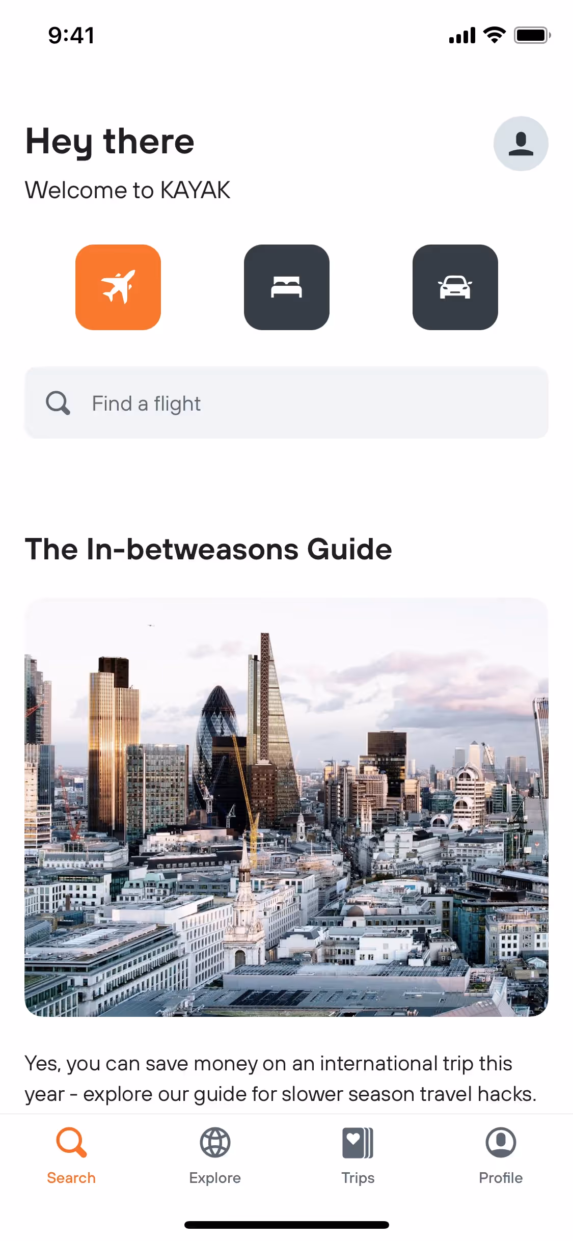
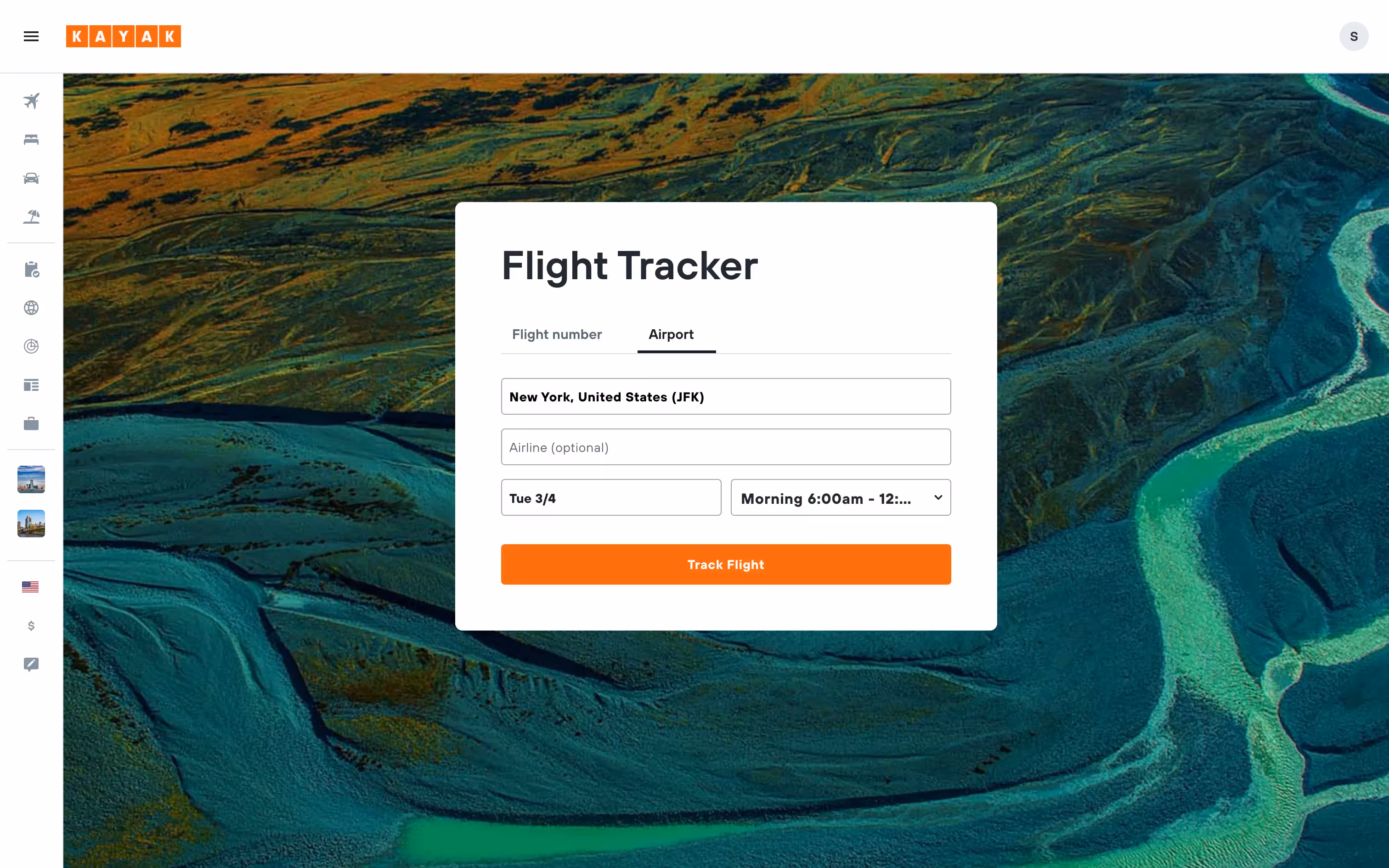
KAYAK is a travel search engine that helps users find and compare deals on flights, hotels, and rental cars. The brand's general colors are vibrant orange (#FF690F) and clean white (#FFFFFF), which are prominently featured in its interface designs. You can easily copy KAYAK's colors in Hex, CMYK, RGB, and other popular formats on this page.
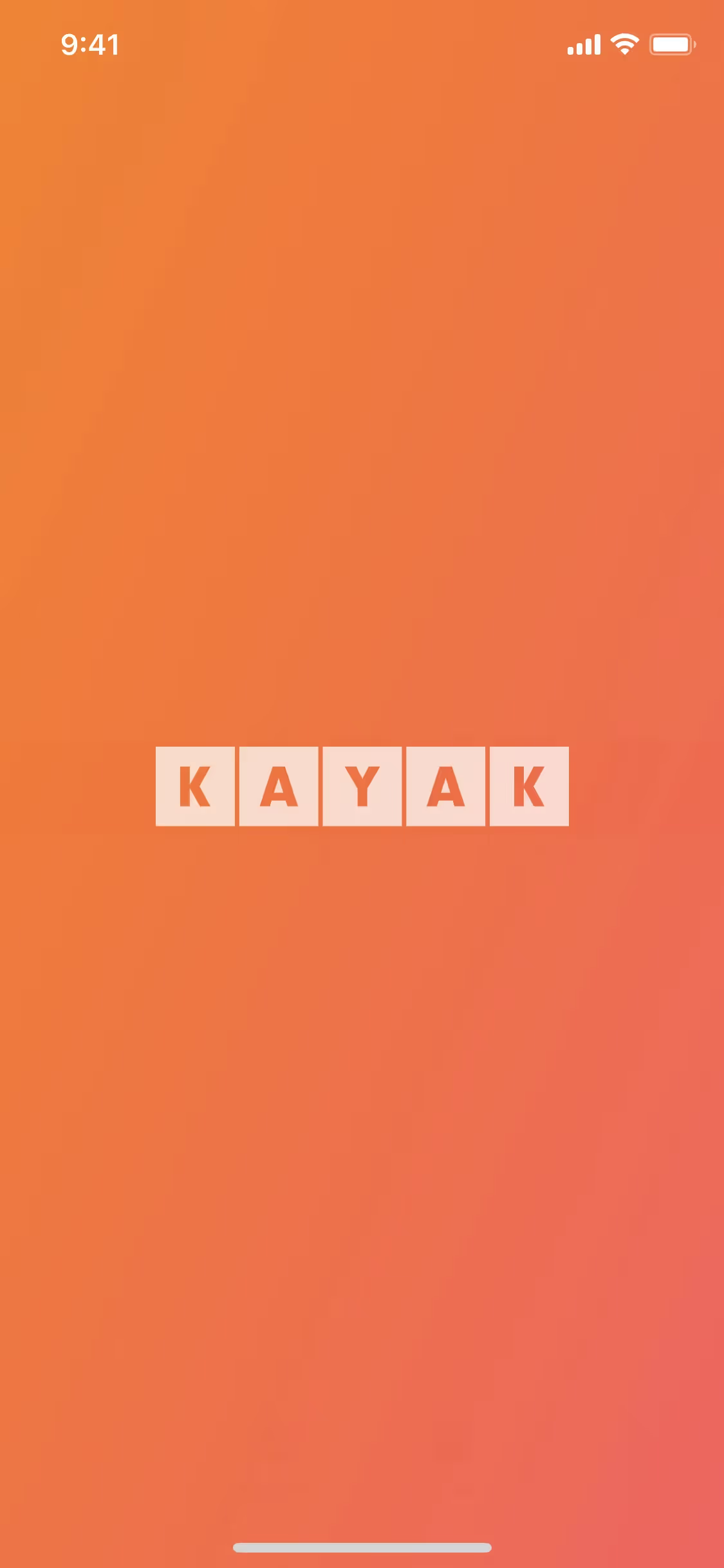
The main colors in Kayak's color palette are a vibrant orange (#FF690F) and a crisp white (#FFFFFF). These colors are designed to create a striking and clean visual experience for users.
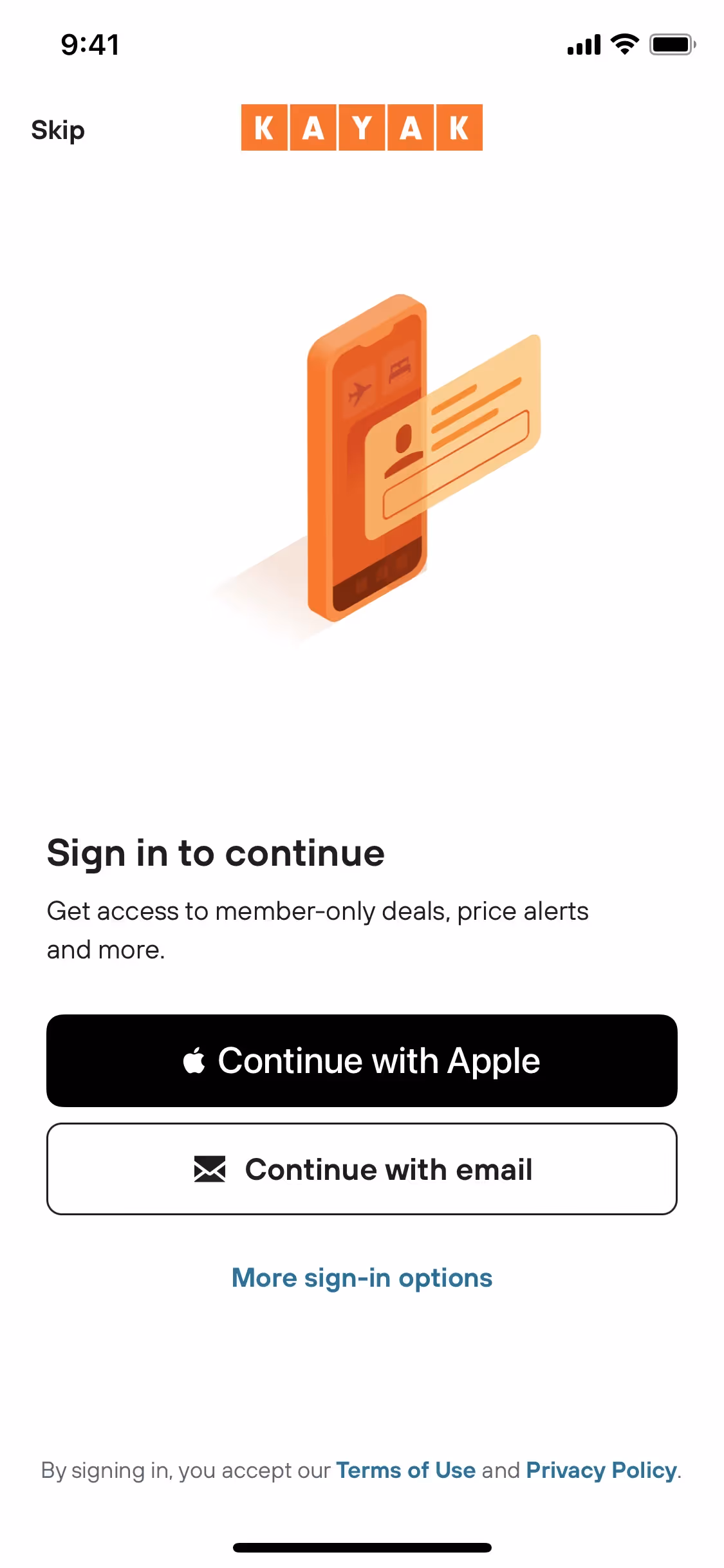
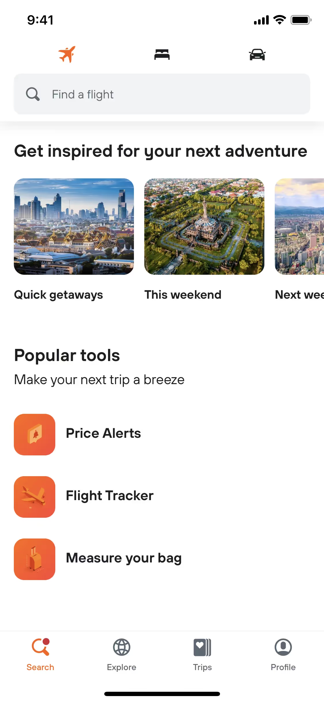
Kayak's primary color, #FF690F, is a vibrant orange that conveys energy, enthusiasm, and a sense of adventure, perfectly aligning with the brand's identity as a dynamic travel platform. This bold hue is designed to capture your attention and evoke excitement about your travel plans. Complementing this, the use of white (#FFFFFF) provides a clean, modern backdrop that enhances readability and ensures the orange elements stand out, reinforcing Kayak's commitment to clarity and user-friendly design.
Kayak's color scheme, while not explicitly detailed in available sources, likely evolved to reflect its brand identity of convenience, savings, and user empowerment. The choice of colors is influenced by the need to create a visually appealing and user-friendly interface that enhances the travel booking experience.
Kayak strategically uses orange and white in its interface designs to guide your actions and enhance your experience. Orange is employed for call-to-action buttons and highlights, drawing your attention to key actions like booking and searching, while white provides a clean, readable background that reduces cognitive load and ensures clarity.
To complement Kayak's primary color (#FF690F), consider using shades like navy blue (#003366) for a striking contrast, or teal (#008080) for a balanced, refreshing look. Additionally, a soft gray (#B0B0B0) can provide a neutral backdrop that enhances the vibrancy of the orange.
On Mobbin’s brand colors page, you can explore a curated list of brand color palettes from top companies. We also offer access to thousands of other UI designs and interfaces from various brands, making it a great resource for finding new color combinations and getting inspiration from real-world examples.
Mobbin helps you stay up-to-date with the latest UI/UX trends by offering an extensive, constantly updated collection of mobile and web design patterns. From color usage to user flows, our platform showcases the latest trends in UI/UX design, allowing you to easily explore current design practices and stay ahead in the industry.
Ready to elevate your design game? Try Mobbin today for free as long as you like, or get full access with any of our paid plans.
Use Mobbin for free as long as you like or get full access with any of our paid plans.


