#1db954
Copy
Copied

PINEAPPLE TECHNOLOGY LTD created incident.io, an all-in-one incident management platform. Its branding and interface designs feature a palette of Flamingo, White, and Mirage. We've made it easy for you to copy these colors in Hex, CMYK, RGB, and more.
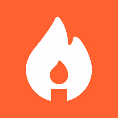
To help you get started, we've identified incident.io's primary colors as Flamingo (#F25533), White (#FFFFFF), and Mirage (#17212F), forming a bold and versatile palette.
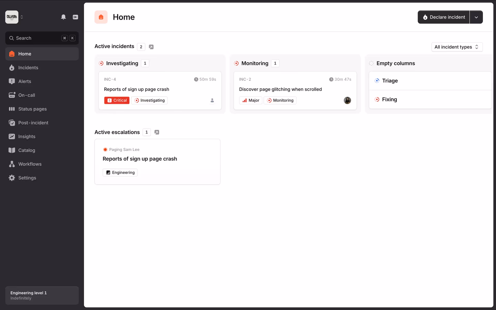
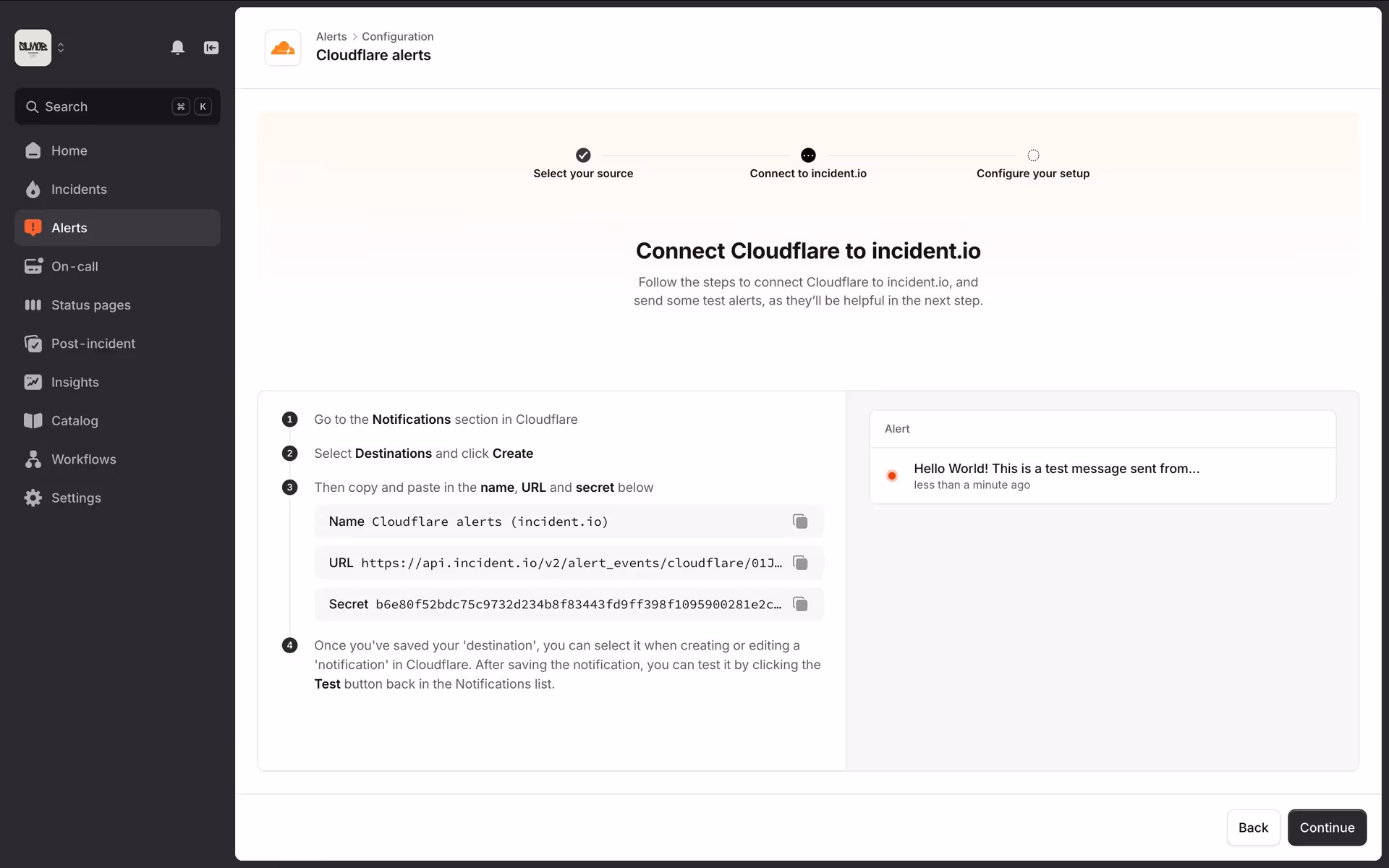
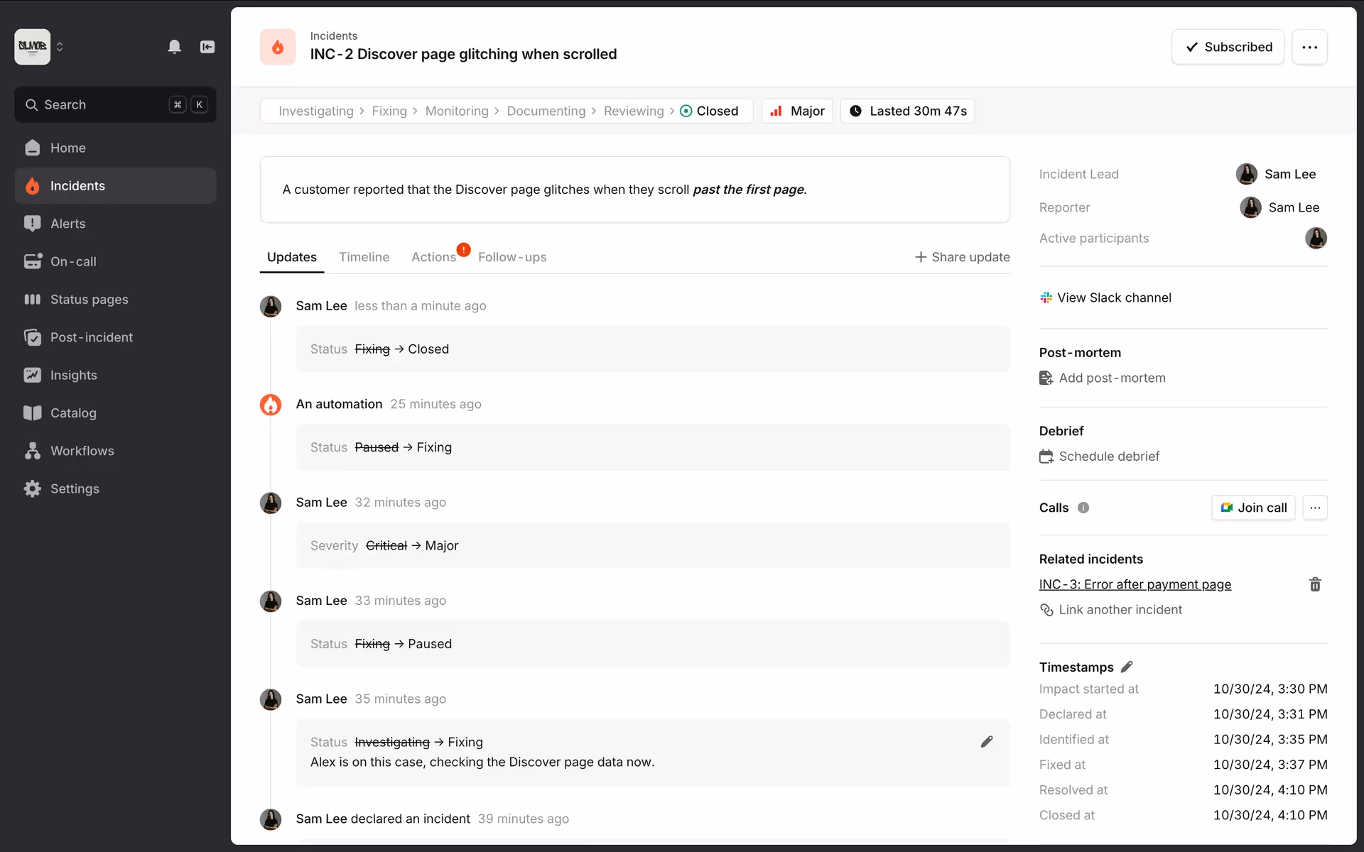
The vibrant Flamingo orange in incident.io's palette grabs your attention, conveying the urgency and confidence needed to resolve incidents. This bold energy is balanced by the professional Mirage and clean White, creating a visual language that feels both action-oriented and reassuringly stable.
The vibrant, high-contrast palette is a masterclass in functional design, likely chosen to signal urgency and clarity during critical incidents. It’s a powerful example of how color can directly support a product's core function.
We see how they leverage the striking Flamingo to draw your eye to crucial actions and notifications, while the Mirage and White foundation reduces cognitive load, keeping you focused when it matters most.
To balance the vibrant energy of #F25533, we suggest exploring deep teals or cool blues. These colors can create a striking contrast and a sophisticated, modern feel for your designs, while a warm cream could offer a softer, more approachable alternative to pure white.
On our brand colors page, you can explore a curated list of color palettes from top companies. We also offer access to thousands of other UI designs and interfaces, making it a great resource for finding new color combinations and getting inspiration from real-world examples.
Our platform offers an extensive, constantly updated library of mobile and web design patterns, allowing you to see the latest trends in everything from color palettes to intricate user flows. By exploring our collection, you can easily keep a pulse on current design practices and stay ahead of the curve in the fast-paced world of UI/UX.
Why not try Mobbin today? You can use it for free for as long as you like, or unlock full access with one of our paid plans.
Use Mobbin for free as long as you like or get full access with any of our paid plans.


