#1db954
Copy
Copied

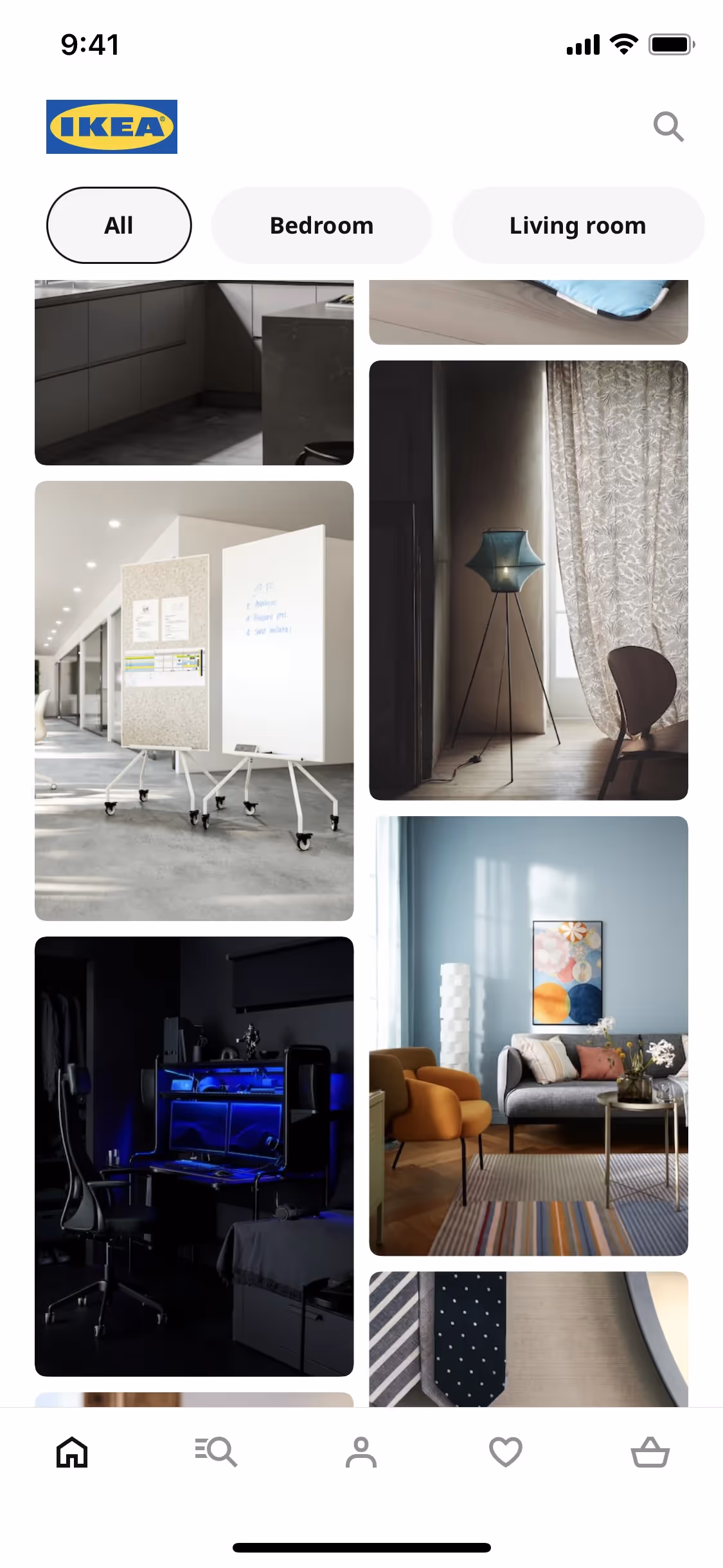
IKEA is a global leader in home furnishings, known for its innovative and affordable designs. The brand's iconic blue (#0057AD) and yellow (#FBDA0C) colors are integral to its visual identity. You can easily copy IKEA's colors in Hex, CMYK, RGB, and other popular formats on this page.
The main colors in IKEA's color palette are a vibrant blue (#0057AD) and a bright yellow (#FBDA0C). These colors are designed to be both eye-catching and memorable, helping to create a strong brand identity.
The primary color in IKEA's app and website, #0057AD, is a deep blue that conveys trust, reliability, and stability, aligning perfectly with IKEA's brand identity of providing dependable and affordable home furnishings. This blue is complemented by a vibrant yellow (#FBDA0C), which adds a sense of optimism and energy, enhancing the overall message of a welcoming and innovative brand.
IKEA's color scheme evolved from its original red logo, chosen for its association with low prices, to the iconic blue and yellow, reflecting the brand's Swedish heritage and aiming for instant recognition. The blue creates attention, while the yellow offers an optimistic impression, making the brand stand out and feel welcoming.
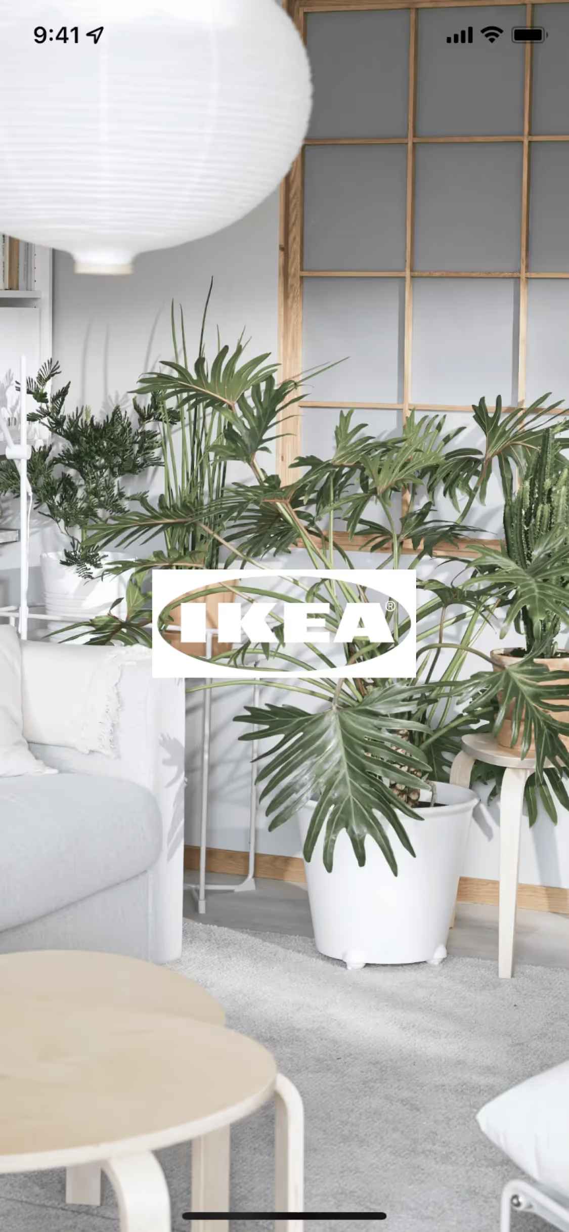
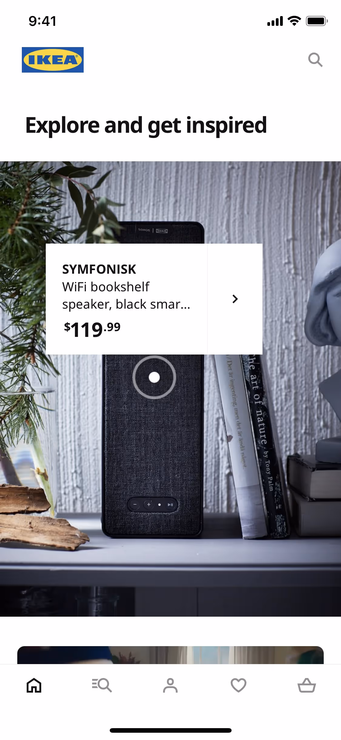
At IKEA, the strategic use of blue and yellow in interface designs is key to guiding your actions and influencing decisions. Blue (#0057AD) draws your attention to offers and important elements, while yellow (#FBDA0C) evokes optimism and positivity, creating a welcoming user experience. These colors are not just visually appealing but are also carefully chosen to enhance brand recognition and direct your focus effectively.
To complement IKEA's primary blue (#0057AD), consider using colors like a soft gray (#D3D3D3) for a balanced look, or a vibrant orange (#FF6600) to create a striking contrast. These choices can enhance your design by adding depth and visual interest.
On Mobbin’s brand colors page, you can explore a curated list of brand color palettes from top companies. We also offer access to thousands of other UI designs and interfaces from various brands, making it a great resource for finding new color combinations and getting inspiration from real-world examples.
Mobbin helps you stay up-to-date with the latest UI/UX trends by offering an extensive, constantly updated collection of mobile and web design patterns. From color usage to user flows, our platform showcases the latest trends in UI/UX design, allowing you to easily explore current design practices and stay ahead in the industry.
Ready to elevate your design game? Try Mobbin today for free as long as you like, or get full access with any of our paid plans.


Use Mobbin for free as long as you like or get full access with any of our paid plans.


