#1db954
Copy
Copied

IFTTT Inc. is the company behind the popular automation app, IFTTT. Its branding and interface designs primarily feature Mine Shaft, white, and a vibrant Picton Blue. We've made it easy for you to copy these colors in Hex, CMYK, RGB, and other popular formats.
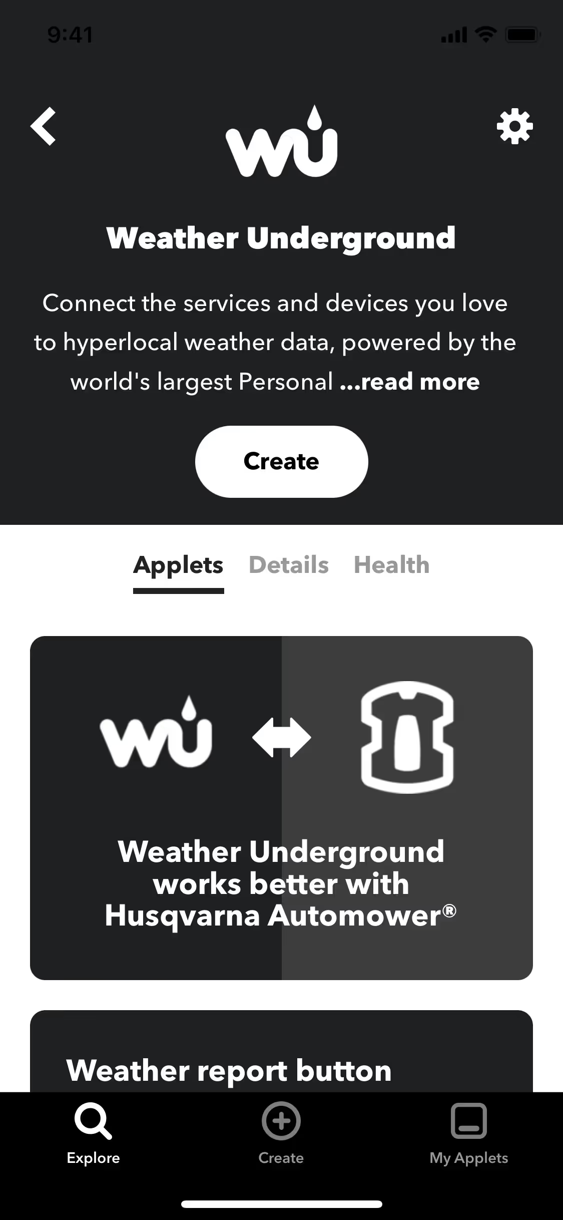
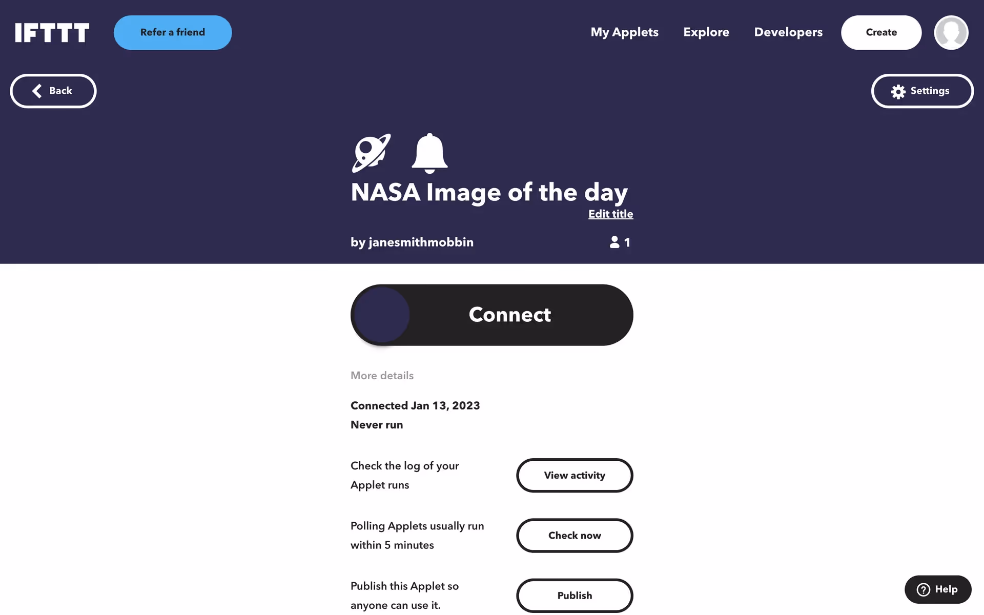
IFTTT's core color palette is a simple yet effective trio. It features a crisp Picton Blue (#52C7F3) as its primary accent, complemented by the classic combination of Mine Shaft (#222222) and White (#FFFFFF) for a clean and modern look.
IFTTT's foundational near-black (#222222) grounds the brand in stability and powerful, straightforward automation. This allows the vibrant Picton Blue to represent the seamless flow and spark of connection you create, while the crisp white provides clarity and focus.
While IFTTT hasn't shared a detailed history of its brand colors, we see its minimalist palette as a direct reflection of its mission: to bring clarity and simplicity to how you connect your digital life.
In our analysis, we see IFTTT masterfully uses its simple palette. The high-contrast Mine Shaft and White create a focused, uncluttered experience, while the vibrant Picton Blue strategically guides you, making key actions like creating applets feel both inviting and effortless.
To build on IFTTT's core palette, we recommend a vibrant coral for energetic accents or a warm ochre to introduce a sophisticated, earthy balance against the primary dark tone.
On our brand colors page, you can explore a curated list of color palettes from top companies. We also offer access to thousands of UI designs from various brands, making it a fantastic resource for discovering new color combinations and drawing inspiration from real-world examples.
Our platform offers an extensive, constantly updated collection of mobile and web design patterns, giving you a real-time look at the latest trends in everything from color usage to intricate user flows. By exploring our library, you can effortlessly keep up with current design practices and stay ahead of the industry curve. Try Mobbin today for free as long as you like, or get full access with any of our paid plans.

Use Mobbin for free as long as you like or get full access with any of our paid plans.


