#1db954
Copy
Copied


Hulu is a popular streaming service offering a variety of TV shows, movies, and live TV options. Hulu's branding and interface designs prominently feature the colors Woodsmoke (#040405), White (#FFFFFF), and Malachite (#1CE783). You can easily copy Hulu's colors in Hex, CMYK, RGB, and other popular formats on this page.
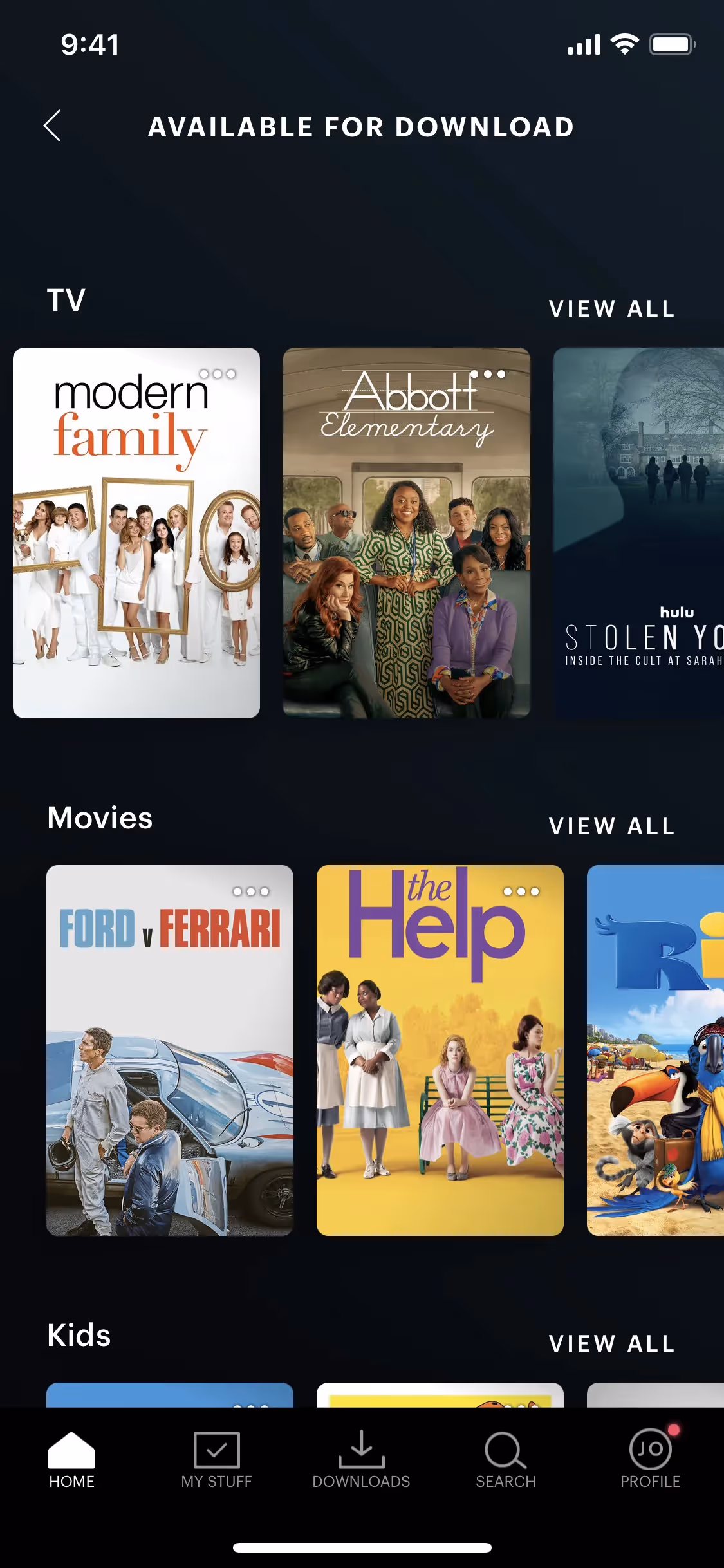
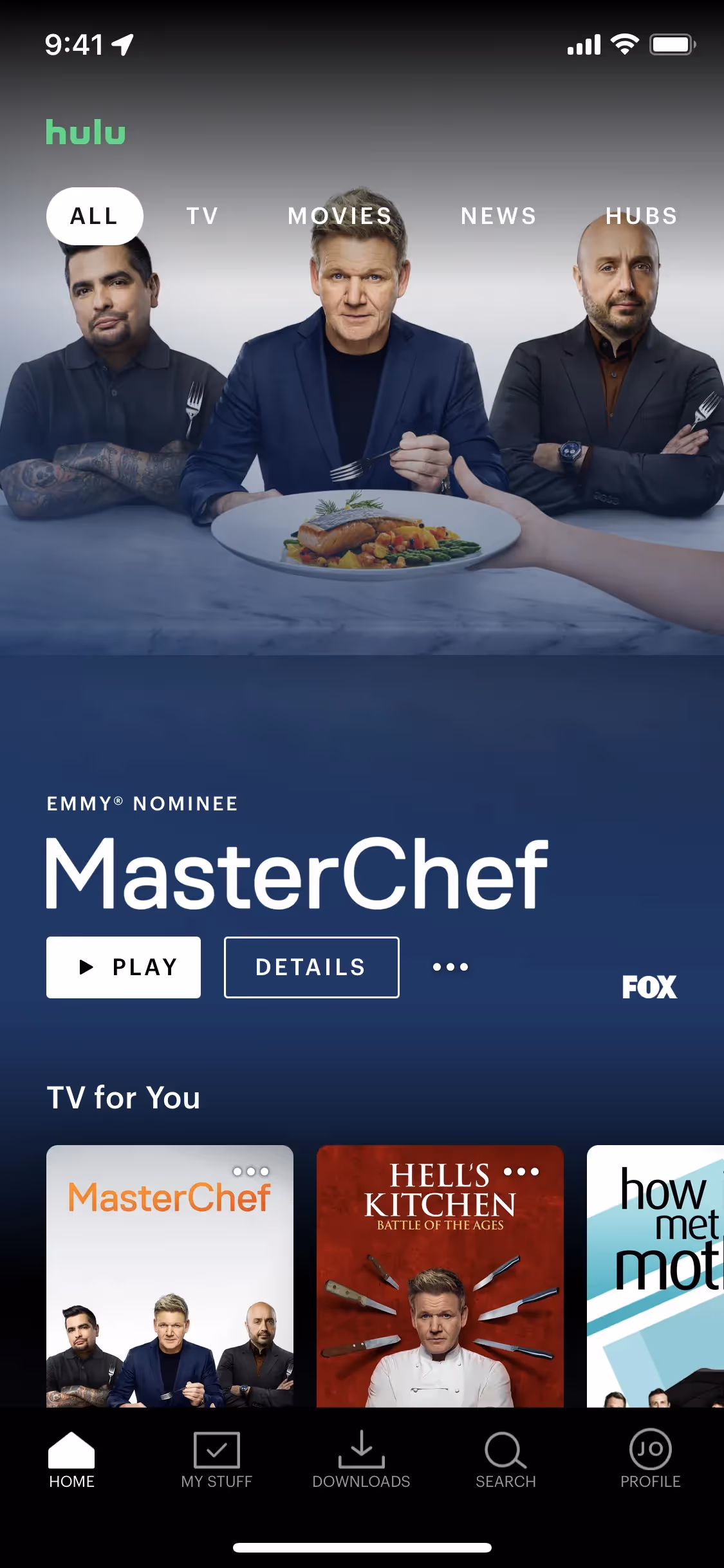
The main colors in Hulu's color palette are Woodsmoke (#040405), White (#FFFFFF), and Malachite (#1CE783). These colors create a striking and modern visual identity that you can draw inspiration from for your own design projects.
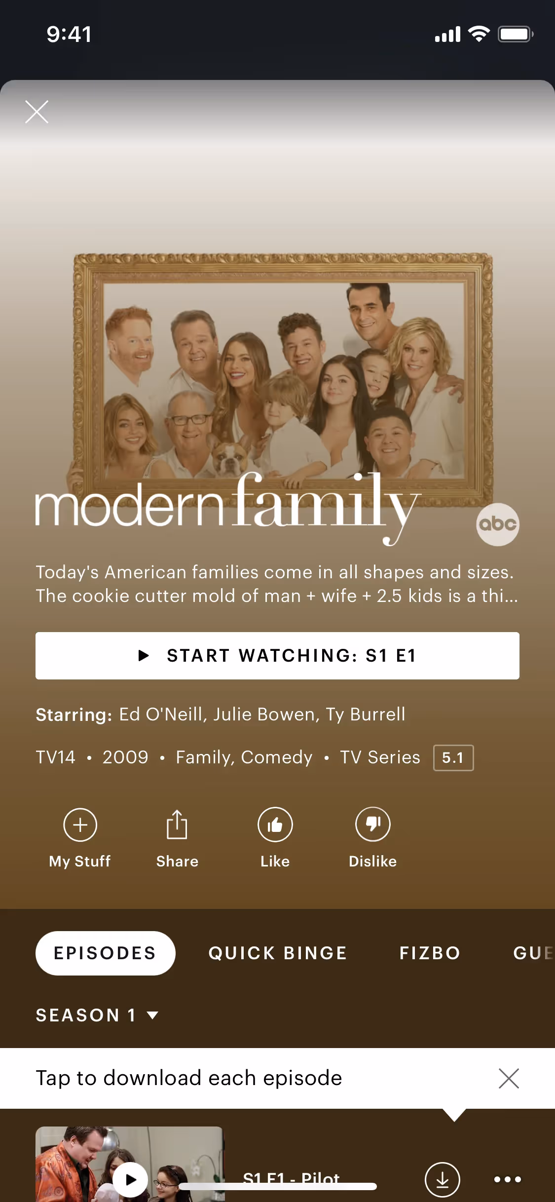
Hulu's primary color, Woodsmoke (#040405), conveys a sense of sophistication and modernity, aligning with the brand's identity as a premium streaming service. This deep, almost black hue evokes feelings of elegance and reliability. Complementing this, the bright Malachite (#1CE783) adds a vibrant, energetic touch, symbolizing innovation and excitement, while White (#FFFFFF) provides a clean, balanced backdrop that enhances readability and user experience.
Hulu's color scheme, particularly its signature 'Hulu Green,' was chosen to convey freshness and distinctiveness, setting it apart from more traditional entertainment palettes. This vibrant green has been a core part of Hulu's identity for a significant period, aiming to be memorable and unique in the minds of viewers.
Hulu's strategic use of color psychology in its interface designs leverages the distinctiveness of Malachite green to create a fresh and memorable brand identity, while the contrast of Woodsmoke black and White ensures legibility and guides your attention to key actions. This thoughtful application of colors not only enhances the cinematic feel but also influences your decisions by making important elements like CTAs stand out, ultimately creating a cohesive and engaging user experience.
To complement Hulu's primary color (#040405), consider using shades like deep teal (#008080) for a balanced look, or vibrant coral (#FF6F61) to create striking contrast. These colors can enhance your design by adding depth and visual interest.
On Mobbin’s brand colors page, you can explore a curated list of brand color palettes from top companies. We also offer access to thousands of other UI designs and interfaces from various brands, making it a great resource for finding new color combinations and getting inspiration from real-world examples.
Mobbin helps you stay up-to-date with the latest UI/UX trends by offering an extensive, constantly updated collection of mobile and web design patterns. From color usage to user flows, you can easily explore current design practices and stay ahead of trends in the industry.
Ready to elevate your design game? Try Mobbin today for free as long as you like, or get full access with any of our paid plans.


Use Mobbin for free as long as you like or get full access with any of our paid plans.


