#1db954
Copy
Copied


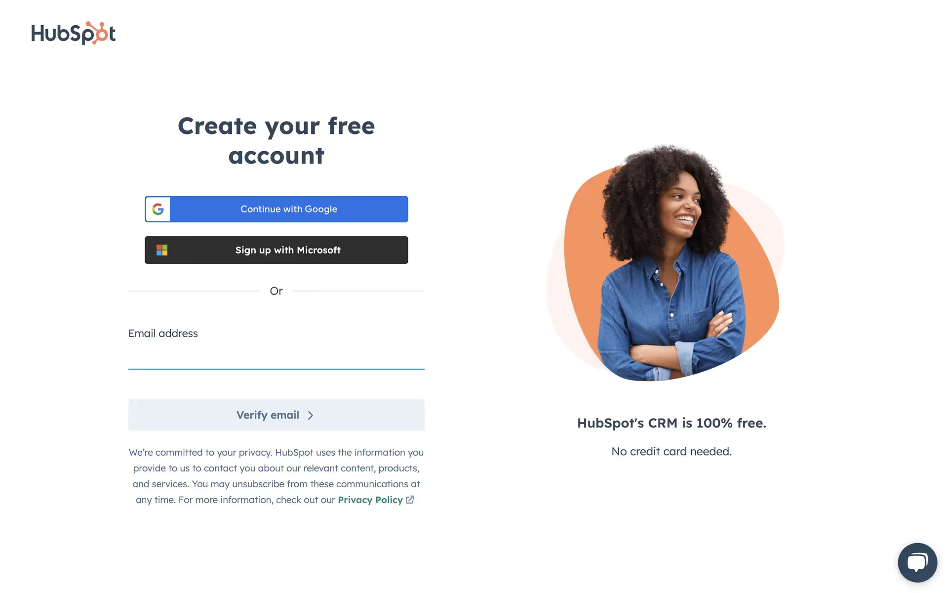
HubSpot, Inc. offers an AI-powered customer platform for marketing, sales, and service. Its branding features a distinct palette of Pickled Bluewood, Forget Me Not, and its signature Coral. On this page, you can easily copy these colors in Hex, CMYK, RGB, and more.
HubSpot's core color palette is a dynamic trio of Pickled Bluewood (#2D3E50), Forget Me Not (#FFF1EE), and Coral (#FF7A59). We've gathered these to help you nail their signature look in your next project.
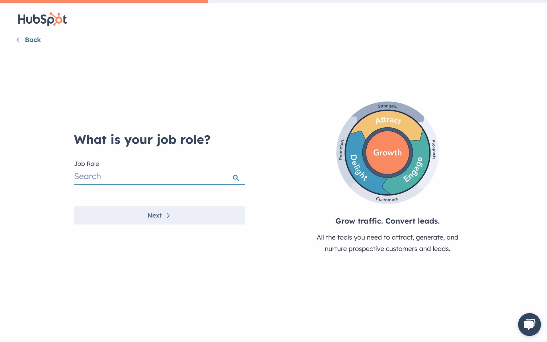
HubSpot's primary dark blue, Pickled Bluewood, establishes a foundation of trust and professionalism, while the energetic Coral accent guides you with a friendly confidence, making the platform feel both reliable and approachable.
HubSpot's color scheme is rooted in their mission to empower growth; the energetic orange and clean secondary colors are designed to feel both approachable and dynamic, mirroring the user-friendly yet powerful platform we feature in our library.
HubSpot strategically pairs the trustworthy Pickled Bluewood with the action-oriented Coral, creating a clear visual hierarchy that confidently guides you toward your goals on a clean, approachable interface.
If you're looking to expand on HubSpot's palette, we'd suggest a vibrant mustard yellow for a high-contrast, energetic feel, or a muted sage green to create a more calming and sophisticated user experience.
Beyond HubSpot's palette, you can explore our brand colors page for a curated list of color palettes from top companies. We also offer access to thousands of UI designs from various brands, providing endless inspiration for your next color combination from real-world examples.
Mobbin keeps you at the forefront of design with our extensive, constantly updated library of mobile and web UI/UX patterns. By exploring the latest trends in everything from color palettes to intricate user flows from top apps, you can easily see what's current and stay ahead of the curve in the design industry.
You can try Mobbin today for free for as long as you like, or get full access with any of our paid plans.

Use Mobbin for free as long as you like or get full access with any of our paid plans.


