#1db954
Copy
Copied

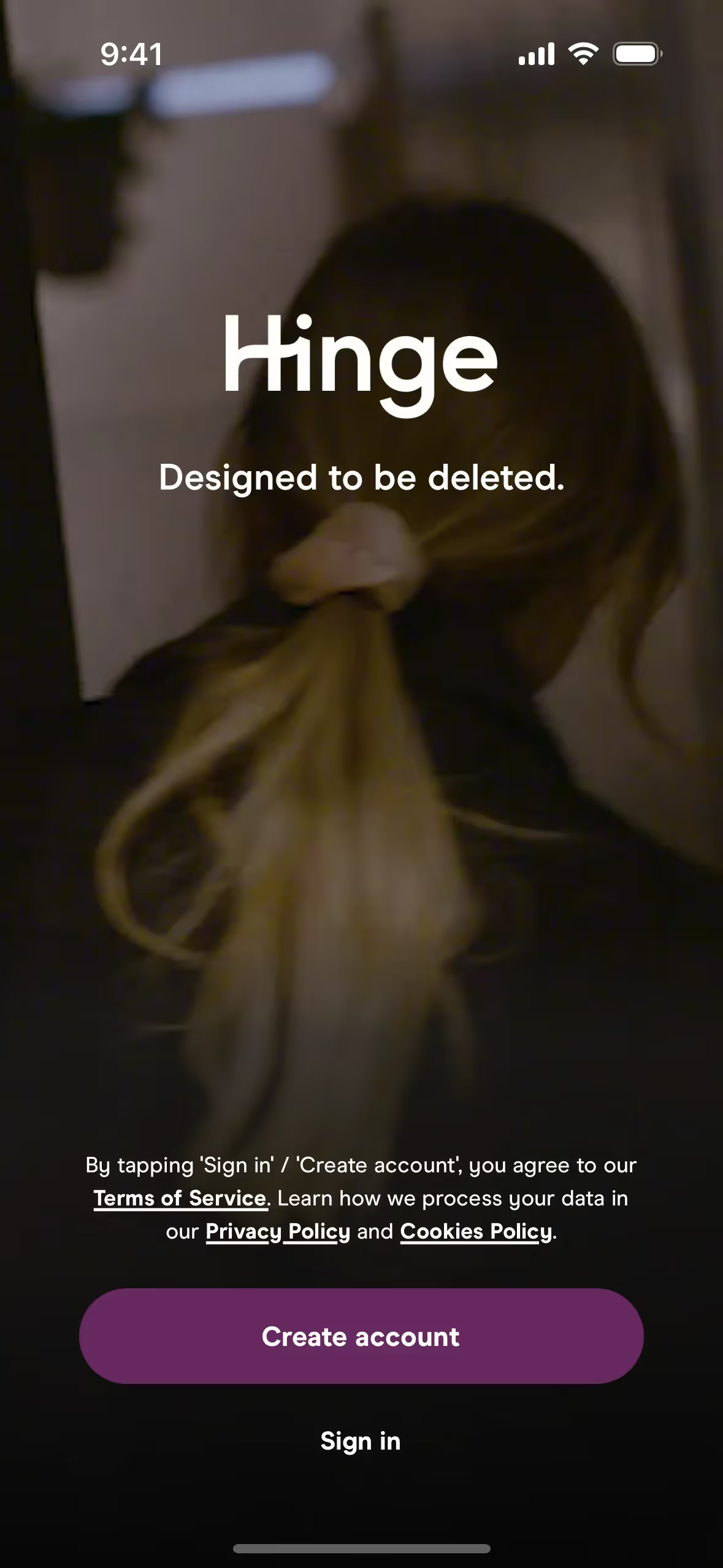
Hinge is a dating app designed to help people find meaningful relationships. Hinge's branding and interface designs prominently feature Cod Gray (#1A1A1A), White (#FFFFFF), and Dove Gray (#666666). You can easily copy Hinge's colors in Hex, CMYK, RGB, and other popular formats on this page.
The main colors in Hinge's color palette are Cod Gray (#1A1A1A), White (#FFFFFF), and Dove Gray (#666666). These colors create a sleek and modern aesthetic, perfect for inspiring your next design project.
Hinge's primary color, Cod Gray (#1A1A1A), conveys a sense of sophistication and modernity, aligning with the app's brand identity of fostering meaningful connections. Complemented by White (#FFFFFF) and Dove Gray (#666666), these colors create a clean, minimalist aesthetic that enhances the user experience by keeping the focus on the content and interactions.
Hinge's color scheme has evolved organically, with no specific historical references or influences explicitly documented. The choice of colors appears to be driven by a desire to create a user-friendly and inviting interface, aligning with Hinge's mission to foster meaningful connections.
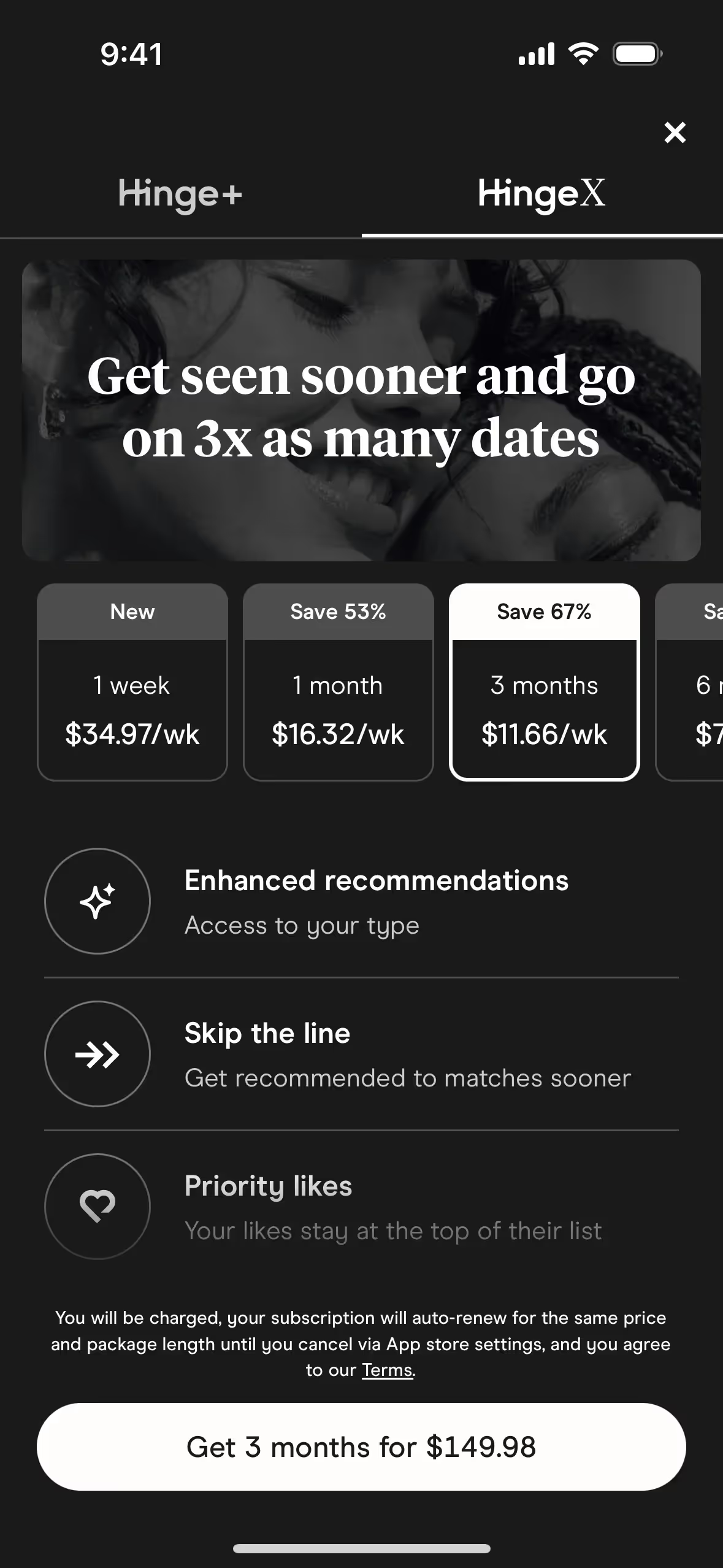
Hinge strategically uses colors like Cod Gray, White, and Dove Gray to create a sleek and modern interface that guides your actions seamlessly. These color choices help to highlight important features, influence your decisions subtly, and ensure a cohesive user experience that feels both intuitive and engaging.
To complement Hinge's primary color (#1A1A1A), consider using shades like deep teal (#008080) for a sophisticated contrast, or soft blush (#FFC0CB) to add a touch of warmth and balance. These colors can enhance your design by creating a visually appealing and harmonious palette.
On Mobbin’s brand colors page, you can explore a curated list of brand color palettes from top companies. We also offer access to thousands of other UI designs and interfaces from various brands, making it a great resource for finding new color combinations and getting inspiration from real-world examples.
Mobbin helps you stay up-to-date with the latest UI/UX trends by offering an extensive, constantly updated collection of mobile and web design patterns. From color usage to user flows, you can easily explore current design practices and stay ahead of industry trends.
Ready to elevate your design game? Try Mobbin today for free as long as you like, or get full access with any of our paid plans.
Use Mobbin for free as long as you like or get full access with any of our paid plans.


