#1db954
Copy
Copied

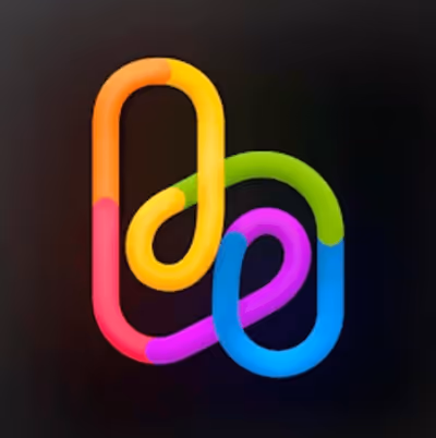
HeightHQ, Inc. is the company behind the project management tool, Height. Its branding and interface designs prominently feature Hollywood Cerise, White, and Gamboge. We've made it easy for you to copy these colors in Hex, CMYK, RGB, and more.
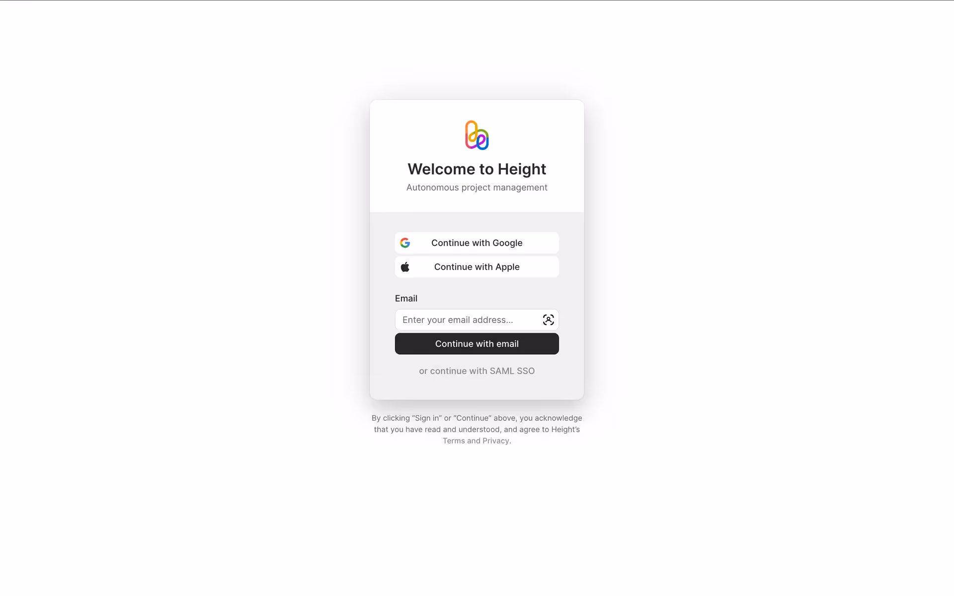
Height's color palette is a vibrant mix designed to inspire. The main colors you'll find are Hollywood Cerise (#DA00AB), White (#FFFFFF), and Gamboge (#EB9D11), creating a bold and clean aesthetic for your design projects.
Height's signature cerise embodies a bold, creative energy, reflecting a forward-thinking approach to productivity that we find inspiring. Accents of warm gamboge and clean white support this by adding a touch of optimism and clarity, creating a palette that encourages you to tackle ambitious projects with confidence.
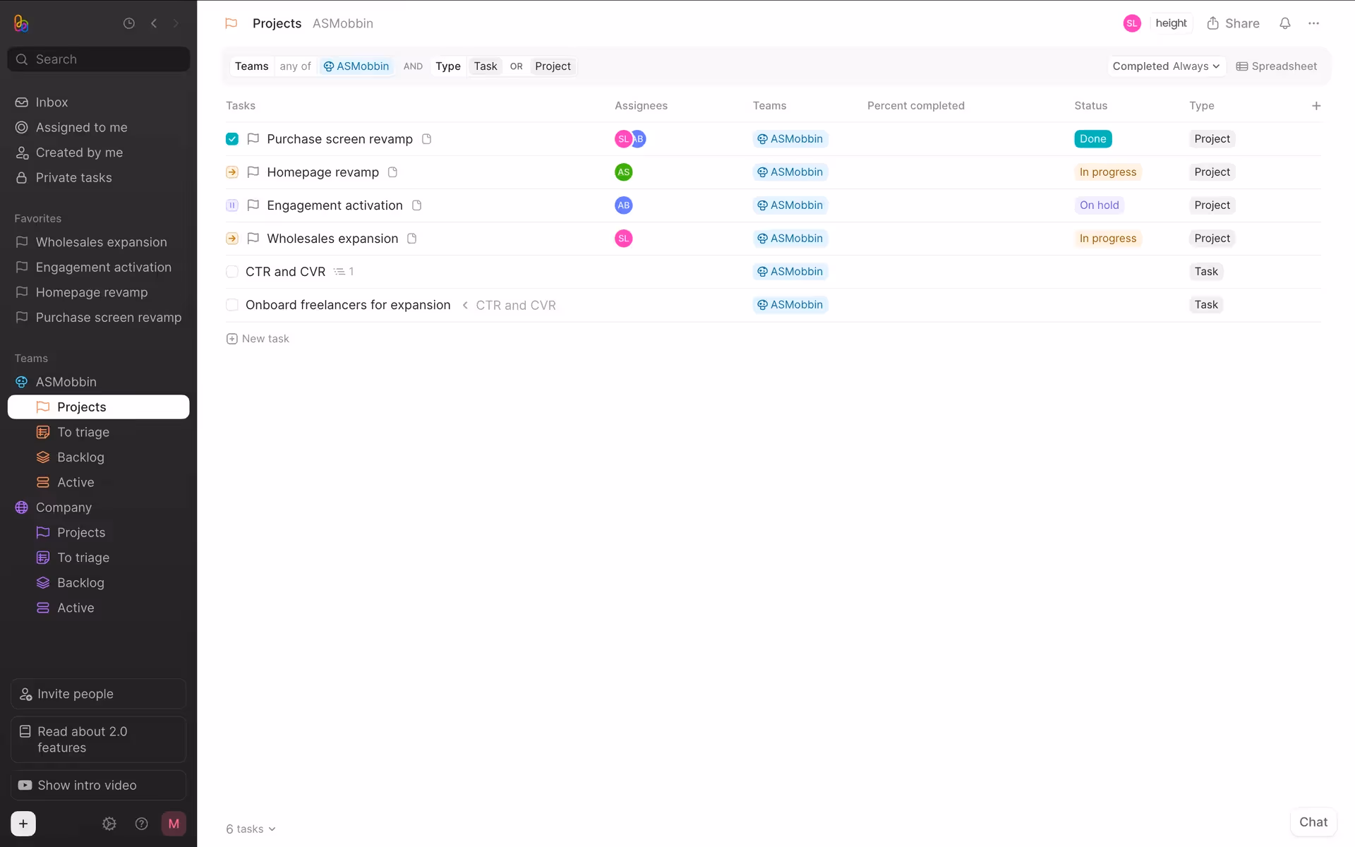
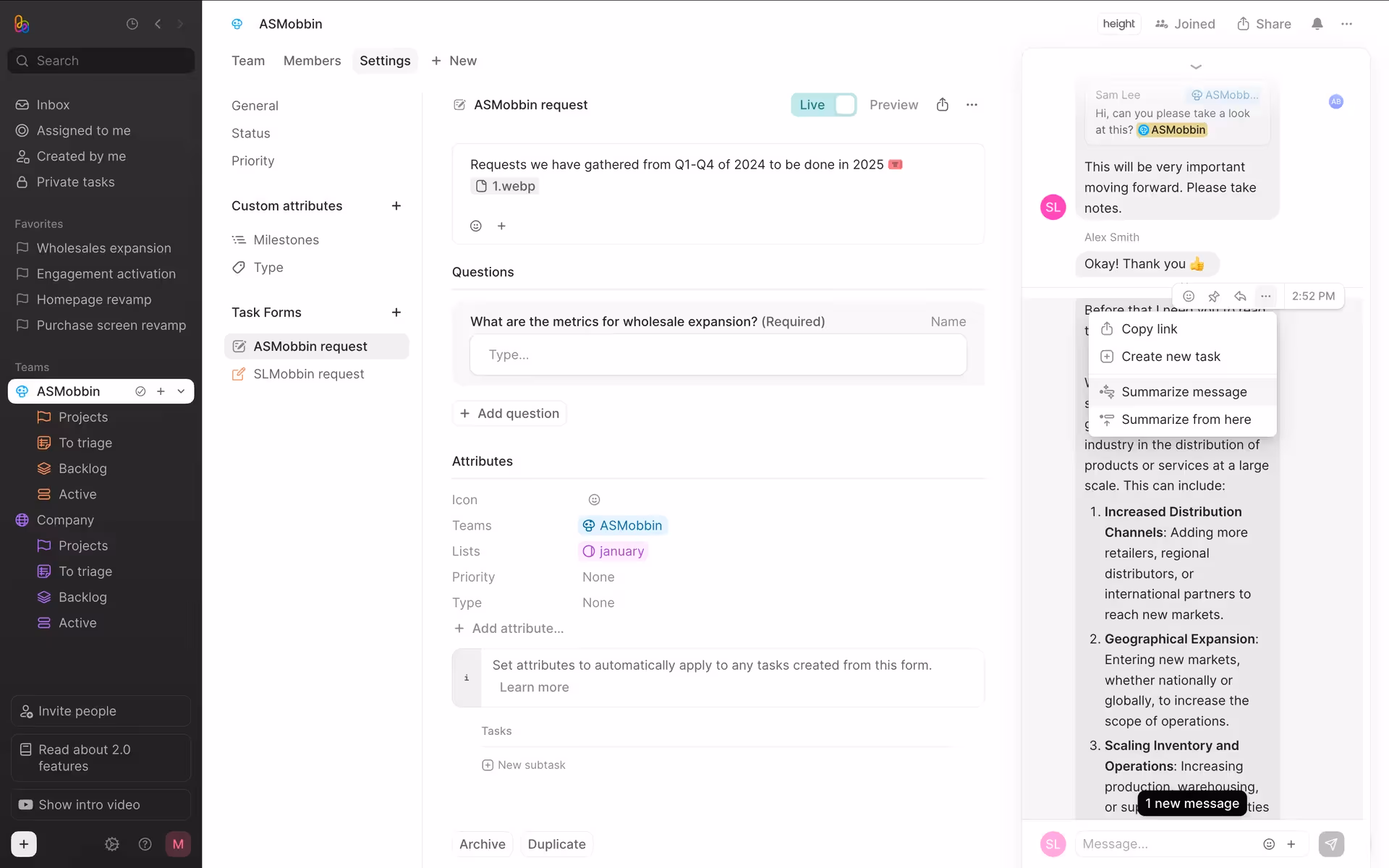
We believe Height's color scheme was intentionally crafted to support deep focus, using a minimalist palette that guides you through complex tasks without distraction.
While Height hasn't shared its specific color psychology strategy, our analysis shows their palette is key to their branding. The vibrant colors create a distinct visual hierarchy, drawing your attention to key components and actions within the interface.
To create a striking contrast with Height's vibrant pink, we suggest exploring a deep forest green for a bold, complementary effect. For a more subdued and sophisticated palette, you could introduce a dark charcoal or a cool-toned grey to balance the energy and ground your designs.
On our brand colors page, you can explore a curated list of color palettes from top companies. We also offer access to thousands of UI designs from various brands, providing endless inspiration for your next color combination from real-world examples.
Mobbin keeps you at the forefront of design with our extensive, constantly updated library of mobile and web design patterns. By exploring the latest trends in everything from color usage to intricate user flows, you can easily stay informed on current industry practices and remain ahead of the curve.
Why not try Mobbin today? You can use it for free for as long as you like, or get full access with any of our paid plans.
Use Mobbin for free as long as you like or get full access with any of our paid plans.


